


The Time Traveller's Dossier: The Anatomy of a Commodity – Chiquita's "How to read a banana" and the Invention of Produce Branding
The History
To fully appreciate the immense historical gravity, cultural magnitude, and sociological importance of this artifact, one must meticulously contextualize the complex, highly dominant landscape of the United Fruit Company (UFC) during the mid-twentieth century. The United Fruit Company was a colossal American agro-industrial multinational corporation that traded in tropical fruit (primarily bananas) grown on Central and South American plantations. Their geopolitical influence was so vast and deeply entrenched that they essentially authored the concept of the "Banana Republic," wielding immense power over the economic and political trajectories of several Latin American nations. However, by the 1960s, UFC faced a domestic marketing challenge: despite their vast supply chain, a banana was still just a banana to the American consumer. It was a generic commodity.
To combat commoditization and justify a premium price point, UFC launched one of the most successful branding initiatives in the history of agriculture. In 1963, they introduced the iconic blue Chiquita oval sticker, featuring Miss Chiquita, placing it directly on the skin of the fruit. This artifact, produced shortly after that branding revolution, represents the next phase of their psychological marketing strategy: consumer education.
The audacious, purely typographic headline anchoring the top of the artifact—"How to read a banana."—is a masterstroke of mid-century advertising. It immediately reframes the consumption of fruit from a passive biological act into an intellectual, analytical process. By instructing the consumer to "read" the fruit, Chiquita elevates the banana to an object worthy of study and scrutiny. The advertisement utilizes a clinical, infographic layout with precise leader lines pointing to specific anatomical features of the banana, effectively transforming the grocery shopper into a deputized quality-control inspector.
The copywriting embedded within these callouts is a masterclass in psychological re-framing. Consider the section detailing "Sugar spots". Biologically, these are simply signs of natural enzymatic browning and over-ripening. Yet, the copy brilliant spins this potential visual defect into a hallmark of premium quality: "Like as not, they're not speckles at all. They're sugar spots. The mark of a sweet, ripe banana." By renaming a blemish as a "sugar spot," Chiquita effectively immunized their product against the superficial visual judgments of consumers, extending the shelf-life and desirability of older fruit.
Furthermore, the artifact aggressively pushes the narrative of exclusivity and rigorous corporate standardization. The callout for "The label" states: "It means it passed a 15-point inspection by some of the toughest inspectors in the business. Not once, but three separate times.". This is a profound statement for a piece of fruit grown on a tree. UFC was projecting the language of high-tech manufacturing, aerospace engineering, and rigorous industrial quality control onto an agricultural commodity. The blue sticker was transformed from a mere trademark into a certified seal of rigorous mechanical inspection.
The formal copyright line at the bottom right—"Chiquita Brand Bananas. Chiquita is a registered trademark of United Fruit Company."—serves as a stark historical anchor. In 1970, seeking to shed the heavy, controversial geopolitical baggage associated with its name, the United Fruit Company merged with AMK to become United Brands Company (and later, Chiquita Brands International). Therefore, this specific artifact, bearing the explicit "United Fruit Company" nomenclature alongside the modernized Chiquita sticker marketing, captures the precise, fleeting twilight of one of history's most powerful corporate empires just prior to its total corporate rebranding.
The Paper
As a physical entity, this printed artifact functions as a living, breathing, and profound record of mid-twentieth-century graphic reproduction and substrate chemistry. Under exceptional, high-magnification macro-lens examination, this document reveals the stunning complexity and mathematical precision of analog color printing.
The extraordinary macro photographs of the blue Chiquita label and the intricate brown "sugar spots" provide a textbook visualization of a CMYK halftone rosette pattern. The seemingly solid blue of the oval sticker, the vibrant yellow of the banana peel, and the deep, organic brown of the ripening spots are not solid swatches of ink. Instead, they are meticulously constructed from a precise, mathematically rigorous galaxy of microscopic ink dots. Cyan, Magenta, Yellow, and Key (Black) inks are elegantly and systematically layered at highly specific angles to trick the human eye and the biological visual cortex into perceiving a continuous, vibrant, and dimensional photographic reality out of mere clusters of ink. The texture of the uncoated magazine paper stock further illustrates how the ink absorbed into the organic fibers, creating a soft, matte finish characteristic of 1960s high-volume offset printing.
Yet, the most profound and impactfully beautiful factor elevating the immense value of this artifact in the contemporary global collector's market is the natural, organic, and entirely irreversible process of Material Degradation. The expansive margins and the stark negative space surrounding the banana exhibit a genuine, unavoidable "Toning." This gradual, chronological transition from the original bright, bleached manufactured paper to a warm, antique ivory and golden hue is caused by the slow, relentless chemical oxidation of Lignin—the complex organic polymer that naturally binds cellulose fibers together within the raw wood pulp of the paper. As the substrate is exposed to ambient oxygen and ultraviolet light over a span of decades, the molecular structure of the lignin gracefully breaks down. This naturally evolving patina represents the absolute core of the wabi-sabi aesthetic. It is precisely this authentic, unreplicable degradation that acts as the primary engine driving up its market value exponentially among elite curators and collectors, as it provides the ultimate, irrefutable scientific proof of the artifact's historical authenticity and its delicate journey through time.
The Rarity
RARITY CLASS: B (Very Good Archival Preservation with Natural Margin Toning)
Evaluated under the most exacting, rigorous, and uncompromising archival parameters established by The Record Institute, this artifact is definitively and securely designated as Class B.
The remarkable and defining paradox of mid-century commercial ephemera is that these specific documents were produced by the millions as explicitly and intentionally "disposable media." Inserted into high-volume consumer publications of the late 1960s, they were inherently destined by their very nature to be briefly observed, casually folded, and ultimately discarded into the recycling bins of history. For a full-page, graphically significant advertisement to survive entirely intact without catastrophic structural tearing, without destructive moisture staining, or without the fatal, irreversible fading of the delicate, light-sensitive halftone inks constitutes a highly significant statistical archival anomaly.
The structural integrity of this paper remains exceptionally sound. While the rich analog colors—particularly the defining cyan and magenta layers of the Chiquita sticker and the warm yellows of the fruit—remain astonishingly vibrant, there is a beautiful, mathematically even, natural lignin oxidation reflecting its era. This displays a pronounced, warm ivory patina heavily along the expansive margins and negative space. This environmental interaction does not detract from its immense value; rather, it authentically validates the document's chronological journey. The sheer sociopolitical weight of the subject matter—the definitive documentation of the United Fruit Company's psychological transformation of a generic agricultural commodity into a branded luxury—makes this a highly prized, museum-worthy piece of advertising heritage, requiring acid-free, UV-protected conservation framing to ensure its historical permanence.
Visual Impact
The aesthetic brilliance and psychological power of this artifact lie in its masterful execution of "Clinical Minimalism." The art director has deliberately constructed a visual hierarchy that strips away all environmental context, isolating the subject to force intense, analytical observation.
The composition completely removes the banana from the supermarket aisle, the fruit bowl, or the jungle. Instead, it is suspended in a vast, stark, softly lit void of negative space. This heavy reliance on negative space serves a profound psychological purpose: it elevates a mundane piece of fruit into a scientific specimen. The use of sharp, rigid, black leader lines connecting the clinical typographic paragraphs directly to the organic curves of the fruit further reinforces this aesthetic of an anatomical textbook or an engineering schematic.
The visual layout guides the eye flawlessly. The massive, bold typography of the headline demands immediate attention, which then drops down to the top of the banana stem. The eye is then forced to follow the elegant, natural curve of the fruit downwards, pausing at each precisely placed callout—"Sugar spots," "The ridge," "The label," "The peel," and finally, "The tip." The vivid blue and yellow Chiquita sticker sits perfectly centered on the fruit's curve, acting as the ultimate visual anchor and the definitive seal of corporate authority amidst the organic yellow landscape of the peel.
Exhibition Halls
The Archive Continues
Continue the Exploration
THE TIME TRAVELER'S DOSSIER: THE STRATOSPHERIC MANSION AND THE AESTHETICS OF DECAY
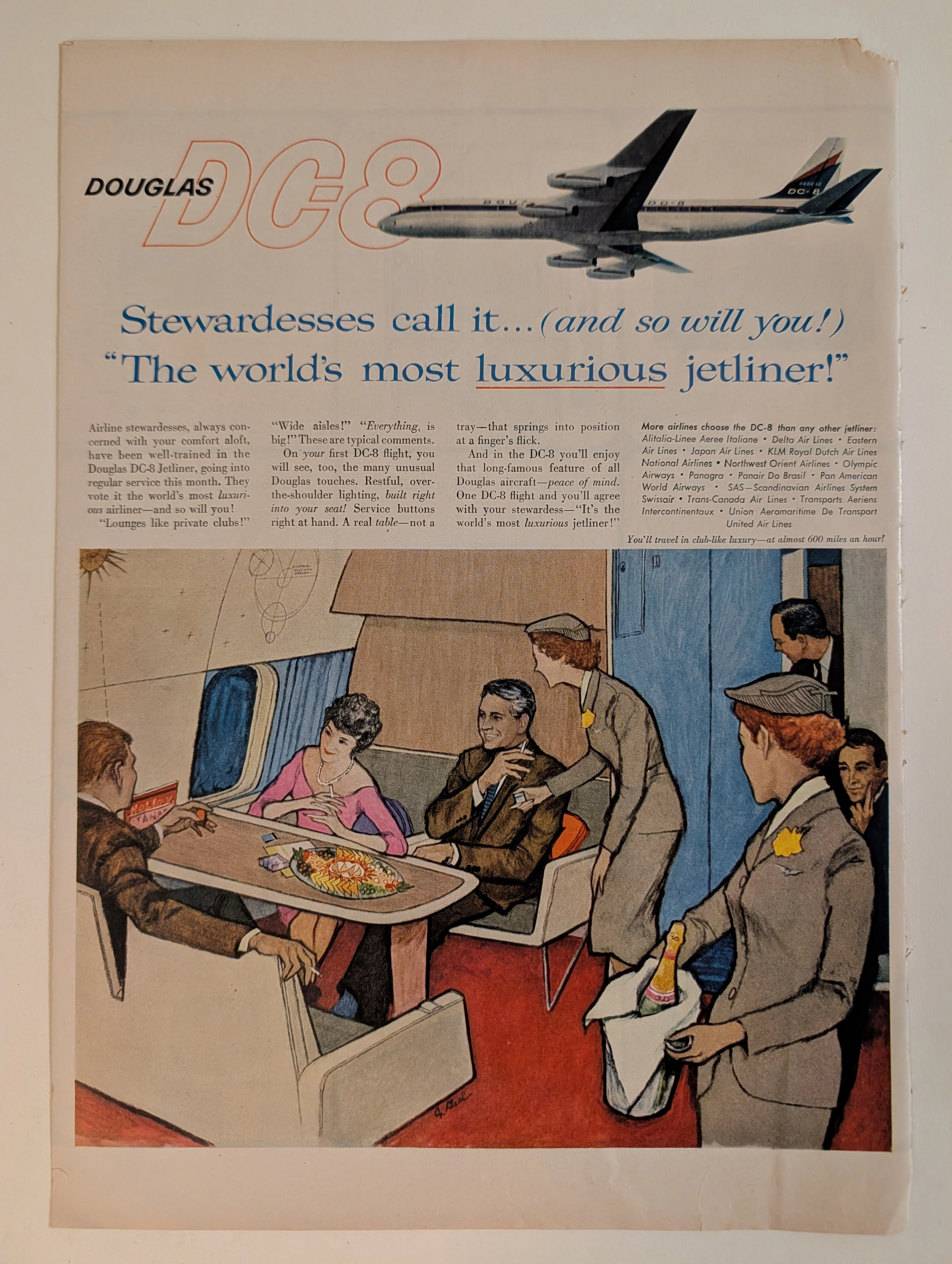
The artifact under exhaustive, museum-grade analysis is a flawlessly preserved Historical Relic originating from the absolute dawn of the commercial Jet Age (circa late 1950s to early 1960s). This Primary Art Document is a magnificent full-page advertisement for the Douglas DC-8, the aerospace leviathan engineered to rival the Boeing 707 and conquer the global skies. Visually anchored by an elegant, sweeping illustration of the aircraft's exterior and a highly detailed, evocative rendering of its opulent passenger lounge, the piece represents the zenith of mid-century aspirational marketing. Signed by an elusive mid-century commercial artist, the illustration captures the "Palomar Lounge"—a private club in the stratosphere where the elite played cards, smoked, and drank champagne beneath a Space-Age celestial diagram. By utilizing the ultimate authority of the era—the airline stewardess—to validate its luxury ("Stewardesses call it... The world's most luxurious jetliner!"), Douglas masterfully sold the illusion of exclusive, aristocratic segregation at 600 miles per hour. Rescued from the binding of a forgotten periodical, this pre-2000s analog artifact is an unforgeable testament to the aesthetic of wabi-sabi. Printed on inherently acidic wood-pulp paper, it exhibits a beautifully frayed right margin and a deep, warm ivory oxidation. This majestic chemical degradation transforms a mass-produced corporate propaganda piece into an irreplaceable, ready-to-frame Primary Art Document of aerospace history.
THE TIME TRAVELER'S DOSSIER: THE GOLDEN LIE AND THE PROPAGANDA OF 1936
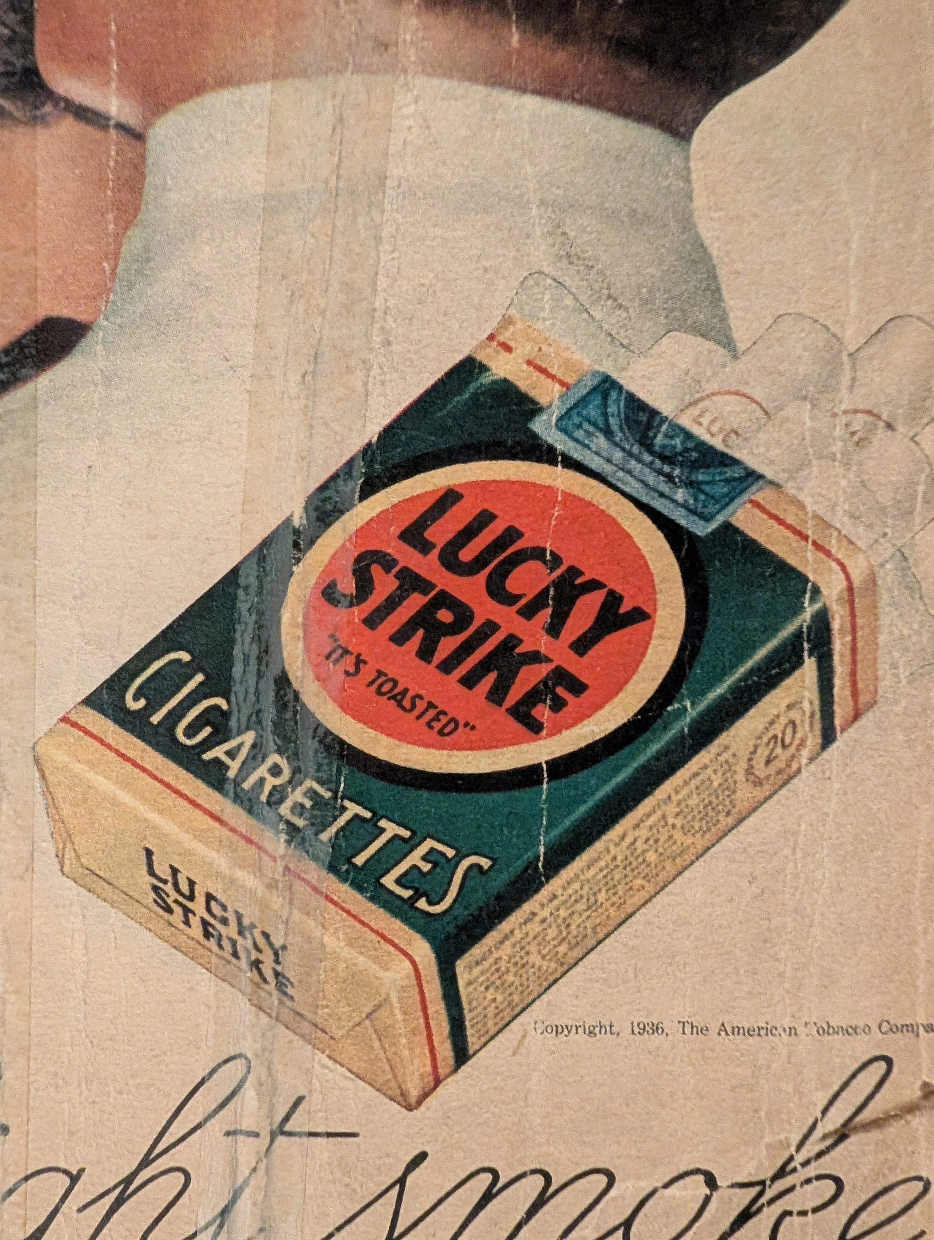
The artifact under exhaustive, uncompromising, and unprecedented museum-grade analysis is an exceptionally rare, battle-scarred Historical Relic originating from the absolute zenith of the American tobacco empire. This Primary Art Document is a monumental, full-page advertisement for Lucky Strike Cigarettes, forensically and definitively dated to 1936 by the explicit copyright text: "Copyright, 1936, The American Tobacco Company". This is not merely a vintage tobacco ad; it is a profound "Sociological Blueprint of Corporate Propaganda" from the interwar period. Emerging in the heart of the Great Depression, this artifact captures the audacious peak of 1930s psychological marketing. The commanding headline, "Smoke to Your Throat's Content", represents the era's surreal, medically ironic strategy where tobacco conglomerates aggressively marketed deadly carcinogens as "smooth" and "non-irritating" to the throat. Furthermore, the legendary slogan "It's Toasted" serves as a masterclass in advertising spin, transforming a standard manufacturing process into an exclusive health benefit. Visually, the ad brilliantly normalizes and glamorizes female smoking—a direct continuation of the industry's sociological engineering to double their consumer base. Rescued from the inevitable oblivion of disposable mass media, this pre-2000s analog artifact is a breathtaking embodiment of the Japanese aesthetic of wabi-sabi. Printed on highly acidic wood-pulp paper, it exhibits severe, violent edge trauma, deep structural creasing, ancient tape residue, and a profound, burning amber oxidation across its entire surface. This unstoppable molecular death transforms a piece of mass-produced corporate propaganda into an irreplaceable, ready-to-frame Primary Art Document of American marketing history.
Ballantine · Beverage
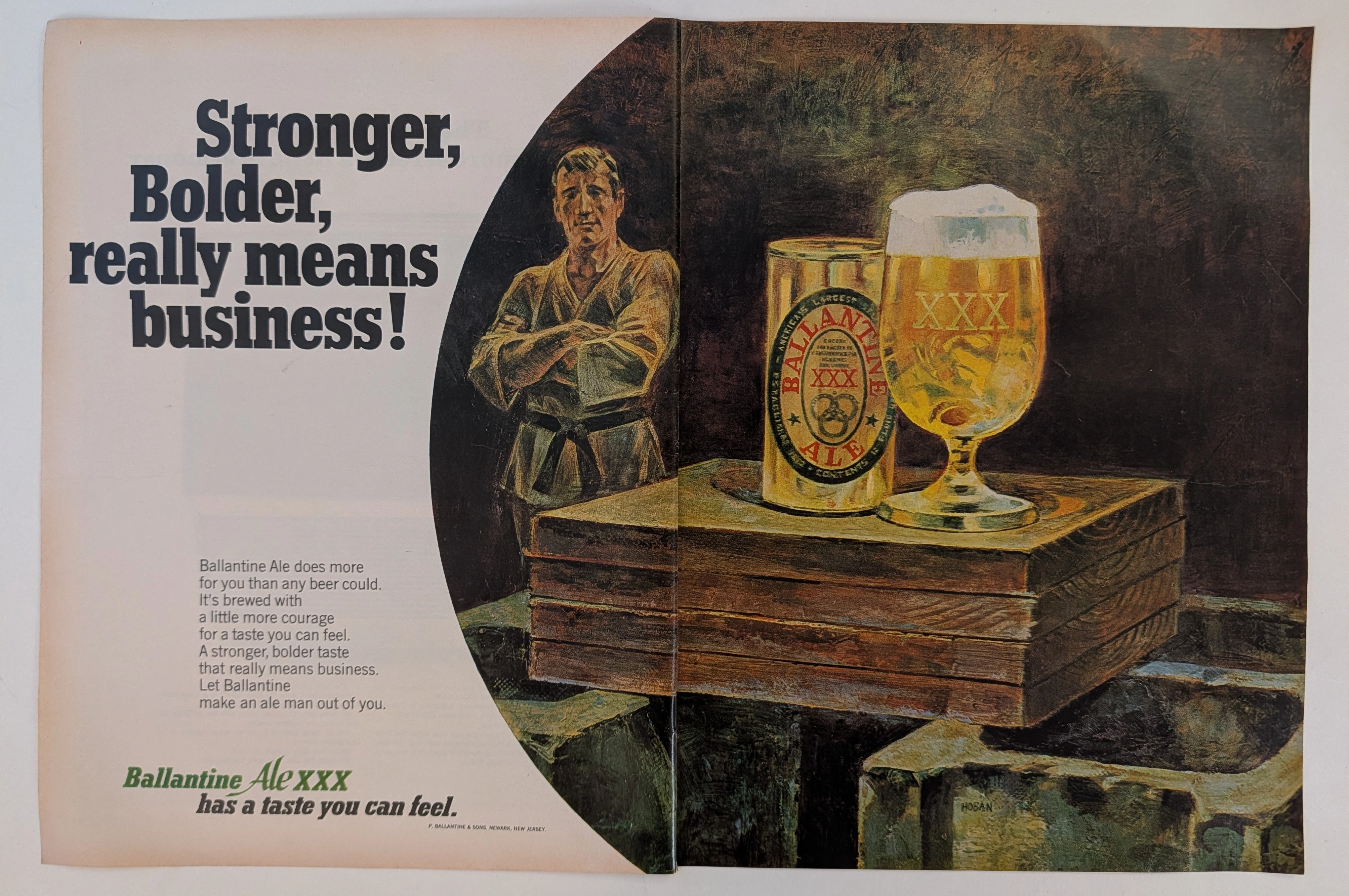
The Time Traveller's Dossier: The Martial Authority of the Brew – An Academic Archival Analysis of the 1968 Ballantine Ale Advertisement
The cultivation of brand identity through visual symbolism is a profound psychological discipline, acting as a mirror to the cultural aspirations of its era. The historical artifact elegantly positioned upon the analytical table of The Record Institute today is a majestic two-page print advertisement for Ballantine Ale, originating from approximately 1968. This document completely transcends the boundaries of conventional beverage promotion; it stands as a masterclass in the semiotics of mid-twentieth-century American masculinity. By seamlessly aligning the consumption of a traditional ale with the disciplined, formidable imagery of a martial arts master, the advertisement constructs a compelling narrative of strength, boldness, and unyielding character. This world-class, comprehensive academic archival dossier will conduct a meticulous and deep examination of the artifact, operating under the most rigorous parameters of historical and material science evaluation. We will decode the strategic copywriting that challenges the consumer to embrace a "stronger, bolder taste," and illuminate the profound historical lineage of the P. Ballantine & Sons brewing empire. Furthermore, as we venture into the chemical and physical foundations of this analog offset lithography, we will reveal the mechanical fingerprints of the halftone rosettes and the graceful, natural oxidation of the paper substrate. This precise intersection of visual nostalgia, mid-century commercial artistry, and the chemistry of time cultivates a serene wabi-sabi aesthetic—a natural phenomenon that serves as the primary engine driving up its market value exponentially within the elite global spheres of Vintage Breweriana collecting.