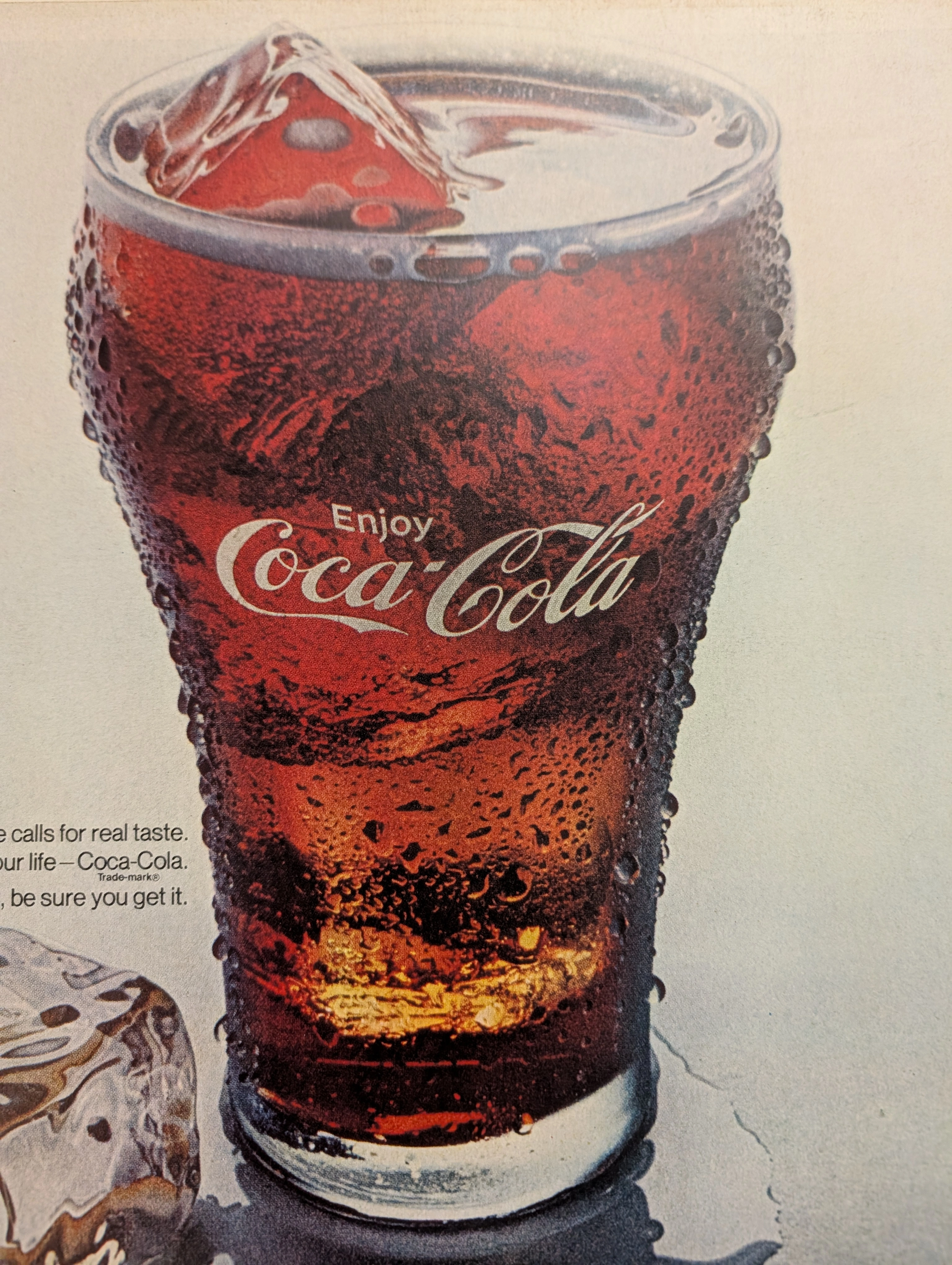
The Time Traveller's Dossier: The Martial Authority of the Brew – An Academic Archival Analysis of the 1968 Ballantine Ale Advertisement
The History
To fully appreciate the immense historical gravity of this artifact, one must contextualize the shifting paradigm of the American beverage industry during the late 1960s, as well as the profound legacy of the brand itself. During this era, the American beer market was experiencing a massive homogenization, with consumer preferences increasingly drifting towards lighter, highly carbonated, and less complex mass-produced lagers. In defiance of this trend, Ballantine Ale positioned itself as the antithesis of the modern, watered-down beverage. It was a drink for those who demanded substance, tradition, and fortitude.
The historical foundation of this defiance rests entirely upon the shoulders of Peter Ballantine (1791–1883). Peter Ballantine was a highly influential Scottish emigrant and brewing pioneer who founded the P. Ballantine & Sons brewing company in Newark, New Jersey, in 1840. He profoundly shaped the American brewing landscape by steadfastly maintaining traditional, robust ale brewing techniques in an evolving market. His insistence on quality and character established the brewery as one of the largest and most respected in the United States by the late 19th and early 20th centuries. The iconic logo prominently displayed on the golden can in the advertisement—the three interlocking Borromean rings containing the letters "XXX"—was adopted by Ballantine in 1879. According to the brand's lore, Peter Ballantine noticed the overlapping condensation rings left by beer glasses on a table and designated them to symbolize the three essential qualities of his ale: Purity, Body, and Flavor. The "XXX" itself is an ancient brewer's mark indicating the highest level of strength and quality.
By 1968, the cultural landscape of America was deeply fascinated by the introduction of Eastern philosophies and martial arts into mainstream media. The advertisement brilliantly capitalizes on this cultural zeitgeist. The illustration features a stoic man dressed in a traditional karate gi, wearing a black belt—the ultimate symbol of dedication, discipline, and physical mastery. He stands with his arms crossed, projecting an aura of quiet, unassailable confidence. The accompanying typography declares, "Stronger, Bolder, really means business!" The text further challenges the reader: "Ballantine Ale does more for you than any beer could. It's brewed with a little more courage for a taste you can feel... Let Ballantine make an ale man out of you."
This is a masterstroke of mid-century psychological marketing. The brand is not merely selling a fermented beverage; it is selling an initiation into a specific archetype of traditional masculinity. The karate master serves as a metaphor for the ale itself—uncompromising, potent, and commanding respect. The wooden planks and concrete cinder blocks upon which the golden can and glass rest are traditional objects used in martial arts breaking demonstrations (tameshiwari), further reinforcing the visual metaphor that Ballantine Ale possesses the strength to break through the mundane and deliver a profound sensory experience.
The Paper
As a physical entity, this printed artifact functions as a living, breathing record of mid-twentieth-century graphic reproduction and substrate chemistry. Under exceptional macro-lens examination, the rich, painterly textures of the martial artist's uniform, the nuanced shading of the rustic background, and the brilliant, luminous amber of the ale within the glass are revealed to be constructed from a precise, mathematically rigorous galaxy of halftone rosettes. This constitutes the mechanical fingerprint of the pre-digital analog offset printing press, where microscopic, varying sizes of Cyan, Magenta, Yellow, and Key (Black) ink dots are elegantly and systematically layered. It is this specific mechanical rhythm that orchestrates the human eye's perception of dimensional depth, shadow, and the highly reflective metallic sheen of the aluminum can.
However, the most profound factor elevating the immense value of this artifact in the contemporary collector's market is the natural, organic process of Material Degradation. The margins and the overall paper substrate exhibit a genuine, unavoidable, and entirely unforgeable "Toning." This gradual, graceful transition from the original manufactured paper to a warm, antique ivory and golden-brown hue is caused by the chemical oxidation of Lignin—the complex organic polymer that binds cellulose fibers together within the raw wood pulp of the paper. As the substrate is exposed to ambient oxygen and ultraviolet light over a span of nearly six decades, the molecular structure of the lignin gracefully breaks down. This accumulation of time, this naturally evolving patina, represents the absolute core of the wabi-sabi aesthetic. The profound appreciation for the beauty found in natural aging, impermanence, and the physical manifestation of history is an irreversible chemical reaction. It is precisely this authentic degradation that acts as the primary engine driving up its market value exponentially among elite collectors, as it provides the ultimate, irrefutable proof of the artifact's historical authenticity and survival.
The Rarity
RARITY CLASS: A (Excellent Archival Preservation)
Evaluated under the most exacting and rigorous archival parameters, this artifact is definitively designated as Class A.
The remarkable paradox of mid-century print advertising is that these documents were produced by the millions as explicitly "disposable media." They were inherently destined to be briefly observed, casually folded, and ultimately discarded into the recycling bins of history. For a large-format advertisement—particularly one that spans a highly vulnerable two-page spread—to survive intact from 1968 without catastrophic structural tearing at the central fold, destructive moisture staining, or fatal fading of the delicate halftone inks constitutes a highly significant statistical archival anomaly. The impeccable structural integrity of this paper, combined with the deep cultural nostalgia associated with the P. Ballantine & Sons brand and the unique martial arts iconography, elevates the desirability of this document among historians of American brewing and commercial art collectors. It is ardently sought after to ensure its historical permanence through museum-grade, acid-free conservation framing.
Visual Impact
The aesthetic brilliance of this artifact lies in its masterful execution of "Visual Weight and Conceptual Balance." The designer has orchestrated a profound juxtaposition between the background and the foreground. In the background, the karate master is rendered in muted, earthy tones—olives, browns, and charcoals—allowing him to recede slightly into the shadows while maintaining an authoritative, watchful presence.
In stark contrast, the foreground erupts with luminosity. The golden Ballantine Ale can and the perfectly poured, condensation-beaded glass of ale are illuminated as if by a theatrical spotlight. This strategic use of chiaroscuro draws the biological perception of the human eye directly to the product, transforming it into an object of intense desire. The placement of the products atop rough-hewn wooden planks and a weathered concrete block creates a deeply tactile visual experience, emphasizing ruggedness and authenticity. Furthermore, the typography is executed with immaculate precision. The heavy, bold, sans-serif font of the headline ("Stronger, Bolder, really means business!") visually mimics the physical strength and stability of the martial artist, creating a flawless harmony between the textual message and the visual semiotics.
The Archive Continues
Continue the Exploration
Drambuie · Beverage
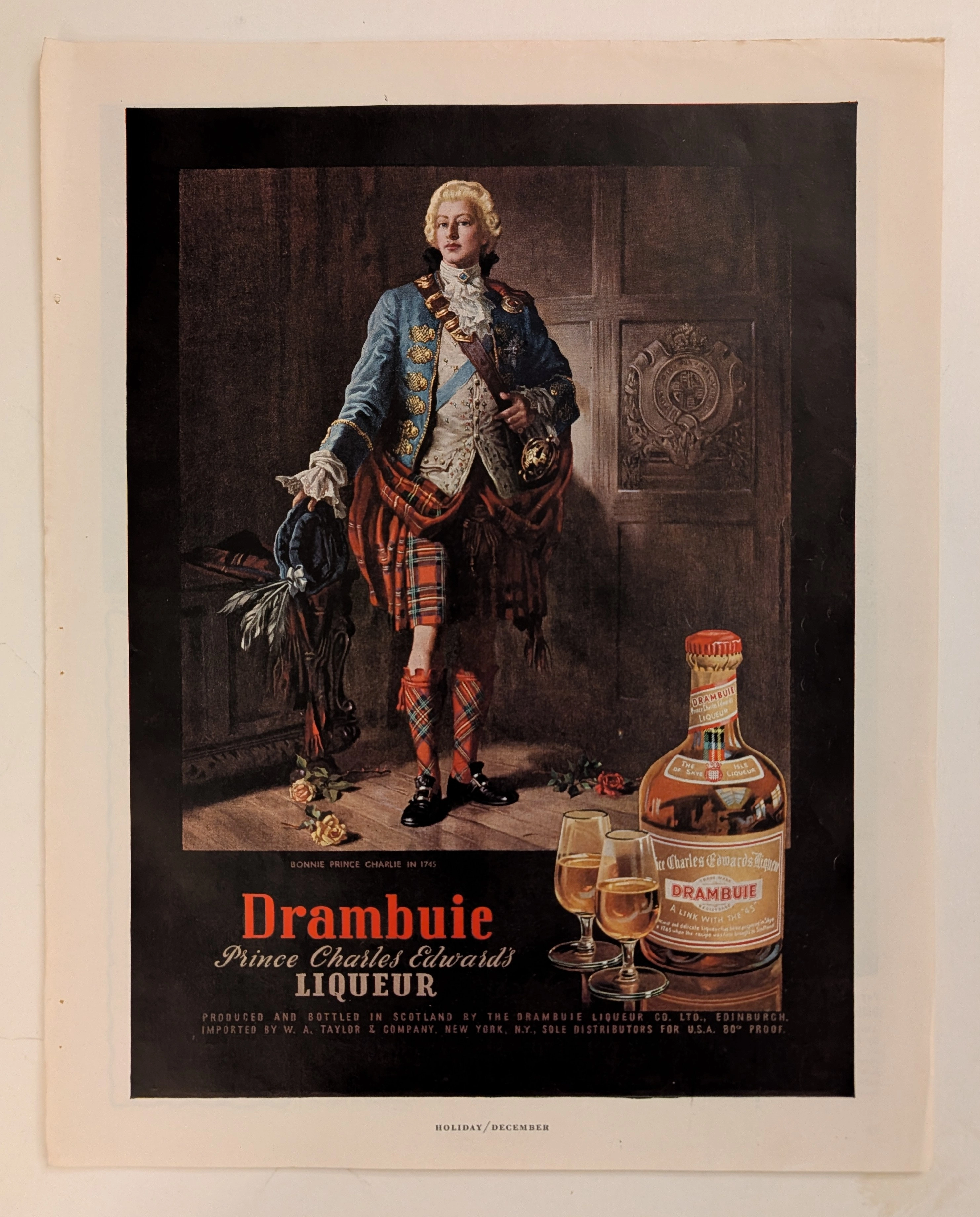
The Time Traveller's Dossier: The Alchemy of Royal Rebellion – Drambuie "Bonnie Prince Charlie" Advertisement (Circa Mid-20th Century)
History is rarely an objective chronicle of facts; it is a malleable narrative, continually rewritten, romanticized, and ultimately weaponized by those seeking to legitimize their power or, in the modern era, their products. Long before digital algorithms could synthesize artificial heritage, the supreme manifestation of corporate alchemy was executed through the calculated precision of the four-color offset press and the appropriation of historical iconography. The artifact presented before us is not merely a vintage magazine tear sheet selling a Scottish liqueur. It is a masterclass in the commodification of myth, a visual distillation of romantic rebellion, and a foundational blueprint for what is now known as "Heritage Branding." This museum-grade, academic archival dossier presents an exhaustive, microscopic deconstruction of a mid-20th-century print advertisement for Drambuie Liqueur. Operating on a profound binary structure, this document records a calculated paradigm shift within the global spirits industry. It captures the precise historical fracture where a highly specific, geographically isolated alcoholic beverage was conceptually transmuted into a literal draught of royal rebellion and aristocratic romance. Through the highly specialized lens of late-analog commercial artistry and stringent visual forensics, this document serves as a masterclass in psychological marketing. It established the foundational archetype for linking the consumption of a physical product with the ingestion of an epic, historical fantasy—an archetype that unconditionally dictates the visual and strategic totems of the modern luxury spirits industry today.
Ritz · Food
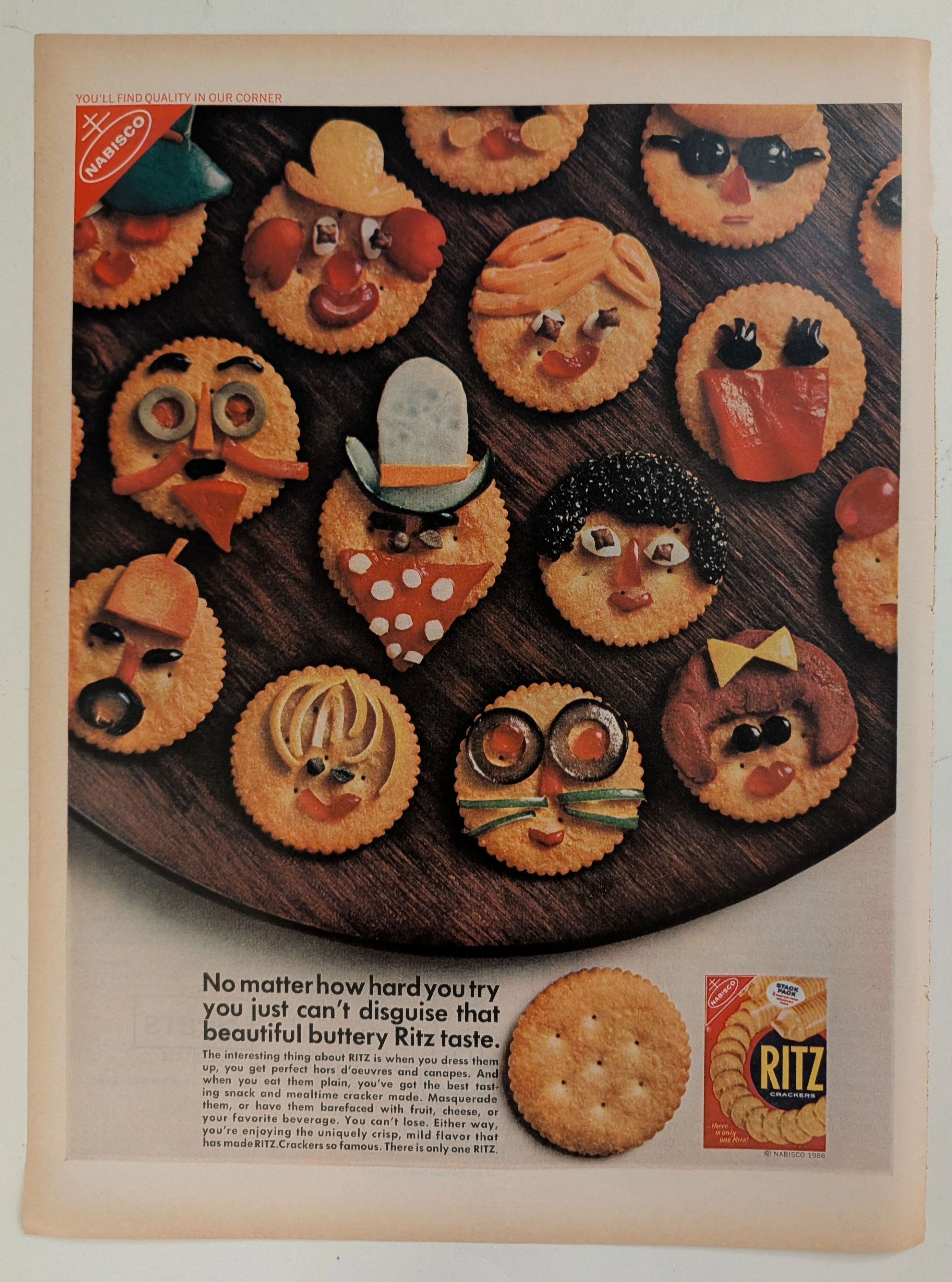
The Time Traveller's Dossier: The Masquerade of Quality – Nabisco's 1968 Ritz "Can't Disguise" Campaign and the Golden Age of Snack Branding
The evolution of the twentieth-century American pantry was fundamentally defined by the rise of standardized, nationally recognized "anchor" brands. The historical artifact elegantly positioned upon the analytical table of The Record Institute today is a striking full-page advertisement for Ritz Crackers, originating from 1968. This document represents a pivotal era in consumer psychology where snack foods were repositioned from simple staples to creative culinary canvases. By utilizing playful, anthropomorphic food art—crackers "disguised" as whimsical faces—Nabisco sought to reassure a burgeoning suburban middle class of the cracker's unmistakable "buttery" identity regardless of how it was "dressed up" for social gatherings. This comprehensive dossier conducts a meticulous examination of the artifact, operating under the absolute most rigorous parameters of historical and material science evaluation. We will decode the brilliant marketing psychology of the "Quality in Our Corner" slogan, analyze the profound sociopolitical impact of standardized grocery branding in the late 1960s, and dissect the mechanical fingerprints of the CMYK halftone rosettes captured in macro imagery. Finally, we will assess its archival rarity, exploring how the graceful, natural oxidation of the paper substrate serves as the primary engine driving up its market value exponentially within elite collection circles.
Ford · Automotive
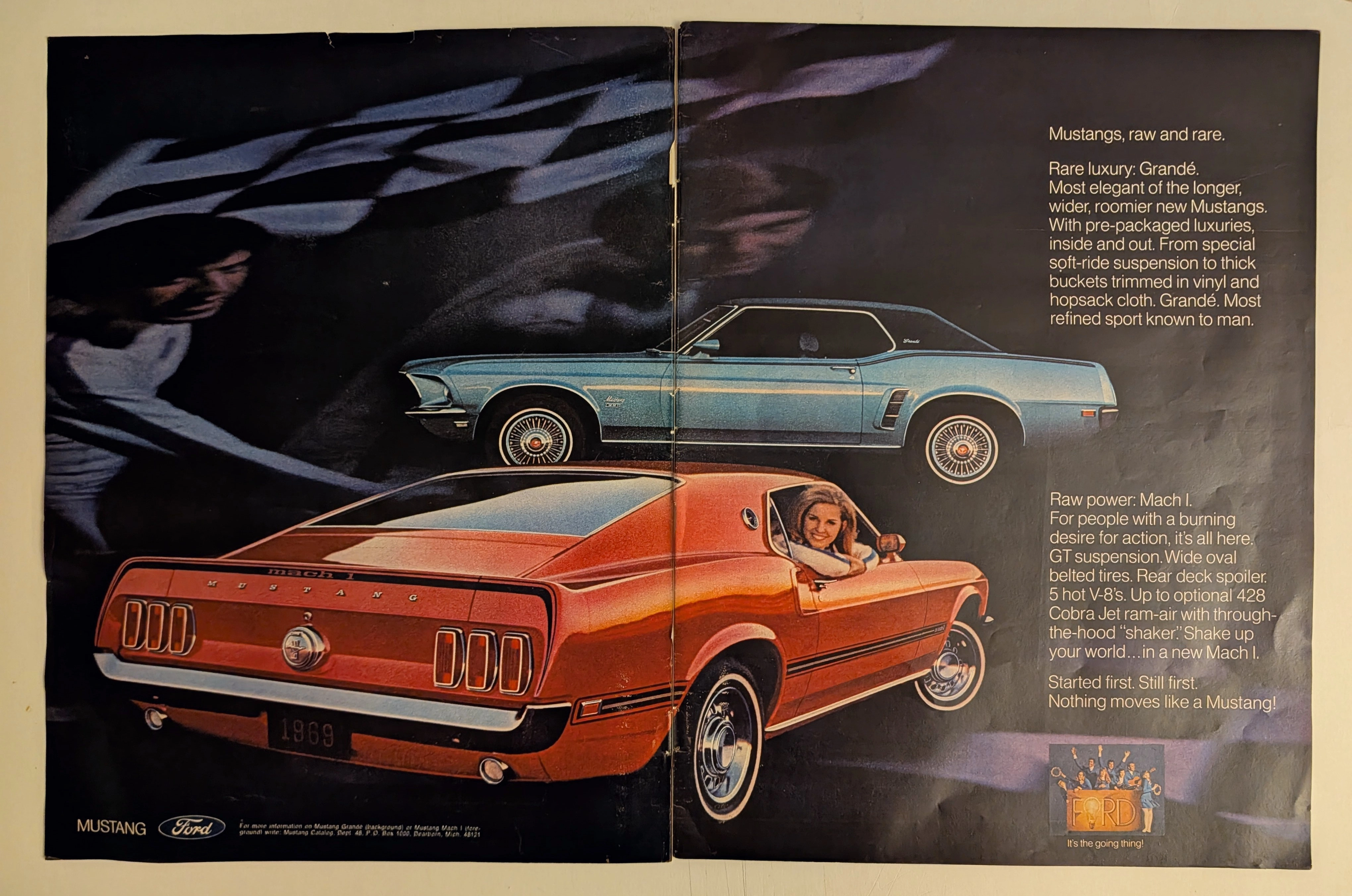
THE TIME TRAVELER'S DOSSIER:CULTURE WEAPONIZATION — "IT'S THE GOING THING"
The artifact under exhaustive, unprecedented museum-grade analysis is a profoundly preserved Historical Relic excavated from the absolute bloodiest battlefield of the American Muscle Car wars. This Primary Art Document is a monumental, two-page centerfold magazine advertisement for the 1969 Ford Mustang. Forensically and undeniably dated to 1969 by the explicit license plate stamped squarely on the rear bumper of the red Mach I, this document masterfully weaponizes Ford's dual-pronged sociological marketing strategy. It expertly captures the affluent bourgeoisie with the refined "Rare luxury" of the Grandé, while simultaneously ensnaring the rebellious, adrenaline-addicted youth with the "Raw power" of the Mach I. Grounded by extreme focal details like the iconic Mach 1 winged gas cap and the definitive 1960s pop-culture choir singing "FORD: It's the going thing!", this artifact's physical battle scars—specifically its authentic center crease and profound chemical paper degradation—elevate it to an irreplaceable Primary Art Document of Rarity Class A.