The Time Traveller's Dossier: How a 1959 Beer Ad Turned Alcohol into 'Health Food' – Barley and Malt Institute Advertisement
The History
To decode the sociological architecture embedded within this printed artifact, it is mandatory to contextualize the macroeconomic landscape of the United States in 1959. The post-war era, characterized by unprecedented economic expansion, required industries to aggressively recalibrate their public narratives. For the brewing sector, this meant navigating the lingering cultural trauma of the Prohibition Era (1920–1933) while simultaneously targeting a newly affluent demographic.
Part 1: The Binary Shift: Saloon vs. Suburbia
The narrative architecture of this artifact is built upon a strict, uncompromising binary contrast. Historically, the American cultural consciousness linked alcohol consumption to the pre-Prohibition saloon—a dark, male-dominated, urban environment frequently associated with moral and social instability. The 1950s brewing industry needed to obliterate that narrative. This advertisement executes the pivot flawlessly, presenting a bright, sanitized, and highly curated vision of a suburban utopia. The messaging deliberately contrasts the old world of isolated intoxication with a new world of integrated, healthy leisure. By conceptually relocating the consumption of beer from the dimly lit tavern to the sunlit tennis court and the refined dining room, the industry successfully mapped its product onto the upward mobility of the American middle class.
Part 2: The Agrarian Health Discourse
Executing this binary shift required the invention of a new vocabulary. The Barley and Malt Institute, functioning as a powerful trade association representing agricultural suppliers, implemented a macro-strategy to force consumer attention onto the organic origins of the product rather than its alcoholic reality. The copywriting functions as an early, aggressive iteration of nutritional "health-washing":
"HEALTHFUL VALUES join the Fun-Flavored refreshment of beer... You satisfy your thirst - and more - because Malt contributes dextrins and maltose that aid digestion... B-complex vitamins and useful minerals, too."
The strategic deployment of scientific terminology—dextrins, maltose, and B-complex vitamins—aligned the product with the 1950s public obsession with scientific advancement and modern nutrition. Positioning beer as an energizing dietary supplement provided consumers with a logical, health-based rationale for consumption, effectively neutralizing historical moral objections with pseudo-medical authority.
Part 3: The Sovereign Homemaker and the Domestic Economy
The socioeconomic structure of the era designated the female homemaker as the absolute sovereign of household acquisitions. For beer to transition from a localized tavern commodity to a universal domestic staple, it required her explicit approval. The advertisement’s inclusion of a mail-in offer for a "Homemaker's Guide to Barley & Malt" reflects a highly targeted direct-marketing strike. By providing literature explicitly designed for the manager of the domestic economy, the Institute positioned beer alongside essential, wholesome groceries like milk and bread. Defining the beverage as a "food product that contains Malt" conceptually eradicated the boundary between recreational intoxicants and standard nutritional provisions.
Part 4: Visual Semiotics: Leisure Culture & Social Harmony
The secondary illustrations (vignettes) function as precise semiotic indicators of middle-class aspiration, engineering consent through imagery:
The Tennis Vignette: Tennis in the mid-twentieth century was an elite pursuit, signifying country club access and the supreme privilege of leisure time. Associating the beverage with a dynamic athletic motion visually reinforces the text’s claim of providing "energizing values for health and vigor." It replaces the historical image of the lethargic drinker with one of extreme vitality and physical capability.
The Romantic Vignette: The depiction of a well-dressed couple sharing a quiet, intellectual environment illustrates the era's ideal of domestic harmony. The composition places the beverage as a stabilizing element of civilized social interaction, contrasting directly with outdated narratives that framed alcohol as a disruptive, chaotic force within the family unit.
Part 5: Pop Culture Impact and Enduring Legacy
The visual language pioneered in this exact era left an indelible, structural mark on global pop culture. The specific aesthetic of this 1959 advertisement—the impeccably groomed, warmly lit patriarch projecting an aura of absolute control and satisfaction—became the universal shorthand for the "American Dream."
This manufactured reality serves as the foundational DNA for critically acclaimed modern media. Television series like Mad Men meticulously reconstructed this exact archetype; Don Draper’s character exists to engineer the very psychological pivots seen in this Barley and Malt ad—selling the feeling of domestic bliss rather than the product itself.
Furthermore, the visual tropes of this era heavily dictate the "Retro-Futurism" aesthetic in vast entertainment franchises like the Fallout universe. Vault-Tec’s propaganda relies entirely on the juxtaposition of this wholesome, unyielding 1950s commercial smile against apocalyptic dread. We see echoes of this manufactured suburban perfection completely deconstructed in media like WandaVision or The Truman Show.
In the modern commercial arena, the contemporary craft beer movement operates on a cyclical return to this 1959 strategy. Today’s premium microbreweries consistently highlight the agrarian origins of their ingredients—"farm-to-glass" localized hops and artisanal malts—echoing the Barley and Malt Institute’s original blueprint.
The Paper
As a physical entity, this tear sheet is an unrepeatable record of mid-century analog printing. The medium-weight coated magazine stock was engineered for mass distribution, yet its current state demands evaluation through the Japanese aesthetic philosophy of wabi-sabi (侘寂)—the recognition of beauty in impermanence and the natural progression of time.
Visual Forensics & Substrate Analysis:
Examining the extreme close-ups of this artifact reveals the mechanical heartbeat of the 1950s press. Under magnification, the illusion of photorealism shatters into a precise, mathematical galaxy of CMYK halftone rosettes. The distinct grain of the offset lithography is aggressively visible in the shading of the tennis player's shorts and the fluid strokes of Weimer Pursell's signature.
Crucially, the archival and market significance of this piece is defined by the ephemeral nature of the old paper itself, which is slowly deteriorating. The margins exhibit authentic "toning"—a gradual, irreversible yellowing caused by the natural oxidation of lignin within the wood pulp when exposed to oxygen and UV light over decades. This organic degradation cannot be cloned by modern digital processes. The subtle brittleness of the paper's edge and its evolving patina elevate the piece from a uniform industrial print to a singular, historically scarred artifact. The wabi-sabi nature of this page ensures that its aesthetic and historical value increases precisely because the supply of surviving pages is naturally returning to the earth.
The Rarity
Rarity Class: A
Within archival parameters, this artifact holds a definitive Class A designation. The paradox of mid-century print ephemera lies in its initial mass production versus its extreme current scarcity. Magazines of the 1950s were quintessential disposable media, destined for the incinerator or the recycling bin. The survival of this specific page—enduring over six decades without yielding to moisture damage, destructive handling, or structural center creases—is an archival anomaly. Finding a specimen that retains its original pigment saturation while bearing only the natural, authentic hallmarks of wabi-sabi aging is highly uncommon. Such pristine remnants are fiercely sought after by curators of mid-century commercial design and Breweriana historians for museum-grade preservation.
Visual Impact
The aesthetic authority of this piece lies in a masterclass of visual composition and psychological design. The immediate focal point is the genuinely euphoric, warmly illuminated face of the male subject. The precise tilt of his head and his eyeline function as a compelling leading line, forcefully directing the viewer's gaze toward the two golden pilsner glasses resting on the tray. These glasses are rendered with remarkable, thirst-inducing photorealism, capturing the exact refraction of light and condensation through chilled liquid. The artist strategically utilizes a quasi-complementary color palette—employing a cool-toned, blue-grey background to forcefully project the warm-toned flesh of the subject and the luminous, golden amber of the beer forward from the two-dimensional picture plane. It is a highly calculated visual mechanism aimed at commanding absolute attention and evoking an immediate physiological thirst response.
Exhibition Halls
The Archive Continues
Continue the Exploration
The White House · Other
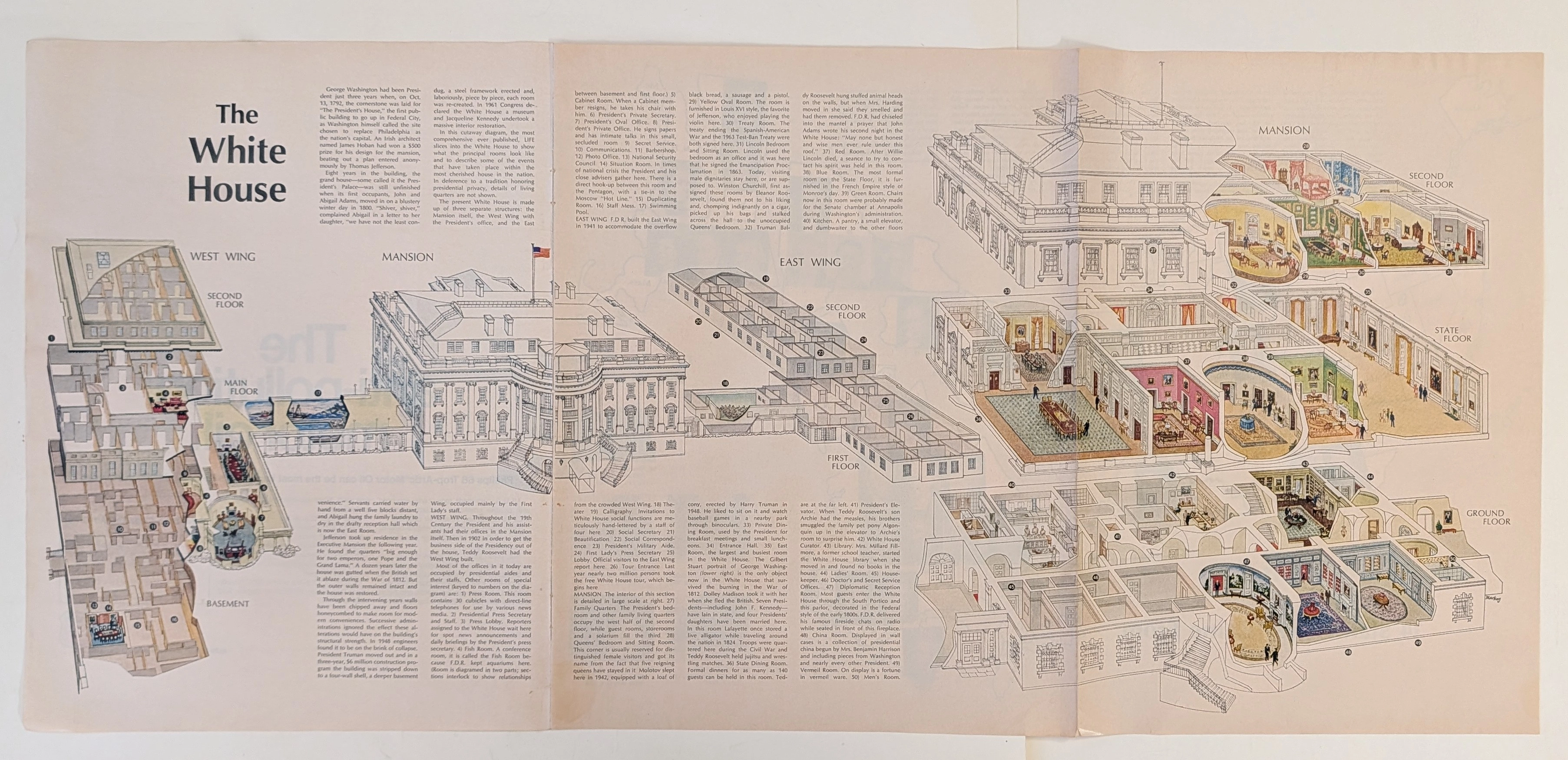
The Time Traveller's Dossier: The Masterpiece of Architectural Anatomy – The White House Isometric Cutaway Artifact (Circa 1960s)
The documentation of monumental architecture represents one of the most profound intersections of art, engineering, and historical preservation. Long before the advent of digital rendering software, computer-aided design (CAD), or virtual three-dimensional modeling, the supreme manifestation of structural visualization was executed through the calculated, mathematically rigorous discipline of the isometric cross-section. The historical artifact presented before us for analysis is not merely an educational fold-out extracted from a mid-20th-century mass-market publication. It is an absolute triumph of commercial illustration and draftsmanship, offering a meticulous visual dissection of one of the most famous residential structures on the globe. This museum-grade, academic archival dossier presents an exhaustive, microscopic deconstruction of this mid-century isometric cutaway diagram. Operating on a profound structural and spatial logic, this document completely strips away the iconic neoclassical exterior facade to reveal a masterful, dollhouse-like cross-section of interior design, historical room layouts, and underlying spatial engineering. It captures a precise historical era in publishing when complex architectural topographies were translated into highly accessible, visually thrilling infographics designed for public education. Through the highly specialized lens of late-analog commercial artistry, architectural history, and stringent visual forensics, this document serves as a masterclass in spatial communication. It establishes the foundational archetype for educational diagrams—an archetype that dictates the visual standards of modern architectural encyclopedias today, executed with a level of handcrafted precision that modern digital tools strive to emulate.
Zippo · Tobacco
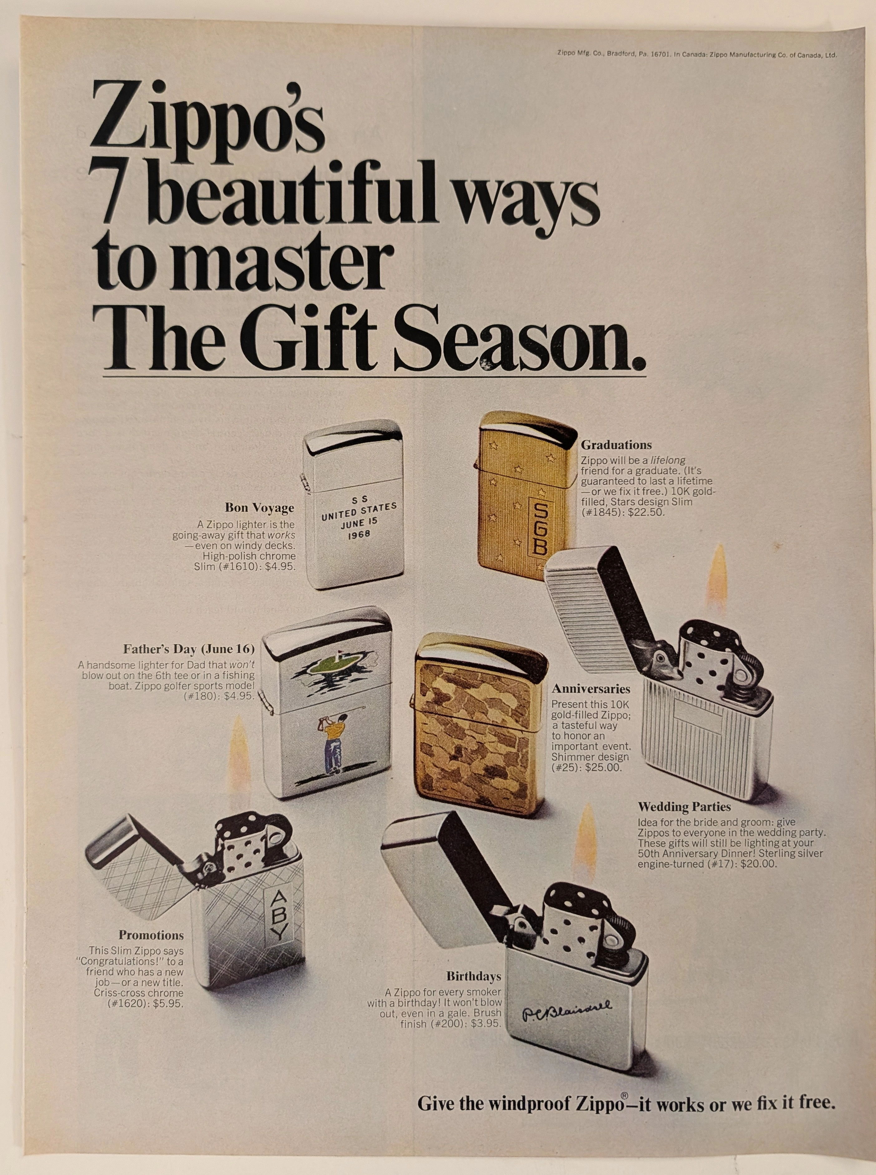
The Time Traveller's Dossier: The Archive of the Immortal Flame – The 1968 Zippo "7 Beautiful Ways" Advertisement
The act of creating fire is a profound symbol of mankind's mastery over nature and the mechanical authority we hold over physical elements. The historical artifact elegantly placed upon the examination table of The Record Institute today is a full-page print advertisement for Zippo from 1968, presented under the campaign "7 beautiful ways to master The Gift Season." This document transcends conventional marketing; it is a flawless psychological projection of the mid-twentieth-century American Dream, encapsulated in metal and backed by a lifetime guarantee. This world-class archival dossier will conduct a meticulous and profound analysis of the artifact, operating under the most rigorous parameters of historical and material science evaluation. We will explore the brand's sophisticated market segmentation through seven occasion-specific lighter models, ranging from high-polish chrome to 10K gold-filled and Sterling Silver editions. Furthermore, we will delve into the magnitude of the legendary declaration, "it works or we fix it free," a promise that confidently challenges the passage of time. Advancing into the chemical foundations of this analog offset lithography, we will reveal the mechanical fingerprints of the halftone rosettes and the natural oxidation of the paper substrate. This precise intersection of metallurgical mechanics and the chemistry of time produces a serene wabi-sabi aesthetic—a phenomenon that serves as the primary engine driving up its market value exponentially within the elite global spheres of Vintage Tobacciana collecting.
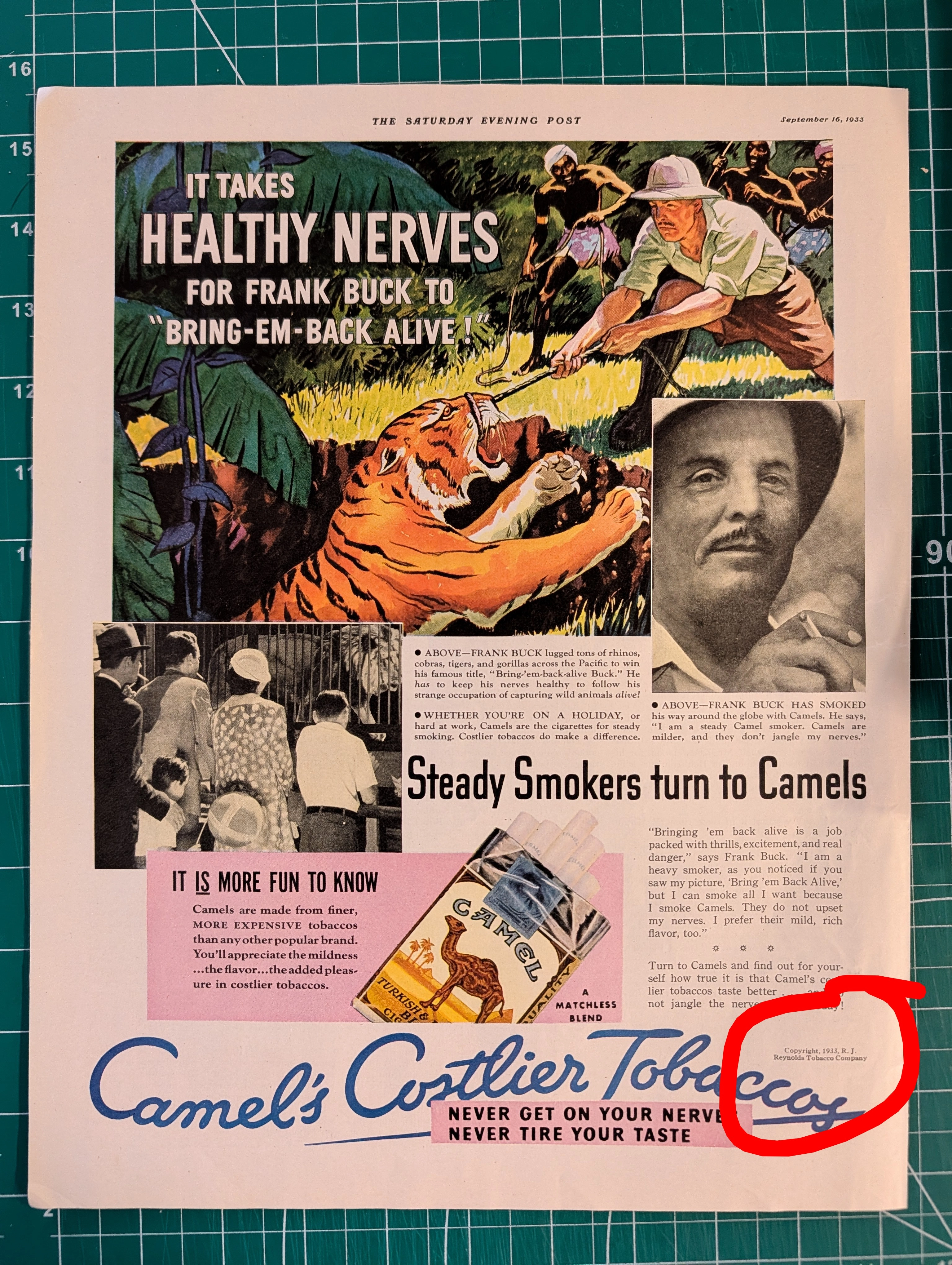
THE TINY TEXT THAT AUTHENTICATES HISTORY Why Fine Print in Magazine Advertisements Matters More Than You Think
Tiny copyright notices in magazine ads originated from mandatory US copyright law (1909 Act) and sector-specific regulations (BATF for alcohol). They function as layered authentication evidence: typographic era-consistency, regulatory language accuracy, ink/paper forensics, and contextual integrity — paralleling vintage band tee authentication methods. Collaboration credits (Pierre Cardin × Tiffany & Co.) and creative credits (photography, calligraphy, fashion) document commercial relationships lost to no other record.