— The Record Institute Journal")
 — The Record Institute Journal")
 — The Record Institute Journal")
The Time Traveller's Dossier: The Alchemy of Acoustics – Marantz "Discover Gold" Advertisement (1981)
The History
To genuinely decode the complex sociopolitical architecture embedded within this printed artifact, one must pull back the lens to contextualize the macroeconomic history, the obsession with high-fidelity audio in the late 1970s and early 1980s, and the audacious DNA of the Marantz Company. By 1981, the golden age of the "silver-faced" stereo receiver was reaching its twilight. The market was saturated with heavy, metallic audio gear from dozens of competing manufacturers. To survive the impending digital transition and the fierce global competition, Marantz, operating out of Chatsworth, California, needed a radical paradigm shift.
They did not just redesign the chassis; they executed a masterstroke of corporate alchemy. By introducing the "Marantz Gold" line, the brand effectively weaponized the aesthetic of wealth to compel modern consumers to prove their audiophile devotion through extreme financial expenditure. They abandoned the utilitarian silver of the 1970s and cloaked their engineering in the visual language of bullion. This advertisement is the direct product of that aggressive repositioning. It is not selling a stereo; it is selling the mythological thrill of striking the motherlode.
Creator / Photographer Information: While the specific studio photographer of this dramatic, highly staged still life remains uncredited, the diorama at the center of the image—a subterranean gold mine—is a masterpiece of analog set design. The photographer constructed a literal cavern of dark, jagged rocks to serve as a pedestal for the glowing Marantz SR 8100 DC receiver. By placing a gleaming, gold-plated pickaxe in the immediate foreground, the uncredited artist hijacked the inherent authority and historical weight of the American Gold Rush, framing the electronic receiver not as a manufactured appliance, but as a priceless, ancient treasure pulled directly from the earth.
Part 1: The Binary Shift: Cold Circuitry vs. Precious Commodity
The narrative architecture of this artifact is built upon a strict, uncompromising binary contrast against the rigid, industrialized reality of mass-produced electronics. In a world defined by plastic components and printed circuit boards, Marantz presented a diametrically opposed concept: the undeniable, eternal weight of solid gold.
The advertisement violently obliterates the narrative of mundane home appliances. It executes a flawless cultural pivot by isolating the receiver within the raw, unrefined darkness of a geological excavation. This represents a profound conceptual transition: the brand isolates the consumer, forcing a one-on-one psychological confrontation with the concept of "Value." The stereo is elevated from a mere machine to a sacred idol of wealth. It dictates that true acoustic perfection does not belong to the modern, sterilized factory; it belongs to the mythical, opulent realm contained exclusively within the "24-Karat Solid Gold Plated" connections of Marantz’s creation.
Part 2: The Semantics of the Gold Standard
To execute a strategy of this magnitude, the brand required a highly specific, unapologetic vocabulary. The copywriting on this page abandons all traditional marketing humility. It deploys a language of pure, economic supremacy:
"DISCOVER GOLD."
"MARANTZ UNCOVERS THE GOLD STANDARD OF AUDIO EQUIPMENT."
"THE SOLID GOLD SOUND"
The deployment of these devastating financial metaphors is not mere poetic prose; it is a calculated psychological hijacking. This is the ultimate manifestation of the "Semantics of Arrogance." The brand shamelessly elevates the act of purchasing a stereo to the macroeconomic level of global currency. This psychological strike paralyzes the consumer's logical defenses regarding price. By equating the amplifier's performance with the "Gold Standard," the financial transaction becomes a required investment in a precious commodity.
Part 3: The Sovereign Consumer & The Illusion of Discovery
The socioeconomic structure of the 1980s was characterized by a booming culture of conspicuous consumption. This advertisement serves as a textbook case study in manufacturing the "Illusion of Discovery". The copy boldly challenges the reader:
"There's a gold mine waiting to be discovered at your Marantz dealer now. Stop by soon. And take your pick."
By utilizing the imagery of the gold pickaxe and the language of prospecting, Marantz was engaging in aggressive psychological conditioning. They were creating a narrative where the consumer is the heroic explorer. Purchasing the "advanced Linear Skating Drawer mechanism" or the "True Power™ Amplification" (which delivers "25% to 50% more power") is no longer a retail transaction; it is a triumphant excavation. The brand is essentially demanding: Will you claim your fortune, or leave it buried?
Part 4: Visual Semiotics: The Monolith of the Mine
In an era where electronics advertising was becoming increasingly sterile and spec-driven, Marantz's deliberate choice to render this advertisement as a theatrical, geological diorama acts as a precise and extremely courageous semiotic indicator:
The Golden Iconography: The Marantz logo at the bottom right is literally rendered as a three-dimensional, glowing gold bar. This visually separates the product from fleeting technological trends, framing the company's trademark not as a corporate stamp, but as a hallmark on a bullion ingot.
The Architecture of Excavation: The receiver is perfectly framed by the craggy, threatening edges of the dark rocks. The visual composition forces the viewer's eye to navigate the danger of the mine to reach the prize in the center. The golden pickaxe, resting triumphantly on the rocks, implies that the hard work has been done; the treasure is simply waiting to be collected.
Part 5: Pop Culture Impact and Enduring Legacy
The marketing strategy pioneered by Marantz—fusing high-fidelity engineering with the opulent, pseudo-historical mythology of gold prospecting—left an indelible mark on global electronics branding. This specific campaign heralded the "champagne" and gold-faced audio equipment era that would completely dominate high-end Japanese and American hi-fi throughout the 1980s and 1990s. The cultural impact of this positioning engineered a societal norm where premium electronics must physically resemble premium jewelry. This physical artifact is the foundational source code for the most pervasive and wildly successful hardware-as-luxury mythologies in the history of consumer electronics.
The Paper
As a physical entity, this carefully extracted single magazine tear sheet—and it must be strictly noted that this is a standard magazine size page, absolutely not a mass-produced, blown-up poster—is an unrepeatable, isolated record of late-analog offset lithographic printing. The medium-weight, glossy paper stock was originally engineered by the ton for mass distribution; however, its current, time-ravaged state demands a profound evaluation through the highest echelon of Japanese aesthetic philosophy: wabi-sabi (侘寂)—the acute recognition and appreciation of beauty found in impermanence, imperfection, and the ruthless, natural progression of time.
Visual Forensics & Substrate Analysis:
Subjecting the extreme macro close-ups of this artifact to visual forensics reveals the mechanical heartbeat of the pre-digital printing press. Under high magnification, the illusion of the smooth, glowing gold violently shatters, dissolving into a precise, mathematically rigorous galaxy of CMYK (Cyan, Magenta, Yellow, Key/Black) halftone rosettes. The distinct, gritty grain of the offset printing process is aggressively visible within the transition zones between the pure white text of "THE SOLID GOLD SOUND" and the absolute black void of the background.
However, the most crucial and valuable aspect of this specific artifact lies in its Material Degradation. Examining the margins and the unprinted negative spaces reveals authentic, undeniable "Toning". This is a gradual, irreversible yellowing and embrittlement effect caused by the natural chemical oxidation of organic Lignin trapped within the wood pulp of the paper upon decades of exposure to air and ambient ultraviolet light.
It is vital to understand the archival and market significance of this ephemeral nature. Analog print media of this era represents a vanishing breed of historical documentation that is slowly, yet unstoppably, disintegrating. This organic, breathing physical degradation is a fingerprint of time that can absolutely never be cloned, replicated, or faked by modern high-precision digital scanning. As these original pages slowly burn themselves out through oxidation, turning fragile and brittle, their supply in the global collector's market shrinks daily. It is precisely this ticking clock of physical impermanence—the fact that this paper is slowly but irreversibly returning to the earth—that is driving up its market value exponentially. The evolving patina elevates the piece from a uniform, lifeless industrial print run into a singular, unique artifact covered in historical scars. The wabi-sabi nature of this decaying paper ensures that its aesthetic and financial worth will continue to skyrocket precisely because it is a dying medium.
The Rarity
Rarity Class: A (Advanced / Highly Desirable)
Within the strictest parameters of international archival evaluation, this artifact holds a definitive Class A designation. The ultimate paradox of late-analog print ephemera lies in the violent contrast between its initial mass production and its extreme, near-extinct scarcity today. Vintage magazines were the quintessential "disposable media," destined to be read once and then mercilessly discarded into incinerators.
For this specific, single-page advertisement to have miraculously survived from 1981—resisting the ravages of destructive handling, severe moisture damage, and avoiding catastrophic structural creases—is a pure statistical archival anomaly. Furthermore, finding a Marantz advertisement featuring the iconic "Discover Gold" diorama, where the black ink retains its absolute abyssal depth while exhibiting only the genuine, unforced hallmarks of wabi-sabi aging, is highly uncommon. Pristine remnants of this specific era of audiophile marketing are fiercely hunted by curators of technology history and archivists of high-fidelity audio. They are acquired with the sole intention of executing museum-grade, acid-free conservation framing, preserving them permanently as historical heirlooms of a lost analog era.
Visual Impact
The aesthetic authority of this piece lies in an absolute masterclass of Chiaroscuro—the intense, dramatic contrast between blinding light and impenetrable shadow. The immediate focal point that hijacks the viewer's optic nerve is the brilliant, radiant reflection striking the polished head of the golden pickaxe and the brushed metal faceplate of the Marantz receiver.
The uncredited photographer achieved this breathtaking visual spectacle through an absolute mastery of optical physics and studio lighting. The warm, golden light cascades across the metallic buttons, the graphic equalizer sliders, and the digital display, creating fierce, specular highlights that aggressively pierce the surrounding blackness of the cavern. The strategic use of the pitch-black void within the rock crevices effectively isolates the product in a vacuum, creating a psychological "aura" of untouchable, buried exclusivity.
Exhibition Halls
The Archive Continues
Continue the Exploration
Ford · Automotive
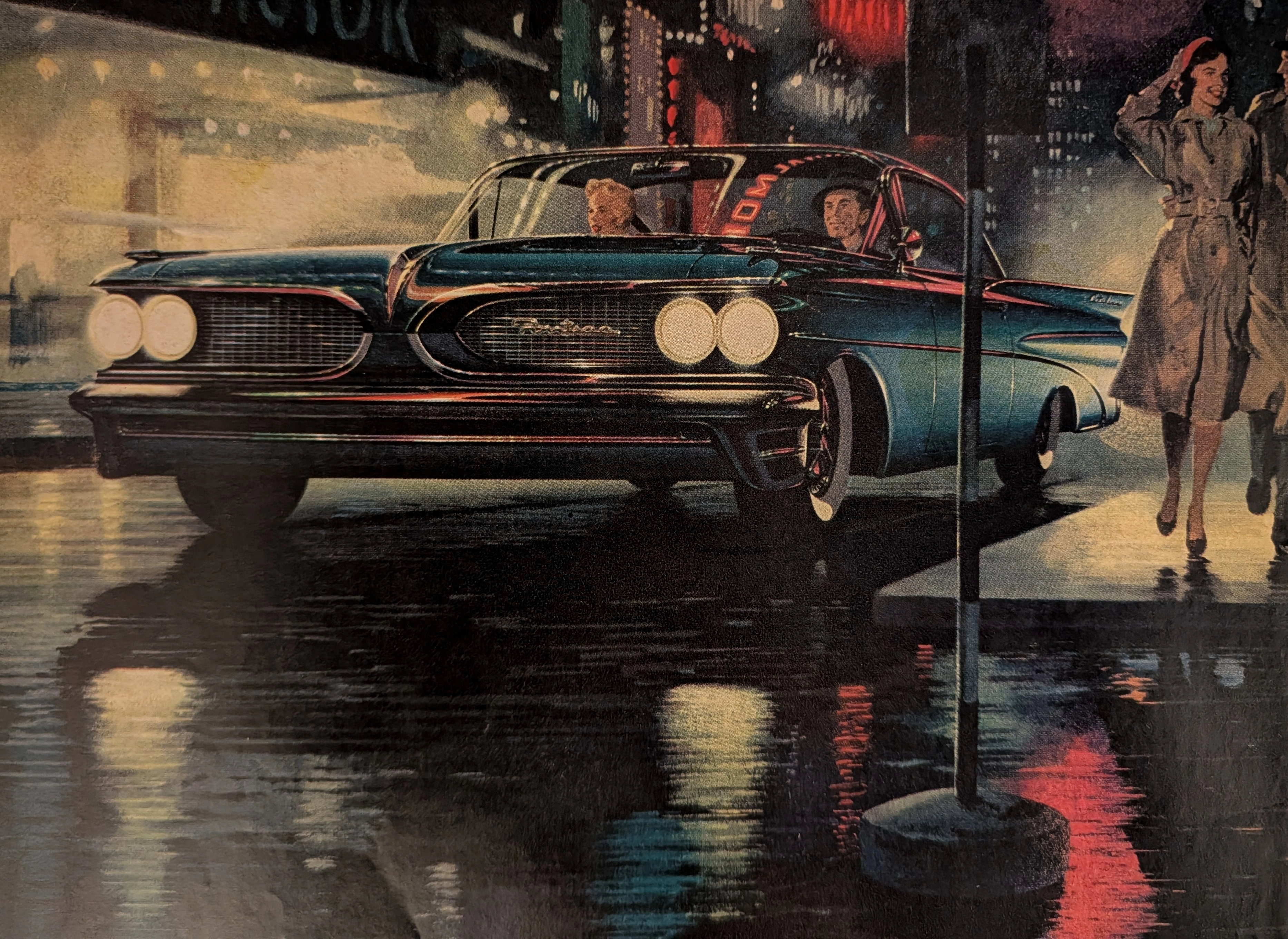
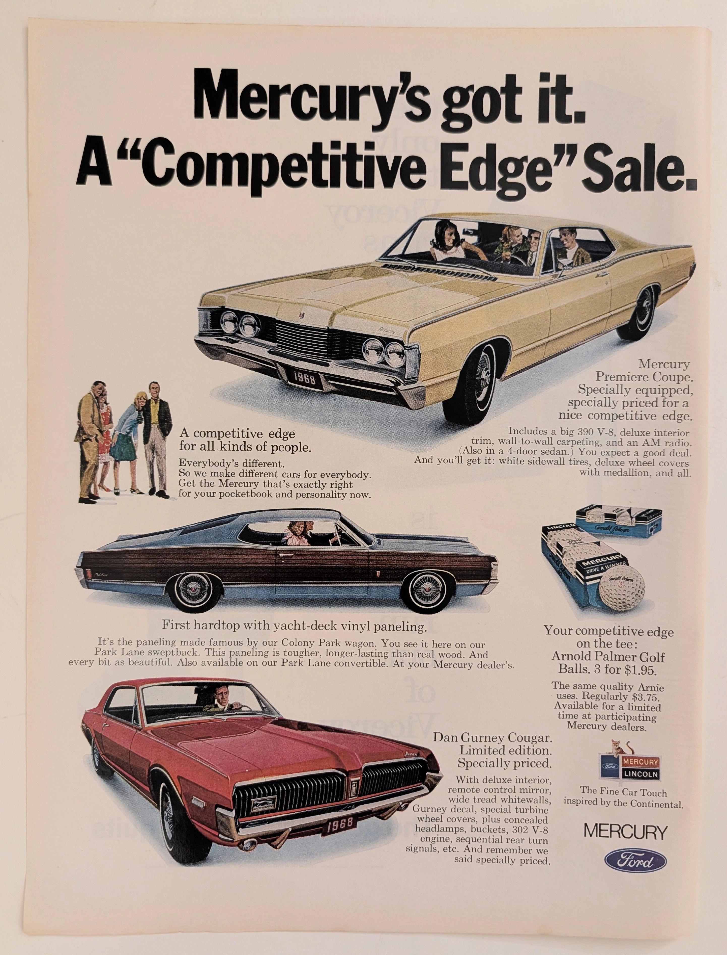
The Time Traveller's Dossier: The Competitive Edge – The 1968 Mercury Lineup and the Architecture of American Automotive Prestige
The evolution of the American automotive market in the late 1960s was characterized by a fierce, uncompromising battle for the expanding, affluent middle class. Automakers were no longer simply selling transportation; they were engineering complex lifestyle avatars. The historical artifact elegantly secured upon the analytical table of The Record Institute today is a striking, full-page print advertisement for the 1968 Mercury "Competitive Edge" Sale. This document completely transcends the standard boundaries of automotive marketing. It operates as a highly sophisticated, multi-layered cultural mirror, reflecting the precise era when the Lincoln-Mercury division sought to simultaneously capture the raw, adrenaline-fueled youth market and the established, affluent golfing demographic within a single, unified corporate narrative. This world-class, comprehensive dossier conducts a meticulous, unyielding, and exceptionally exhaustive examination of the artifact, operating under the absolute most rigorous parameters of historical, sociological, and material science evaluation. Dedicating the overwhelming majority of our analytical focus to its immense historical gravity, we will decode the brilliant marketing psychology embedded within the "Competitive Edge" campaign, analyze the profound cultural importance of legendary figures Dan Gurney and Arnold Palmer, and dissect the visual semiotics of the "Sign of the Cat" branding. Furthermore, as we venture deeply into the chemical and physical foundations of this analog printed ephemera, we will reveal the precise mechanical fingerprints of the CMYK halftone rosettes captured in the macro imagery of the vehicles and golf balls. Finally, we will assess its archival rarity, exploring how the graceful, natural oxidation of the paper substrate cultivates a serene wabi-sabi aesthetic—a natural, irreversible phenomenon that serves as the primary engine driving up its market value exponentially within the elite global spheres of Vintage Commercial Ephemera and Automotive Archives.
GE · Technology
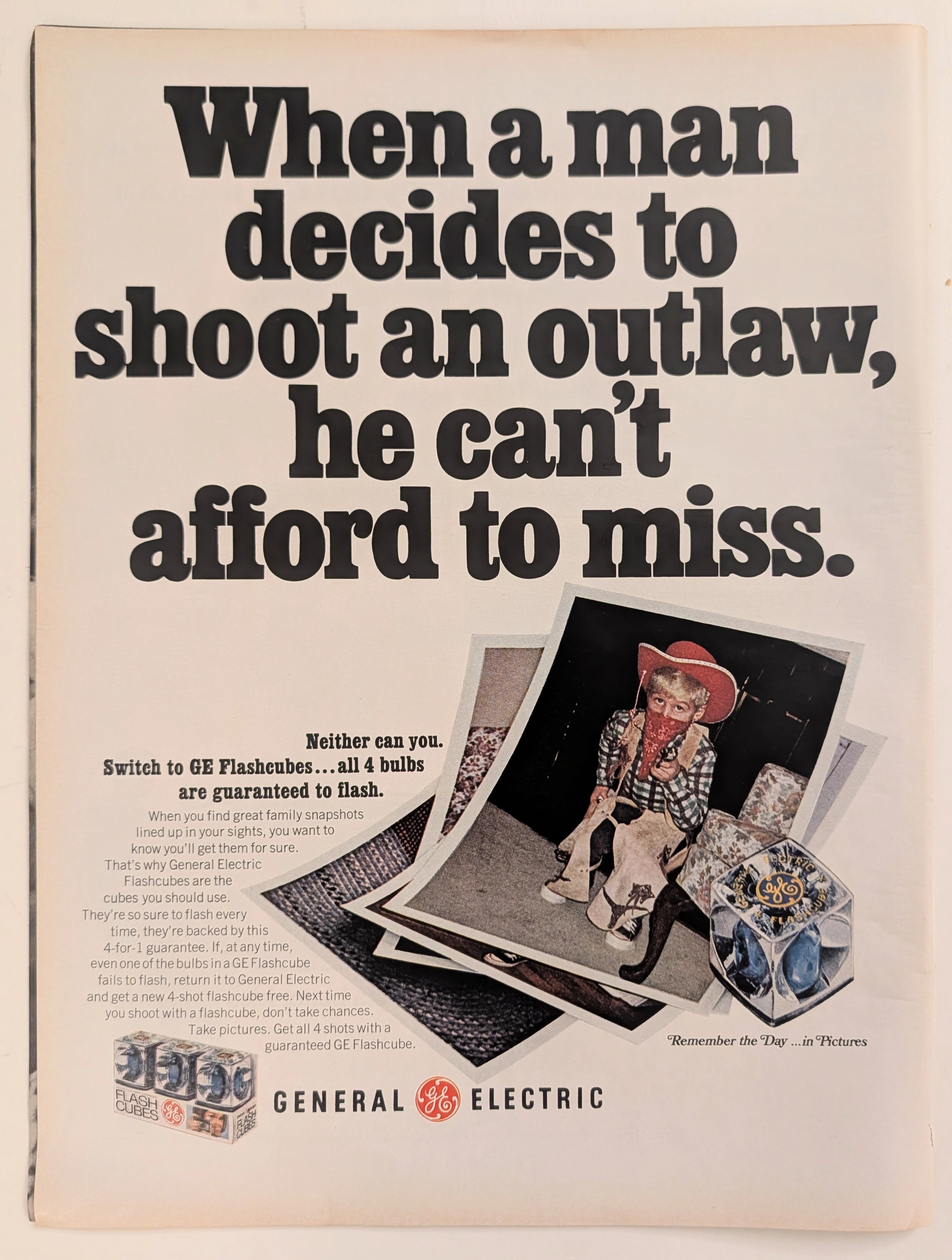
The Time Traveller's Dossier: Capturing the Outlaw – The General Electric Flashcube and the Democratization of Amateur Photography
The evolution of twentieth-century domestic life and the archiving of the American family unit was fundamentally defined by the rapid, uncompromising advancement of accessible consumer photography. The historical artifact elegantly and securely positioned upon the analytical table of The Record Institute today is a striking, narrative-driven full-page print advertisement for General Electric (GE) Flashcubes. This document completely transcends the standard, utilitarian boundaries of photographic equipment marketing. It operates as a highly sophisticated, multi-layered cultural mirror, reflecting a precise era in consumer psychology where the anxiety of "missing the moment" was aggressively addressed by industrial innovation. By utilizing the playful, universally recognizable motif of childhood dress-up—a young boy costumed as an Old West "outlaw"—GE sought to reassure the mid-century parent that their technological consistency would never fail the spontaneous archiving of family history. This world-class, comprehensive dossier conducts a meticulous, unyielding, and exceptionally exhaustive examination of the artifact, operating under the absolute most rigorous parameters of historical, sociological, and material science evaluation. Dedicating the overwhelming majority of our analytical focus to its immense historical gravity, we will decode the brilliant marketing psychology embedded within the "shoot an outlaw" double entendre, analyze the profound sociopolitical impact of the Flashcube's invention on consumer behavior, and dissect the economic realities of the "4-for-1 guarantee." Furthermore, as we venture deeply into the chemical and physical foundations of this analog printed ephemera, we will reveal the precise mechanical fingerprints of the CMYK halftone rosettes captured in the stunning macro imagery of the GE logo. Finally, we will assess its archival rarity, exploring how the graceful, natural oxidation of the paper substrate cultivates a serene wabi-sabi aesthetic—a natural, irreversible phenomenon that serves as the primary engine driving up its market value exponentially within the elite global spheres of Vintage Commercial Ephemera and Technology Archives.
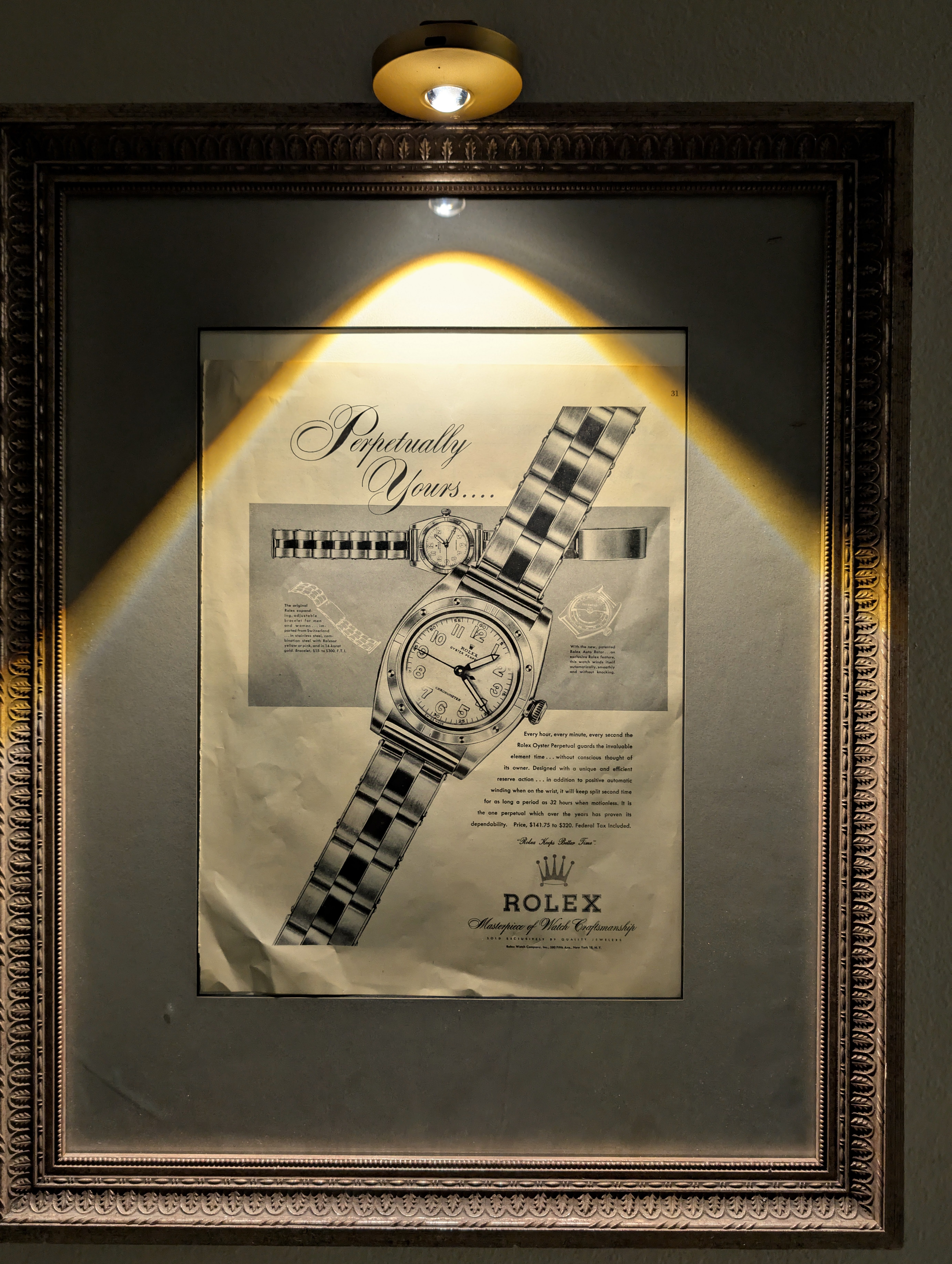
Rolex "Perpetually Yours"
This rare mid-century Rolex "Perpetually Yours" advertisement captures the genesis of the modern Rolex empire. Featuring the legendary Oyster Perpetual, it celebrates the historic union of the world's first waterproof 'Oyster' case (1926) and the revolutionary self-winding 'Perpetual' rotor (1931). A true museum-grade horological archive, this piece represents the ultimate mechanical blueprint that defined Rolex's eternal supremacy.