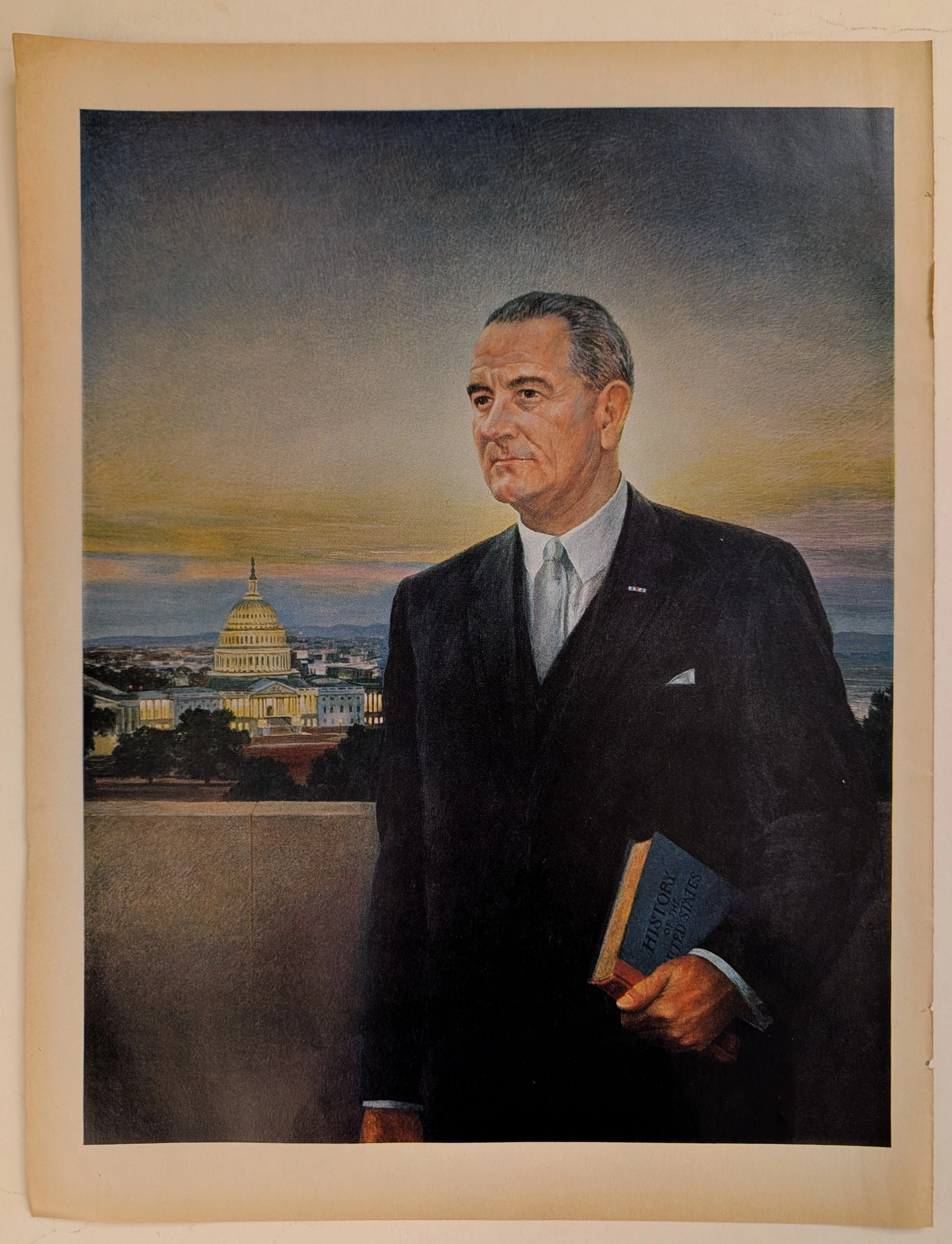
— The Record Institute Journal")
 — The Record Institute Journal")
 — The Record Institute Journal")
 — The Record Institute Journal")
 — The Record Institute Journal")
 — The Record Institute Journal")
 — The Record Institute Journal")
 — The Record Institute Journal")
 — The Record Institute Journal")
The Time Traveller's Dossier: The Masterpiece of Architectural Anatomy – The White House Isometric Cutaway Artifact (Circa 1960s)
The History
To genuinely decode the complex architectural topography embedded within this printed artifact, one must contextualize the physical evolution of the structure itself, entirely separate from its functional role. The physical history of this mansion is a fascinating chronicle of continuous construction, devastating destruction, and highly ambitious structural renovation.
The narrative within the artifact correctly identifies the foundational figures of this architectural endeavor. The original site was selected by George Washington. As the first President of the United States and a former surveyor, Washington was a crucial historical figure who oversaw the initial planning and geographical placement of the nation's new capital city along the Potomac River, though he never lived in the building himself. The architectural design competition was famously won by James Hoban. Hoban was an Irish-born architect who immigrated to the United States; his profound influence from Palladian architecture and the Leinster House in Dublin shaped the building's iconic Neoclassical facade, earning him a $500 prize and eternal recognition in the annals of architectural history.
As noted in the artifact's historical text, the building faced severe physical trials. "A dozen years later the house was gutted when the British set it ablaze during the War of 1812. But the outer walls remained intact and the house was restored". This catastrophic fire necessitated the famous whitewashing of the surviving porous sandstone walls to mask the severe smoke and scorch damage, fundamentally altering the visual identity of the structure from natural stone to its brilliant, monochromatic hue.
Perhaps the most fascinating architectural detail highlighted in this artifact is the massive, grueling reconstruction that occurred in the mid-20th century. The text explicitly states that successive administrations ignored the building's structural health until it was found to be "on the brink of collapse". During a massive construction program, the building was "stripped down to a four-wall shell, a deeper basement dug, a steel framework erected and, laboriously, piece by piece, each room was re-created". This represents a monumental triumph of structural engineering: completely removing the failing, centuries-old wooden load-bearing beams and inserting a modern, highly resilient steel skeleton, all while meticulously preserving the historic exterior facade and replicating the delicate interior moldings.
Creator / Illustrator Information: At the far right of the Ground Floor cross-section, anchored unobtrusively near the architectural foundations, lies the signature of the artist responsible for this immense undertaking: Mackey. Mackey was a highly skilled architectural illustrator and draftsman of the mid-20th century, specializing in transforming dense, unreadable structural blueprints into engaging, vibrant, and accessible works of commercial art. His ability to humanize massive, imposing structures through the inclusion of miniature figures and warm color palettes made his work highly sought after in educational publishing.
Mackey's illustration is a textbook example of isometric projection, a highly specific method for visually representing three-dimensional objects in two dimensions. It is an axonometric projection in which the three coordinate axes appear equally foreshortened, and the angle between any two of them is precisely 120 degrees. By utilizing this strict geometric discipline, Mackey completely bypassed the flat, lifeless nature of standard two-dimensional blueprints. This technique allows for a unique perspective, peeling back the roof and exterior walls to reveal the intricate spatial relationships of the labyrinthine interior without the distortion of standard vanishing-point perspective. It provides the viewer with an omniscient, overhead view of the architecture.
Part 1: The Isometric Supremacy: Flattening the Labyrinth
The narrative architecture of this artifact is built upon a strict, uncompromising dedication to spatial clarity. A mansion containing over 130 rooms, multiple sublevels, and sprawling annexes is inherently chaotic to visualize. In the face of such overwhelming structural complexity, Mackey presented a diametrically opposed concept: absolute visual transparency.
The artifact executes a flawless spatial pivot by slicing the building open, creating a multi-tiered "dollhouse" effect. The illustration deliberately contrasts the impenetrable exterior walls with a warm, colorful, and inviting interior topography. This represents a profound conceptual transition: the illustration is no longer merely showing a building; it is providing visual ownership to the reader. It guarantees that the viewer can comprehend the entirety of this massive estate in a single, sweeping glance.
Part 2: The Semantics of Interior Design
To execute a visual strategy of this magnitude, the artifact required a highly specific, color-coded visual vocabulary. The illustration abandons standard blueprint monochromaticity and crosses boldly into the realm of interior design documentation. Mackey deliberately utilizes distinct color palettes to separate spatial functions.
The grand, ceremonial spaces of the State Floor—such as the Blue Room, the Red Room, and the Green Room—are rendered in vibrant, saturated hues, immediately drawing the viewer's eye and establishing them as the ornate heart of the building. Conversely, the sprawling, maze-like layout of the basement and the West Wing annexes are depicted in muted, utilitarian grays and beiges, visually separating the functional, operational zones from the historic display areas. This deployment of color is a calculated visual hierarchy, effectively mapping the building's distinct functional zones directly into the viewer's understanding.
Part 3: The Omniscient Observer & The Illusion of Access
The educational publishing structure of the era was characterized by a booming desire for encyclopedic knowledge. This artifact serves as a masterclass in creating "Illusory Access" to highly restricted spaces.
The visual layout places the consumer in the position of an omniscient observer. The inclusion of tiny, meticulously painted figures—staff members walking the halls, individuals sitting in the library, or conversing in the ornate oval rooms—provides crucial architectural scale. These figures are not mere decorations; they serve as avatars for the viewer, allowing the eye to measure the height of the ceilings and the expanse of the corridors. The publication was not just selling a map; they were selling an immersive, printed tour of a grand residence.
Part 4: Visual Semiotics: The Anatomy of the Cutaway
In an era where exterior photography was abundant, the deliberate choice to render this artifact through the medium of an isometric cross-section acts as a precise semiotic indicator:
Structural Honesty: A photograph shows only the skin of a building. An isometric cutaway, however, represents structural truth, engineering, and spatial honesty. By depicting the residence through this medium, the artist visually divorced the building from mere postcard imagery. It framed the structure as a complex, living machine, a piece of architectural history that transcends its famous facade.
The Architecture of Navigation: The visual composition is heavily coded with numerical waypoints (from 1 to 50). The numbered keys systematically guide the eye through the labyrinth, cross-referencing with the dense blocks of historical text. The visual composition forces the viewer's brain to engage actively with the image, matching the text to the rooms, creating an interactive, immersive educational experience long before the digital age.
Part 5: Pop Culture Impact and Enduring Legacy
The illustrative strategy pioneered by artists like Mackey left an indelible mark on the global publishing industry. This specific strategy—fusing rigorous architectural accuracy with engaging, colorful illustration—was the absolute gold standard for educational diagrams.
Before these mass-produced isometric cutaways, complex architecture was the exclusive domain of engineers and draftsmen. The cultural impact of this visual positioning engineered a societal norm where the general public expected complex structural information to be distilled into beautiful, digestible infographics. In the modern digital arena, 3D rendering studios still attempt to manufacture the aura of handcrafted charm and meticulous detail that Mackey achieved decades ago. This physical artifact is the foundational source code for the most pervasive educational publishing methodology in modern history.
The Paper
As a physical entity, this fold-out centerfold is an unrepeatable, isolated record of mid-20th-century large-format offset lithographic printing. The medium-weight, matte-coated magazine stock was originally engineered by the ton for mass distribution in educational periodicals. However, its current, aged state—complete with distinct, structural vertical fold lines—demands a profound evaluation through the lens of archival preservation and the Japanese aesthetic philosophy of wabi-sabi (侘寂)—the acute recognition and appreciation of beauty found in impermanence, imperfection, and the natural progression of time.
Subjecting the extreme macro close-ups of this artifact to visual forensics reveals the mechanical heartbeat of the pre-digital printing press. Under high magnification, the illusion of Mackey's smooth watercolor washes violently shatters, dissolving into a precise, mathematically rigorous galaxy of CMYK (Cyan, Magenta, Yellow, Key/Black) halftone rosettes. The distinct, gritty grain of the offset printing process is aggressively visible within the transition zones of the green carpets and the pink wallpapers of the State Floor. The typography below the illustration, exhibiting the slight ink spread characteristic of mid-century press pressure, firmly anchors the piece in its historical, analog reality.
The most crucial and valuable aspect of this specific artifact lies in its Material Degradation, particularly along its structural seams. Examining the vertical fold lines and the unprinted margins reveals authentic, undeniable "Toning". This is a gradual, irreversible yellowing, browning, and embrittlement effect. It is caused by the natural chemical oxidation of organic lignin—a complex polymer that binds cellulose fibers together—trapped within the wood pulp of the paper. Upon decades of exposure to ambient oxygen and ultraviolet light, the lignin structure breaks down, absorbing more light and causing the distinct warm, aged coloration.
It is vital to understand the archival and market significance of this ephemeral nature. Analog, multi-fold print media from the mid-20th century represents a vanishing breed of historical documentation. Large centerfolds are inherently fragile by design; they were meant to be opened, folded repeatedly, and ultimately torn along their weakened creases. This organic, breathing physical degradation is a fingerprint of time that can absolutely never be cloned, replicated, or faked by modern high-precision digital scanning. As these original pages slowly burn themselves out through oxidation along the fold lines, turning increasingly fragile, their supply in the global collector's market shrinks daily. The evolving patina elevates the piece from a uniform, lifeless industrial print run into a singular, unique artifact covered in historical scars. The wabi-sabi nature of this decaying paper ensures that its aesthetic and financial worth will continue to appreciate precisely because it is a slowly dying medium.
The Rarity
Rarity Class: S (Superior / Exceptional Archival Survival)
Within the strictest parameters of international archival evaluation, this artifact holds a definitive Class S designation. The ultimate paradox of mid-20th-century fold-out ephemera lies in the violent contrast between its initial, widespread mass production and its extreme, near-extinct scarcity intact today. Multi-page educational centerfolds were quintessential "disposable media," destined to be ripped from their bindings or shredded along their stress points by careless handling.
For this specific, large-format diagram to have miraculously survived several decades—resisting the ravages of destructive unfolding, severe moisture damage, and avoiding catastrophic tearing along its delicate vertical center creases—is a pure statistical archival anomaly. Furthermore, finding a Mackey-illustrated architectural cutaway, wherein the CMYK pigments retain their original vibrant depth while exhibiting only the genuine, unforced hallmarks of wabi-sabi aging along the folds, is highly uncommon. Pristine, structurally sound remnants of this specific era of architectural illustration are fiercely hunted by curators of design history, architectural archivists, and collectors of mid-century educational ephemera. They are acquired with the sole intention of executing museum-grade, acid-free conservation framing, preserving them permanently as historical heirlooms of the era when complex structural engineering was successfully translated into breathtaking visual art for the masses.
Visual Impact
The aesthetic authority of this artifact lies in an absolute masterclass of spatial organization and continuous line work. The immediate focal point that hijacks the viewer's optic nerve is the central core of the main structure, specifically the stacked curvature of the prominent ceremonial rooms. The artist’s brilliant use of contrasting elements—the stark, pristine white of the exterior architectural shell against the rich, saturated jewel tones of the interior carpets and wallpapers—creates a profound sense of depth and three-dimensionality.
This immense visual weight in the center is perfectly balanced by the sprawling, linear extensions of the flanking wings. The layout acts as a primary leading line, guiding the eye from the grand, colorful central axis outward into the utilitarian corridors. The juxtaposition between the highly detailed, vibrant upper floors and the more sterile, grid-like basement levels forces the viewer's brain to categorize the architecture functionally. It traps the reader in a continuous, closed loop of visual exploration and architectural discovery, ensuring the eye never rests but constantly searches for the next miniature detail.
Exhibition Halls
The Archive Continues
Continue the Exploration
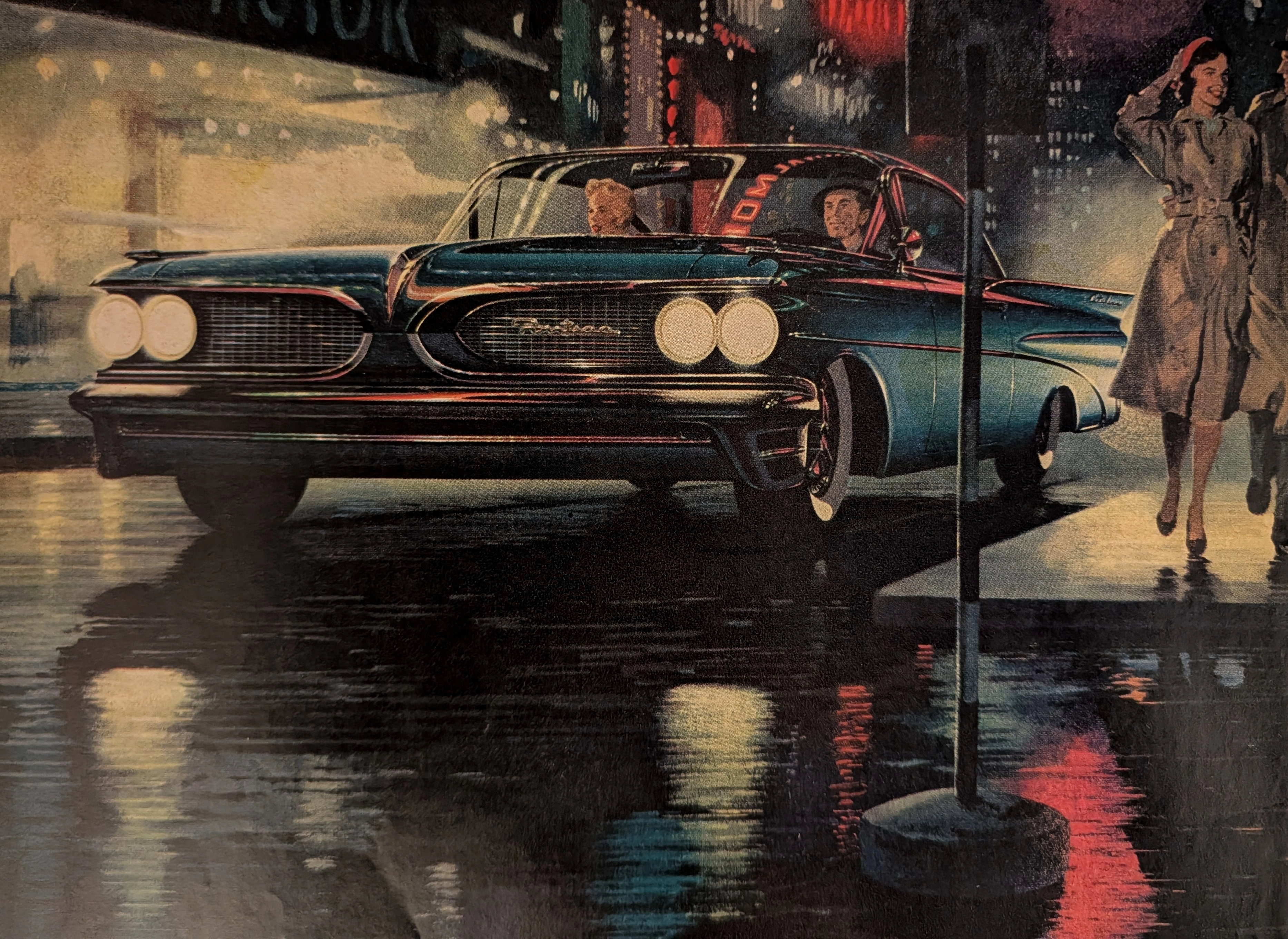
Pontiac · Automotive
THE TIME TRAVELER'S DOSSIER :THE BIRTH OF THE WIDE-TRACK
The artifact currently subjected to our uncompromising, museum-grade analysis is a profoundly preserved Historical Relic excavated from the turning point of Detroit's "horsepower and handling" wars. This Primary Art Document is a full-page magazine advertisement for the 1959 Pontiac, explicitly introducing the brand's revolutionary "Wide-Track" engineering. Functioning as a "Forensic Blueprint of Automotive Rebranding," the document masterfully weaponizes the peerless artistic talents of Fitz and Van to transform Pontiac from a conservative, aging brand into America's most aggressive performance marque. Its historical context is irrefutably anchored by the extreme macro details of its proprietary engineering claims and the highly coveted "Body by Fisher" corporate hallmark. Grounded by these physical timestamps, the microscopic artist signature, and its breathtaking wabi-sabi chemical degradation, this artifact commands an irreplaceable status, cementing its Rarity Class A designation.
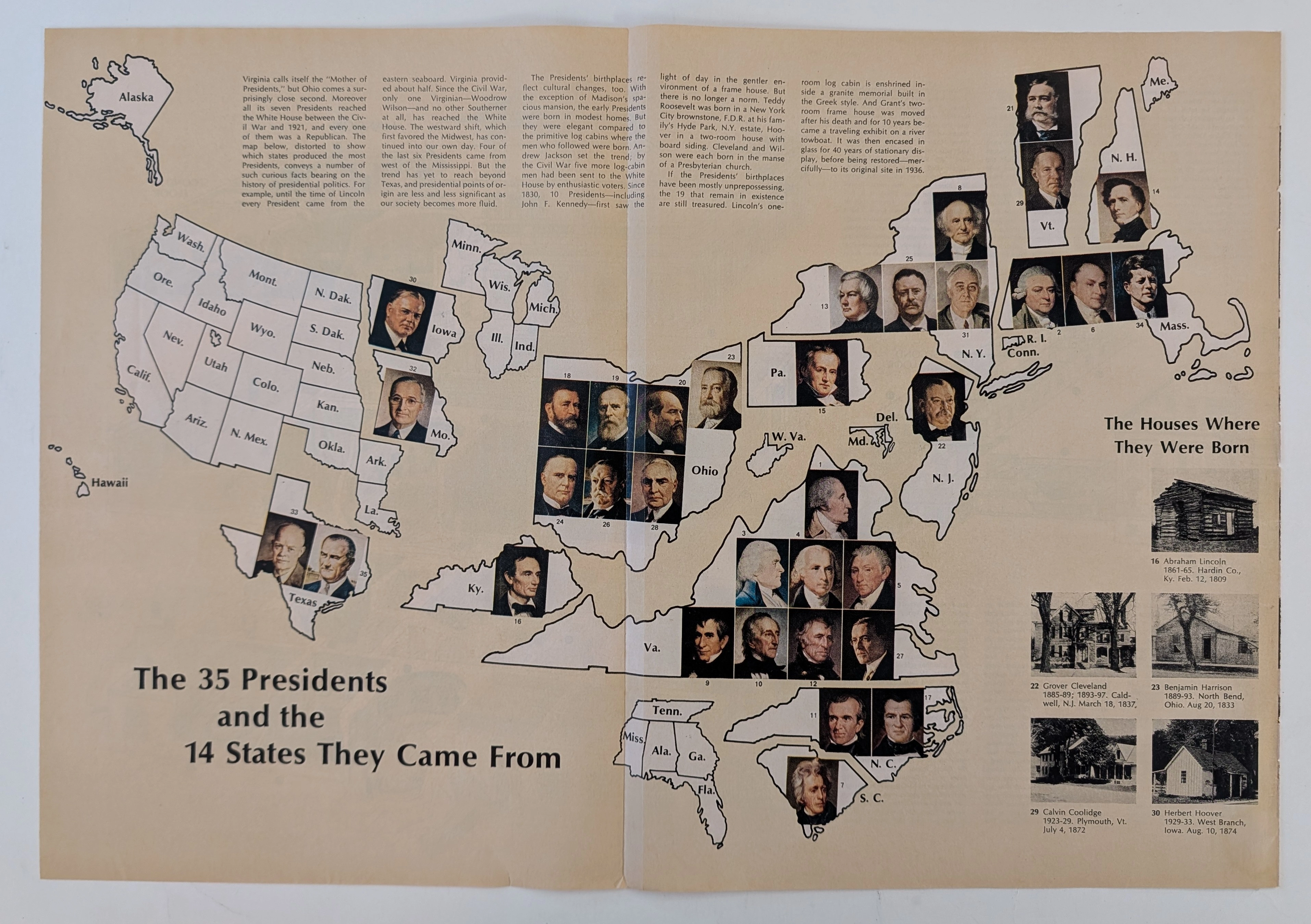
The Time Traveller's Dossier: The Geopolitics of Supreme Power – Cartographic Origins of the 35 U.S. Presidents (Circa Mid-1960s)
The history of supreme executive power is not inscribed solely within the text of legal documents, constitutional amendments, or international treaties; it is deeply rooted in the geographical origins and territorial foundations of political leaders. Long before the modern era of complex spatial data analysis or digital infographics, the structural understanding of state power in the United States was conveyed through the meticulous art of cartographic illustration. The historical artifact presented before us for museum-grade forensic analysis is not merely a conventional fold-out extracted from a mid-20th-century educational publication. It is a profound "geopolitical visual encyclopedia," meticulously compiling and categorizing the geographic birthplaces of the thirty-five individuals who had ascended to the highest office in the White House up to that point in history. This academic archival dossier presents an exhaustive, microscopic deconstruction of the historical and aesthetic framework of the diagram titled "The 35 Presidents and the 14 States They Came From." Operating on a profound scholarly narrative structure, this document decodes the shifting tectonic plates of executive power in the United States—from the foundational era concentrated on the Eastern Seaboard, moving steadily into the Midwest, and ultimately expanding toward the Southern and Western frontiers. Through the highly specialized lens of late-analog print analysis, American political history, and rigorous visual forensics, this document serves as a temporal window. It allows us to explore the foundational roots of the "American Dream" as conveyed through the birthplaces of these statesmen, ranging from humble log cabins to opulent estates, all rendered with the mechanical precision of mid-century offset lithography.
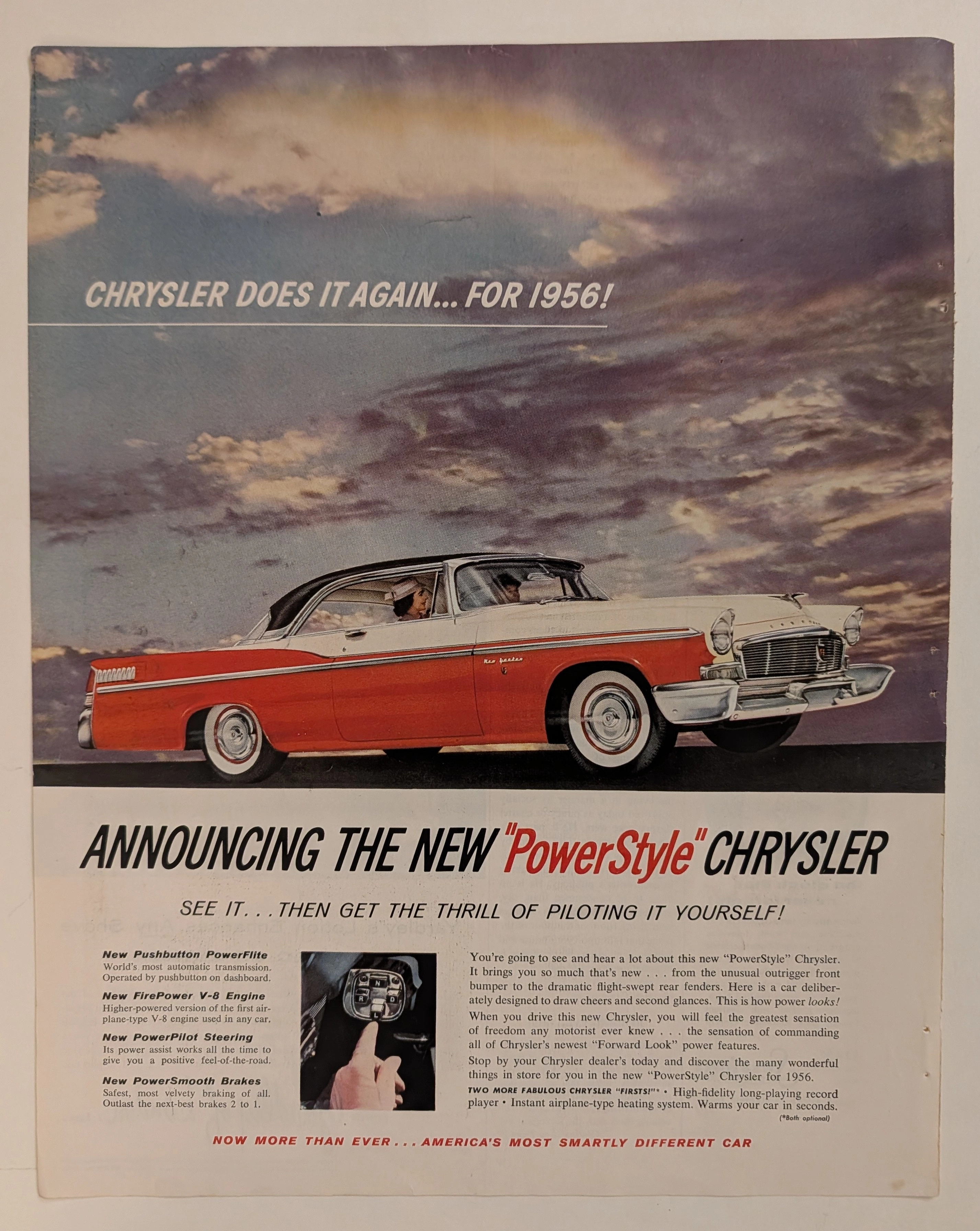
Chrysler · Automotive
The Time Traveller's Dossier: The Architecture of Command and Authority – The 1956 Chrysler "PowerStyle" Manifesto
History is not merely chronicled through written texts; it is forged in cold steel, sculpted in gleaming chromium, and dictated by the absolute, ruthless triumph of industrial design. Long before the modern world was infected and subdued by sterile digital algorithms and soulless autonomous vehicles, there was an era where the guttural roar of a V-8 engine was the ultimate symphony of American prosperity. In this bygone epoch, automotive architecture was a literal weapon—a physical manifestation used to declare a man’s absolute sovereignty over space and time. The historical artifact that stands before us is not merely a decaying magazine advertisement ravaged by the decades. It is an absolute "Blueprint of Victory." It is the visual manifesto utilized by Chrysler in 1956 to violently obliterate the mundane complacency of its rivals, aggressively establishing the "Era of Pushbutton Command" as the mandatory new standard for the American elite. This museum-grade academic archival dossier will execute an exhaustive, uncompromising deconstruction of the 1956 Chrysler New Yorker "PowerStyle" campaign—the absolute zenith of the legendary "Forward Look" design philosophy. Through the highly specialized lens of visual forensics and commercial semiotics, we will expose how every single brushstroke, every shadow, and every line of copywriting was deployed in a calculated psychological war to transform the ordinary "driver" into a sovereign "pilot." This document serves as an undeniable testament to how Chrysler artificially engineered "America's most smartly different car," weaponizing the zeitgeist of the Jet Age to monopolize consumer desire. This is a Class S marketing relic that has survived the destructive progression of time to validate its supremacy in your hands today.