The Time Traveller's Dossier: The Architecture of Command and Authority – The 1956 Chrysler "PowerStyle" Manifesto
The History
To genuinely decode the sheer arrogance and architectural supremacy of Chrysler in 1956, we must pull back the lens and contextualize the brutal post-WWII economic battleground. The United States was skyrocketing toward the absolute zenith of global hegemonic power. The "American Dream" had aggressively mutated; it was no longer merely about owning a static suburban home with a white picket fence. It was about the violent, relentless conquest of distance. The globe was plunging headfirst into the Atomic Age and the Jet Age. Everything had to be faster, more powerful, and visually designed to look as though it were breaking the sound barrier even while parked dead in a driveway.
Entering 1956, Chrysler found itself in a desperate, existential struggle to break free from the suffocating, conservative shadows of General Motors and Ford. They chose to push all their chips to the center of the table with the apocalyptic "PowerStyle" campaign. This was the exact historical fracture where Chrysler violently shed its stodgy, antiquated image and strapped on the armor of the future, drawing direct, unapologetic inspiration from aerospace engineering. The marketing linguistics deployed here are ruthlessly calculated. By utilizing terms like "FirePower V-8 Engine" and "Pushbutton PowerFlite," Chrysler was not selling transportation; they were selling military-grade empowerment. Appropriating military terminology for an automotive engine is a calculated move to implant imagery of explosive violence, raw thrust, and devastating power, all elegantly contained beneath the hood. The ad explicitly links it to an "airplane-type V-8," transferring the supremacy of the skies directly into the driver's hands, making the act of engaging a multi-ton machine as effortless as launching an intercontinental ballistic missile.
The Paper
As a physical entity, these tear sheets, meticulously excised and sold as isolated single pages, are an unrepeatable record of late-analog offset lithographic printing. It is an absolute, ironclad rule that must be permanently etched into the historical record: this physical artifact is an individually cut, standard magazine-sized page. It was engineered for intimate, handheld consumption. It is NOT, under any circumstances, a massive promotional wall poster! This medium-weight, matte-coated magazine stock was originally manufactured by the ton for mass distribution within mid-century publications. However, its current, aged physical state demands a profound evaluation through the highest echelon of Japanese aesthetic philosophy: wabi-sabi (侘寂)—the acute recognition and appreciation of beauty found in impermanence, imperfection, and the ruthless, natural progression of time.
The most crucial, coldly calculated, and economically valuable aspect of this specific artifact lies in its Material Degradation. Examining the margins and unprinted white spaces reveals authentic, undeniable "Toning." This is a gradual, completely irreversible yellowing and browning effect caused by the natural chemical oxidation of organic lignin trapped within the paper's wood pulp, following 70 years of relentless exposure to ambient air and ultraviolet light. Pre-2000s analog print media represents an endangered species of historical documentation. This organic, breathing physical degradation is a fingerprint of time that cannot be cloned or faked by any modern scanning process. As these original pages slowly consume themselves through the oxidation of lignin, becoming increasingly fragile, their supply in the elite global collector's market shrinks every single day. It is precisely this ticking clock of physical impermanence—the raw, brutal fact that this paper is slowly disintegrating and returning to the earth—that acts as the exact catalyst driving up its market value exponentially.
The Rarity
Rarity Class: S (Rare / Historic Year / Prime Forward Look Era)
Within the strictest parameters of international archival evaluation, this artifact skyrockets to a definitive Class S designation. The ultimate paradox of analog print ephemera lies in the violent contrast between its incredibly cheap, initial mass production and its extreme, near-extinct scarcity today. While hundreds of thousands of these pages were printed in 1956, vintage magazines were the quintessential "disposable media," pre-destined to be incinerated or thrown into the recycling pulper.
For a full-page, vibrant artwork to have miraculously survived the destructive jaws of paper shredders, the devastating rot of severe moisture damage, and completely avoided catastrophic structural center creases for over seven decades is an extreme statistical archival anomaly. Finding a specimen that impeccably preserves the visual clarity of the revolutionary "Pushbutton PowerFlite" insert, alongside the pristine "Matador Red" pigment without severe fading, elevates this from a mere piece of paper to a highly coveted holy grail for automotive historians and curators of mid-century industrial design worldwide
Visual Impact
The aesthetic execution of this tear sheet is a masterclass in visual intimidation and desire manipulation, utilizing the breathtaking medium of watercolor and gouache rendering to achieve a level of hyper-realism that photography of the era could not capture. The vehicle is rendered in a stunning, aggressive two-tone combination of pristine white and a hyper-violent "Matador Red." This is severed by a razor-sharp, spear-like chrome trim running the entire length of the fuselage. These architectural lines act as literal arrows pointing relentlessly toward the future. Red was not chosen merely for its beauty; it is the universal color of aggression, apex energy, and undeniable status.
The background is a dramatic, bruised, violet-and-gold twilight sky filled with turbulent, sweeping clouds. This atmospheric theatre communicates a profound message: "The world is changing, the horizon is shifting, and only the commander of the Chrysler New Yorker possesses the authority to claim this sunset." The slight low-angle perspective used to render the car ensures it looms over the viewer, projecting an aura of majestic dominance. Furthermore, subjecting the extreme macro close-ups of this artwork to visual forensics reveals a fascinating duality. Under high magnification, the soft brushstrokes violently shatter into a precise galaxy of CMYK halftone rosettes. This distinct, gritty analog grain is the undeniable steel fingerprint of industrial mass reproduction from an era entirely reliant on analog film cameras.
The Archive Continues
Continue the Exploration
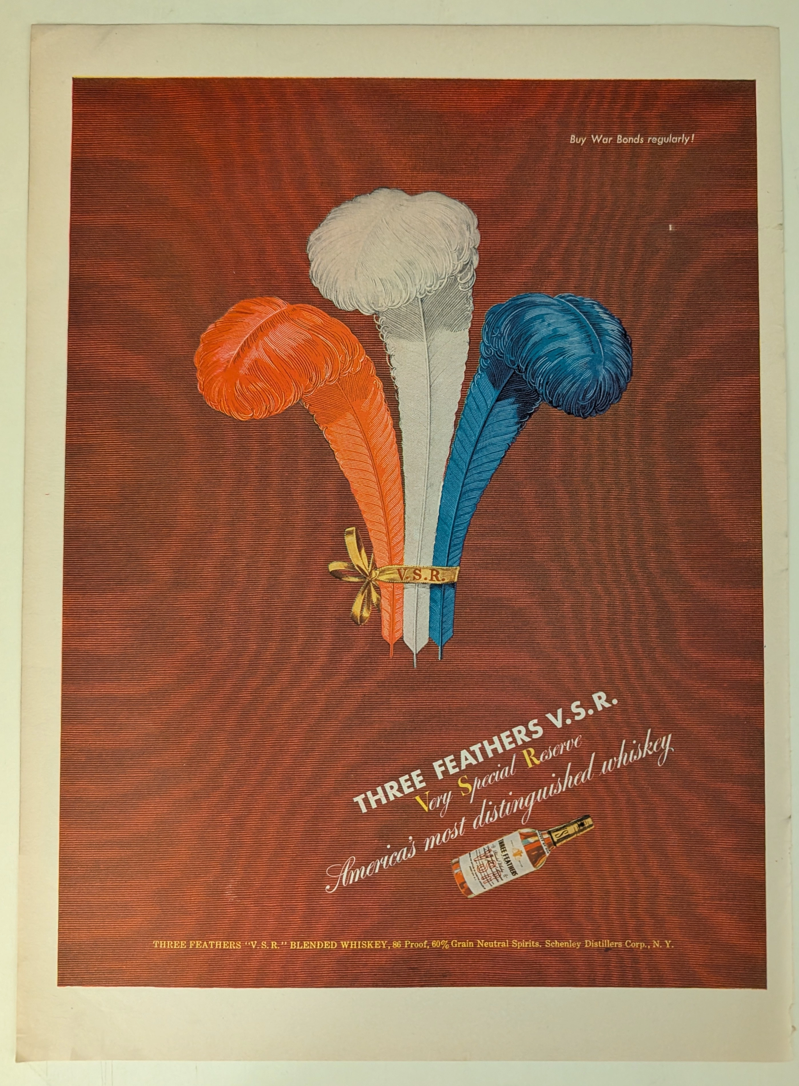
THE TIME TRAVELER'S DOSSIER: BLOOD CAPITALISM AND THE WEAPONIZATION OF WHISKEY
This impeccably preserved Historical Relic is a Primary Art Document from the brutal crucible of World War II, featuring a sweeping advertisement for THREE FEATHERS V.S.R. Blended Whiskey. It chronicles the ultimate mid-century psychological strategy of "Patriotic Capitalism." The artifact is forensically and definitively dated to the WWII era by the explicit, government-aligned directive in the upper right corner: "Buy War Bonds regularly!". Visually, the brand masterfully hijacked American nationalism by rendering its iconic three feathers in a vibrant Red, White, and Blue patriotic color scheme. Surviving the aggressive scrap paper drives of the 1940s, the acidic analog paper exhibits a profound integration of the deep crimson ink into its degrading fibers, perfectly encapsulating the analog aesthetic of wabi-sabi. This slow chemical death elevates this rescued wartime artifact to an irreplaceable Primary Art Document of Rarity Class A.
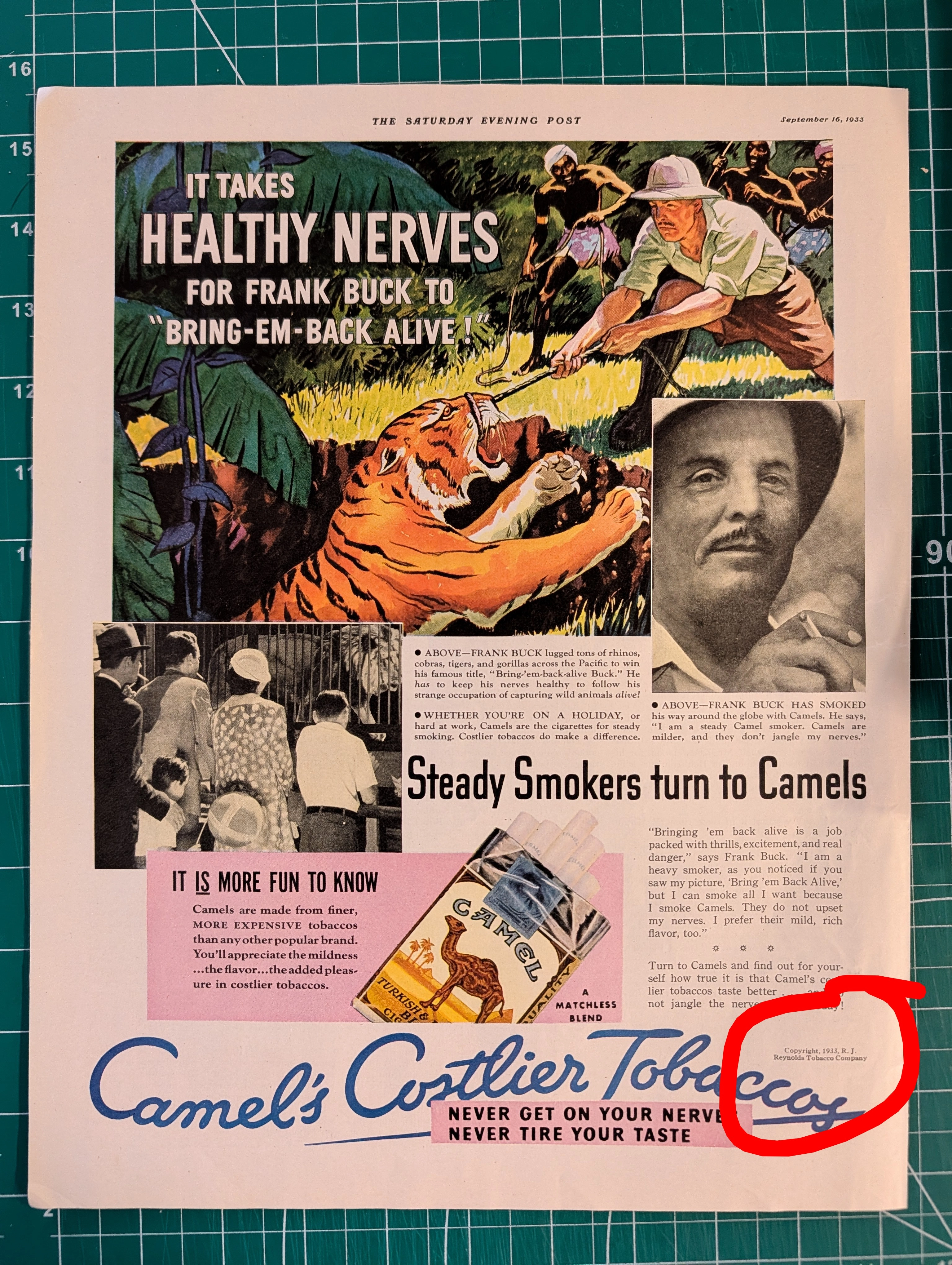
THE TINY TEXT THAT AUTHENTICATES HISTORY Why Fine Print in Magazine Advertisements Matters More Than You Think
Tiny copyright notices in magazine ads originated from mandatory US copyright law (1909 Act) and sector-specific regulations (BATF for alcohol). They function as layered authentication evidence: typographic era-consistency, regulatory language accuracy, ink/paper forensics, and contextual integrity — paralleling vintage band tee authentication methods. Collaboration credits (Pierre Cardin × Tiffany & Co.) and creative credits (photography, calligraphy, fashion) document commercial relationships lost to no other record.
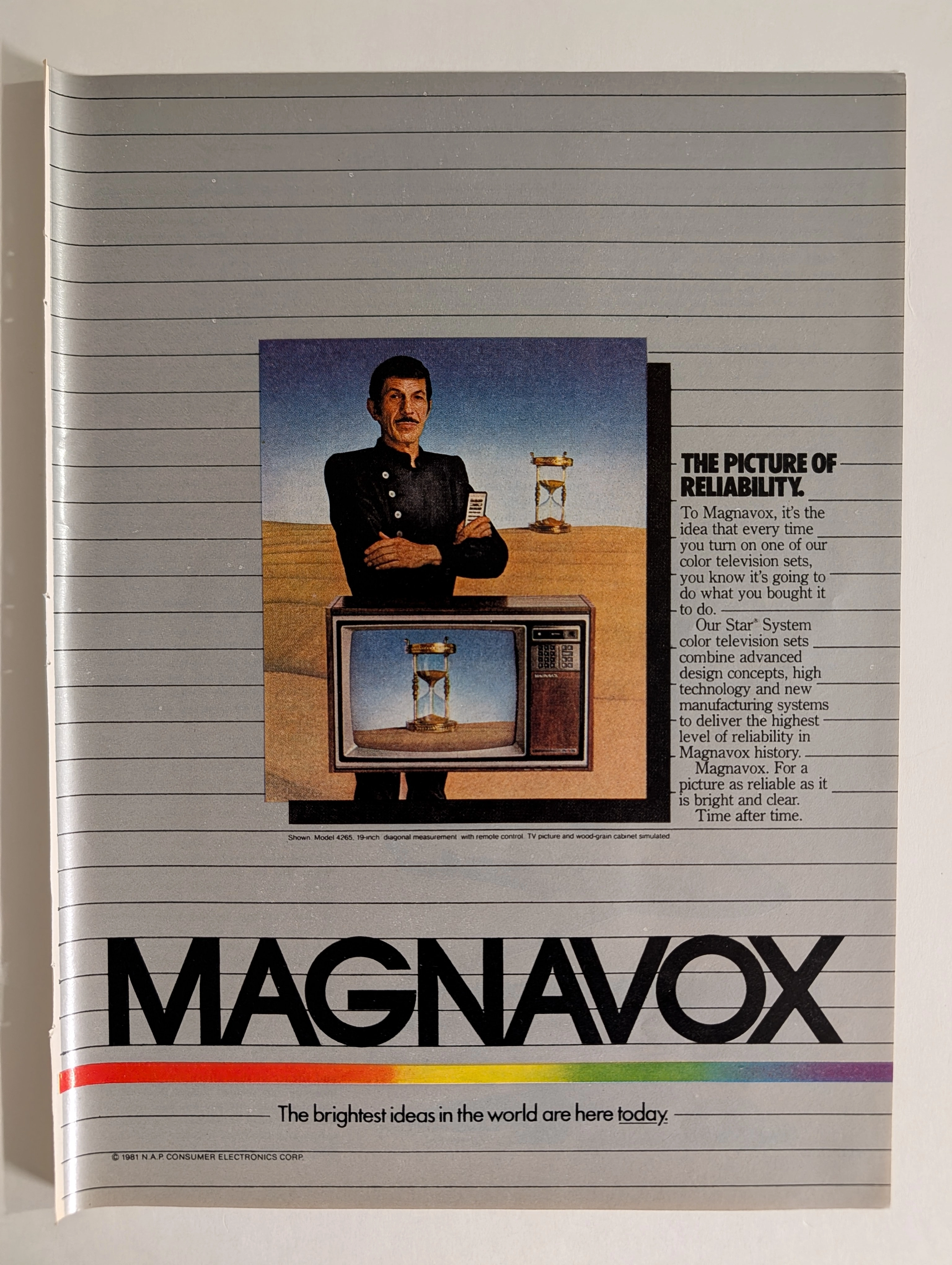
Magnavox Star System 1981 Leonard Nimoy TV Advertisement | 'The Picture of Reliability' | Deep Analysis Rarity Class A-SS
The advertisement analyzed here is a full-page full-color magazine promotion for Magnavox's Star® System color television sets, copyright © 1981 N.A.P. Consumer Electronics Corp. The ad features what is almost certainly Leonard Nimoy — iconic for his role as Mr. Spock in Star Trek — dressed in a black nehru-collar uniform against a surrealist desert landscape, standing above a Magnavox color TV set (Model 4265, 19-inch diagonal) that displays an hourglass on screen. A second hourglass appears behind him. The visual concept communicates timeless reliability. The headline 'The Picture of Reliability' and tagline 'The brightest ideas in the world are here today' frame Magnavox's Star System as the pinnacle of 1981 television technology. The rainbow spectrum stripe at the bottom is a distinctive brand element that ran across Magnavox advertising throughout the early 1980s. N.A.P. (North American Philips) Consumer Electronics Corp. was the American subsidiary of Philips that owned the Magnavox brand at this time, having acquired it in 1974.