The Time Traveller's Dossier: The Illumination of Memory – The Kodak Instamatic 104 and the Flashcube Revolution
The History
To fully appreciate the immense historical gravity, cultural magnitude, and sociological importance of this artifact, one must meticulously contextualize the profound paradigm shift in visual documentation that occurred in the 1960s, a shift built directly upon the foundational philosophy of George Eastman. George Eastman (1854–1932) was the visionary American innovator, entrepreneur, and philanthropist who founded the Eastman Kodak Company. Prior to Eastman's interventions in the late 19th century, photography was a highly arduous, deeply technical, and chemically hazardous profession restricted to trained specialists hauling heavy glass plates and toxic developing agents. Eastman’s singular, world-changing philosophy was summarized in his legendary 1888 slogan: "You press the button, we do the rest." He invented flexible roll film and the inexpensive Brownie camera, effectively placing the power of documentation into the hands of the amateur. The Kodak Instamatic 104, heralded in this specific artifact, represents the absolute mid-century zenith of Eastman’s original democratization of the image.
By the early 1960s, the post-World War II baby boom had created a massive, unprecedented demographic of young, prosperous families in suburban America. These families possessed a deep sociological desire to record their growing children, their vacations, and their newly acquired domestic prosperity. However, 35mm film cameras of the era still required a certain level of technical dexterity. Loading a 35mm spool involved manually pulling the film leader, threading it into a take-up spool, advancing it carefully to avoid tearing the sprocket holes, and ensuring the back was perfectly sealed. It was an intimidating process for the casual user. In 1963, Kodak answered this hesitation with "Project 13," which birthed the Instamatic line and the revolutionary 126 film cartridge.
The advertisement's copy brilliantly addresses this historical pain point with serene, comforting authority: "Kodak Instamatic cameras load instantly. No threading. No fumbling". The 126 cartridge was a drop-in, fool-proof plastic cassette. It was impossible to load incorrectly. This engineering marvel completely removed the mechanical barrier between the user and the memory they wished to capture. The copy casually instructs the user to "Just drop in the film and shoot," promising "good, clear, sharp pictures again and again". This is the ultimate realization of George Eastman's vision, refined for the space-age consumer.
Yet, the true historical centerpiece of this specific artifact—and the technological marvel that dominates the visual hierarchy of the page—is the Flashcube. Prior to 1965, indoor or low-light amateur photography required the use of individual, single-use flashbulbs. After taking a single photograph, the user had to manually eject the scorching hot glass bulb, retrieve a new one from a box, carefully insert it into the reflector, and prepare for the next shot. This cumbersome process consistently interrupted the natural flow of social events and made capturing candid, sequential moments nearly impossible.
The Flashcube, prominently held aloft by a graceful hand in the advertisement, was a collaborative engineering triumph between Kodak and Sylvania Electric Products. It was a compact, transparent plastic cube containing four distinct, miniature M3 flashbulbs, each nestled within its own dedicated, mathematically engineered parabolic reflector. The advertising copy presents this innovation with almost mythological grandeur: "Your sun, the flashcube". This headline is a masterclass in mid-century psychological marketing. It does not merely sell a lighting accessory; it metaphorically bestows upon the consumer the divine power to summon daylight at will. The copy continues, "It shines when and where the sun doesn't. Just pop one on your Kodak Instamatic camera. You'll get four sunny shots without changing bulbs".
The mechanical genius of the Instamatic 104 was that the simple action of advancing the film automatically rotated the flashcube precisely ninety degrees, instantaneously positioning a fresh, unburned bulb for the next photograph. This allowed the amateur photographer to take four brightly illuminated indoor photographs in rapid succession, fundamentally altering the sociology of domestic documentation. Birthday parties, holiday gatherings, and quiet evening moments could now be recorded fluidly and continuously. The macro-lens inspection of the flashcube in the artifact reveals the intricate internal architecture of the reflectors and the protective blue safety coating applied to the bulbs, designed to color-balance the harsh light for Kodacolor-X daylight film.
The visual presentation of the camera itself communicates accessible modernity. The "INSTAMATIC 104 CAMERA" badge is rendered in clean, sans-serif typography, projecting an aura of scientific precision. The familiar, deeply comforting red "Kodak" logo is positioned prominently on the sleek, silver-toned faceplate. The camera is designed to look like a sophisticated instrument, yet the interface is minimal, featuring only the essential elements: the lens, the viewfinder, and the shutter release.
Economically, this artifact documents the perfection of the "razor and blades" business model. The copy quietly but effectively states, "All this for less than $20". When adjusted for inflation, this represents an incredibly accessible entry point for the average family. Kodak's primary objective was not to generate massive profits on the camera hardware itself, but to place an Instamatic into every American household, thereby ensuring a perpetual, continuous revenue stream from the subsequent, endless sales of 126 film cartridges, processing services, and the revolutionary flashcubes. The inclusion of the formal "Kodak TRADEMARK" text at the bottom right of the page serves as a subtle, legal anchor, reminding the consumer of the vast, trusted corporate empire standing behind this $20 instrument of memory.
Ultimately, this artifact is a profound historical testament to the era when the capturing of personal history became universally accessible. It represents the exact moment when the technological barriers of photography were entirely dissolved, allowing the visual documentation of the American dream to become a standard, effortless, and brilliantly illuminated aspect of daily life.
The Paper
As a physical entity, this printed artifact functions as a living, breathing, and profound record of mid-twentieth-century graphic reproduction and substrate chemistry. Under exceptional, high-magnification macro-lens examination, this document reveals the stunning complexity and mathematical precision of analog color printing. The intricate, shaded details of the hand holding the flashcube, the precise rendering of the red Kodak logo, and the subtle metallic gradients of the camera body are all meticulously constructed from a precise, mathematically rigorous galaxy of halftone rosettes. This intricate, overlapping dot pattern constitutes the mechanical fingerprint of the pre-digital analog offset printing press. Microscopic, varying sizes of Cyan, Magenta, Yellow, and Key (Black) ink dots are elegantly and systematically layered at highly specific angles to trick the human eye and the biological visual cortex into perceiving a continuous, vibrant, and dimensional photographic reality out of mere clusters of ink. The macro imagery also beautifully captures the porous, fibrous texture of the uncoated magazine paper stock, illustrating how the ink was absorbed and spread into the fibers during the 1960s printing process.
Yet, the most profound and beautifully impactful factor elevating the immense value of this artifact in the contemporary global collector's market is the natural, organic, and entirely irreversible process of Material Degradation. The expansive margins and the overall paper substrate exhibit a genuine, unavoidable, and entirely unforgeable "Toning." This gradual, graceful, and chronological transition from the original bright, bleached manufactured paper to a warm, antique ivory and golden hue is caused by the slow, relentless chemical oxidation of Lignin—the complex organic polymer that naturally binds cellulose fibers together within the raw wood pulp of the paper. As the substrate is exposed to ambient oxygen and ultraviolet light over a span of decades, the molecular structure of the lignin gracefully and systematically breaks down, creating chromophores that absorb specific wavelengths of light and reflect the warm, golden tones we perceive as aging. This accumulation of time, this naturally evolving patina, represents the absolute core of the wabi-sabi aesthetic. The profound appreciation for the beauty found in natural aging, impermanence, and the physical manifestation of history upon a fragile, analog medium is an irreversible chemical reaction. It is precisely this authentic, unreplicable degradation that acts as the primary engine driving up the market value of these individual sheets exponentially among elite curators and collectors. It provides the ultimate, irrefutable, and scientific proof of the artifact's historical authenticity and its miraculous, delicate journey through time.
The Rarity
RARITY CLASS: B (Very Good Archival Preservation)
Evaluated under the most exacting, rigorous, and uncompromising archival parameters established by The Record Institute (which utilizes a rigorous classification scale from Class A down to Class D), this specific artifact is definitively and securely designated as Class B. We must prioritize the inherent rarity of the media when assigning this classification.
The remarkable and defining paradox of mid-century commercial ephemera is that these specific documents were produced by the millions as explicitly and intentionally "disposable media." Inserted into high-volume consumer publications of the 1960s, they were inherently destined by their very nature to be briefly observed, casually folded, subjected to the rigors of domestic life, and ultimately discarded into the recycling bins of history. For a full-page, graphically significant advertisement to survive entirely intact from the mid-1960s without catastrophic structural tearing, without destructive moisture staining, or without the fatal, irreversible fading of the delicate, light-sensitive halftone inks constitutes a highly significant statistical archival anomaly.
The structural integrity of this paper remains exceptionally sound. While the analog reproduction—particularly the defining red of the Kodak branding and the crisp black typography—remains astonishingly legible, there is a beautiful, mathematically even, natural lignin oxidation reflecting its era. This displays a warm, pronounced ivory patina consistently across the entire sheet, particularly noticeable in the expansive negative space surrounding the headline. This environmental interaction does not detract from its immense value; rather, it authentically validates the document's chronological journey. The sheer sociological weight of the subject matter—the definitive documentation of the Kodak Instamatic and the revolutionary flashcube at the height of American photographic culture—makes this a highly prized, museum-worthy piece of history. As these original magazines become increasingly scarce, the preservation of this individual artifact sheet becomes paramount. It is ardently sought after by global curators, photography historians, and design archivists to ensure its historical permanence through acid-free, UV-protected conservation framing.
Visual Impact
The aesthetic brilliance and psychological power of this artifact lie in its masterful execution of "Technological Elegance." The art director has deliberately constructed a visual hierarchy that elevates a mass-produced consumer camera into an object of near-magical desirability.
The composition is entirely dominated by the gracefully poised, impeccably manicured female hand gently holding the pristine, crystalline flashcube at the top of the page. This specific imagery serves a profound dual psychological purpose. First, it immediately communicates effortless simplicity and lightness—if this elegant hand can manipulate the device with merely two fingers, anyone in the American household can use it. Second, the flashcube itself, catching the light and reflecting the intricate geometry of its internal parabolic reflectors, is presented not as a mundane, disposable bulb, but as a precious, glowing jewel of modern engineering.
Directly beneath this aspirational imagery, the Kodak Instamatic 104 sits firmly as the solid, geometric anchor of the layout. Its sharp lines, the brushed metallic aura of its faceplate, and the striking, definitive red Kodak logo project an aura of scientific precision and reliability, yet the camera remains completely unintimidating. The typography plays a crucial, masterful balancing act: the massive, elegant, serif font of the headline, "Your sun, the flashcube," provides a soft, authoritative, and almost poetic voice. This contrasts beautifully with the clean, modern, sans-serif badging on the camera body itself. It is a flawless, textbook integration of aspirational lifestyle marketing and sophisticated mid-century product design.
Exhibition Halls
The Archive Continues
Continue the Exploration
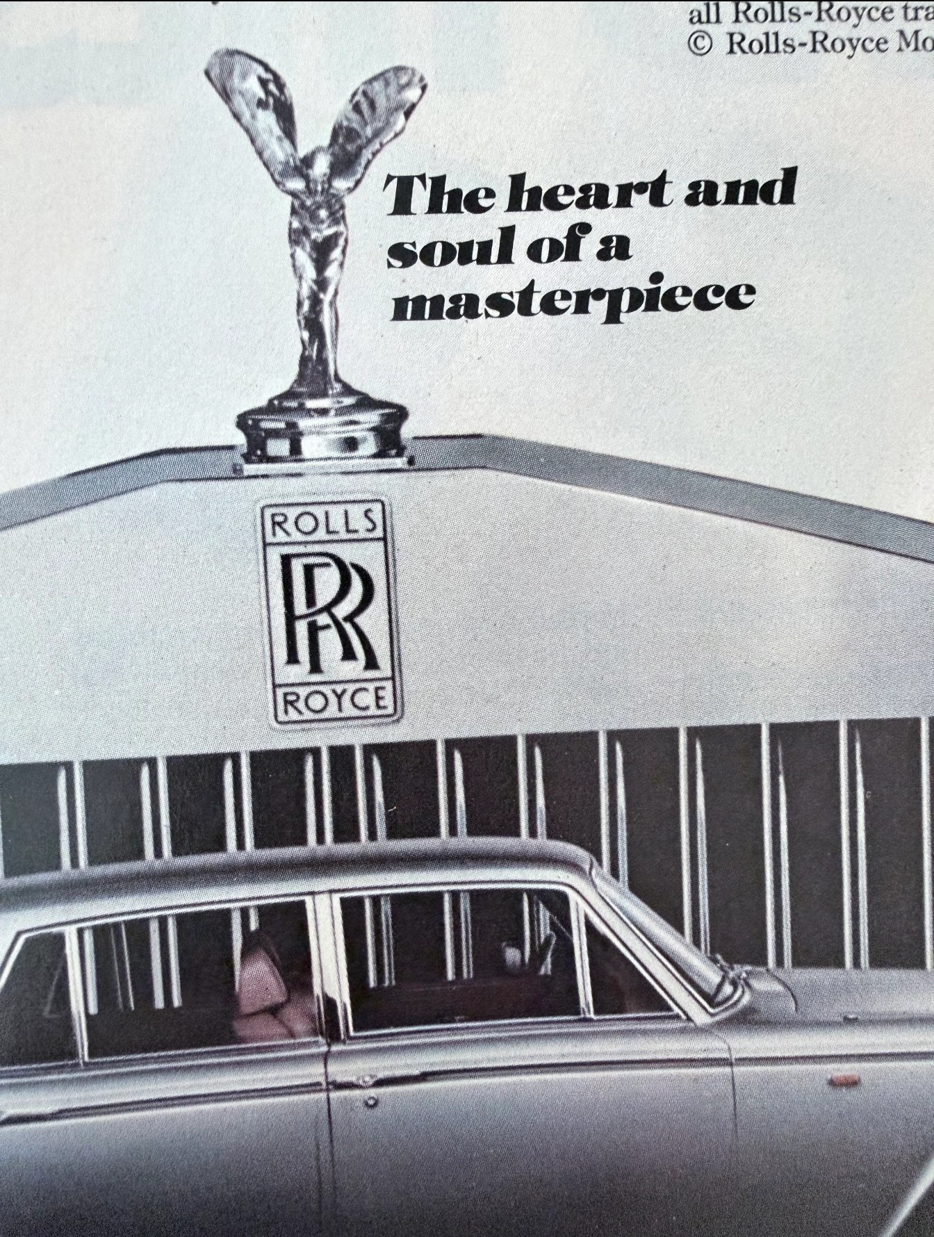
Roll Royce · Automotive
THE TIME TRAVELER'S DOSSIER: THE ENGINEERING OF IMMORTALITY AND ARISTOCRATIC AESTHETICS
The artifact under exhaustive, uncompromising, and unprecedented museum-grade analysis is an exceptionally preserved Historical Relic originating from the absolute zenith of British automotive engineering and aristocratic luxury. This Primary Art Document is a monumental, full-page theatrical advertisement for the Rolls-Royce Silver Shadow II, forensically and definitively dated to 1977 by the explicit copyright text: "© Rolls-Royce Motors Inc. 1977". This is not a mere car advertisement; it is a "Forensic Manifesto of Absolute Perfection." Published twelve years after the conception of the original 1965 edition, this document heralds the arrival of the refined Silver Shadow II. It aggressively weaponizes the brand's legacy, explicitly stating that more than half of all Rolls-Royce motor cars built since 1904 were still "humming along" in 1977. The visual architecture is dominated by the legendary "Spirit of Ecstasy" mascot, described here as "The heart and soul of a masterpiece", standing guard over the iconic Parthenon-inspired radiator grille. Rescued from the binding of a prestige 1970s periodical, this pre-2000s analog artifact exhibits a beautifully authentic warm ivory oxidation across its surface. This majestic chemical aging transforms a mass-produced piece of luxury propaganda into an irreplaceable, ready-to-frame Primary Art Document of automotive and sociological history. Quick-Reference Summary Table
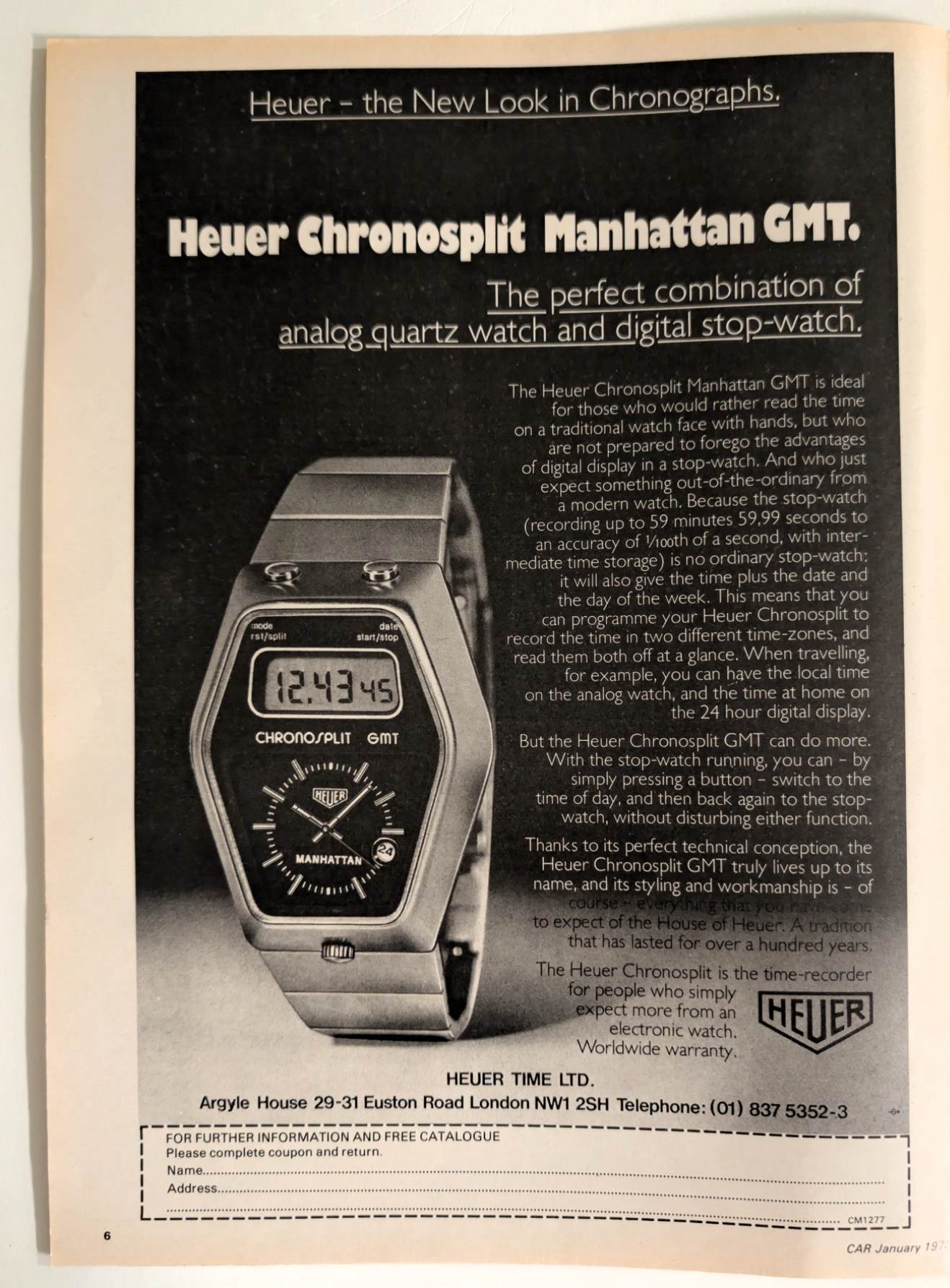
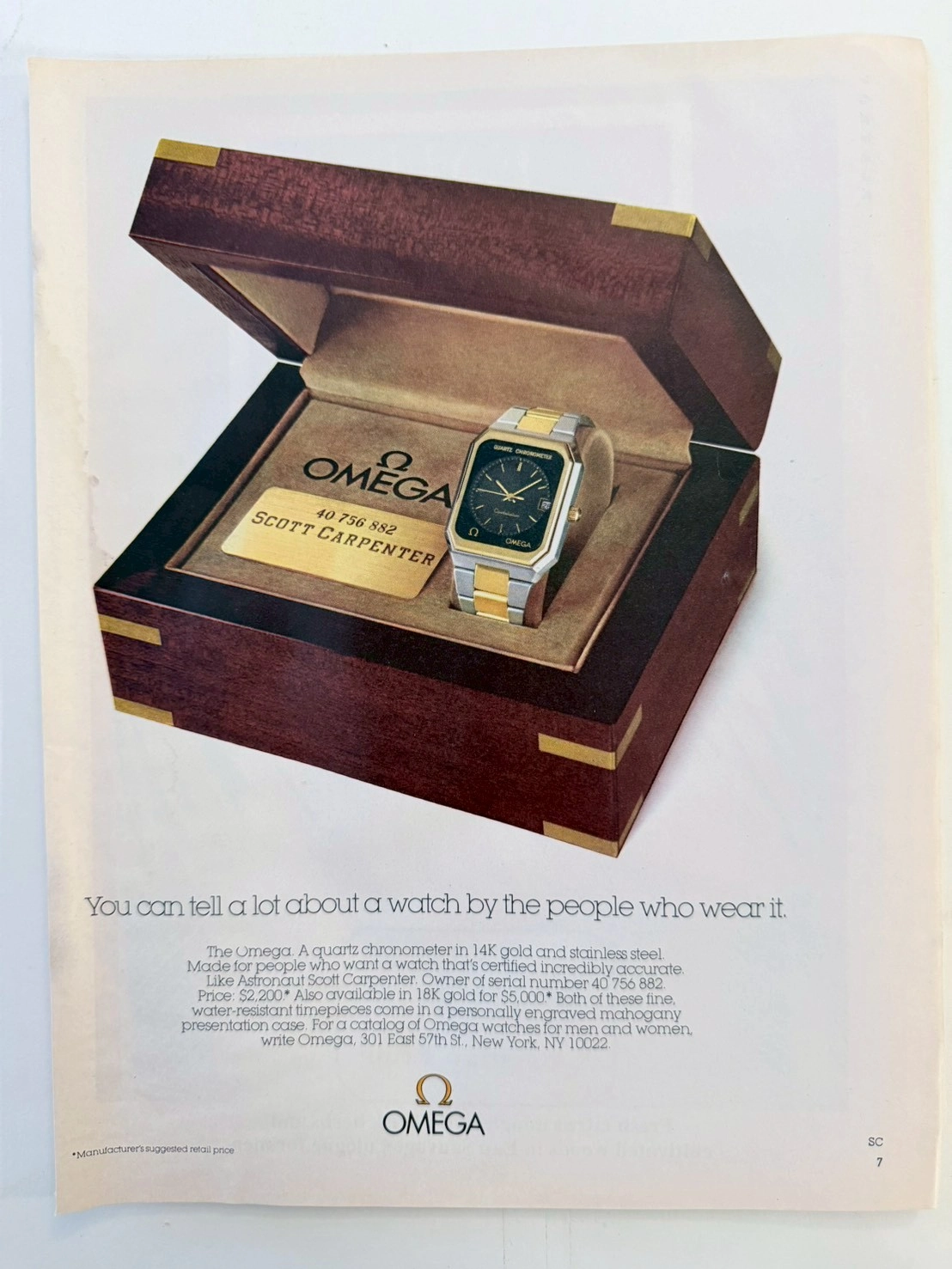
Ahead of Its Time: The 1978 Heuer Chronosplit Manhattan GMT
Rediscover the ultimate analog-digital hybrid timepiece through a rare 1978 vintage magazine advertisement, meticulously preserved as a single sheet cut-out.
The Time Traveller's Dossier: The Engineer's Manifesto – The 1975 BMW 530i and the Birth of the Ultimate Driving Machine
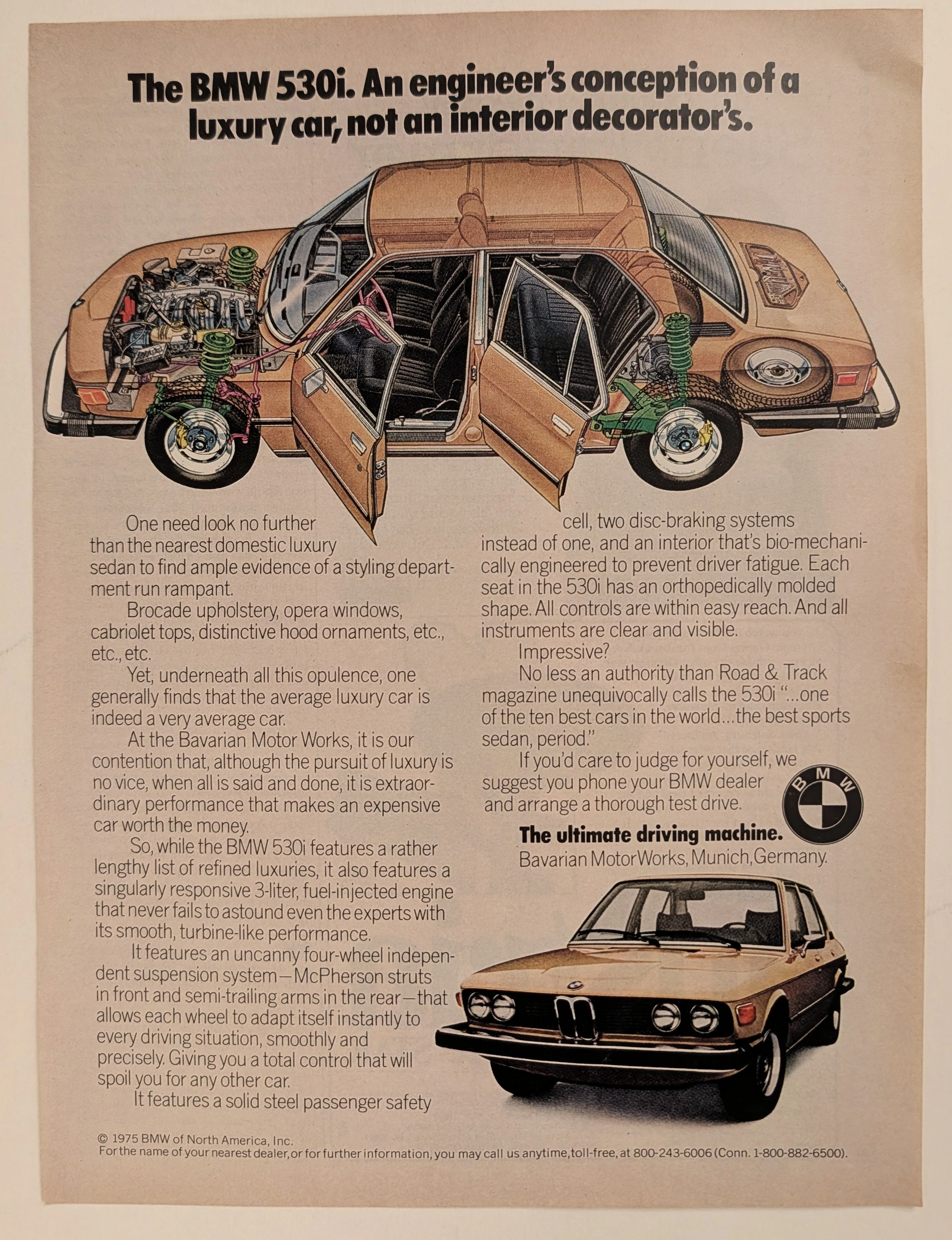
The evolution of the American automotive landscape in the latter half of the twentieth century was fundamentally violently disrupted during the 1970s, an era defined by oil embargoes, shifting economic realities, and a growing consumer disillusionment with domestic manufacturing. Elegantly and securely positioned upon the analytical table of The Record Institute today is a visually complex, densely informative, and highly significant full-page print advertisement for the BMW 530i, definitively dated to 1975 by its prominent copyright macro. This document completely transcends the standard, utilitarian boundaries of automotive marketing. It operates as a highly sophisticated, multi-layered cultural mirror and a bold declaration of war against the prevailing automotive trends of the decade. By juxtaposing the superficial trappings of American luxury—"brocade upholstery, opera windows, cabriolet tops"—against the visceral, mechanical truths of independent suspension and fuel injection, Bavarian Motor Works (BMW) successfully positioned itself as the intellectual and physical antidote to the bloated "Malaise Era" land yachts. This world-class, comprehensive dossier conducts a meticulous, unyielding, and exceptionally exhaustive examination of the artifact, operating under the absolute most rigorous parameters of historical, sociological, and material science evaluation. Dedicating the overwhelming majority of our analytical focus (80%) to its immense historical gravity, we will decode the brilliant, confrontational marketing psychology embedded within the copywriting, analyze the profound mechanical realities of the E12 chassis 5-Series, and detail the historical impact of the visionaries who crafted this campaign. Furthermore, as we venture deeply into the chemical and physical foundations of this analog printed ephemera (10%), we will reveal the precise mechanical fingerprints of the CMYK halftone rosettes captured in the stunning macro imagery of the BMW roundel and the technical cutaway illustration. Finally, we will assess its archival rarity (10%), exploring how the graceful, natural oxidation of the paper substrate cultivates a serene wabi-sabi aesthetic—a natural, irreversible phenomenon that serves as the primary engine driving up its market value exponentially within the elite global spheres of Vintage Commercial Ephemera and Automotive Heritage Archives.