The Time Traveller's Dossier: The Architecture of Slumber – The 1967 Simmons Golden Value
The History
To fully appreciate the immense cultural magnitude and sociological importance of this artifact, one must meticulously contextualize the profound shifts in American domestic life during the 1960s. Following the post-WWII housing boom, the American middle class experienced unprecedented economic mobility. Concurrently, the 1960s witnessed an explosion in commercial travel, leading to the rapid development of high-end hotel and motel chains across the nation. For many Americans, these modern hotels offered a level of climate control, sophisticated design, and ergonomic comfort that surpassed their own homes. Simmons brilliantly recognized this psychological association between travel and luxury.
The headline "FIRST PUBLIC SALE!" emblazoned across the top of the spread is a masterclass in manufactured exclusivity. The copywriting explicitly states, "Simmons hotel mattress redesigned especially for your home." This strategy bypasses the traditional metric of selling a mattress based purely on materials, instead selling the authority of the hospitality industry. The text reassures the consumer: "Hotels rely on experts to select their mattresses... So do you, but you don't need to be an expert. Simmons has taken the guesswork out." It effectively democratizes luxury, offering the working-class consumer the exact same sleep architecture enjoyed by the traveling elite for a highly accessible $49.95.
The visual composition reinforces this narrative of structural superiority. The bottom of the left page features a sprawling, modernist cityscape, suggesting that the very foundation of modern urban development rests upon Simmons engineering. On the right page, a beautifully sketched illustration of a towering hotel building proudly declares, "America's finest hotels choose the individual coil construction of famous Beautyrest". This architectural imagery equates the structural integrity of a steel-and-glass skyscraper with the internal steel coil construction of the mattress, implying unmatched durability.
Further reinforcing consumer trust is the prominent inclusion of the "Good Housekeeping Guarantees" seal. In 1967, this seal was the ultimate cultural proxy for safety, reliability, and value. For the mid-century housewife, who functioned as the primary domestic purchasing agent, this red star and its promise of "replacement or refund to consumer" neutralized any perceived financial risk associated with the $49.95 investment.
Simultaneously, the artifact reveals a fascinating duality in aesthetic trends. While the engineering is marketed as modern and industrial, the visual presentation of the mattress itself clings to European aristocratic signifiers. The "handsome new cover with luxurious quilting" is adorned with repeating heraldic crests featuring a fleur-de-lis and a shield design. This specific semiotic choice provides an aura of old-world royalty to a mass-produced item. Conversely, the side panel introduces the famous "Beautyrest by Simmons" line featuring a deeply traditional, romantic floral pattern, utilizing a higher price point starting at $79.50. This dual-presentation highlights the sophisticated "good, better, best" tiered pricing architecture that defined mid-century retail strategy.
The Paper
As a physical entity, this printed artifact functions as a living, breathing, and profound record of mid-twentieth-century graphic reproduction and substrate chemistry. Under exceptional macro-lens examination, this document reveals the stunning complexity and mathematical precision of analog color printing. The intricate architectural shadows of the modern buildings, the delicate blue and gold threads of the printed heraldic crest, and the crisp, bold typography of the $49.95 price tag are all meticulously constructed from a precise, mathematically rigorous galaxy of halftone rosettes. This intricate pattern constitutes the mechanical fingerprint of the pre-digital analog offset printing press. Microscopic, varying sizes of Cyan, Magenta, Yellow, and Key (Black) ink dots are elegantly and systematically layered at specific angles to trick the human eye and the biological visual cortex into perceiving continuous, vibrant, and dimensional reality.
Yet, the most profound and impactful factor elevating the immense value of this artifact in the contemporary collector's market is the natural, organic, and entirely irreversible process of Material Degradation. The expansive margins and the overall paper substrate exhibit a genuine, unavoidable, and entirely unforgeable "Toning." This gradual, graceful transition from the original bright, bleached manufactured paper to a warm, antique ivory and golden hue is caused by the slow chemical oxidation of Lignin—the complex organic polymer that binds cellulose fibers together within the raw wood pulp of the paper. As the substrate is exposed to ambient oxygen and ultraviolet light over a span of nearly six decades, the molecular structure of the lignin gracefully and systematically breaks down. This accumulation of time, this naturally evolving patina, represents the absolute core of the wabi-sabi aesthetic. The profound appreciation for the beauty found in natural aging, impermanence, and the physical manifestation of history upon a fragile medium is an irreversible chemical reaction. It is precisely this authentic, unreplicable degradation that acts as the primary engine driving up its market value exponentially among elite collectors, as it provides the ultimate, irrefutable proof of the artifact's historical authenticity and its magnificent journey through time.
The Rarity
RARITY CLASS: B (Very Good Archival Preservation with Visible Centerfold Wear)
Evaluated under the most exacting, rigorous, and uncompromising archival parameters, this artifact is definitively and securely designated as Class B.
The remarkable and defining paradox of mid-century commercial ephemera is that these specific documents were produced by the millions as explicitly and intentionally "disposable media." Inserted into thick consumer magazines, they were inherently destined by their very nature to be briefly observed, casually folded, and ultimately discarded. For a large-format, two-page centerfold advertisement to survive since 1967 constitutes a highly significant statistical archival anomaly.
This specific artifact is a highly vulnerable two-page spread. While the rich blues of the typography and the golden yellows of the mattress quilting remain remarkably vibrant and unfaded, close inspection reveals the prominent vertical bindery crease running directly down the center of the image. Along this central fold, there is visible structural stress and slight organic discoloration inherent to the staples or adhesive of the original publication's binding. In the rigorous world of paper archiving, this physical interruption precludes a Class A grading. However, this environmental wear does not detract from its immense value; rather, it authenticates the document's journey. The sheer sociological weight of the subject matter—the translation of hotel luxury to the suburban bedroom—makes this minor structural wear aesthetically acceptable. It is ardently sought after by global curators, domestic historians, and design archivists to ensure its historical permanence through acid-free, UV-protected conservation framing.
Visual Impact
The aesthetic brilliance and psychological power of this artifact lie in its masterful execution of "Scale Juxtaposition." The art director has intentionally manipulated perspective to elevate a mundane domestic object into a monument of modern engineering.
The massive, floating Simmons Golden Value mattress dominates the absolute center of the composition, rendered in sharp, hyper-realistic detail. Beneath it, the sprawling mid-century cityscape is painted in loose, stylized, almost impressionistic strokes of blue and green. This deliberate contrast in rendering styles and scale visually communicates that the mattress is larger than life—a foundational monolith that dwarfs even the city itself. The eye is naturally drawn from the bold, commanding typography of "FIRST PUBLIC SALE!" down to the intricate gold crests of the quilting, and finally out toward the supporting architectural vignettes. It is a seamless, highly effective integration of industrial product photography and aspirational lifestyle illustration.
Exhibition Halls
The Archive Continues
Continue the Exploration
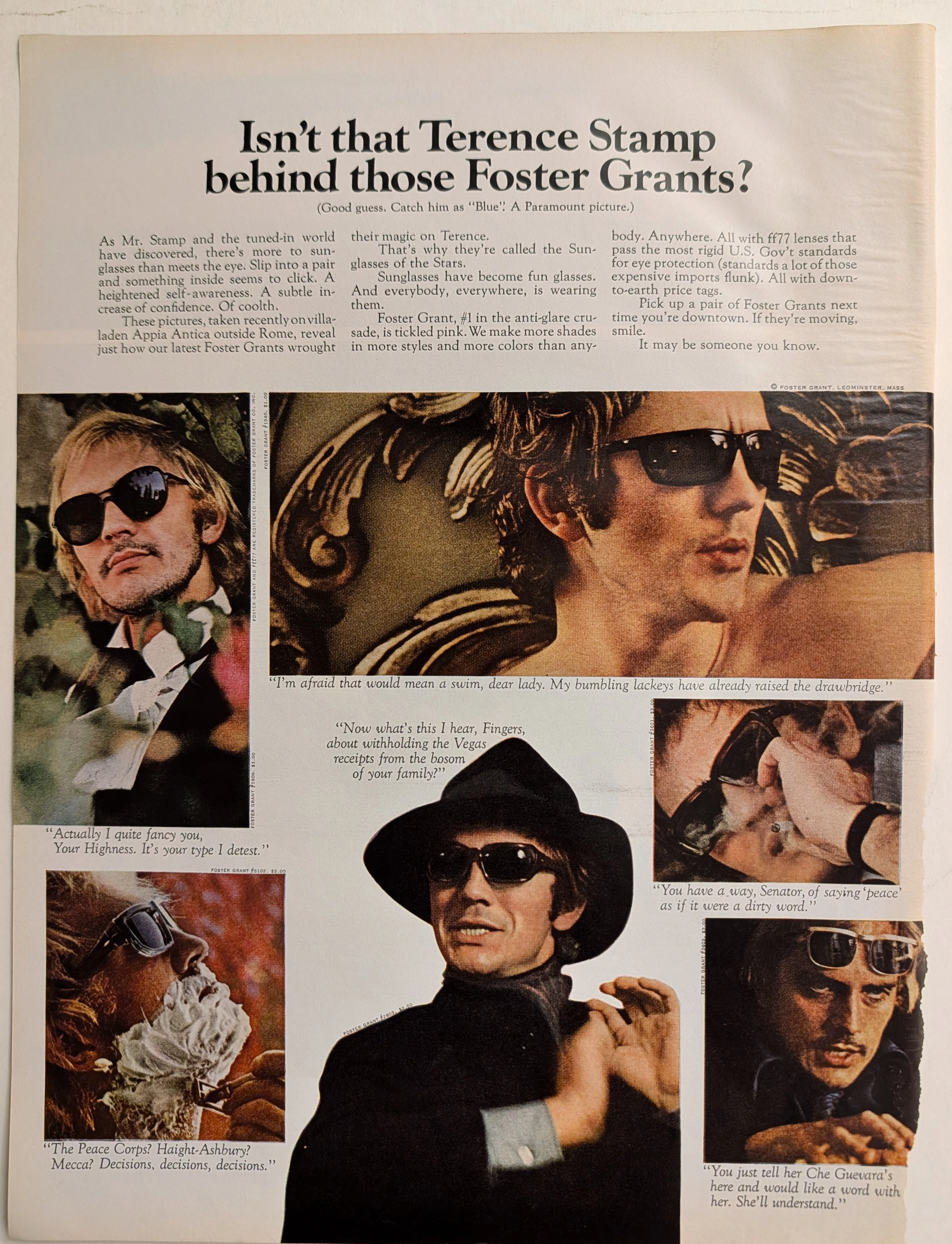
The Time Traveller's Dossier: The Sartorial Armor of Terence Stamp – A Foster Grant Exhibition
The metamorphosis of sunglasses from a purely utilitarian device designed to protect the human cornea into a profound instrument of psychological transformation and sartorial armor is one of the most fascinating narratives in the history of modern fashion. The historical artifact elegantly and securely positioned upon the analytical table of The Record Institute today is a majestic, large-format print advertisement for Foster Grant Sunglasses, featuring the internationally renowned British actor Terence Stamp, originating from approximately 1968. This document completely transcends the traditional boundaries of optical equipment marketing. It operates as a highly sophisticated, multi-layered cultural mirror, reflecting the exact moment when celebrity mystique, mass-market manufacturing, and the volatile sociopolitical crosscurrents of the late 1960s converged on a single printed page. This world-class, comprehensive dossier conducts a meticulous, unyielding, and exceptionally deep examination of the artifact, operating under the absolute most rigorous parameters of historical, sociological, and material science evaluation. We will decode the brilliant advertising strategy that successfully elevated injection-molded plastics to the realm of high fashion, analyze the complex biographical and cultural significance of Terence Stamp as the chosen emissary of this campaign, and dissect the rich, era-defining semiotics embedded within the six distinct personas he portrays. Furthermore, as we venture deeply into the chemical and physical foundations of this analog printed ephemera, we will reveal the precise mechanical fingerprints of the CMYK halftone rosettes and the graceful, natural oxidation of the paper substrate. This precise intersection of visual nostalgia, mid-century commercial artistry, and the immutable chemistry of time cultivates a serene wabi-sabi aesthetic—a natural, irreversible phenomenon that serves as the primary engine driving up its market value exponentially within the elite global spheres of Vintage Fashion Ephemera and Cinematic Memorabilia collecting.
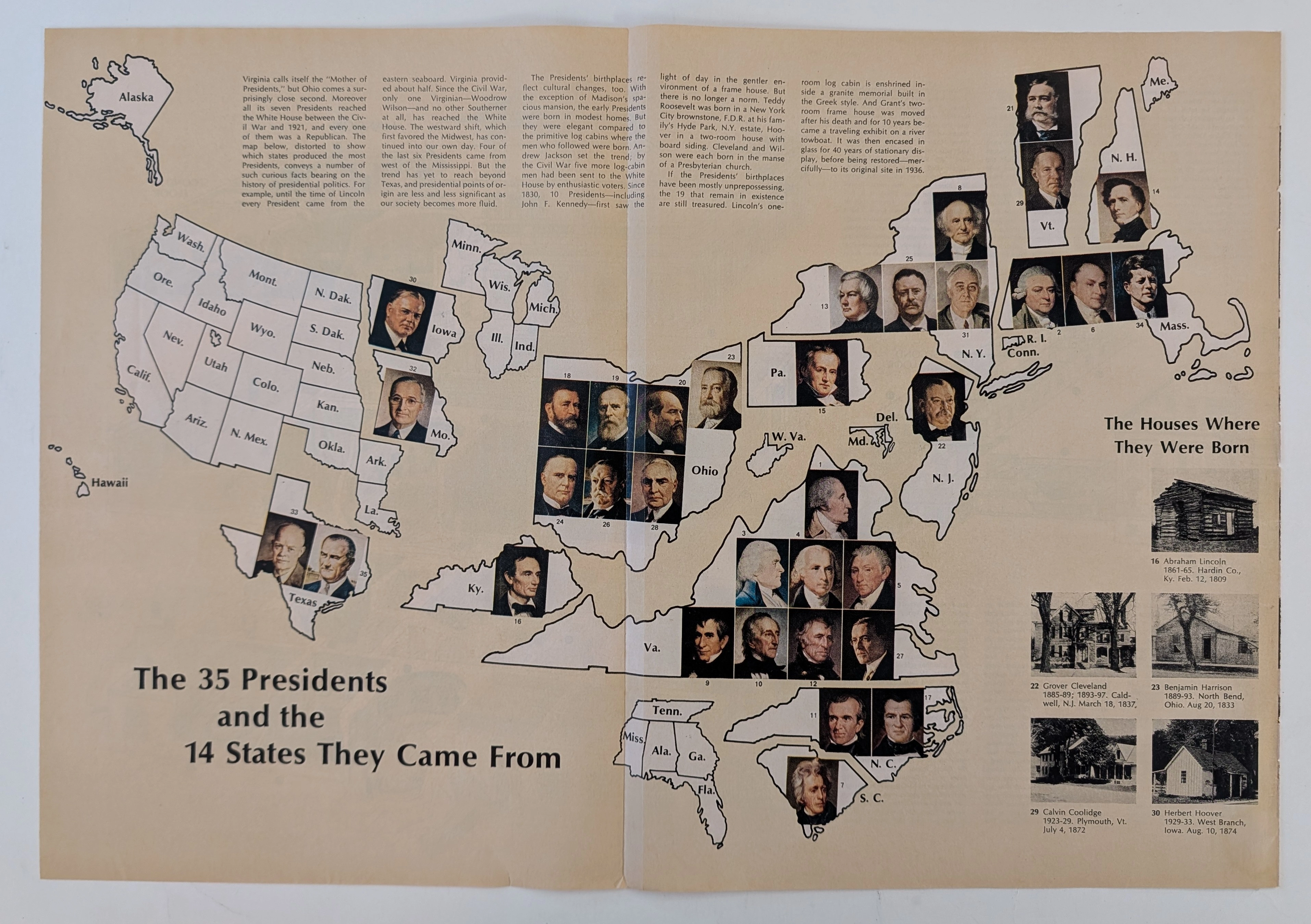
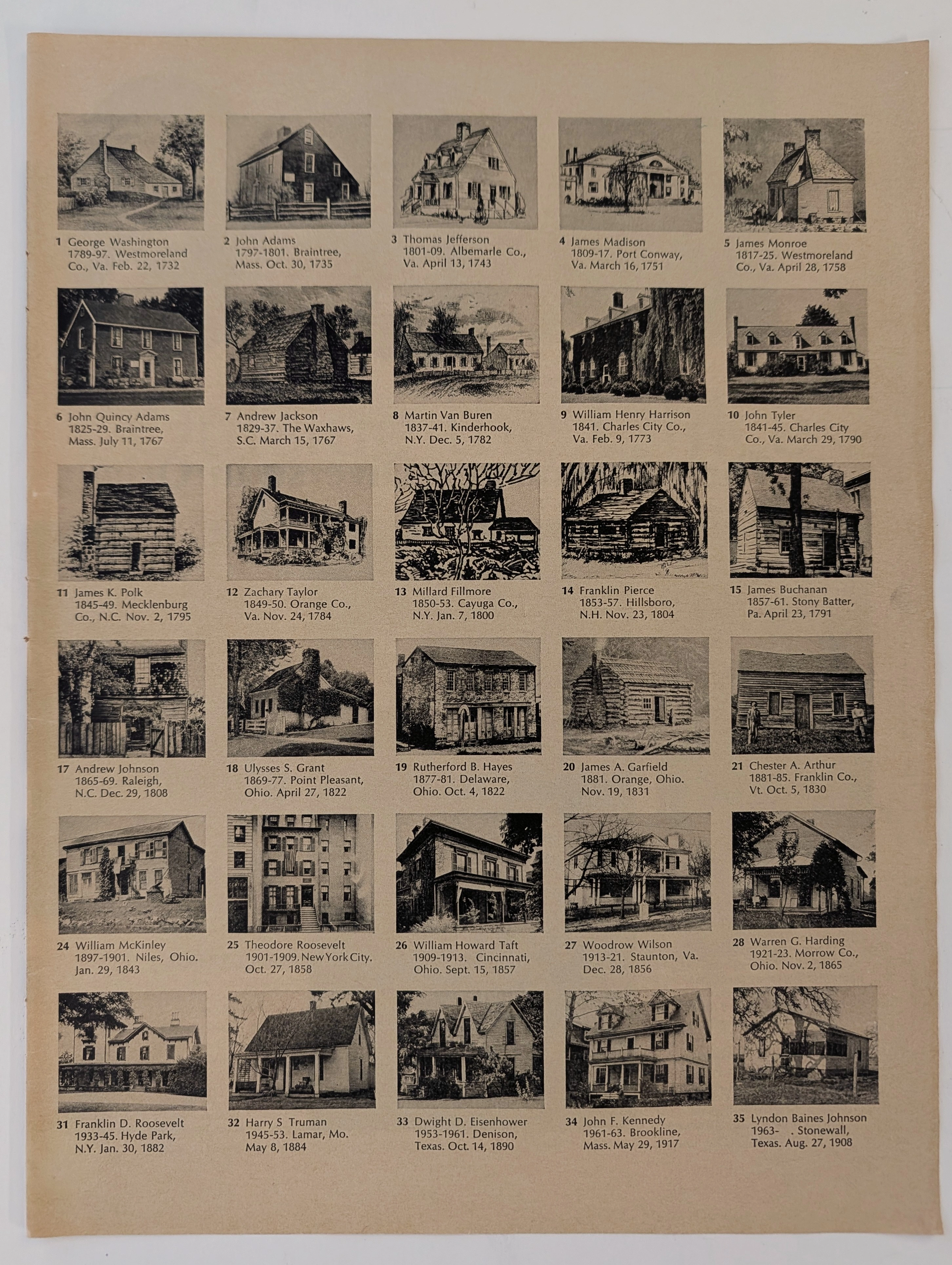
The Time Traveller's Dossier: The Geopolitics of Supreme Power – Cartographic Origins of the 35 U.S. Presidents (Circa Mid-1960s)
The history of supreme executive power is not inscribed solely within the text of legal documents, constitutional amendments, or international treaties; it is deeply rooted in the geographical origins and territorial foundations of political leaders. Long before the modern era of complex spatial data analysis or digital infographics, the structural understanding of state power in the United States was conveyed through the meticulous art of cartographic illustration. The historical artifact presented before us for museum-grade forensic analysis is not merely a conventional fold-out extracted from a mid-20th-century educational publication. It is a profound "geopolitical visual encyclopedia," meticulously compiling and categorizing the geographic birthplaces of the thirty-five individuals who had ascended to the highest office in the White House up to that point in history. This academic archival dossier presents an exhaustive, microscopic deconstruction of the historical and aesthetic framework of the diagram titled "The 35 Presidents and the 14 States They Came From." Operating on a profound scholarly narrative structure, this document decodes the shifting tectonic plates of executive power in the United States—from the foundational era concentrated on the Eastern Seaboard, moving steadily into the Midwest, and ultimately expanding toward the Southern and Western frontiers. Through the highly specialized lens of late-analog print analysis, American political history, and rigorous visual forensics, this document serves as a temporal window. It allows us to explore the foundational roots of the "American Dream" as conveyed through the birthplaces of these statesmen, ranging from humble log cabins to opulent estates, all rendered with the mechanical precision of mid-century offset lithography.
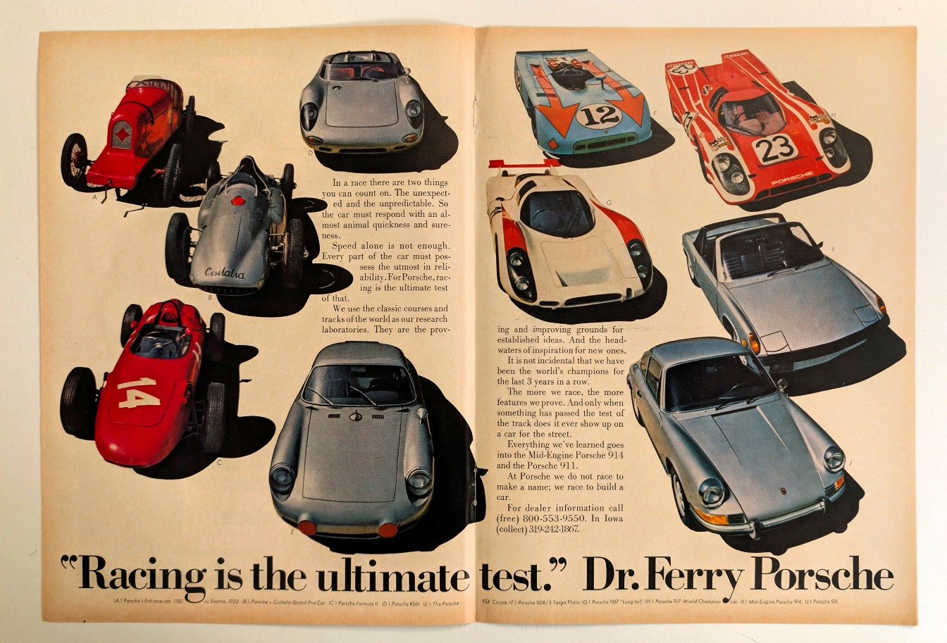
"The Bloodline of Champions: Ferry Porsche's Ultimate Test"
Uncovering the historical lineage of Porsche's motorsport dominance, from the 1922 Sascha to the legendary 917, and how track technology forged the 911.