THE TIME TRAVELER'S DOSSIER: THE KOREAN WAR ANCHOR AND THE SCARCITY OF LUXURY
The History
[ PART I: THE KOREAN WAR ANCHOR AND THE SCARCITY OF LUXURY ]
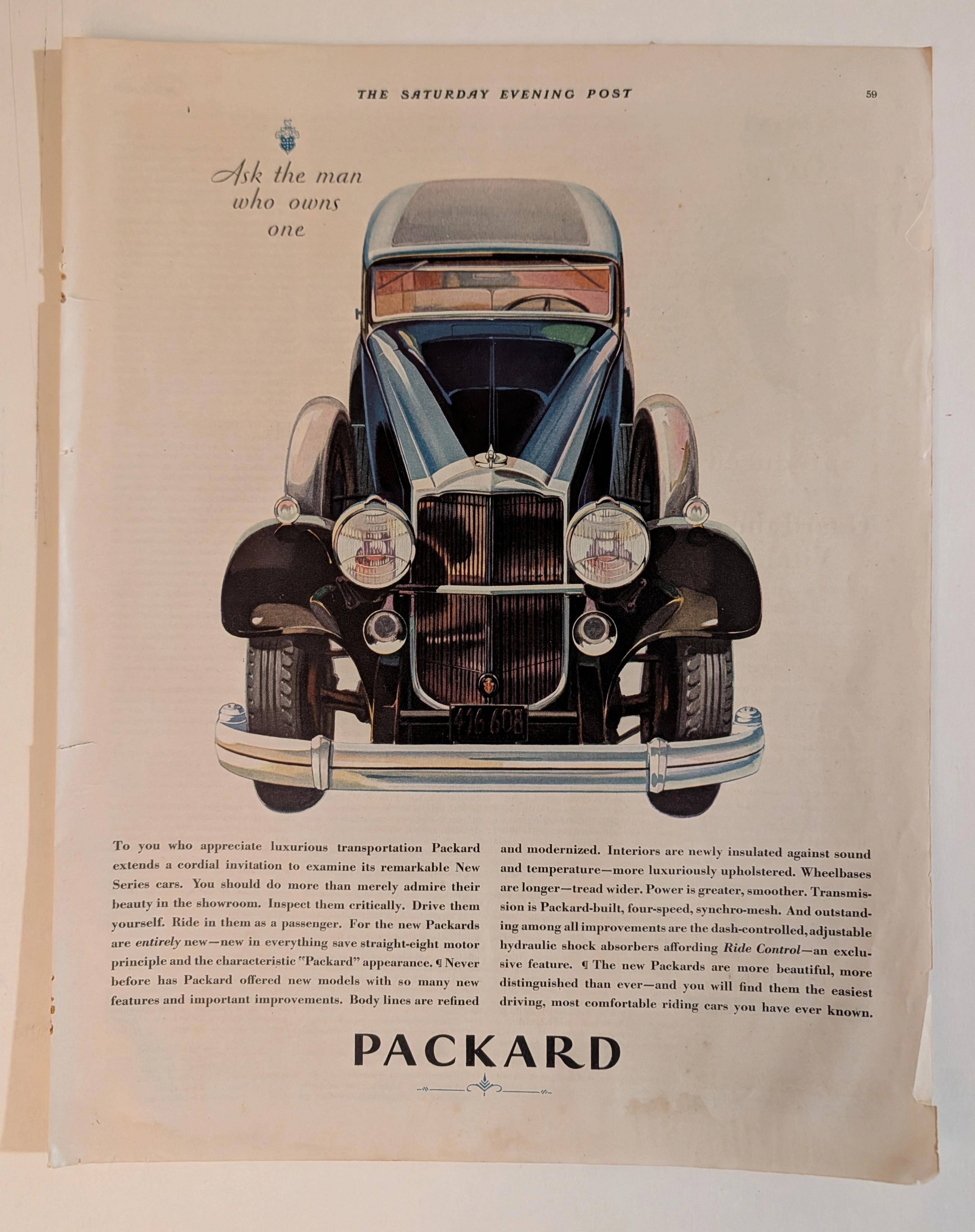
Welcome to the hushed, heavily guarded vaults of American industrial royalty. To merely glance at this document is a severe dereliction of curatorial duty; one must forensically interrogate it. At first glance, this advertisement appears to be a standard, albeit highly opulent, promotion for a luxury automobile. However, the true historical gravity of this artifact is hidden in plain sight, tucked away in the unassuming, capitalized fine print at the bottom left corner.
Direct your analytical focus to the text: "WHITE SIDEWALLS WHEN AVAILABLE".
This single, five-word sentence is the ultimate historical timestamp. It instantly transports us out of the realm of abstract advertising and slams us into the geopolitical reality of the early 1950s. During the Korean War (1950-1953), the United States government, via the National Production Authority (NPA), imposed severe restrictions on civilian access to critical wartime materials. Natural rubber and titanium dioxide (the pigment required to make tires bright white) were strictly rationed for the military effort. Consequently, the production of iconic white sidewall tires—the absolute prerequisite for any respectable luxury car of the era—was federally banned or severely limited.
By printing this disclaimer, Chrysler was not just making an excuse; they were documenting a global crisis. They were telling the wealthiest citizens of America that despite their immense capital, despite being able to afford the "Finest Car America Has Yet Produced!", they still had to bow to the realities of a nation at war. This transforms the advertisement from a mere piece of commercial propaganda into a profound Primary Art Document of sociological and wartime history.
[ PART II: THE PSYCHOLOGICAL ARCHITECTURE OF AMERICAN ARISTOCRACY ]
The United States of America was founded on the violent rejection of monarchy. Yet, the psychological architecture of this advertisement demonstrates a chilling, brilliant paradox: the American elite's desperate, unyielding hunger for royal validation.
Examine the upper hemisphere of the artifact. Before the viewer even registers the automobile, they are assaulted by the iconography of kings and queens. The physical crown, resting upon white ermine fur—the traditional heraldic symbol of sovereignty—is a blatant appeal to old-world European aristocracy. The single, hyper-realistic red rose laid across the tricolor ribbon acts as a symbol of romanticized nobility and exclusivity.
Then, hover your gaze over the meticulously illustrated jeweled Imperial emblem. The artist has rendered every individual diamond, ruby, and gold facet of the crown and the stylized eagle/V-wings with microscopic precision. This is "Social Engineering" at its most potent. Chrysler was locked in a brutal war for high-society dominance against Cadillac and Lincoln. By explicitly using the word "Imperial" in an elegant, sweeping script, and pairing it with literal crowns, Chrysler bypassed rational engineering arguments and attacked the consumer's ego directly. They were not selling a machine; they were selling a knighthood.
[ PART III: THE COPYWRITING — SNOBBERY AS A WEAPON ]
The copywriting in the center of the page is a masterclass in weaponized snobbery and exclusionary marketing. Let us dissect the text line by line.
"You have heard the admiration in the voices of your friends as they spoke of it...". Immediately, the ad establishes social proof. It relies on the assumption that the reader exists within an elite echo chamber where everyone is already discussing this specific vehicle.
"But only after you, yourself, have driven and experienced the Chrysler Imperial's matchless performance will you understand why it is becoming the first choice among the discriminating...". The use of the word "discriminating" is a highly calculated socio-economic dog whistle. It implies that only those with superior taste, breeding, and intellect can truly appreciate the vehicle. Furthermore, the phrase "matchless performance" is a clandestine, heavily veiled reference to the greatest engineering triumph of the era. In 1951, Chrysler introduced the legendary 331 cubic-inch "FirePower" V8 engine—the very first generation of the mythical Hemi. While the ad portrays a serene, aristocratic carriage, underneath the hood of that green hardtop lurked a monstrous, world-beating powerplant that would soon dominate international racing. The ad whispers of luxury but conceals a drag racer's heart.
The paragraph delivers its final, lethal blow: "More and more, those who can afford any motor car in the world, choose the Imperial by Chrysler.". Notice the italicization of the word "any". This is supreme, hegemonic arrogance. It challenges the millionaires. It tells them: You could buy a Rolls-Royce, you could buy a Bentley, but if you truly understand power and prestige, you will buy this.
[ PART IV: FORENSIC ICONOGRAPHY AND MACRO DETAILS ]
At The Record, our curatorial eye misses nothing. The extreme focal points of the vehicle itself reveal the transitional nature of automotive design in the early 1950s.
Direct your attention to the macro-crop of the hood. The front end is dominated by a massive, imposing chrome grille, affectionately known by historians as the "egg-crate" or "waterfall" grille. The artist has perfectly captured the heavy, reflective gleam of the chrome bars. Above it, resting proudly on the deep green hood, is the V-shaped emblem with a subtle gold center, and right beside it, the delicate, almost microscopic silver script reading "Chrysler".
This is a critical detail. In just a few short years (1955), "Imperial" would be spun off into its own distinct, standalone marque, completely dropping the "Chrysler" name to compete directly with Cadillac. This artifact captures the exact historical moment before that divorce—it is still proudly an "Imperial BY CHRYSLER". The deep Forest Green paint job on the 2-door hardtop body (the "Newport" style) reflects the conservative, "old money" aesthetics of the early 50s, standing in stark contrast to the wild, neon tail-fin era that would explode later in the decade.
The Paper
The physical medium of this artifact is just as historically profound as the ink printed upon it. We must maintain absolute, uncompromising reverence for the inevitable, tragic beauty of analog destruction.
Examine the extreme right edge of the entire canvas. You will notice a jagged, uneven, beautifully violent tear running vertically from top to bottom. Amateurs and sterile perfectionists might view this as a flaw or damage. At The Record, we view this as the "Scar of Liberation." It is the physical, forensic proof that this thick, high-quality periodical page was forcefully and purposefully ripped from the binding of a heavy, original 1950s mass-market magazine. It was rescued from an incinerator or a landfill by someone who recognized its artistic value decades ago.
Furthermore, observe the surface of the paper itself. Over more than 70 years, ambient oxygen and ultraviolet light have waged a relentless chemical war against the paper's inherent lignin. This irreversible oxidation process has birthed a magnificent, undeniable "patina." What was once a sterile, bright white background has gracefully degraded into a deep, warm, toasted Antique Ivory. The rich green of the car and the crimson of the velvet crown have sunken deeply into the porous fibers, adopting a soft, matte finish that modern glossy screens cannot replicate.
This is the profound Japanese aesthetic of wabi-sabi—the spiritual realization of finding absolute perfection in impermanence, flaw, and decay. This paper is quietly, literally burning itself alive at a molecular level. Its slow, majestic, and irreversible death is precisely what transfigures it from a disposable piece of mid-century corporate marketing into an immortal piece of Primary Art.
The Rarity
To understand the immense, almost incalculable valuation of this artifact, you must comprehend the brutal reality of ephemera survival from the early 1950s. The post-war era was a time of rapid consumption and disposal. Magazines were read and immediately thrown away.
The statistical probability of a full-page, highly detailed Chrysler Imperial advertisement surviving over seven decades with its colors so vividly saturated, its typography perfectly intact, and its historical "White Sidewall" context preserved is staggeringly, miraculously low.
When you fuse this extreme, pristine physical scarcity with the monumental historical presence of the Korean War rubber shortage, the clandestine birth of the mighty Hemi V8, the explicit sociological signaling of American royalty, and the breathtaking wabi-sabi degradation of its paper stock, this artifact unequivocally commands the highly prestigious Rarity Class A designation. It has evolved far beyond a disposable piece of vintage commercial advertising. It is a highly coveted Historical Relic, a museum-grade testament to mid-century American capitalism and geopolitical reality, demanding to be framed and fiercely protected by an alpha curator who understands the heavy, beautiful, and irreplaceable weight of automotive history.
Visual Impact
The Visual Impact of this extraordinary vertical canvas is a masterclass in psychological manipulation and aristocratic signaling. The architectural layout abandons the typical action-oriented car advertisements of the era; instead, it demands quiet, breathless reverence. The background is a vast, ethereal expanse of pale, warm ivory—a deliberate choice to evoke the walls of a high-society art gallery or the interior of a royal vault.
The upper hemisphere is dominated not by machinery, but by the ultimate symbols of absolute monarchy. A plush, crimson velvet crown rests upon an ermine-trimmed pillow, accompanied by a single, flawless red rose draped over a tricolor ribbon. Hovering below this organic still-life is the meticulously rendered, bejeweled Imperial crown and eagle emblem. This heavy, golden iconography forces the viewer to associate the brand with untouchable European royalty before they even look at the vehicle.
In the lower hemisphere, the Imperial by Chrysler (specifically the Newport 2-door hardtop configuration) is presented in a deeply saturated, aristocratic Forest Green. The car is not moving; it is positioned as a static monument to American industrial wealth. The contrast between the rich green of the coachwork, the vibrant red of the rose and crown, and the oxidized ivory paper creates a three-dimensional depth that is visually arresting. The torn right edge of the page serves as a violent, physical frame—a reminder of its extraction from the real world into the archive.
The Archive Continues
Continue the Exploration
Mattel Electronics Computer Chess 1981 Full-Page Ad | Bruce Pandolfini | Julio Kaplan | Chess AI History | Deep Analysis Rarity Class A
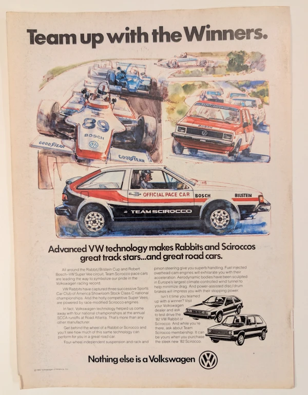
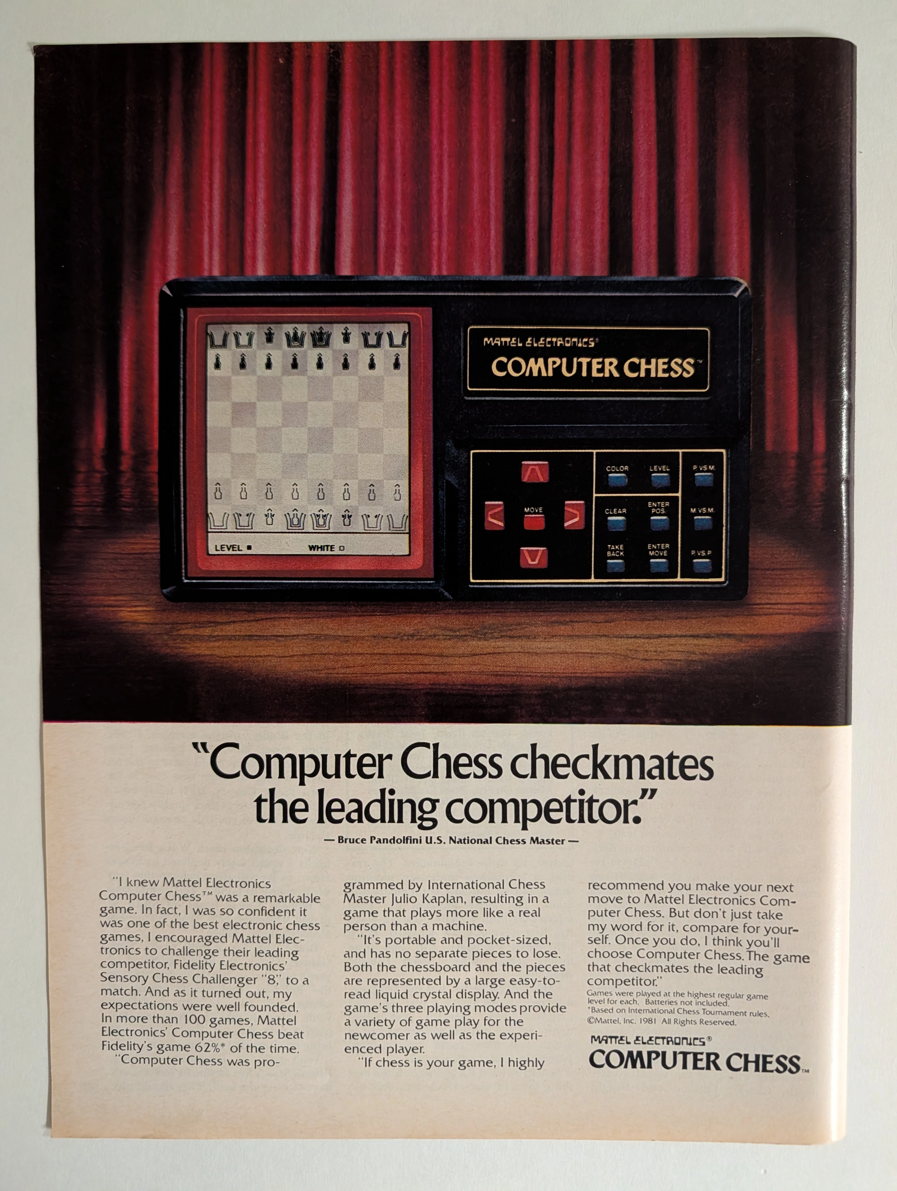
The advertisement analyzed here is a full-page full-color magazine advertisement for the Mattel Electronics Computer Chess™ handheld/tabletop electronic game, copyright © Mattel, Inc. 1981. The ad ran in major American consumer magazines during 1981–1982 — the golden apex of the first electronic game boom. It features a dramatic theatrical photograph of the device spotlit against red velvet curtains on a wooden stage, with a bold competitive claim endorsed by U.S. National Chess Master Bruce Pandolfini: that Mattel's Computer Chess beat Fidelity Electronics' Sensory Chess Challenger '8' in more than 62% of over 100 head-to-head games. The ad also credits International Chess Master Julio Kaplan as programmer. This single page represents the intersection of early consumer AI history, 1980s toy advertising at its most theatrical, and a pivotal moment in the chess-computer arms race that prefigured Deep Blue.
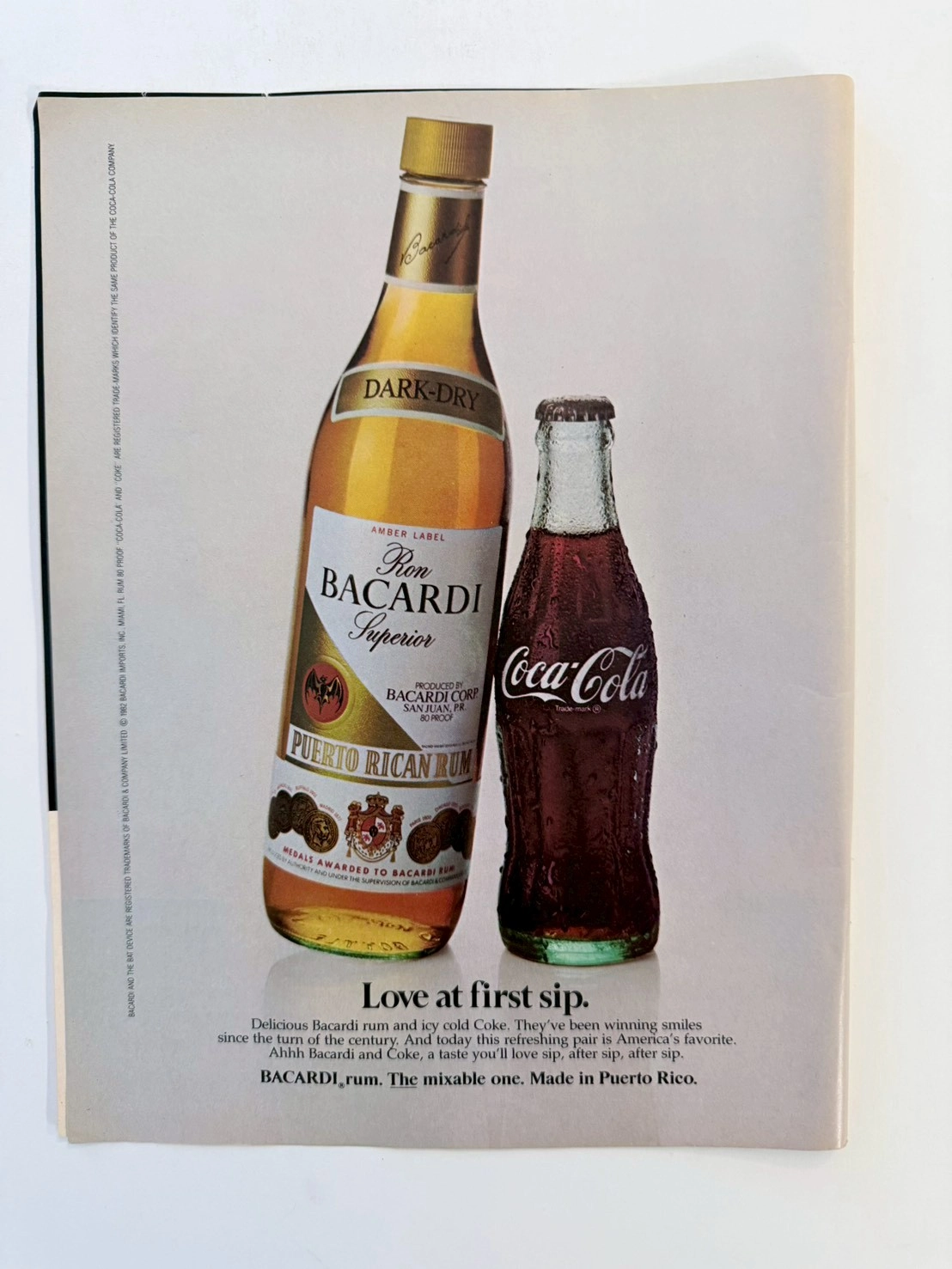
The Treaty of Two Empires: Deconstructing the 1982 Bacardi & Coca-Cola Vintage Ad (Class S)
Dive into the history of American consumerism with this museum-grade analysis of the iconic 1982 Bacardi and Coca-Cola co-branding advertisement. This Class S archival piece captures the definitive shift from the Golden Age of Illustration to 1980s commercial studio photography. Explore the geopolitical legacy of the "Cuba Libre" and the analog practical effects behind the immortal condensation on the Coca-Cola contour bottle.
Gucci x Mercedes Benz · Fashion
THE TIME TRAVELER'S DOSSIER:THE ENGINEERING OF ELEGANCE, THE GUCCI TRUNK, AND THE ARCHITECTURE OF REASON
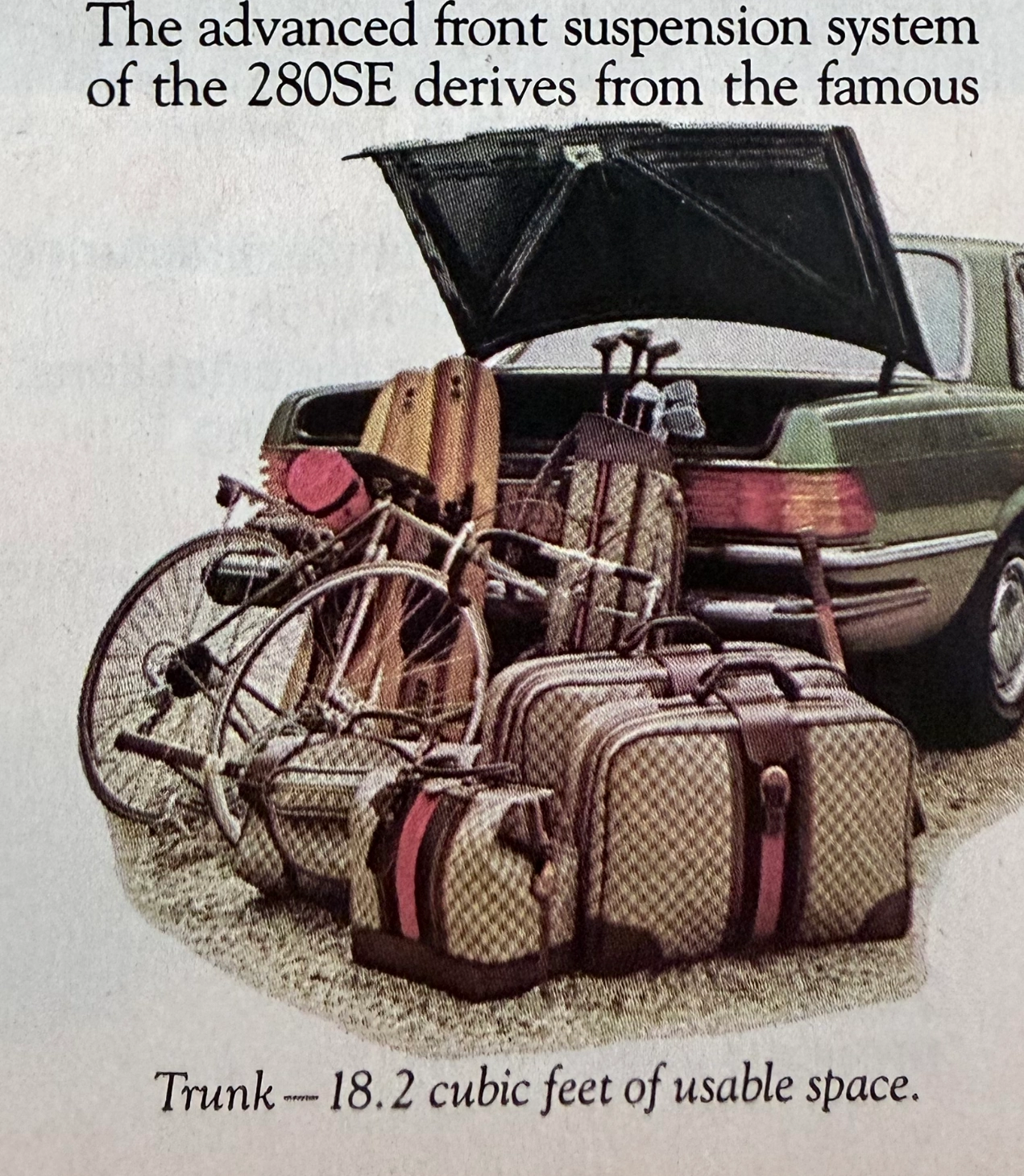
The artifact under exhaustive, uncompromising, and unprecedented museum-grade analysis is a remarkably preserved Historical Relic originating from the absolute zenith of West German automotive engineering. This Primary Art Document is a densely informative, multi-column magazine advertisement for the Mercedes-Benz 280SE Sedan (W116 chassis). This document is a "Forensic Blueprint of Engineered Elegance and Status Commodification." It aggressively markets the 280SE as the "Heir to a Classic," positioning it as a vehicle that inherits the legendary proportions of the 450 Series but is powered by a highly advanced, fuel-injected 6-cylinder engine. The copywriting reads like an arrogant technical dossier, boasting of the "Continuous Injection System" (CIS) and a fully independent "Suspense-free suspension" derived from the legendary C-111 high-speed research vehicle. However, the absolute psychological masterstroke lies in the lower-left illustration. To visually prove the cavernous "18.2 cubic feet of usable space," the artist meticulously illustrated the trunk effortlessly swallowing a bicycle, golf clubs, and a set of Gucci luggage. The unmistakable beige geometric monogram and the iconic red-and-green Web stripe on the suitcases serve as a deliberate, powerful socio-economic signal. It explicitly communicates that the Mercedes-Benz trunk is designed exclusively for the "Jet-Set" elite who travel with Italian haute couture. Rescued from a mass-market periodical, this pre-2000s analog artifact exhibits a beautifully authentic warm ivory oxidation across its surface. This majestic chemical aging transforms a mass-produced piece of technical propaganda into an irreplaceable Primary Art Document of automotive and sociological history.