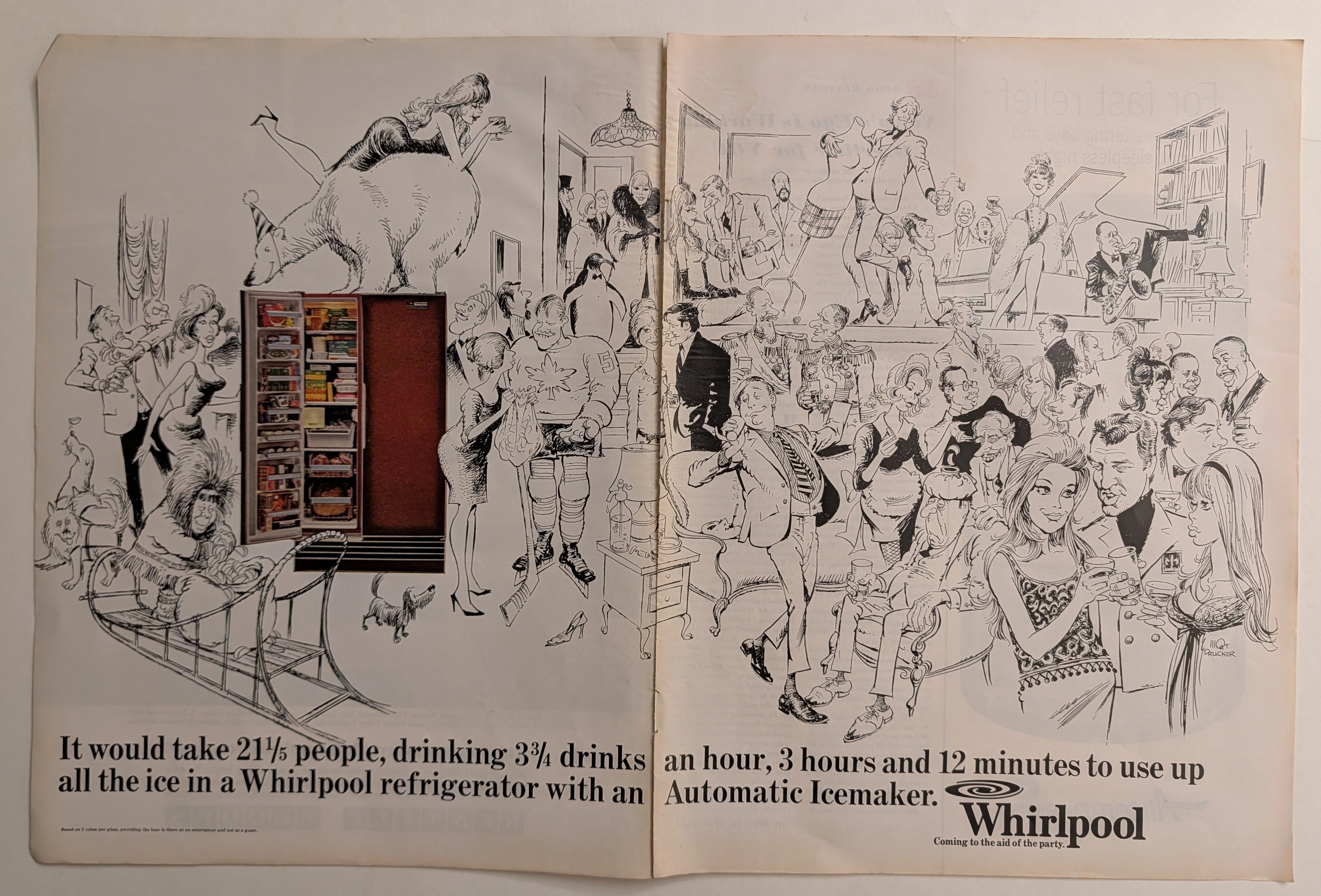
— The Record Institute Journal")
 — The Record Institute Journal")
 — The Record Institute Journal")
The Treaty of Two Empires: Deconstructing the 1982 Bacardi & Coca-Cola Vintage Ad (Class S)
The History
"The Capitalist Treaty in a Single Glass"
Step into the vibrant, high-octane world of 1982. It was the dawn of Reaganomics in America, an era where the booming stock market birthed the Yuppie (Young Urban Professional), and MTV revolutionized visual consumption. Amidst this cultural explosion of speed and excess, this magazine advertisement emerged not merely as a pitch for liquor, but as one of the most culturally potent visual symbols of the 20th century.
Look at the profound simplicity masking an absolute masterstroke of branding. This is an unspoken, unofficial treaty between two global empires. On the right stands Coca-Cola—the quintessential embodiment of American capitalism, daytime innocence, suburban family values, and wholesome Americana. On the left stands Bacardi—the very spirit of Caribbean exile, political resilience, nocturnal rebellion, and sultry rhythm. By placing these two iconic bottles side-by-side under the brilliant glare of studio strobes, Madison Avenue erased the boundary between the sacred and the profane. They didn't just sell a cocktail; they democratized evening sophistication, proving that American consumerism could absorb, blend, and perfect any cultural export.
"The Anatomy of the Exiled Empire and the Atlanta Elixir"
Behind the condensation of these glass bottles lies a sweeping epic of revolution, exile, and industrial genius:
Bacardi (The Exiled Empire & The Immortal Bat): The story begins in Santiago de Cuba in 1862, when Don Facundo Bacardí Massó revolutionized the rum industry. He took "Aguardiente"—a harsh, throat-burning grog favored by pirates—and tamed it using a proprietary charcoal mellowing process, creating a refined, amber spirit. The iconic Fruit Bat (Murciélago) logo was suggested by his wife, Doña Amalia, who discovered a colony of bats in the distillery’s rafters. In Spanish and Taino folklore, the bat is a harbinger of good health, family unity, and fortune.
But the true gravity of this artifact is rooted in survival. In 1960, Fidel Castro’s communist regime confiscated Bacardi’s Cuban distilleries and assets without compensation. Yet, the Bacardi family executed one of the greatest corporate escapes in history. Foreseeing the political collapse, they had already smuggled their most prized possession out of the country: "La Levadura Bacardi"—the proprietary, closely guarded yeast strain responsible for the rum's unique flavor profile. The text on this ad, "Produced by Bacardi Corp, San Juan, P.R.," is a quiet act of defiance. It is a declaration that the soul of Cuba was not in the soil controlled by Castro, but within the liquid in this bottle.
Coca-Cola (The Enigmatic Vessel): Born in an Atlanta pharmacy in 1886, Coca-Cola is the undisputed elixir of globalization. The glass "Contour Bottle" dripping with moisture in this image is a masterclass in industrial design. Commissioned in 1915 to the Root Glass Company, designer Earl R. Dean was given a seemingly impossible brief: "Create a bottle so distinct that it can be recognized by touch in the dark, or even if it lies shattered on the ground." Inspired by the grooved, bulbous shape of a cacao pod, Dean forged a silhouette that became more recognizable globally than the American flag.
The "Cuba Libre" Legacy: While the advertisement prudently uses the sanitized tagline "Love at first sip," every historian knows the true, blood-soaked name of this concoction: the Cuba Libre. Born in the smoldering aftermath of the Spanish-American War around 1900, at The American Bar in Havana, a U.S. Army Signal Corps captain mixed his newly imported Coca-Cola with local Bacardi rum and a squeeze of lime. He raised his glass to the newly liberated nation and toasted, "¡Por Cuba Libre!" (To a Free Cuba!). This 1982 advertisement brilliantly distills a century of heavy geopolitical history into a glossy, effortless 80s lifestyle moment.
"The Deep Context: The Aesthetics of Speed and Commercial Realism"
The early 1980s served as the official obituary for the "Golden Age of Illustration." The romantic, hand-painted gouache and watercolor masterpieces that defined the 1950s were suddenly deemed antiquated and slow. The advertising world was violently overtaken by the "Commercial Studio Photographer"—wizards of lighting, practical effects, and hyper-realism.
Analyze the sheer brilliance of the copywriting strategy: "The mixable one." In the high-speed, Wall Street-driven 1980s, Bacardi did not try to market itself as a pretentious, brooding single malt scotch that demanded quiet contemplation. They positioned themselves as the ultimate social lubricant. They understood that the modern consumer wanted instant gratification. You didn't need a mixologist, a shaker, or a recipe book; you just needed Bacardi, Coke, and ice. This exact strategy of "effortless sophistication" is precisely what catapulted Bacardi to become the number-one-selling spirit brand in the world during that decade.
The Analog Charm: The Material Science of the "Sweat"
Take out your jeweler's loupe and inspect the Coca-Cola bottle. Observe the immaculate, perfectly plump droplets of condensation clinging to the glass without running down the curvature.
In the analog world of 1982, devoid of CGI or Adobe Photoshop, this was the breathtaking art of "Practical Effects." The tungsten lights in a professional studio were brutally hot; real ice and natural condensation would evaporate in mere seconds, ruining the shot. To achieve this immortal, mouth-watering "sweat," master photographers would first apply a micro-layer of "dulling spray" to the glass to reduce harsh reflections. Then, using a fine-mist atomizer, they would spray a meticulous mixture of 50% water and 50% Glycerin. The glycerin manipulated the surface tension, allowing the droplets to remain perfectly beaded, completely immune to the studio heat, and capable of catching the specular highlights from the softboxes flawlessly.
Furthermore, the 1980s publishing industry had transitioned from matte, porous paper to heavy, Clay-Coated Glossy Stock. This chemical advancement in paper manufacturing revolutionized Offset Lithography (CMYK printing). The ink no longer bled into the fibers but sat vibrantly on top of the clay coating. This is why the radiant, golden amber of the Bacardi shines with such intense luminosity, juxtaposed against the deep, syrupy, mahogany-black of the Coca-Cola. The faint, sepia-toned oxidation (patina) framing the edges of this page is the authentic footprint of 40 years of aging. It is a visceral, tactile piece of analog alchemy that no high-resolution digital screen can ever truly replicate.
Exhibition Halls
The Archive Continues
Continue the Exploration
Zippo · Tobacco
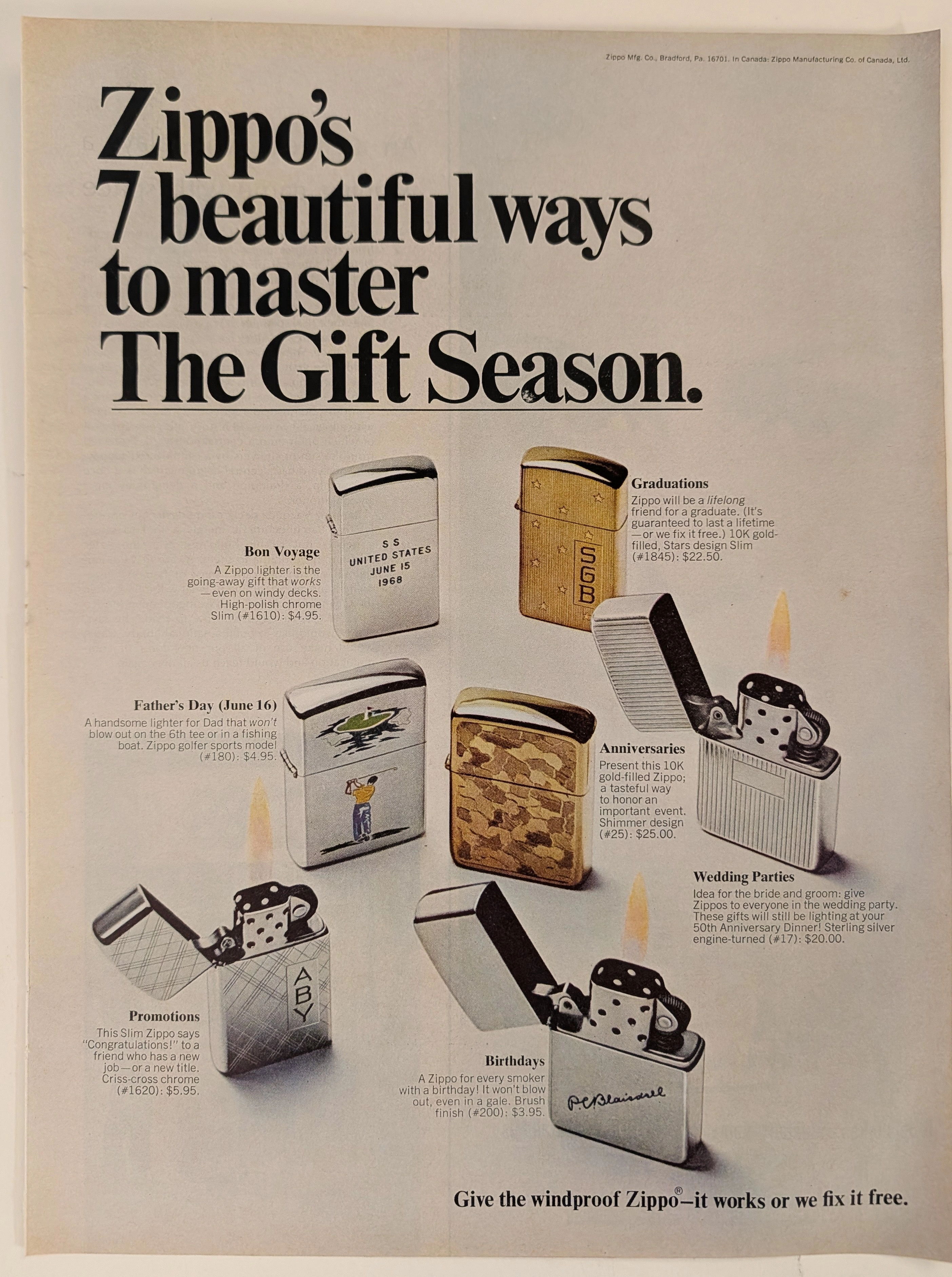
The Time Traveller's Dossier: The Archive of the Immortal Flame – The 1968 Zippo "7 Beautiful Ways" Advertisement
The act of creating fire is a profound symbol of mankind's mastery over nature and the mechanical authority we hold over physical elements. The historical artifact elegantly placed upon the examination table of The Record Institute today is a full-page print advertisement for Zippo from 1968, presented under the campaign "7 beautiful ways to master The Gift Season." This document transcends conventional marketing; it is a flawless psychological projection of the mid-twentieth-century American Dream, encapsulated in metal and backed by a lifetime guarantee. This world-class archival dossier will conduct a meticulous and profound analysis of the artifact, operating under the most rigorous parameters of historical and material science evaluation. We will explore the brand's sophisticated market segmentation through seven occasion-specific lighter models, ranging from high-polish chrome to 10K gold-filled and Sterling Silver editions. Furthermore, we will delve into the magnitude of the legendary declaration, "it works or we fix it free," a promise that confidently challenges the passage of time. Advancing into the chemical foundations of this analog offset lithography, we will reveal the mechanical fingerprints of the halftone rosettes and the natural oxidation of the paper substrate. This precise intersection of metallurgical mechanics and the chemistry of time produces a serene wabi-sabi aesthetic—a phenomenon that serves as the primary engine driving up its market value exponentially within the elite global spheres of Vintage Tobacciana collecting.
Chiquita · Food
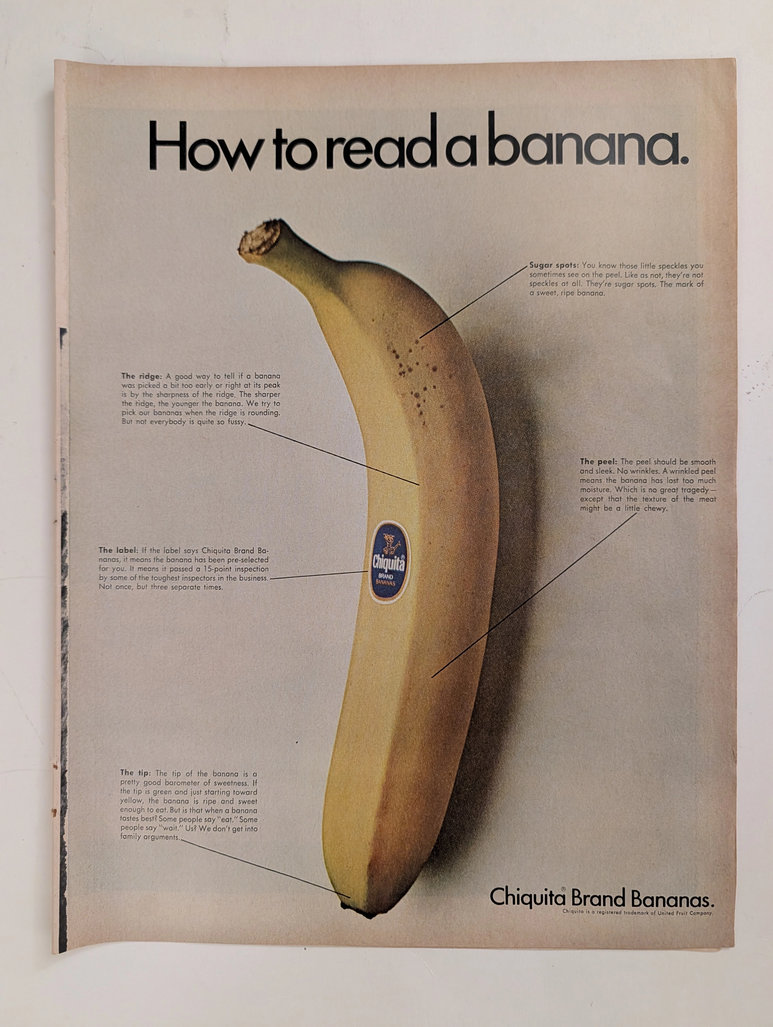
The Time Traveller's Dossier: The Anatomy of a Commodity – Chiquita's "How to read a banana" and the Invention of Produce Branding
The evolution of the mid-twentieth-century American supermarket was defined by the rapid transition from bulk, unbranded agricultural goods to highly packaged, fiercely differentiated consumer brands. The historical artifact elegantly and securely positioned upon the analytical table of The Record Institute today is a striking, full-page print advertisement for Chiquita Brand Bananas, originating from the late 1960s. This document completely transcends the standard boundaries of grocery marketing. It operates as a highly sophisticated, multi-layered cultural mirror, reflecting the precise era when the United Fruit Company utilized educational infographics to train the American housewife to perceive natural biological traits as engineered markers of exclusive quality. This world-class, comprehensive dossier conducts a meticulous, unyielding, and exceptionally exhaustive examination of the artifact, operating under the absolute most rigorous parameters of historical, sociological, and material science evaluation. Dedicating the overwhelming majority of our analytical focus to its immense historical gravity, we will decode the brilliant marketing psychology embedded within the "How to read a banana" campaign, analyze the immense sociopolitical weight of the United Fruit Company, and dissect the profound visual semiotics of the blue Chiquita sticker. Furthermore, as we venture deeply into the chemical and physical foundations of this analog printed ephemera, we will reveal the precise mechanical fingerprints of the CMYK halftone rosettes captured in the macro imagery of the fruit's peel. Finally, we will assess its archival rarity, exploring how the graceful, natural oxidation of the paper substrate cultivates a serene wabi-sabi aesthetic—a natural, irreversible phenomenon that serves as the primary engine driving up its market value exponentially within the elite global spheres of Vintage Commercial Ephemera and Advertising Archives.
Marantz · Entertainment
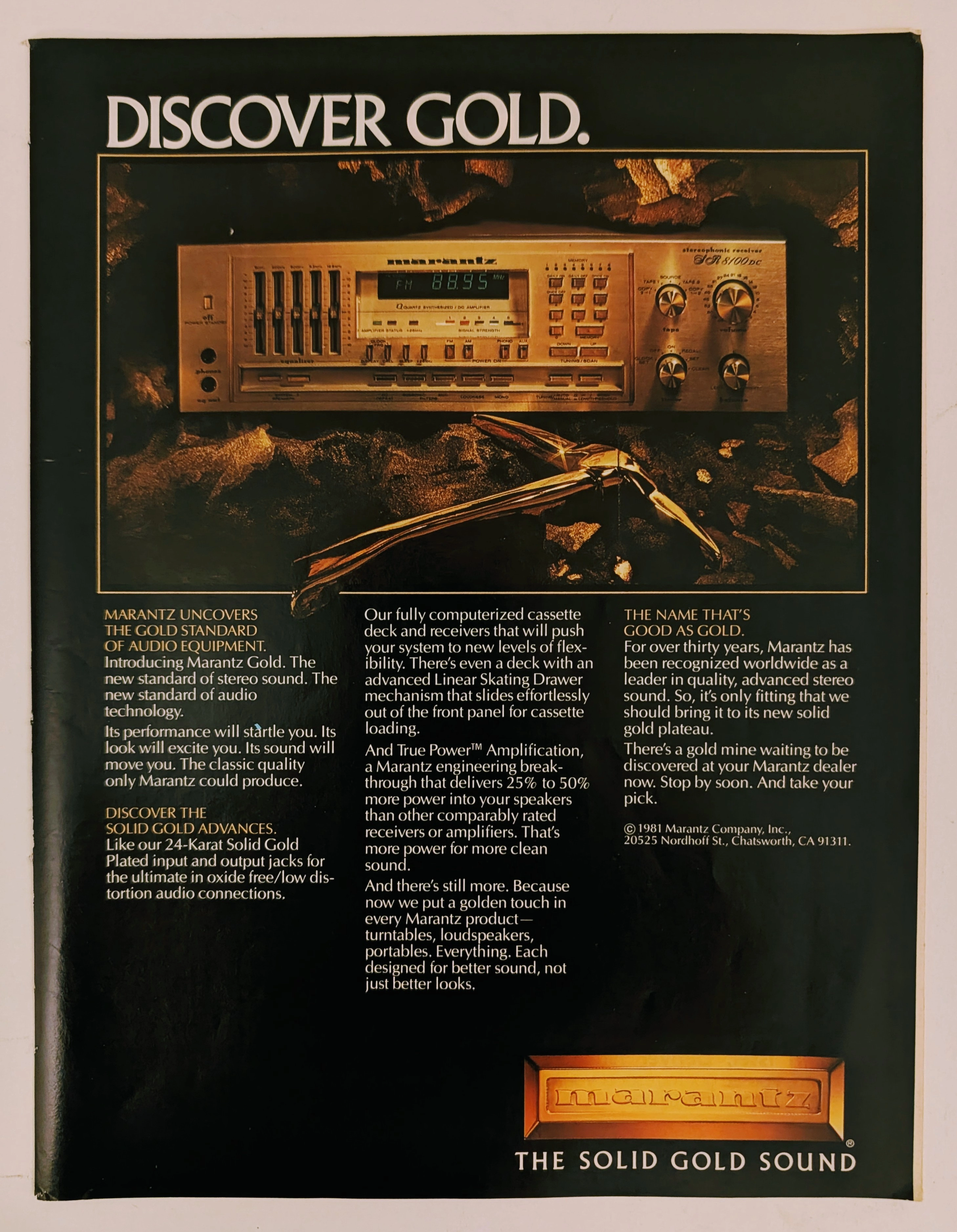
The Time Traveller's Dossier: The Alchemy of Acoustics – Marantz "Discover Gold" Advertisement (1981)
History is not an accidental sequence of events; it is a meticulously engineered illusion crafted by those who command the aesthetic and cultural narratives of their time. Long before digital algorithms could sterilely dictate consumer preferences, the ultimate manifestation of psychological manipulation and corporate alchemy was executed through the calculated precision of the offset printing press and the absolute mastery of analog darkroom photography. The historical artifact before us is not merely a disposable page torn from a vintage magazine. It is a perfectly weaponized blueprint of audio-exoticism, a visual declaration of extreme consumer luxury, and an unwavering testament to an era where electronic hardware was sold not merely as a functional utility, but as a precious, excavated commodity. This museum-grade, academic archival dossier presents an exhaustive, microscopic deconstruction of a 1981 print advertisement for the Marantz "Solid Gold" audio equipment line. Operating on a profound and ruthless binary structure, this document records a calculated paradigm shift within the global consumer electronics industry. It captures the precise historical fracture where silicon, copper, and plastic were conceptually transmuted into a literal, physical embodiment of a precious metal. Through the highly specialized lens of late-analog commercial artistry and stringent visual forensics, this document serves as a masterclass in psychological marketing. It established the foundational archetype for selling technology as a high-yield status symbol—an archetype that unconditionally dictates the visual and strategic totems of the modern high-end audiophile industry today.