


The Time Traveller's Dossier: The Engineer's Manifesto – The 1975 BMW 530i and the Birth of the Ultimate Driving Machine
The History
To fully appreciate the immense historical gravity, cultural magnitude, and sociological importance of this artifact, one must meticulously contextualize the complex, highly specific landscape of the United States automotive industry in 1975. The mid-1970s represented the absolute nadir of American automotive engineering, a period historians refer to as the "Malaise Era." Stifled by sudden, stringent emissions regulations and the psychological shock of the 1973 OPEC oil crisis, domestic manufacturers in Detroit struggled to adapt. Instead of innovating their powertrains, they masked severe performance deficits with excessive, superficial luxury. Cars grew massively in size, floating on soft, disconnected suspensions, and interiors were styled to resemble opulent living rooms, draped in crushed velour and simulated woodgrain.
It is within this exact climate of bloated, underperforming "personal luxury coupes" that BMW launched its rhetorical and mechanical assault, perfectly encapsulated in the headline of this artifact: "The BMW 530i. An engineer's conception of a luxury car, not an interior decorator's." This advertisement marks a watershed moment for BMW in North America. Prior to this era, BMW was known in the US primarily for the 2002, a nimble, quirky, and beloved compact sedan that appealed to a niche group of driving enthusiasts. However, to capture the lucrative executive market, BMW introduced the E12 chassis—the first generation of the 5 Series. The 530i model, specifically engineered for the American market, featured a 3.0-liter, fuel-injected M30 inline-six engine. The copywriter leans heavily into the mechanical superiority of this machine, detailing the "four-wheel independent suspension system—McPherson struts in front and semi-trailing arms in the rear". This wasn't merely a list of parts; it was a philosophical manifesto. By exposing the "guts" of the car in the central illustration, BMW was stripping away the velvet and chrome to reveal the cold, hard, unyielding physics of performance. They were educating a new class of affluent professionals—the precursors to the "Yuppies" of the 1980s—that true luxury was not about isolation from the road, but rather about absolute control over it.
The sociological impact of this marketing strategy is inextricably linked to the brilliant minds behind its creation. This artifact features the debut of one of the most famous and enduring slogans in corporate history: "The ultimate driving machine." This immortal phrase, and the entire philosophical repositioning of BMW in America, was the brainchild of Martin Puris and Ralph Ammirati.
Curatorial Biographical Note: Martin Puris and Ralph Ammirati were visionary advertising executives who founded the legendary New York advertising agency Ammirati & Puris in 1974. Their historical importance to the automotive and marketing industries cannot be overstated. When BMW formed its North American subsidiary in the mid-1970s to take control of its own distribution, they hired Ammirati & Puris to redefine the brand. Puris and Ammirati were the architects who fundamentally revolutionized BMW's brand identity. By coining the slogan 'The ultimate driving machine' and focusing entirely on unapologetic engineering excellence, they successfully repositioned BMW from a quirky European import into the definitive, aspirational vehicle for the affluent, performance-minded American professional, laying the marketing foundation that BMW relies upon to this very day.
The text of the advertisement further cements this repositioning by appealing to external, objective authority, citing Road & Track magazine's unequivocal praise: "...one of the ten best cars in the world...the best sports sedan, period." This was a calculated move to validate the engineer's approach over the decorator's. The artifact documents a moment when consumers were taught to demand more for their money—"extraordinary performance that makes an expensive car worth the money"—rather than settling for "indeed a very average car" hidden beneath "brocade upholstery" and "distinctive hood ornaments."
The Paper
As a physical entity, this printed artifact functions as a living, breathing, and profoundly detailed record of mid-twentieth-century graphic reproduction, technical illustration, and substrate chemistry. Under exceptional, high-magnification macro-lens examination, this document reveals the stunning complexity and mathematical precision of analog color offset printing.
The visual brilliance of this artifact is anchored by its central image: an intricate, hand-drawn technical cutaway illustration. Before the advent of computer-aided design (CAD) and digital 3D rendering, creating an image that seamlessly blended the exterior sheet metal of a car with its internal mechanical components required extraordinary artistic and engineering skill. The illustrator would have utilized a combination of airbrushing for the smooth gradients of the exterior paint, alongside extremely fine technical pens and gouache to detail the McPherson struts, the fuel injection intake runners, and the complex wiring harness.
The macro photography of this illustration, as well as the classic BMW roundel, provides a textbook, museum-grade visualization of a CMYK halftone rosette pattern. The rich golden-bronze hue of the car's exterior, the vibrant green of the suspension coils, and the deep blue of the BMW logo are not continuous, solid swatches of ink. Instead, they are meticulously and flawlessly constructed from a precise, mathematically rigorous galaxy of microscopic ink dots. The Cyan, Magenta, Yellow, and Key (Black) inks are elegantly and systematically layered at highly specific angles (traditionally 15, 75, 90, and 45 degrees respectively) to trick the human eye and the biological visual cortex into perceiving a continuous, dimensional reality out of mere clusters of overlapping pigment. The texture of the uncoated magazine paper stock further illustrates how the liquid ink was absorbed into the organic cellulose fibers, creating a soft, matte finish characteristic of commercial lithography in 1975.
Yet, the most profound and beautifully impactive factor elevating the immense value of this artifact in the contemporary global collector's market is the natural, organic, and entirely irreversible process of Material Degradation. The expansive margins of the page exhibit a genuine, unavoidable "Toning." This gradual, chronological transition from the original bright, bleached manufactured paper to a warm, antique ivory hue is caused by the slow, relentless chemical oxidation of Lignin—the complex organic phenolic polymer that naturally binds cellulose fibers together within the raw wood pulp of the paper. As the substrate is exposed to ambient atmospheric oxygen and ultraviolet light over a span of five decades, the molecular structure of the lignin gracefully breaks down, forming chromophores that darken the paper. This naturally evolving patina represents the absolute core of the wabi-sabi aesthetic. It is precisely this authentic, unreplicable degradation that acts as the primary engine driving up its market value exponentially among elite curators and collectors. It provides the ultimate, irrefutable scientific proof of the artifact's historical authenticity and its delicate, unbroken journey through time.
The Rarity
Evaluated under the most exacting, rigorous, and uncompromising archival parameters established by The Record Institute (which spans a meticulous classification system from Pristine Class A down to Heavily Degraded Class D), this artifact is definitively and securely designated as Class B.
The remarkable and defining paradox of mid-century commercial ephemera is that these specific documents were produced by the millions as explicitly and intentionally "disposable media." Inserted into high-volume, mass-market consumer or automotive publications in 1975, they were inherently destined by their very nature to be briefly observed, casually folded, used as scrap paper, or ultimately discarded into the recycling bins and incinerators of history. For a full-page, graphically complex, and textually dense advertisement to survive entirely intact without catastrophic structural tearing, without destructive moisture staining (foxing), or without the fatal, irreversible fading of the delicate, light-sensitive analog inks constitutes a highly significant statistical archival anomaly.
The structural integrity of this paper remains exceptionally sound. While the rich analog colors—particularly the vibrant greens of the exposed suspension and the metallic gold of the chassis—remain astonishingly vivid, there is a beautiful, mathematically even, natural lignin oxidation reflecting its 1975 origin. This displays a pronounced, warm ivory patina heavily along the margins. This environmental interaction does not detract from its immense value; rather, it authentically validates the document's chronological journey. The sheer sociopolitical and engineering weight of the subject matter—the definitive documentation of BMW's aggressive repositioning in America, the debut of the "ultimate driving machine" ethos, and the masterful analog technical illustration—makes this a highly prized, museum-worthy piece of consumer culture heritage, requiring acid-free, UV-protected conservation framing to ensure its historical permanence.
Visual Impact
The aesthetic brilliance and psychological power of this artifact lie in its masterful execution of "Mechanical Transparency and Didactic Authority." The art director was tasked with communicating invisible, complex engineering concepts to a consumer base accustomed to buying cars based solely on exterior styling and interior plushness. This required a layout that functioned more like a scientific textbook than a traditional fashion-oriented car advertisement.
The composition utilizes a highly effective didactic hierarchy. The eye is immediately arrested by the massive, centralized technical cutaway illustration. This "ghosting" technique visually strips away the golden sheet metal to expose the engine block, the independent suspension system, and the bio-mechanically engineered seating. This is a profound semiotic choice: it explicitly tells the consumer that the true beauty and value of a BMW lie beneath the surface, inherently mocking the superficial "interior decorators" of Detroit. The lower half of the page provides a grounding reality with a standard front-three-quarter photographic view of the vehicle, ensuring the consumer knows what the machine looks like on the street. The dense, multi-column typography below the main image demands intellectual engagement. It does not coddle the reader with empty adjectives; it demands that they read and understand terms like "McPherson struts" and "semi-trailing arms." The bold, austere inclusion of the BMW roundel and the ultimate driving machine slogan in the lower right acts as the final, authoritative stamp of approval. It is a masterclass in utilizing layout to educate the consumer, elevate their expectations, and stroke their psychological desire for intellectual and mechanical superiority.
The Archive Continues
Continue the Exploration
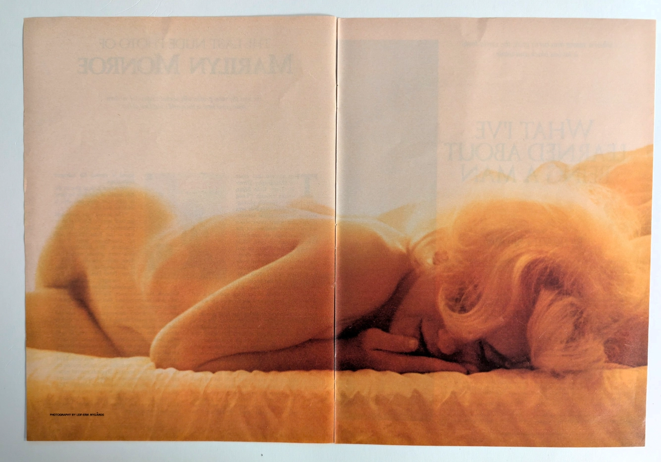
The Final Glimpse of a Legend: The History Behind Marilyn Monroe's Last Nude
Uncover the profound historical significance of the ultimate photograph of the 20th century's greatest pop culture icon, captured by Leif-Erik Nygårds just weeks before her tragic death.
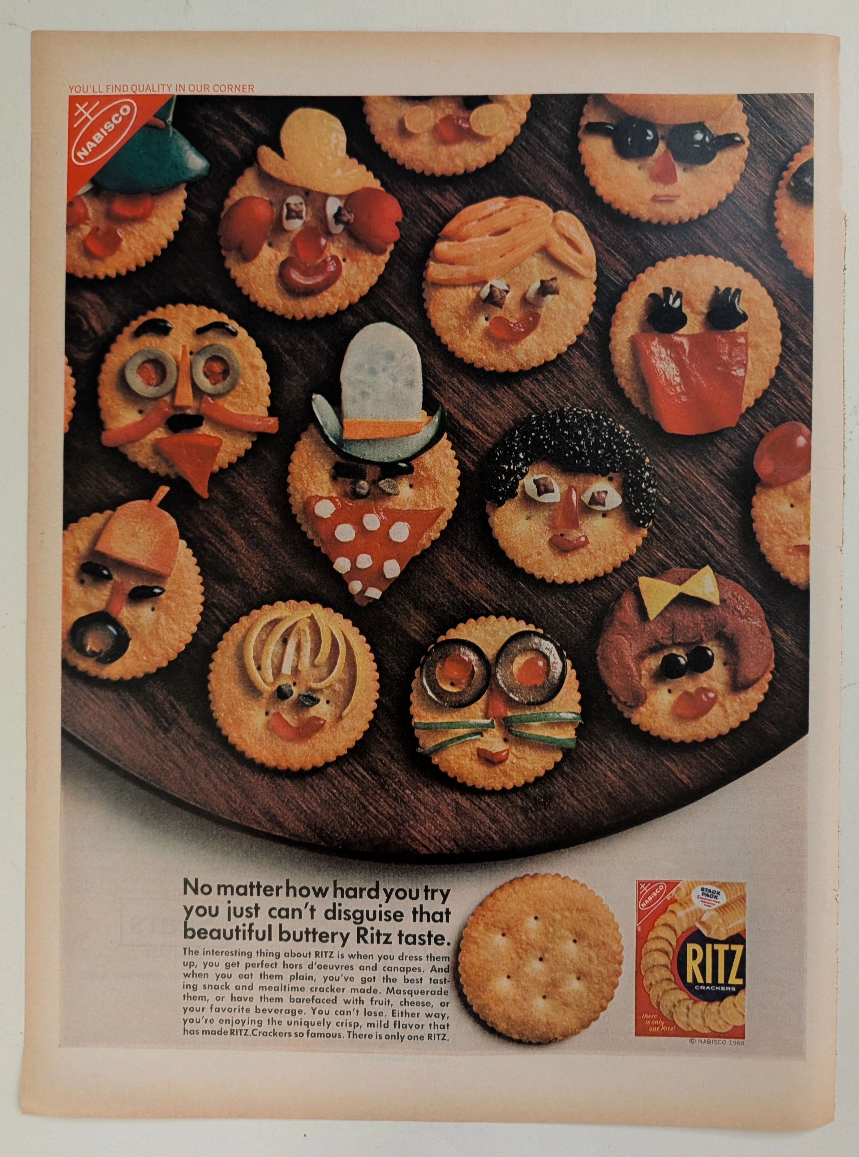
Ritz · Food
The Time Traveller's Dossier: The Masquerade of Quality – Nabisco's 1968 Ritz "Can't Disguise" Campaign and the Golden Age of Snack Branding
The evolution of the twentieth-century American pantry was fundamentally defined by the rise of standardized, nationally recognized "anchor" brands. The historical artifact elegantly positioned upon the analytical table of The Record Institute today is a striking full-page advertisement for Ritz Crackers, originating from 1968. This document represents a pivotal era in consumer psychology where snack foods were repositioned from simple staples to creative culinary canvases. By utilizing playful, anthropomorphic food art—crackers "disguised" as whimsical faces—Nabisco sought to reassure a burgeoning suburban middle class of the cracker's unmistakable "buttery" identity regardless of how it was "dressed up" for social gatherings. This comprehensive dossier conducts a meticulous examination of the artifact, operating under the absolute most rigorous parameters of historical and material science evaluation. We will decode the brilliant marketing psychology of the "Quality in Our Corner" slogan, analyze the profound sociopolitical impact of standardized grocery branding in the late 1960s, and dissect the mechanical fingerprints of the CMYK halftone rosettes captured in macro imagery. Finally, we will assess its archival rarity, exploring how the graceful, natural oxidation of the paper substrate serves as the primary engine driving up its market value exponentially within elite collection circles.
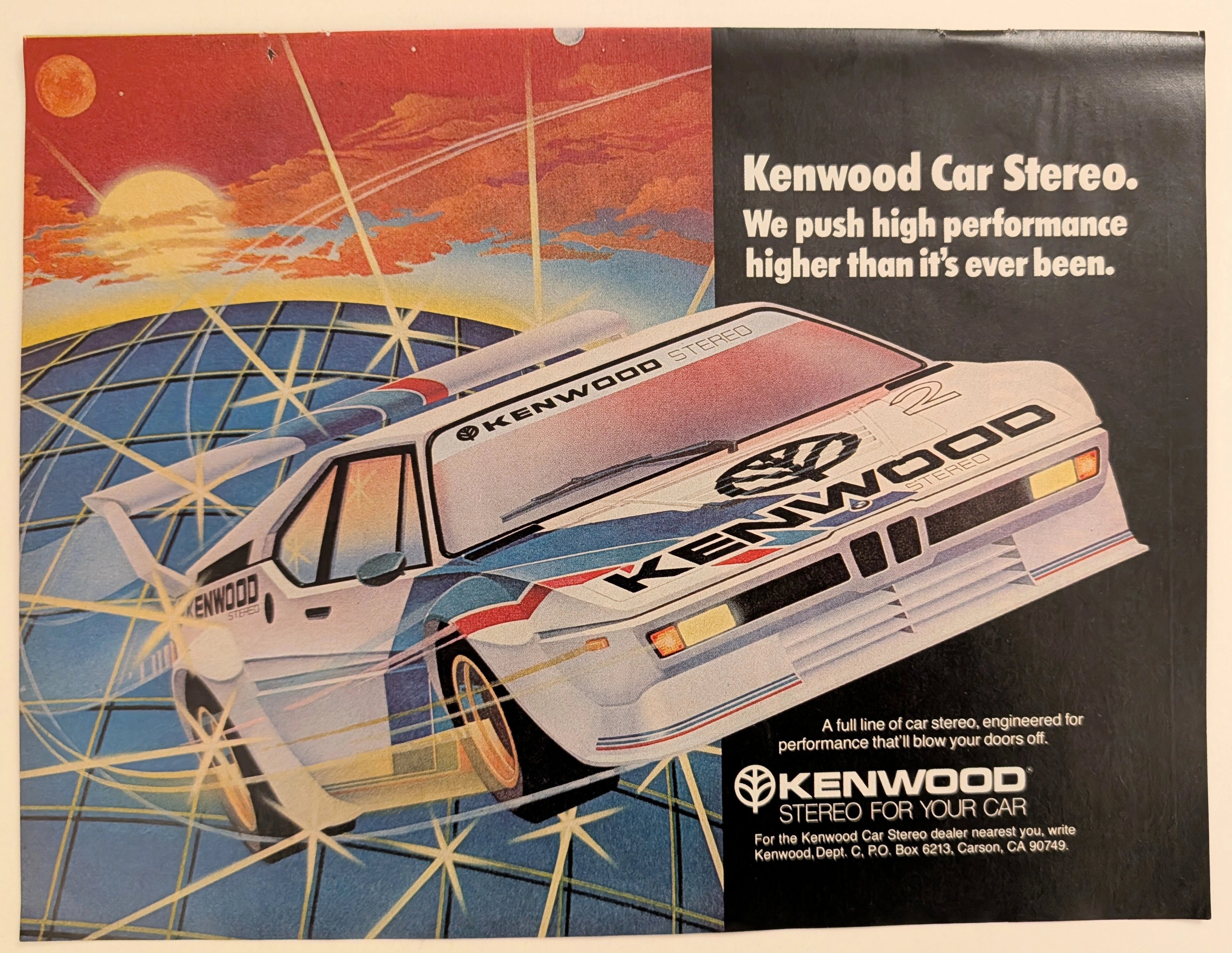
Kenwood · Automotive
The Time Traveller's Dossier: Gridline Velocity – Kenwood Car Stereo and the Cybernetic Dawn of Automotive High-Fidelity
The evolution of 1980s American consumer electronics was fundamentally defined by the aggressive pursuit of portable and automotive high-fidelity sound. Elegantly and securely positioned upon the analytical table of The Record Institute today is a visually arresting, neon-drenched full-page print advertisement for Kenwood Car Stereo. This document completely transcends the standard, utilitarian boundaries of automotive accessory marketing. It operates as a highly sophisticated cultural mirror, reflecting a precise era in consumer psychology where auditory power was directly equated with vehicular performance. By utilizing a breathtaking, airbrushed illustration of a futuristic, aerodynamic race car accelerating over a cybernetic gridscape, Kenwood brilliantly positioned its audio equipment not just as radios, but as extreme, high-octane performance upgrades capable of generating sound that will literally "blow your doors off." This world-class, comprehensive dossier conducts a meticulous, unyielding, and exceptionally exhaustive examination of the artifact, operating under the absolute most rigorous parameters of historical, sociological, and material science evaluation. Dedicating the overwhelming majority of our analytical focus (80%) to its immense historical gravity, we will decode the brilliant marketing psychology embedded within the "neon grid" visual narrative, analyze the profound cultural shift toward aftermarket car audio customization, and dissect the aggressive, performance-based copywriting. Furthermore, as we venture deeply into the chemical and physical foundations of this analog printed ephemera (10%), we will reveal the precise mechanical fingerprints of the CMYK halftone rosettes captured in the stunning macro imagery of the airbrushed car. Finally, we will assess its archival rarity (10%), exploring how the graceful, natural oxidation of the paper substrate cultivates a serene wabi-sabi aesthetic—a natural, irreversible phenomenon that serves as the primary engine driving up its market value exponentially within the elite global spheres of Vintage Commercial Ephemera, Audio History, and Outrun/Synthwave Art Archives.