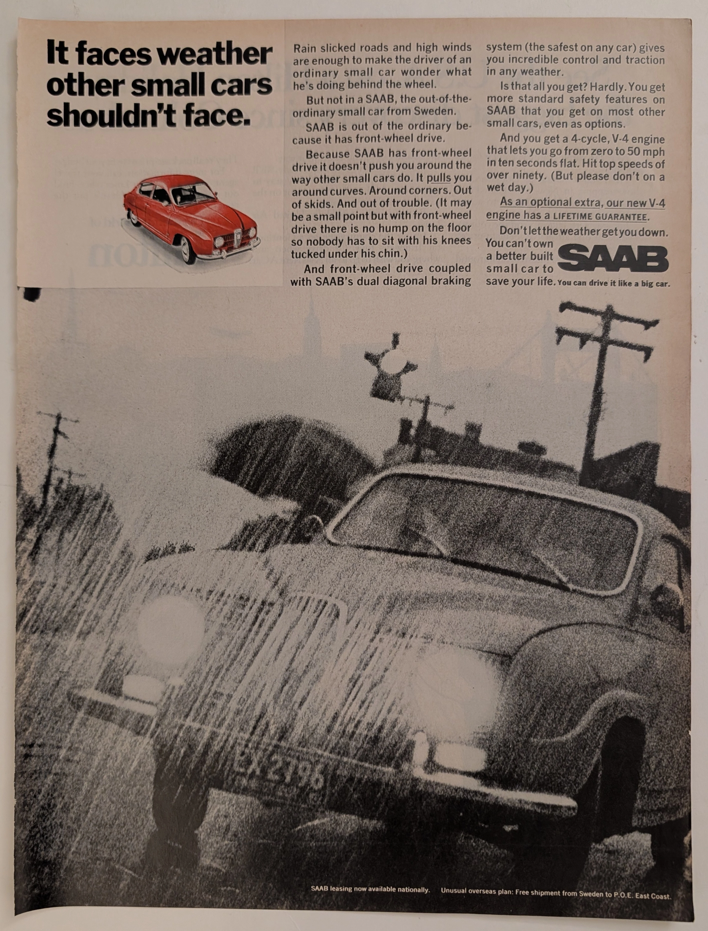
The Time Traveller's Dossier: Gridline Velocity – Kenwood Car Stereo and the Cybernetic Dawn of Automotive High-Fidelity
The History
To fully appreciate the immense historical gravity, cultural magnitude, and sociological importance of this artifact, one must meticulously contextualize the complex, highly competitive landscape of the 1980s mobile audio industry. Prior to this era, factory-installed car radios were largely functional, low-wattage AM/FM receivers equipped with single, paper-cone dashboard speakers. The 1980s, however, witnessed a tectonic shift in youth culture, driven by the advent of bass-heavy electronic music, hip-hop, and hard rock, alongside the proliferation of the high-fidelity cassette tape. The automobile interior suddenly became the primary, isolated environment where young consumers could experience music at concert-level volumes.
This cultural demand birthed the multi-billion-dollar aftermarket car audio industry. Brands like Kenwood, Alpine, and Pioneer engaged in a fierce technological arms race to produce the highest-wattage amplifiers, the most sophisticated graphic equalizers, and the most robust component speakers. The marketing warfare documented in this artifact illustrates a crucial strategy: aligning audio equipment with extreme automotive performance. Kenwood’s headline, "We push high performance higher than it's ever been," is deliberately ambiguous, blurring the lines between engine horsepower and acoustic wattage.
The visual narrative of the advertisement is an absolute masterclass in 1980s commercial illustration. It heavily utilizes the "Cyberpunk" or "Synthwave" aesthetic—a futuristic visual language popularized by early computer graphics, arcade games, and sci-fi cinema (such as Tron). The illustration features a heavily modified, wedge-shaped sports car (evocative of Group B rally cars or IMSA racers of the era, complete with massive aerodynamic wings and wide-body flares) adorned in Kenwood racing livery. The vehicle is depicted traveling at breakneck speed across a glowing, blue wireframe grid, moving toward a stylized, alien sunset with binary moons. Starburst lens flares emanate from the car's headlights and reflections, a staple technique of 80s airbrush artists used to convey intense energy and pristine technological perfection.
This dreamscape effectively communicates to the consumer that installing a Kenwood system is akin to upgrading to a supercar. The closing copywriting is aggressively visceral: "A full line of car stereo, engineered for performance that'll blow your doors off.". This is not a refined appeal to classical audiophiles; it is a raw, adrenaline-fueled promise to a generation that equated acoustic volume with personal power and freedom. It cemented Kenwood's status as a brand for the bold, the fast, and the unapologetic.
The Paper
As a physical entity, this printed artifact functions as a living, breathing, and profoundly detailed record of late-twentieth-century graphic reproduction and substrate chemistry. Under exceptional, high-magnification macro-lens examination, this document reveals the stunning complexity and mathematical precision of analog color offset printing, specifically in how it attempts to reproduce the smooth gradients of hand-painted airbrush art.
The extraordinary macro photographs of the Kenwood logo and the starburst reflections on the vehicle's flank provide a textbook, museum-grade visualization of a CMYK halftone rosette pattern. The vibrant, glowing neons of the wireframe grid and the soft, fiery gradients of the alien sunset are not solid, continuous swatches of ink. Instead, they are meticulously and flawlessly constructed from a precise, mathematically rigorous galaxy of microscopic ink dots. The Cyan, Magenta, Yellow, and Key (Black) inks are elegantly and systematically layered at highly specific angles to trick the human eye and the biological visual cortex into perceiving a continuous, luminous, and dimensional cybernetic reality out of mere clusters of overlapping pigment. The way the sharp, black "KENWOOD" typography sits atop the textured halftone dot matrix of the car's white bodywork is a testament to the immense mechanical pressure and precise registration capabilities of the commercial presses of the era.
Yet, the most profound and impactfully beautiful factor elevating the immense value of this artifact in the contemporary global collector's market is the natural, organic, and entirely irreversible process of Material Degradation. The expansive margins of the page exhibit a genuine, unavoidable "Toning." This gradual, chronological transition from the original bright, bleached manufactured paper to a warm, antique ivory hue is caused by the slow, relentless chemical oxidation of Lignin—the complex organic phenolic polymer that naturally binds cellulose fibers together within the raw wood pulp of the paper. As the substrate is exposed to ambient atmospheric oxygen and ultraviolet light over a span of four decades, the molecular structure of the lignin gracefully breaks down and darkens. This naturally evolving patina represents the absolute core of the wabi-sabi aesthetic. It is precisely this authentic, unreplicable degradation that acts as the primary engine driving up its market value exponentially among elite curators and collectors. When meticulously severed from its original binding as an individual sheet, it provides the ultimate, irrefutable scientific proof of the artifact's historical authenticity and its delicate, unbroken journey through time, making it an exceptionally highly prized candidate for conservation framing.
The Rarity
RARITY CLASS: B (Very Good Archival Preservation with Natural Margin Toning)
Evaluated under the most exacting, rigorous, and uncompromising archival parameters established by The Record Institute (which spans a meticulous classification system from Pristine Class A down to Heavily Degraded Class D), this artifact is definitively and securely designated as Class B.
The remarkable and defining paradox of 1980s commercial ephemera is that these specific documents were produced by the millions as explicitly and intentionally "disposable media." Inserted into high-volume, mass-market consumer or automotive publications, they were inherently destined by their very nature to be briefly observed, casually folded, used as scrap paper, or ultimately discarded into the recycling bins and incinerators of history. For a full-page, graphically complex, and highly color-saturated advertisement to survive entirely intact without catastrophic structural tearing, without destructive moisture staining, or without the fatal, irreversible fading of the delicate, light-sensitive halftone inks constitutes a highly significant statistical archival anomaly.
The structural integrity of this paper remains exceptionally sound. While the rich analog colors—particularly the vibrant, saturated oranges of the sunset and the glowing blues of the neon grid—remain astonishingly vivid, there is a beautiful, mathematically even, natural lignin oxidation reflecting its era. This displays a pronounced, warm ivory patina heavily along the margins. This environmental interaction does not detract from its immense value; rather, it authentically validates the document's chronological journey. The sheer visual impact and sociological weight of the subject matter—the definitive documentation of the aftermarket car audio boom and the zenith of 80s synthwave commercial art—makes this a highly prized, museum-worthy piece of consumer culture heritage, perfectly suited for acquisition as an individual artifact for acid-free, UV-protected conservation framing.
Visual Impact
The aesthetic brilliance and psychological power of this artifact lie in its masterful execution of "Kinetic Futurism and Airbrushed Supremacy." The art director was tasked with communicating the invisible, auditory power of a car stereo using purely visual, static elements, necessitating an illustration that crackled with kinetic energy and aggressive forward momentum.
The composition utilizes a highly effective diagonal tension. The vehicle itself is angled aggressively downward and forward, bursting out of the neon wireframe grid and creating a profound sense of velocity that sweeps from the bottom left toward the typography on the right. The background is a masterwork of 1980s airbrush technique, utilizing smooth, dreamlike gradients to render an otherworldly sky that contrasts sharply with the hard, geometric lines of the blue grid below. The ubiquitous use of starburst lens flares—on the car's edges, the headlights, and the grid intersections—acts as a visual metaphor for high-frequency treble and explosive acoustic clarity. The stark, black right-hand column grounds the chaotic energy of the illustration, providing a severe, authoritative canvas for the bold white typography. It is a masterclass in utilizing commercial illustration to simultaneously educate the consumer on the brand's aggressive identity while intensely stroking their deepest psychological desires for speed, technological superiority, and visceral acoustic power.
The Archive Continues
Continue the Exploration
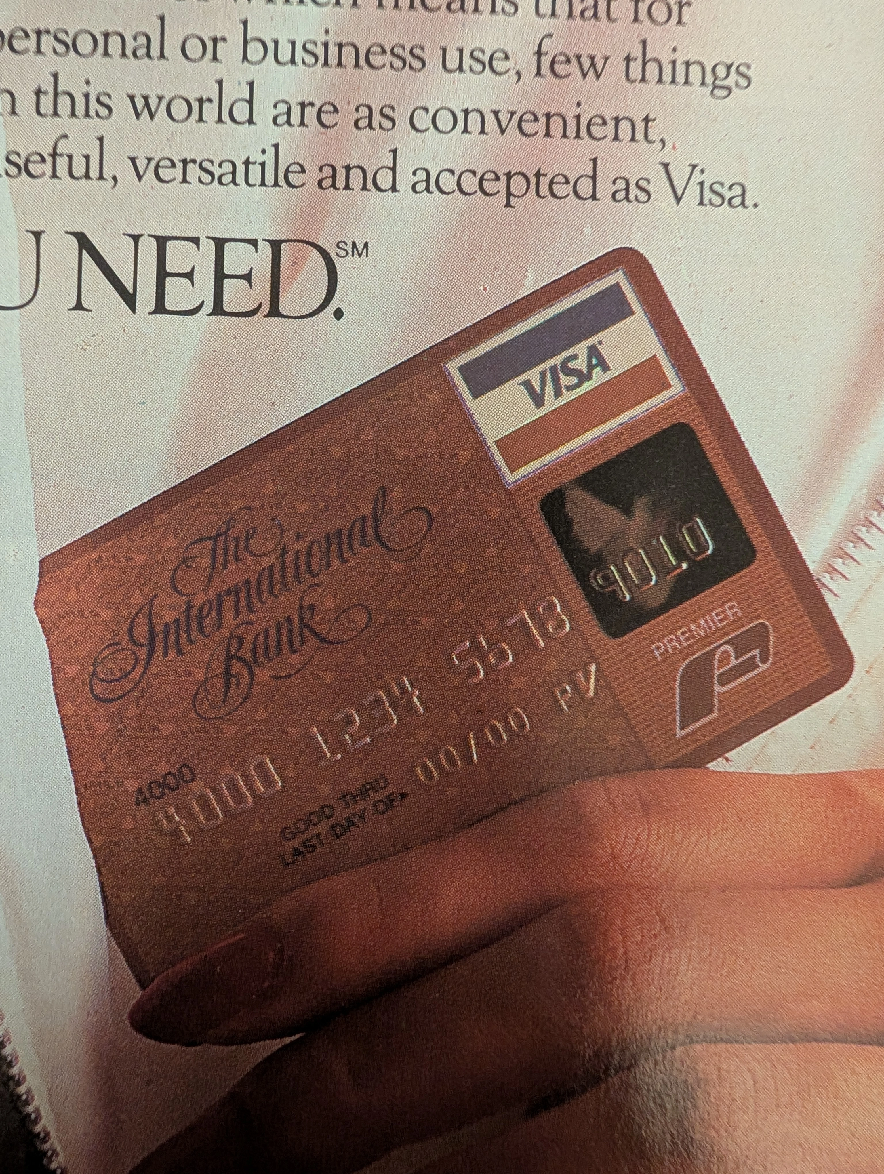
VISA · Travel
The Time Traveller’s Dossier: 1985 Visa Premier Vintage Advertisement — The Passport to Borderless Wealth
Delve into the archives to explore this definitive 1985 Visa Premier vintage advertisement, a piece that serves as far more than mere financial promotion. It is a historical milestone capturing the evolution of global consumerism and the financial services industry. Published during the mid-1980s, an era when international travel became the ultimate status symbol, this artifact stands as a powerful representation of the premium credit card wars for collectors of vintage ads and old advertisements. The "All You Need" campaign fundamentally transformed Visa's image from an everyday convenience into a "financial passport," universally accepted from the exclusive ski slopes of California to the majestic peaks of Switzerland. Unlike classic print ads of previous decades that focused on tangible consumer goods, this piece sells the intangible allure of freedom, security, and elite access. This document remains a profound testament to the dawn of financial globalization and a masterpiece of fintech archival history.
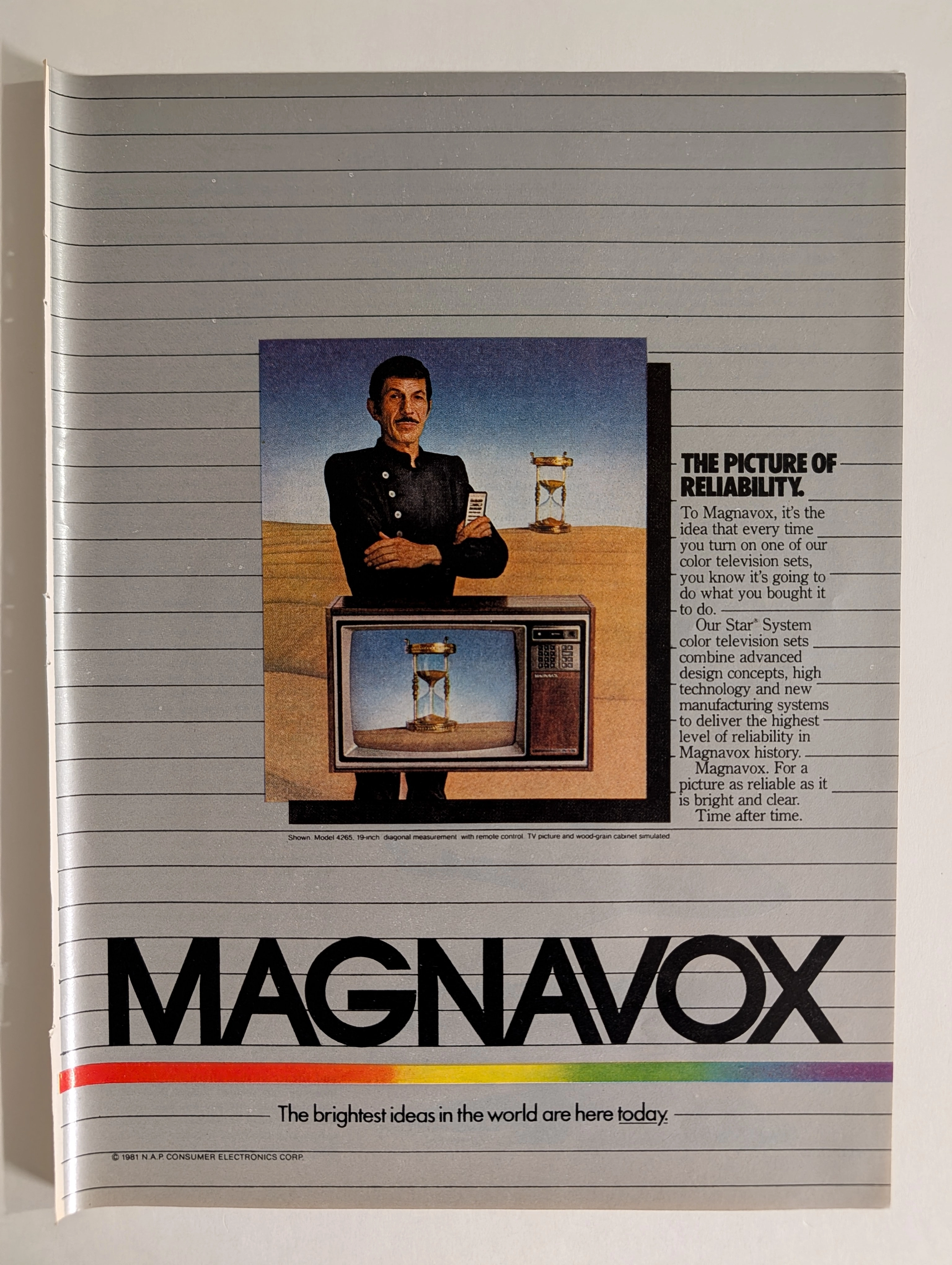
Magnavox Star System 1981 Leonard Nimoy TV Advertisement | 'The Picture of Reliability' | Deep Analysis Rarity Class A-SS
The advertisement analyzed here is a full-page full-color magazine promotion for Magnavox's Star® System color television sets, copyright © 1981 N.A.P. Consumer Electronics Corp. The ad features what is almost certainly Leonard Nimoy — iconic for his role as Mr. Spock in Star Trek — dressed in a black nehru-collar uniform against a surrealist desert landscape, standing above a Magnavox color TV set (Model 4265, 19-inch diagonal) that displays an hourglass on screen. A second hourglass appears behind him. The visual concept communicates timeless reliability. The headline 'The Picture of Reliability' and tagline 'The brightest ideas in the world are here today' frame Magnavox's Star System as the pinnacle of 1981 television technology. The rainbow spectrum stripe at the bottom is a distinctive brand element that ran across Magnavox advertising throughout the early 1980s. N.A.P. (North American Philips) Consumer Electronics Corp. was the American subsidiary of Philips that owned the Magnavox brand at this time, having acquired it in 1974.
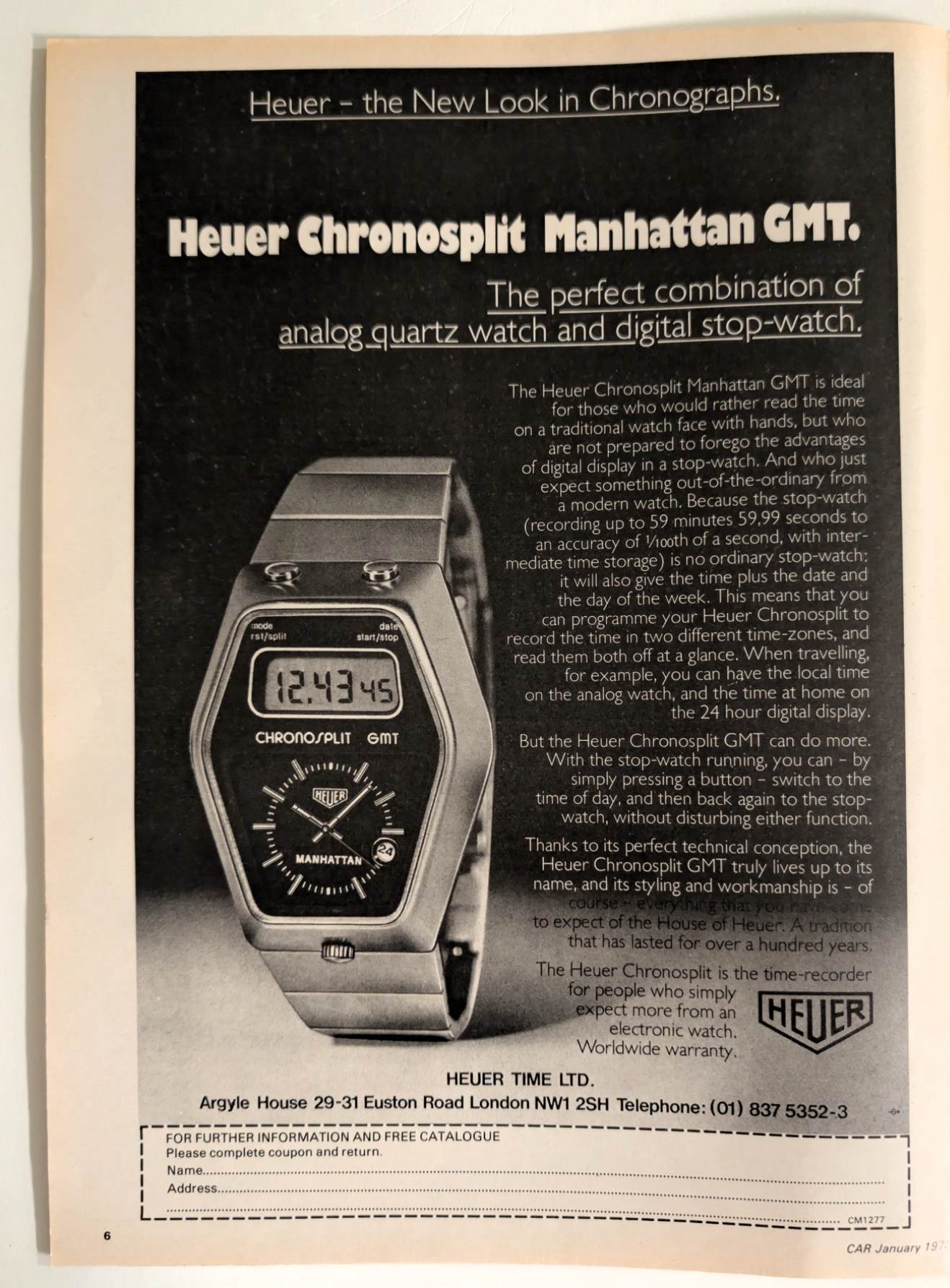
Ahead of Its Time: The 1978 Heuer Chronosplit Manhattan GMT
Rediscover the ultimate analog-digital hybrid timepiece through a rare 1978 vintage magazine advertisement, meticulously preserved as a single sheet cut-out.