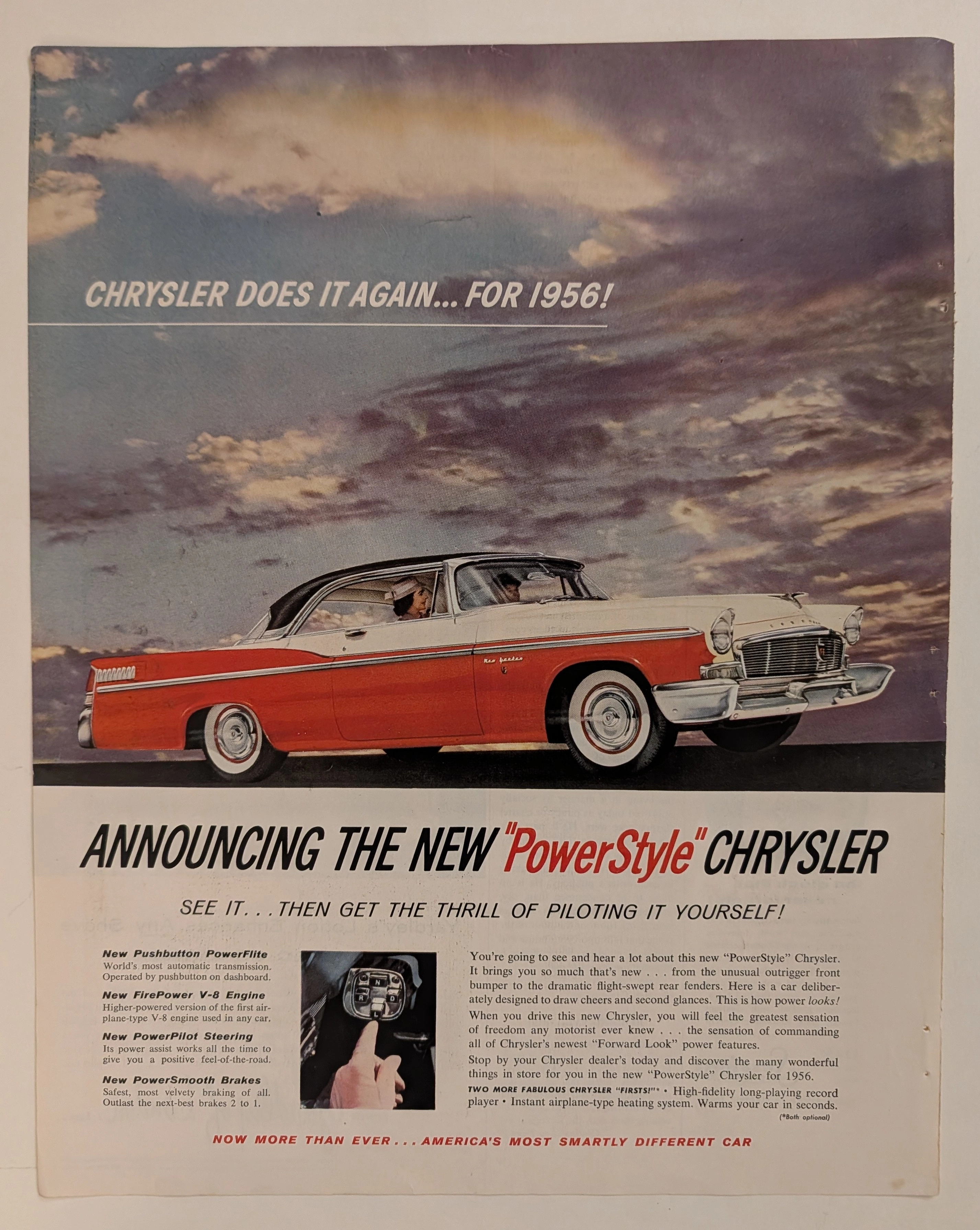
THE TIME TRAVELER'S DOSSIER:CULTURE WEAPONIZATION — "IT'S THE GOING THING"
The History
( THE GENESIS OF 1969 AND THE ARCHITECTURE OF DUALITY )
Welcome to the absolute, suffocating zenith of American automotive madness. To merely look at this document is an insult to its historical gravity; one must dissect it. The year 1969 was not just a point on a calendar; it was a violent socio-cultural explosion. The United States was putting men on the moon, Woodstock was defining a generation, and on the streets of Detroit, the horsepower wars between Ford, General Motors, and Chrysler had escalated into a ruthless, uncompromising arms race. The original 1964 Mustang had created the "pony car" segment, but by 1969, the market had fractured. Consumers demanded either opulent, insulated luxury or raw, tire-shredding performance.
This specific two-page centerfold is the ultimate sociological manifesto of how the Ford Motor Company responded to that fracture. Ford realized that a single vehicle could no longer satiate the entire American public. The Mustang had to become an empire, an umbrella brand that conquered every conceivable demographic. The copywriter's absolute genius lies in the deliberate division of the American Dream. The bold, imposing, and uncompromising sans-serif headline declares with supreme, hegemonic authority: "Mustangs, raw and rare.". In just four words, the advertisement establishes the parameters of the battlefield.
[ PART II: THE GRANDÉ — THE ILLUSION OF BOURGEOIS REFINEMENT ]
Direct your analytical focus to the upper right quadrant of the spread. Here, the text meticulously constructs the persona of the light blue Mustang Grandé. It is explicitly marketed under the banner of "Rare luxury: Grandé.". In 1969, Ford elongated and widened the Mustang chassis, transforming it from a nimble sports car into a substantial grand tourer. The copy proudly announces it as the "Most elegant of the longer, wider, roomier new Mustangs.".
This section of the advertisement speaks directly to Wall Street executives, affluent suburbanites, and those seeking to broadcast their arrival into the upper middle class. It promises a sanctuary of isolation from the chaotic world outside, offering "pre-packaged luxuries, inside and out.". The engineering terms used here are deliberately soft and pacifying: it highlights a "special soft-ride suspension" designed to glide over imperfections, rather than conquer them. Furthermore, it appeals to tactile vanity by boasting of "thick buckets trimmed in vinyl and hopsack cloth.". Hopsack cloth, a highly textured, basket-weave fabric, was the pinnacle of interior design chic in the late 60s, signaling refined taste. The paragraph concludes with a statement of supreme arrogance: "Grandé. Most refined sport known to man.".
[ PART III: THE MACH I — THE AVATAR OF UNAPOLOGETIC VIOLENCE ]
Beneath the civilized facade of the Grandé lies a monstrous, mechanical threat. The lower right quadrant shifts its psychological tone with whiplash-inducing speed, introducing the bright red Mustang Mach I under the banner of "Raw power: Mach I.". This is not a car for the country club; this is the avatar of pure, unadulterated violence, speaking directly to the testosterone-fueled, rebellious youth culture.
The copywriting sheds all pretenses of elegance. It issues a direct challenge: "For people with a burning desire for action, it's all here.". It immediately lists a litany of lethal, track-ready hardware. Gone is the "soft-ride"; instead, it demands respect with a "GT suspension". It boasts of "Wide oval belted tires" to grip the asphalt and a "Rear deck spoiler" for aerodynamic dominance.
However, the absolute pinnacle of this engineering arrogance—the holy grail for muscle car historians—is explicitly printed in the text: "5 hot V-8's. Up to optional 428 Cobra Jet ram-air with through-the-hood 'shaker'.". The 428 cubic-inch Cobra Jet engine was a mythical, brutally powerful powerplant designed to dominate drag strips. The mention of the "'shaker'" hood scoop—a literal hole cut into the hood allowing the air cleaner assembly, mounted directly to the engine block, to vibrate visibly as the engine idled—was a visceral, almost terrifying mechanical connection between machine and driver. The ad practically dares the consumer to buy it, commanding them to "Shake up your world... in a new Mach I.". Ford successfully caged both the refined gentleman and the speed-crazed psychopath within a single, monolithic advertisement.
[ PART IV: FORENSIC ICONOGRAPHY AND THE DETAILS OF DOMINANCE ]
At The Record, we do not merely glance; we scrutinize. The visual architecture of this piece is cemented by extreme, hyper-detailed focal points that secure its place in the annals of industrial design.
First, examine the rear fascia of the Mach 1. The artist has meticulously rendered the Mustang script and the "mach 1" designation on the rear deck lid. The typography alone is a study in aggression, with the lowercase "mach 1" script juxtaposed against the wide-set block letters of "M U S T A N G".
Second, the absolute centerpiece of the car's rear design is the legendary Mach 1 pop-open gas cap. The illustration captures the metallic reflection of the chrome ring, the textured inner circle, and the iconic Mustang tri-bar pony emblem mounted in the center. This gas cap was styled after aerospace and racing designs, further emphasizing the "Mach" (speed of sound) branding.
Third, the artifact provides its own undeniable, forensic timestamp. Stamped squarely on the rear bumper, acting as a historical anchor, is a license plate that proudly reads "1969". Below the cars, microscopic fine print directs consumers: "For more information on Mustang Grandé (background) or Mustang Mach I (foreground) write: Mustang Catalog, Dept. 48, P.O. Box 1000, Dearborn, Mich. 48121". This tiny detail grounds the mythical imagery back into the reality of corporate commerce and physical mail-order catalogs.
[ PART V: POP CULTURE WEAPONIZATION — "IT'S THE GOING THING!" ]
To truly elevate this piece into the stratosphere of 1960s pop culture, one must analyze the lower right quadrant. The advertisement transcends mere automotive engineering by surgically integrating the era's most potent and recognizable corporate propaganda campaign.
Here, we find an illustration of a jubilant, guitar-playing, tambourine-shaking choir of young men and women standing behind a glowing, three-dimensional, golden box bearing the "FORD" logo, complete with a shining lightbulb representing bright ideas. Beneath them is the immortal, era-defining slogan: "It's the going thing!".
This was not just a tagline; it was a massive, multi-million dollar television, radio, and print campaign. The "Going Thing" singers actually released record albums and appeared on national television variety shows. By embedding this choir into the Mach 1 and Grandé advertisement, Ford explicitly proved that they were not merely selling steel, rubber, and glass; they were manufacturing a mandatory cultural movement. They were telling the consumer: If you do not own a Ford, you are being left behind by history. It is the flawless collision of automotive engineering and state-of-the-art, psychological corporate marketing. The copy summarizes this hegemonic dominance perfectly: "Started first. Still first. Nothing moves like a Mustang!".
The Paper
At The Record, our ultimate, uncompromising reverence is reserved for the inevitable, tragic, and spectacular beauty of analog destruction. The physical medium of this artifact is just as historically significant as the artwork printed upon it. This artifact is a two-page "Centerfold Spread," meant to span the absolute center of a high-end mass-market magazine.
Magazines of the late 1960s utilized incredibly cheap, highly acidic wood-pulp paper. They were explicitly designed by their publishers for disposable, immediate consumption. They harbored a fatal chemical death sentence within their very fibers from the millisecond they rolled off the roaring offset printing presses.
Direct your curatorial, analytical gaze to the massive canvas of this paper. After more than 57 years, the most prominent, undeniable physical feature is the severe vertical Center Crease slicing down the middle. Amateurs might view this as a defect. We view it as the ultimate "Scar of Survival." It is the forensic, physical proof that this piece was forcefully, carefully liberated from the metal staples of an original periodical destined for the incinerator.
Furthermore, ambient oxygen and ultraviolet light have waged a relentless, unstoppable chemical war against the deep black background ink. It has gracefully degraded, oxidizing from a flat black into a mysterious, velvety, Cosmic Midnight Blue hue. The inherent lignin in the wood pulp has reacted to the atmosphere, burning the once-sterile white edges into a warm, toasted amber patina.
This is the profound Japanese aesthetic of wabi-sabi—the spiritual realization of finding absolute perfection in impermanence, flaw, and decay. This paper is quietly, literally burning itself alive at a molecular level. No modern digital reprint, no ultra-high-resolution scan can ever replicate the fragile, tactile soul, the tragic history, nor the distinct olfactory signature of aging 1960s pulp. Its slow, majestic, and irreversible death is precisely what transfigures it from a disposable magazine insert into an immortal piece of Primary Art.
The Rarity
To understand the immense, almost incalculable valuation of this artifact, you must comprehend the brutal reality of ephemera survival, specifically regarding two-page centerfolds. Because they spanned two pages, they were notoriously difficult to preserve. They were routinely ripped at the staples, torn by readers, used as wall posters until faded by the sun, or destroyed by moisture separating the two halves.
The statistical probability of a massive, text-heavy 1969 Ford Mustang centerfold surviving nearly six decades with its colors so violently saturated, its typography perfectly intact, and the two halves remaining cohesively joined is staggeringly, miraculously low.
When you fuse this extreme, pristine physical scarcity with the monumental historical presence of the legendary 428 Cobra Jet Mach 1, the luxurious socio-economic marker of the Grandé, and the definitive pop-culture imprint of the "Going Thing" campaign, this artifact unequivocally commands the highly prestigious Rarity Class A designation. It has evolved far, far beyond a disposable piece of vintage commercial advertising. It is a highly coveted Historical Relic, a museum-grade testament to American horsepower, demanding to be framed and fiercely protected by an alpha curator who understands the heavy, beautiful, and irreplaceable weight of automotive history.
Visual Impact
The Visual Impact of this massive, two-page centerfold spread is a calculated, violently effective assault on the viewer's psychological state. The architectural layout of the canvas employs a strict, uncompromising dichotomy designed to physically manifest two completely divergent human desires. The background is a monolithic, atmospheric void, originally printed in deep black but beautifully degraded into a cosmic, velvety midnight blue through decades of chemical oxidation.
In the upper hemisphere, submerged in a cool, ethereal, almost cinematic lighting, sits the light blue Mustang Grandé. Its profile is static, strictly horizontal, projecting an aura of aristocratic stillness and unbothered superiority. It is not moving; it does not have to.
Conversely, the lower hemisphere erupts in visceral, kinetic energy. The bright, inferno-red Mustang Mach I is angled aggressively toward the viewer, bursting out of the darkness. The composition deliberately emphasizes its massive rear haunches, the aggressive rear deck spoiler, and the quad exhaust tips, creating an illusion of imminent, explosive forward motion. The physical center crease of the magazine brutally divides these two worlds—the civilized and the savage—yet they are unified under the overarching, imposing typography floating in the darkness. The visual weight forces the viewer's eye in a Z-pattern: starting from the blue Grandé, sliding down to the intense red of the Mach 1, and finishing at the jubilant pop-culture logo in the bottom right corner.
Exhibition Halls
The Archive Continues
Continue the Exploration
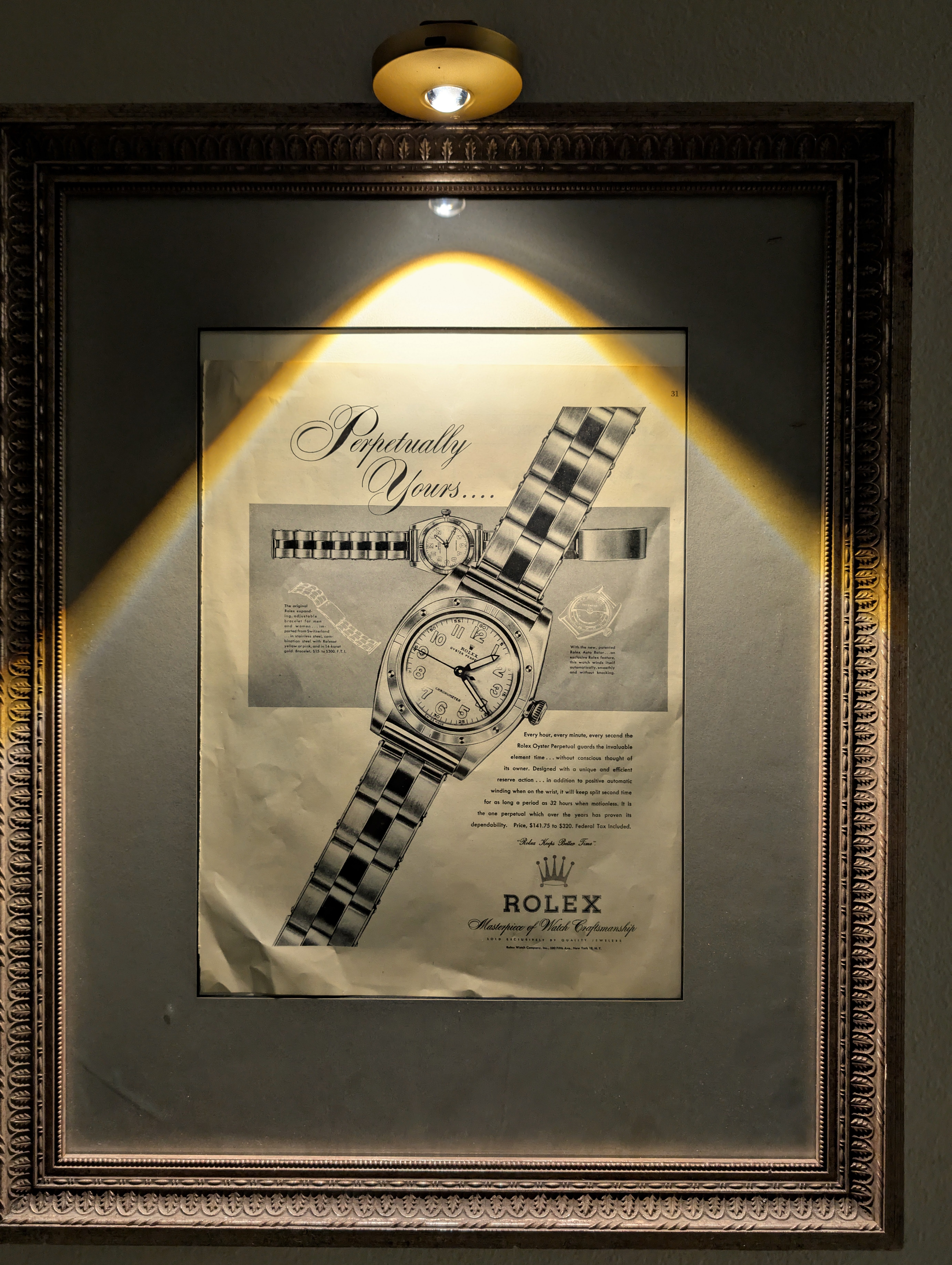
Rolex "Perpetually Yours"
This rare mid-century Rolex "Perpetually Yours" advertisement captures the genesis of the modern Rolex empire. Featuring the legendary Oyster Perpetual, it celebrates the historic union of the world's first waterproof 'Oyster' case (1926) and the revolutionary self-winding 'Perpetual' rotor (1931). A true museum-grade horological archive, this piece represents the ultimate mechanical blueprint that defined Rolex's eternal supremacy.
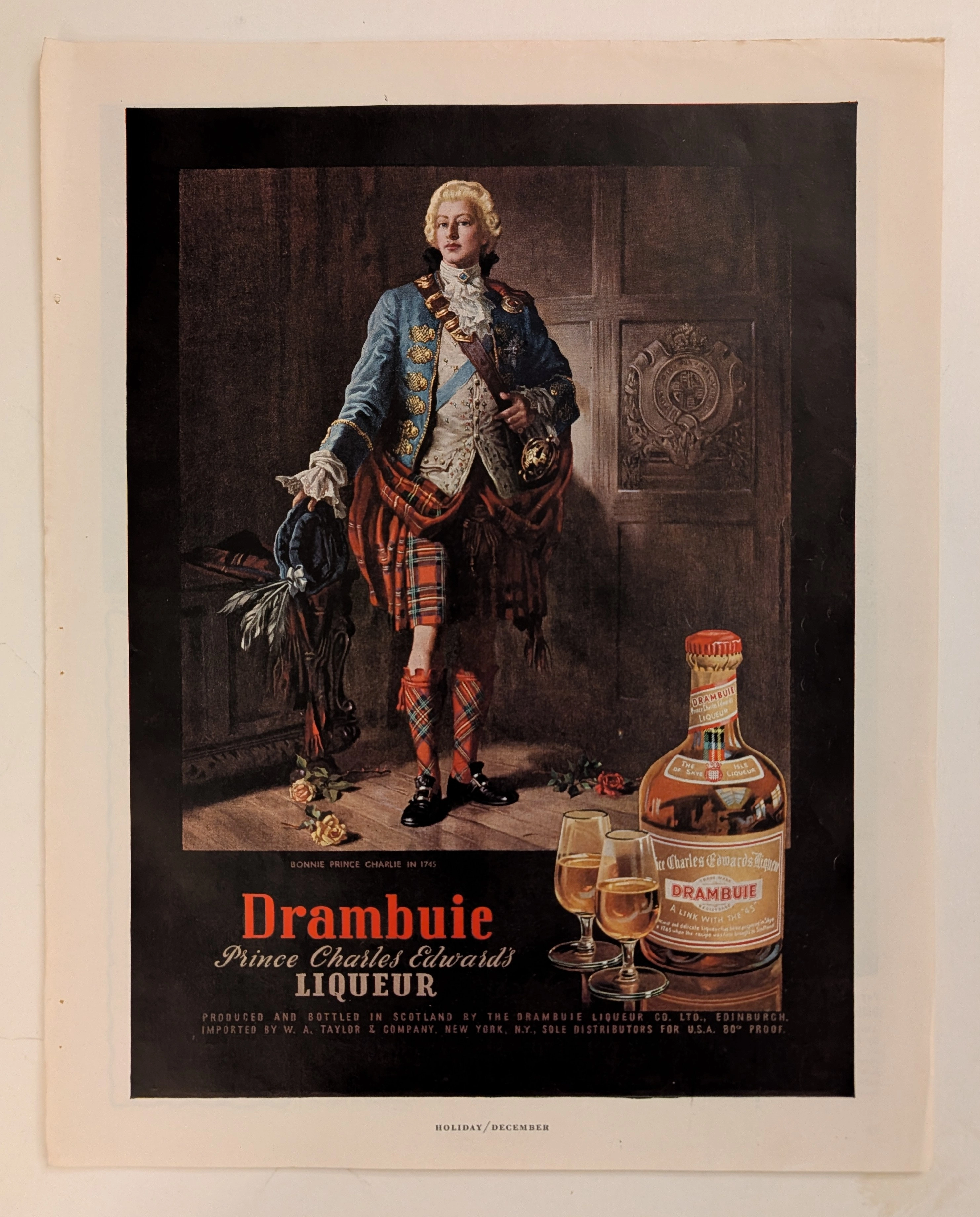
Drambuie · Beverage
The Time Traveller's Dossier: The Alchemy of Royal Rebellion – Drambuie "Bonnie Prince Charlie" Advertisement (Circa Mid-20th Century)
History is rarely an objective chronicle of facts; it is a malleable narrative, continually rewritten, romanticized, and ultimately weaponized by those seeking to legitimize their power or, in the modern era, their products. Long before digital algorithms could synthesize artificial heritage, the supreme manifestation of corporate alchemy was executed through the calculated precision of the four-color offset press and the appropriation of historical iconography. The artifact presented before us is not merely a vintage magazine tear sheet selling a Scottish liqueur. It is a masterclass in the commodification of myth, a visual distillation of romantic rebellion, and a foundational blueprint for what is now known as "Heritage Branding." This museum-grade, academic archival dossier presents an exhaustive, microscopic deconstruction of a mid-20th-century print advertisement for Drambuie Liqueur. Operating on a profound binary structure, this document records a calculated paradigm shift within the global spirits industry. It captures the precise historical fracture where a highly specific, geographically isolated alcoholic beverage was conceptually transmuted into a literal draught of royal rebellion and aristocratic romance. Through the highly specialized lens of late-analog commercial artistry and stringent visual forensics, this document serves as a masterclass in psychological marketing. It established the foundational archetype for linking the consumption of a physical product with the ingestion of an epic, historical fantasy—an archetype that unconditionally dictates the visual and strategic totems of the modern luxury spirits industry today.
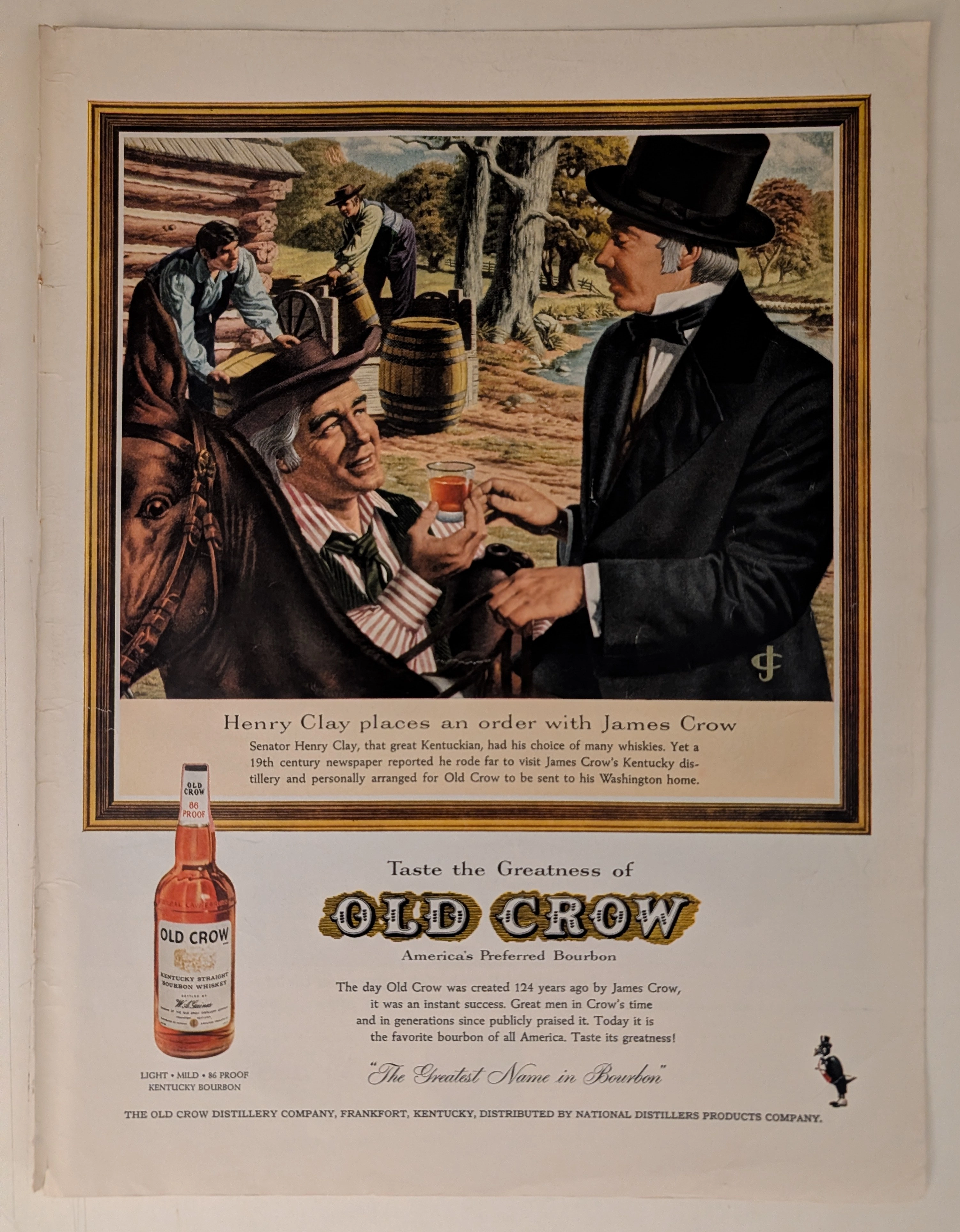
THE TIME TRAVELER'S DOSSIER: OLD CROW - THE MYTHOLOGY OF AMERICAN BOURBON
The artifact currently subjected to our uncompromising, museum-grade analysis is a profoundly preserved Historical Relic excavated from the golden age of American print media. This Primary Art Document is a full-page, magazine-sized advertisement for OLD CROW Kentucky Straight Bourbon Whiskey. Functioning as a "Forensic Blueprint of American Myth-Making," the document masterfully weaponizes political heritage and historical titans to validate the aristocratic taste and unparalleled quality of the bourbon. Its historical context is irrefutably anchored by the embossed text physically molded into the glass bottle itself—the most powerful and undeniable forensic evidence available in mid-century liquor advertising. Grounded by extreme macro details of the label, the microscopic golden monogram embroidered on the coat, and the breathtaking wabi-sabi chemical degradation of the highly acidic, magazine-sized paper, this artifact commands an irreplaceable status. It firmly cements its Rarity Class A designation as an absolute masterpiece of historical marketing engineering and analog preservation.