THE TIME TRAVELER'S DOSSIER: PAN AM - THE ARCHITECTURE OF THE AMERICAN TOURIST
The History
[ PART I: THE PSYCHOLOGY OF THE "OFF-SEASON" ELITE ]
Welcome to the velvet-roped departure lounges of mid-century American aristocracy. To merely glance at this document is a severe dereliction of curatorial duty; we must forensically interrogate its psychological intent. In the post-WWII era, America was experiencing an unprecedented economic explosion. International travel, previously reserved for ocean-liner-bound elites, was becoming accessible to the upper-middle class via aviation.
This advertisement is the ultimate sociological mechanism designed to promote "off-season" European travel. Examine the headline: "Go now—Europe has time to talk with you". This is a masterful psychological hook. It leverages the inherent snobbery of the leisure class. It implies that traveling during the crowded summer is for amateurs; traveling in the winter or early spring (noted by the "HOLIDAY / FEBRUARY" imprint) allows for an exclusive, intimate, and highly privileged interaction with the "Old World," unbothered by the masses. The image of the Swiss Guard pointing and personally guiding the young American boy reinforces this illusion of VIP access.
[ PART II: FORENSIC ICONOGRAPHY AND MACRO DETAILS ]
At The Record, our curatorial gaze penetrates down to the molecular level. Direct your attention to the extreme macro crop of the boy's hands holding the flight bag.
The PAA (Pan American Airways) flight bag was not merely luggage; it was the ultimate mid-century status symbol. Carrying this bright blue bag through an airport or down a European street was a loud, visible broadcast of wealth, sophistication, and global mobility. The artist/photographer has ensured the logo is perfectly legible, completely unwrinkled, and facing the camera—a flawless piece of product placement.
Furthermore, examine the microscopic illustration at the very bottom of the page. This is not a generic airplane. The distinct four-engine configuration, the shape of the tail, and the faint lettering "DC-7B" and "PAA" on the vertical stabilizer forensically identify the aircraft as a Douglas DC-7B. This specific detail acts as a precise historical timestamp. The DC-7B was Pan Am's premier piston-engine airliner in the mid-1950s, utilized for transatlantic routes just before they ushered in the Jet Age with the Boeing 707 in 1958. This dates the artifact to the final, golden years of propeller-driven luxury flight.
[ PART III: THE ALCHEMY OF COPYWRITING ]
The typography and copywriting at the base of the page project absolute hegemonic dominance. It declares in bold, unyielding red lettering: "PAN AMERICAN". Directly beneath it, the legendary, unchallenged slogan: "WORLD'S MOST EXPERIENCED AIRLINE".
During this era, Pan Am was not just a company; it was the unofficial flag carrier of the United States, an instrument of American soft power projecting technological and economic supremacy across the globe. The copy does not beg the consumer to fly; it instructs them. It assumes the reader has the financial capital to be "impulsive" and to take advantage of "Family Fares" and "15-day tourist Excursion Fares".
The Paper
The physical medium of this artifact is just as historically profound as the photographic art it carries. We must maintain an absolute, uncompromising reverence for the inevitable, tragic beauty of analog destruction.
Examine the extreme left edge of the entire canvas. You will notice a deeply jagged, uneven, and violently torn perimeter running vertically from top to bottom. Amateurs and sterile perfectionists might view this as damage. At The Record, we view this as the "Scar of Liberation." It is the undeniable physical proof that this high-quality page was forcefully and purposefully ripped from the metal staples of a thick, original issue of Holiday magazine.
More importantly, observe the surface of the paper itself. Over the course of roughly seven decades, ambient oxygen and ultraviolet light have waged a relentless chemical war against the paper's inherent wood-pulp lignin. This irreversible oxidation process has birthed a magnificent, undeniable "patina." What was once a sterile, bright white background has gracefully degraded into a deep, warm, toasted Antique Ivory.
This slow, majestically tragic molecular decay is precisely what drives the extreme market value of this artifact. These magazines were printed on highly acidic paper, explicitly designed for immediate, disposable consumption. They were never meant to survive the century. The fact that this delicate, highly flammable, and chemically self-destructing sheet of analog paper has survived intact is a statistical miracle. No modern digital reprint, no high-resolution scan, can ever replicate the tactile fragility, the distinct olfactory signature, or the authentic "Wabi-Sabi" soul of this dying 1950s pulp. In the global market of high-end ephemera, it is this very impermanence—the fact that the paper is quietly burning itself alive—that elevates it from a piece of vintage commercial trash to a highly coveted, irreplaceable Primary Art Document.
The Rarity
To understand the immense, almost incalculable valuation of this artifact, one must comprehend the brutal reality of aviation ephemera survival. The post-war era was defined by rapid consumption; travel magazines were read on airplanes or in country club lounges and immediately discarded.
The statistical probability of a full-page, highly detailed Pan American advertisement from Holiday magazine surviving seven decades with its colors so vividly saturated, its typography perfectly intact, and its precise DC-7B historical data preserved is staggeringly low.
When you fuse this pristine physical preservation with the monumental sociological signaling of the American tourist class, the mythological iconography of the Vatican Swiss Guard, the forensic evidence of mid-century aviation technology, and the breathtaking wabi-sabi degradation of its torn, highly acidic paper stock, this artifact unequivocally commands the absolute highest Rarity Class S designation. It has evolved far beyond a disposable piece of vintage commercial advertising. It is a highly coveted Historical Relic, a museum-grade testament to transatlantic commerce and American post-war supremacy, demanding to be framed and fiercely protected by an alpha curator who understands the heavy, beautiful weight of analog history.
Visual Impact
The Visual Impact of this vertical canvas is a masterclass in establishing a transatlantic cultural bridge while asserting American economic dominance. The architectural layout utilizes a brilliant juxtaposition of the "Old World" and the "New World."
In the foreground and midground, we see the archetypal post-WWII American nuclear family. The father, armed with a high-end 35mm rangefinder camera, captures the moment; the mother, impeccably dressed in a vibrant salmon coat and pearls, watches with serene pride; the son, dressed in a sharp blazer and tie, acts as the focal point of interaction. They are actively engaging with a Vatican Swiss Guard, whose striking, colorful Renaissance-era uniform (traditionally attributed to Michelangelo or Raphael) provides a massive visual anchor on the right side of the canvas.
The psychological brilliance of the composition lies in the boy's grip on the vivid blue "PAA - PAN AMERICAN WORLD AIRWAYS" flight bag. It rests at the dead center of the lower interaction zone. The bright white lettering against the Pan Am blue acts as a powerful corporate flag planted firmly on European soil. The violently torn left edge of the page provides a brutal, physical frame to this scene of high-society educational tourism, anchoring the illusion firmly to the tragic reality of physical decay.
Exhibition Halls
The Archive Continues
Continue the Exploration
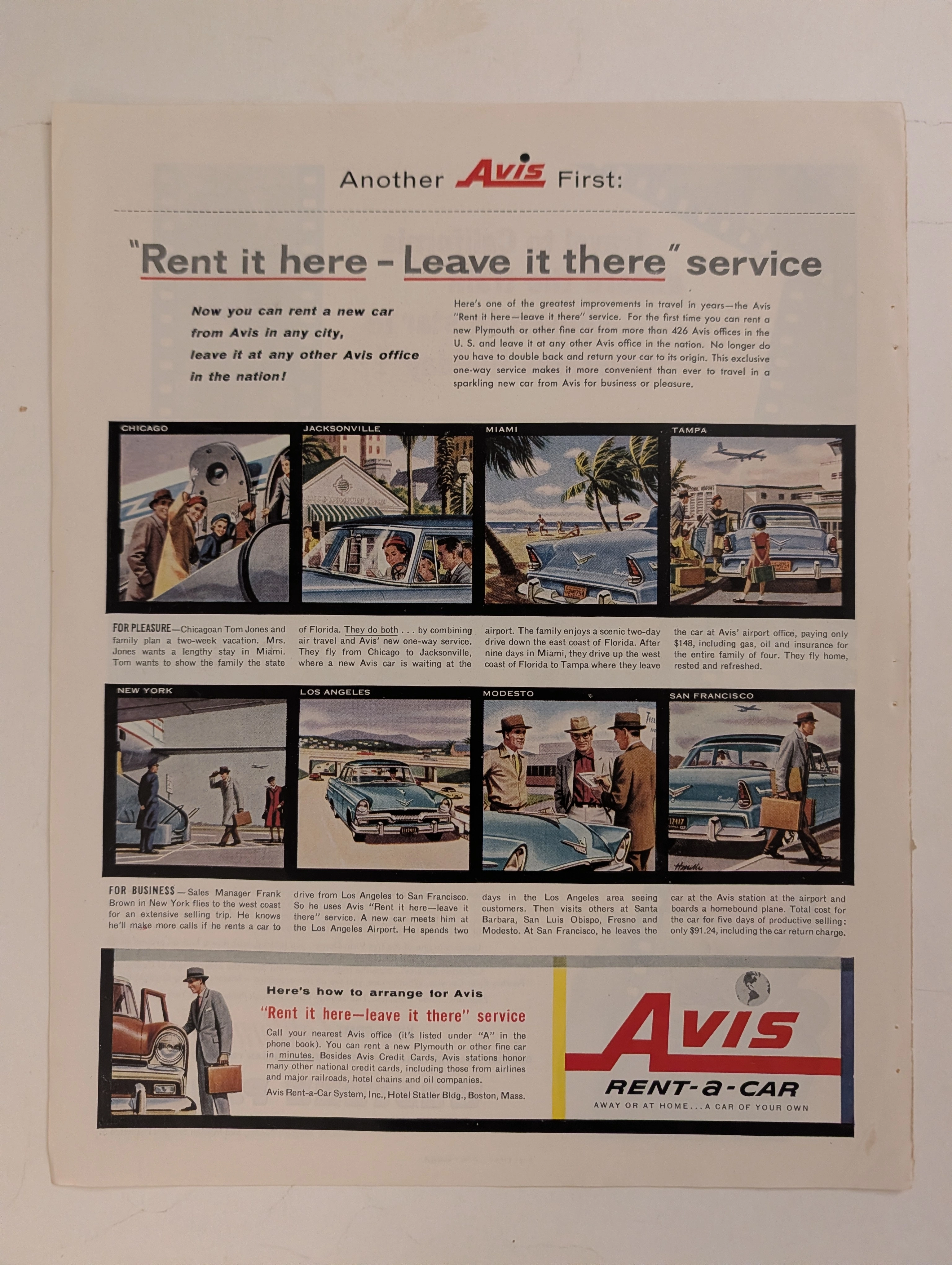
The Time Traveller's Dossier: The Architecture of Unrestricted Mobility – Avis "Rent it Here - Leave it There" Advertisement (Circa 1956)
History is not merely recorded; it is engineered, paved, and conquered through the relentless expansion of commercial logistics. Long before digital networks rendered physical distances obsolete, and before the globalized travel infrastructure became a mundane background hum of modern life, the conquest of geography was executed through bold, capital-intensive logistical paradigms. The historical artifact before us is not merely a nostalgic mid-century magazine advertisement for a car rental agency. It is a perfectly weaponized blueprint of post-war American expansionism, a visual manifesto of the "fly-drive" revolution, and an unwavering testament to an era when mastering the vast North American continent was sold as the ultimate consumer luxury. This museum-grade, academic archival dossier presents an exhaustive deconstruction of a mid-1950s print advertisement for the Avis Rent-a-Car system, specifically introducing their groundbreaking "Rent it here - Leave it there" service. Operating on a profound, dual-narrative storyboard structure, this document records a calculated paradigm shift within the global travel and transportation industry. It captures the precise historical fracture where the American public conceptually transitioned from the localized, static constraints of pre-war rail and personal automobile travel into the hyper-mobile, fluid, and aerospace-integrated era of the 1950s. Through the highly specialized lens of late-analog commercial illustration and stringent visual forensics, this document serves as a masterclass in the psychological marketing of freedom and corporate efficiency. It established the foundational archetype for the modern, frictionless travel economy—an archetype that unconditionally dictates the logistical strategies of the global tourism and business travel sectors today.
Admiral · Technology
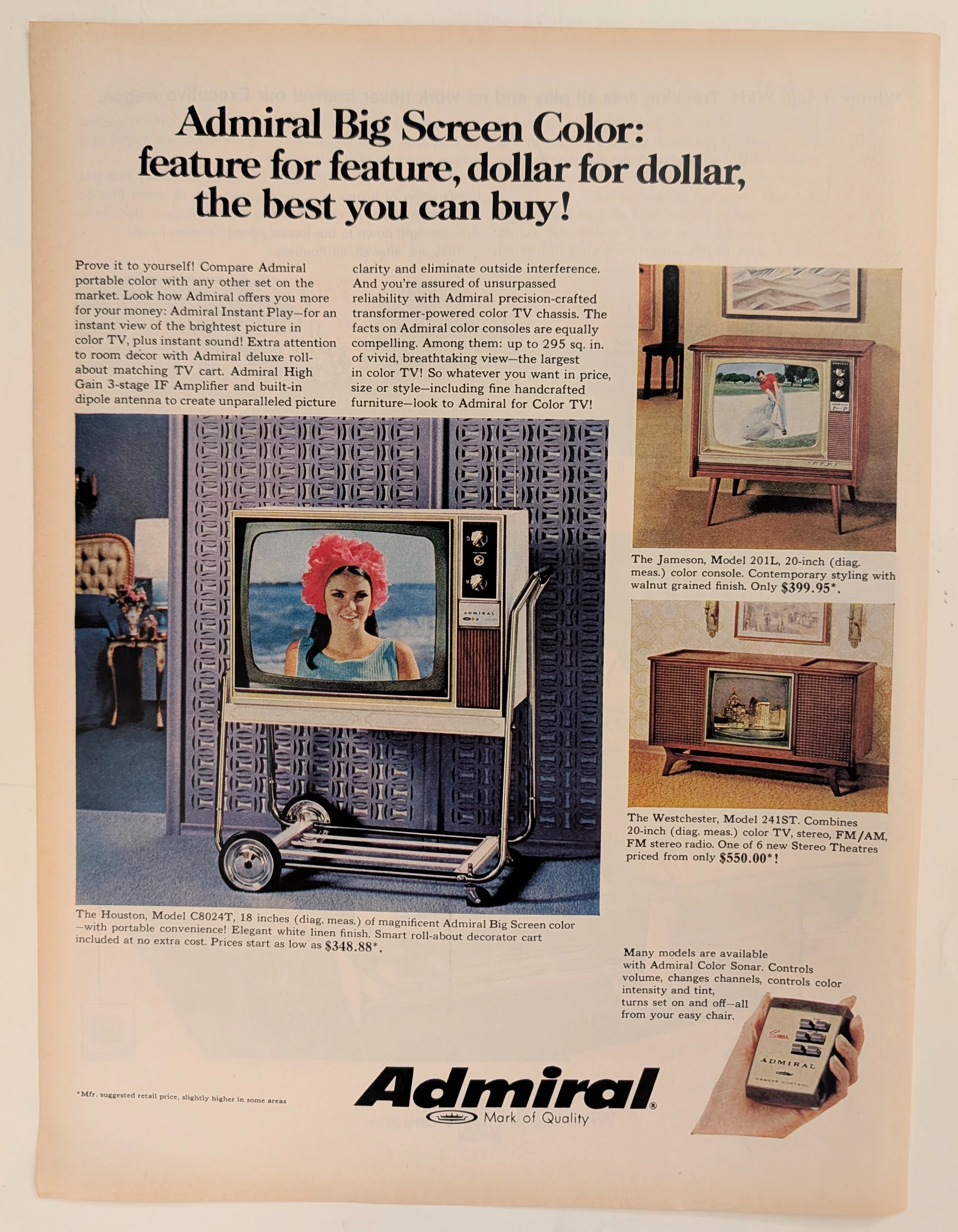
The Time Traveller's Dossier: The Architecture of the Airwaves – Admiral Color Television, the Sonar Remote, and the Transformation of the American Living Room
The evolution of the twentieth-century American domestic sphere was fundamentally defined by the rapid, uncompromising integration of broadcast technology into the daily rituals of the nuclear family. The historical artifact elegantly and securely positioned upon the analytical table of The Record Institute today is a striking, text-dense full-page print advertisement for Admiral Big Screen Color Televisions, originating from the late 1960s. This document completely transcends the standard, utilitarian boundaries of appliance marketing. It operates as a highly sophisticated, multi-layered cultural mirror, reflecting a precise era in consumer psychology where the television set was aggressively repositioned: from a novel, standalone mechanical box into a massive, aesthetically dominant piece of "handcrafted" wooden furniture, complete with the space-age luxury of wireless command. This world-class, comprehensive dossier conducts a meticulous, unyielding, and exceptionally exhaustive examination of the artifact, operating under the absolute most rigorous parameters of historical, sociological, and material science evaluation. Dedicating the overwhelming majority of our analytical focus to its immense historical gravity (80%), we will decode the brilliant marketing psychology embedded within the "Stereo Theatre" concept, analyze the profound sociopolitical impact of the "Color Sonar" remote control, and dissect the economic realities of mid-century high-fidelity entertainment. Furthermore, as we venture deeply into the chemical and physical foundations of this analog printed ephemera (10%), we will reveal the precise mechanical fingerprints of the CMYK halftone rosettes captured in the macro imagery of the broadcast screens. Finally, we will assess its archival rarity (10%), exploring how the graceful, natural oxidation of the paper substrate cultivates a serene wabi-sabi aesthetic—a natural, irreversible phenomenon that serves as the primary engine driving up its market value exponentially within the elite global spheres of Vintage Commercial Ephemera and Technology Archives.
The Time Traveller's Dossier: The Engineer's Manifesto – The 1975 BMW 530i and the Birth of the Ultimate Driving Machine
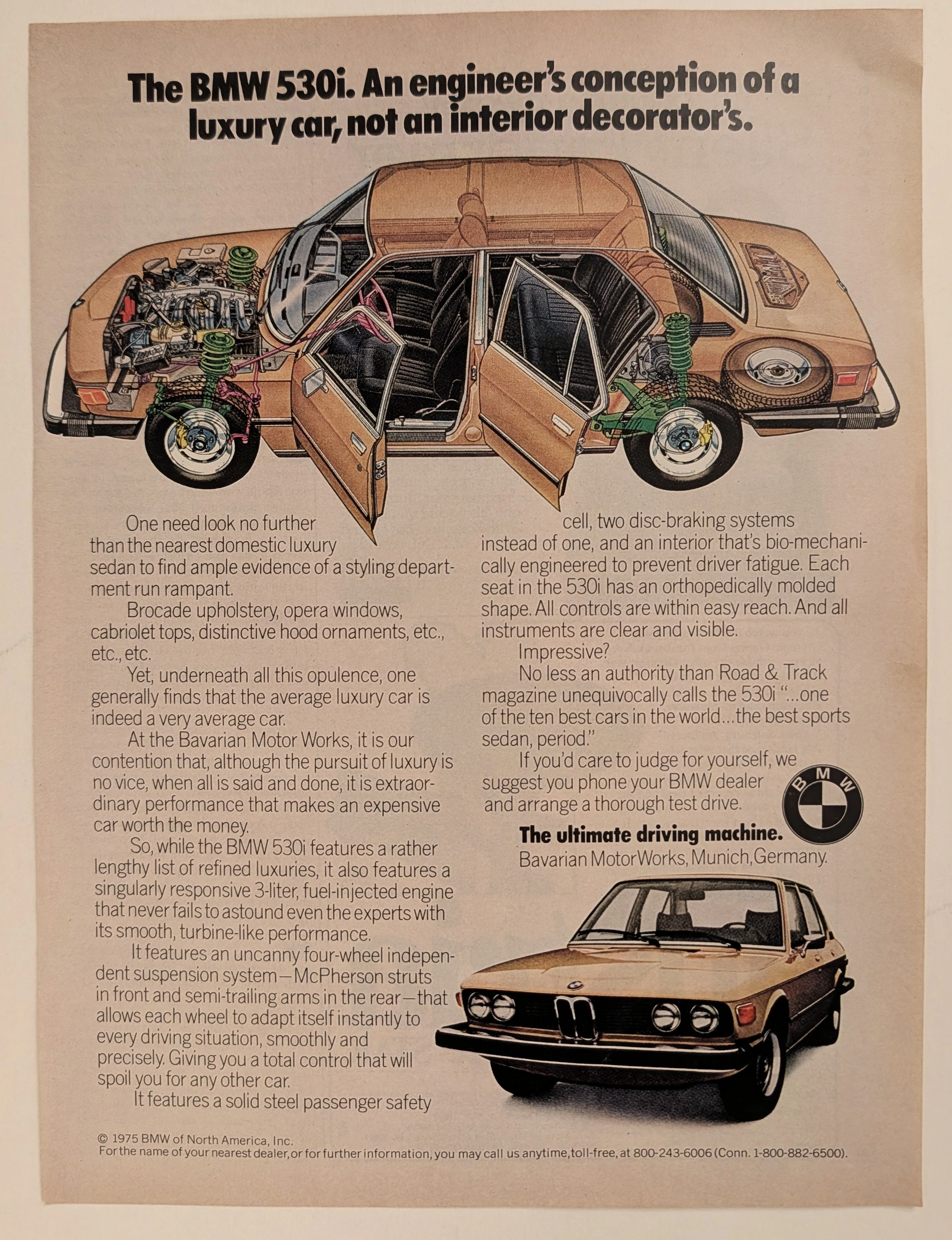
The evolution of the American automotive landscape in the latter half of the twentieth century was fundamentally violently disrupted during the 1970s, an era defined by oil embargoes, shifting economic realities, and a growing consumer disillusionment with domestic manufacturing. Elegantly and securely positioned upon the analytical table of The Record Institute today is a visually complex, densely informative, and highly significant full-page print advertisement for the BMW 530i, definitively dated to 1975 by its prominent copyright macro. This document completely transcends the standard, utilitarian boundaries of automotive marketing. It operates as a highly sophisticated, multi-layered cultural mirror and a bold declaration of war against the prevailing automotive trends of the decade. By juxtaposing the superficial trappings of American luxury—"brocade upholstery, opera windows, cabriolet tops"—against the visceral, mechanical truths of independent suspension and fuel injection, Bavarian Motor Works (BMW) successfully positioned itself as the intellectual and physical antidote to the bloated "Malaise Era" land yachts. This world-class, comprehensive dossier conducts a meticulous, unyielding, and exceptionally exhaustive examination of the artifact, operating under the absolute most rigorous parameters of historical, sociological, and material science evaluation. Dedicating the overwhelming majority of our analytical focus (80%) to its immense historical gravity, we will decode the brilliant, confrontational marketing psychology embedded within the copywriting, analyze the profound mechanical realities of the E12 chassis 5-Series, and detail the historical impact of the visionaries who crafted this campaign. Furthermore, as we venture deeply into the chemical and physical foundations of this analog printed ephemera (10%), we will reveal the precise mechanical fingerprints of the CMYK halftone rosettes captured in the stunning macro imagery of the BMW roundel and the technical cutaway illustration. Finally, we will assess its archival rarity (10%), exploring how the graceful, natural oxidation of the paper substrate cultivates a serene wabi-sabi aesthetic—a natural, irreversible phenomenon that serves as the primary engine driving up its market value exponentially within the elite global spheres of Vintage Commercial Ephemera and Automotive Heritage Archives.