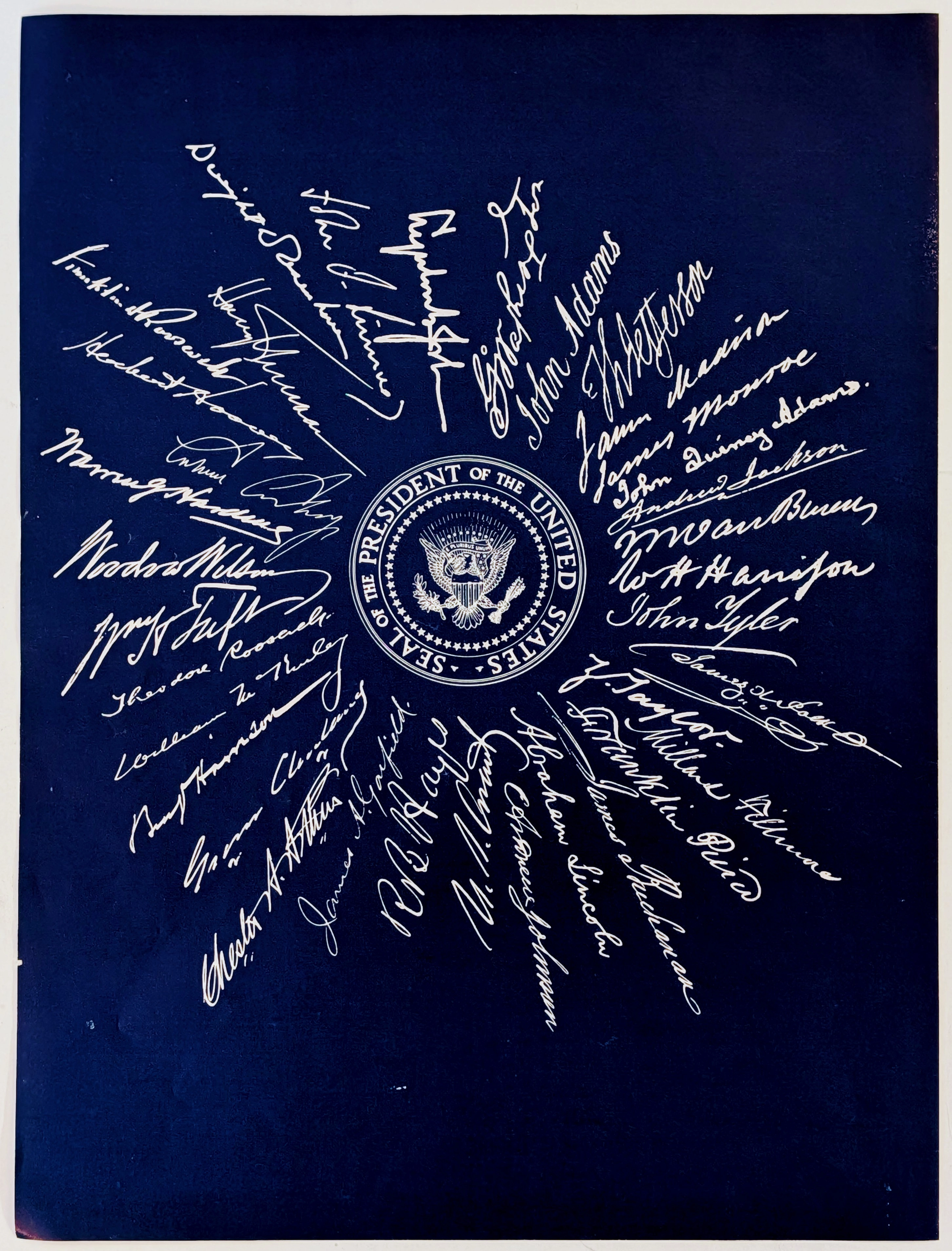
— The Record Institute Journal")
 — The Record Institute Journal")
 — The Record Institute Journal")
 — The Record Institute Journal")
 — The Record Institute Journal")
 — The Record Institute Journal")
The Time Traveller's Dossier: The Architecture of Eternity – De Beers "Glory of Bells" Advertisement (Circa early 1940s)
The History
To genuinely decode the complex sociological architecture embedded within this printed artifact, one must pull back the lens to contextualize the macroeconomic history, the geopolitical climate of the 1940s, and the audacious DNA of the De Beers syndicate. At the end of the 19th century, massive diamond mines were discovered in South Africa, threatening to flood the market and crash the value of the stones. To prevent this, the major investors consolidated their interests to form De Beers, effectively creating a global cartel that strictly controlled the supply—and therefore the price—of diamonds. However, controlling supply was only half the battle; they needed to control demand.
Enter N.W. Ayer & Son, the visionary American advertising agency hired by De Beers in the late 1930s. The agency faced a monumental challenge: diamonds were considered a luxury for the ultra-rich, and the Great Depression had decimated consumer spending. As the world plunged into the devastating abyss of World War II, selling frivolous luxury goods became practically taboo. N.W. Ayer’s solution was diabolical in its brilliance: they decided to intertwine the diamond with the very fabric of human emotion, specifically the institution of marriage. They needed to convince the American public that a diamond was not a luxury, but a psychological necessity—an anchor of hope and permanence in a world torn apart by global conflict. This specific advertisement, referencing "wartime's partings" and "bravely united in faith," is a direct product of this wartime psychological operation. It expertly balances the emotional manipulation of separated lovers with a strategic public relations caveat regarding "Industrial Diamonds" for "high-speed war production," ensuring the brand appeared patriotic rather than parasitic during a global crisis.
Creator / Illustrator Information: At the tail end of this historical context, we must examine the architects of the visual narrative itself. The striking, atmospheric illustration dominating the upper half of this page is the work of Bernard Lamotte (1903–1983), a highly esteemed French-born artist and illustrator. Relocating to the United States in the 1930s, Lamotte brought with him a deeply romantic, post-impressionistic European sensibility that American advertising agencies highly coveted. He was commissioned specifically to paint the "De Beers Collection," a series of artworks depicting sacred and monumental institutions—in this case, the Cathedral of St. Louis in the Vieux Carré (French Quarter) of New Orleans. Lamotte’s masterful use of sweeping, textural brushstrokes and muted, solemn color palettes elevated the advertisement from a mere commercial pitch to a piece of museum-worthy fine art. By employing a recognized fine artist rather than a standard commercial graphic designer, N.W. Ayer & Son deliberately infused the De Beers brand with an aura of aristocratic heritage, eternal permanence, and high-culture sophistication.
Part 1: The Binary Shift: The Chaos of War vs. The Permanence of the Stone
The narrative architecture of this artifact is built upon a strict, uncompromising binary contrast against the grim reality of the 1940s. The world was engulfed in the absolute chaos, destruction, and profound uncertainty of World War II. Millions of young men were being deployed overseas; couples were being separated with no guarantee of reunion. In the face of such overwhelming existential dread, De Beers presented a diametrically opposed concept: absolute, unyielding permanence.
The advertisement violently obliterates the narrative of uncertainty. It executes a flawless cultural pivot by centering the visual focus not on a diamond, but on the Cathedral of St. Louis—a monumental, unmovable architectural fortress of faith. The message deliberately contrasts the transient, fragile nature of human life during wartime with the eternal, indestructible nature of the church and, by associative proxy, the diamond. The text speaks of "wartime's partings" but immediately counters it with the promise of "long fulfilment" and "steadfast light." This represents a profound conceptual transition: the brand is no longer merely selling a sparkly rock; it is selling psychological salvation. It is selling the absolute guarantee that despite the bombs, the distance, and the death, the bond between the young couple—solidified by the De Beers diamond—will survive the apocalypse.
Part 2: The Semantics of Spiritual Capitalism
To execute a strategy of this magnitude, the brand required a highly specific, psychologically invasive vocabulary. The copywriting on this page abandons all traditional marketing humility and boldly crosses the line into the realm of theology. It deliberately hijacks the sacred lexicon of the Christian church to sanctify a commercial transaction:
"Glory of bells..."
"bravely united in faith..."
"her solemn wedding ceremony in her own church..."
"Her greatest treasure, the diamond engagement ring..."
The deployment of this language is not merely poetic prose; it is a calculated psychological hijacking. This is the ultimate manifestation of "Spiritual Capitalism." De Beers makes no attempt to discuss the geological properties of the diamond in the main emotional text. Instead, it shamelessly elevates the act of purchasing a diamond ring to the level of a holy sacrament. The psychological strike effectively fuses the eternal sanctity of God, the church, and the wedding vow directly into the carbon lattice of the De Beers diamond. By equating the diamond ring with "her deepest assurance" and "steadfast light," the exorbitant price tag ceases to be a commercial transaction; it becomes a mandatory religious offering at the altar of matrimony. If a man truly loved his fiancée with pure, holy devotion, he was socially and spiritually obligated to prove it with a diamond.
Part 3: The Sovereign Consumer & The Illusion of Value
The socioeconomic structure of the era was carefully managed by De Beers to ensure maximum profitability without alienating the working and middle classes. This advertisement serves as a masterclass in price anchoring and the creation of perceived value. On the left flank of the page, the agency starkly lists the current prices for diamonds:
One-half carat: $200 to $350
One carat: $400 to $800
Two carats: $1050 to $2500
In the early 1940s, $800 was an astronomical sum of money—often representing several months' wages for an average American worker. By boldly publishing these exorbitant prices right next to an emotionally devastating narrative about love and war, De Beers was engaging in aggressive psychological conditioning. They were not just selling a product; they were teaching the American public exactly how much love was supposed to cost. Furthermore, the inclusion of the "Facts You Should Know About Diamonds" and the paragraph on "Industrial Diamonds" serves a dual purpose. First, it justifies the high cost by explaining that "Color, cutting, brilliance and clarity" determine value, educating the consumer to accept the cartel's pricing matrix. Second, the mention of industrial diamonds aiding "high-speed war production" provides the consumer with a moral loophole. It allowed the buyer to spend a fortune on a luxury item without feeling unpatriotic, as De Beers cleverly framed their mining operations as an essential component of the Allied war effort.
Part 4: Visual Semiotics: The Painted Sanctity
In an era where photography was becoming increasingly dominant in advertising, N.W. Ayer’s deliberate choice to render this advertisement through a traditional oil painting acts as a precise and highly courageous semiotic indicator:
Institutional Eternity: A photograph represents a fleeting fraction of a second—a moment captured and frozen. A painting, however, especially one rendered in Bernard Lamotte's textured, monumental style, represents history, endurance, and eternity. By depicting the Cathedral of St. Louis through the medium of fine art, De Beers visually divorced the engagement ring from the disposable, fast-paced world of consumer goods. It framed the diamond as an antique, an heirloom, a piece of eternal history that transcends the mortal coil.
The Architecture of the Cut: The towering, sharply pointed spires of the cathedral in the painting subliminally mirror the precise, geometric facets of a round brilliant-cut diamond. The church literally reaches toward the heavens, channeling divine light, just as the diamond refracts terrestrial light. The visual composition forces the viewer's eye upwards, creating a psychological association between the grandeur of the architecture, the divine authority of God, and the structural perfection of the De Beers gemstone.
Part 5: Pop Culture Impact and Enduring Legacy
The marketing strategy pioneered by De Beers and N.W. Ayer & Son left an indelible, ineradicable mark on global human culture. This specific campaign strategy—fusing the diamond with the concept of eternal love and matrimonial commitment—was the immediate precursor to the legendary 1947 slogan "A Diamond is Forever." The audacity to completely invent a tradition from thin air and enforce it upon the global populace became the absolute gold standard for behavioral marketing.
Before De Beers, diamond engagement rings were not a universal standard; they were a rarity. The cultural impact of this positioning engineered a societal norm that is now blindly followed across the globe. In the modern commercial arena, brands still desperately attempt to manufacture the aura of mandatory emotional compliance that De Beers achieved decades ago. This physical artifact is the foundational source code for the most arrogant, pervasive, and wildly successful psychological marketing mythology in the history of modern capitalism.
The Paper
As a physical entity, this tear sheet is an unrepeatable, isolated record of mid-20th-century offset lithographic printing. The medium-weight, uncoated magazine stock was originally engineered by the ton for mass distribution during wartime paper rationing; however, its current, aged state demands a profound evaluation through the highest echelon of Japanese aesthetic philosophy: wabi-sabi (侘寂)—the acute recognition and appreciation of beauty found in impermanence, imperfection, and the ruthless, natural progression of time.
Visual Forensics & Substrate Analysis (The Economics of Ephemera):
Subjecting the extreme macro close-ups of this artifact to visual forensics reveals the mechanical heartbeat of the pre-digital printing press. Under high magnification, the illusion of Lamotte's sweeping, continuous brushstrokes violently shatters, dissolving into a precise, mathematically rigorous galaxy of CMYK (Cyan, Magenta, Yellow, Key/Black) halftone rosettes. The distinct, gritty grain of the offset printing process is aggressively visible within the transition zones of the painted sky and the foliage. The typography below, exhibiting the slight ink spread characteristic of the era, anchors the piece in its historical reality.
However, the most crucial and valuable aspect of this specific artifact lies in its Material Degradation. Examining the margins and the unprinted negative spaces reveals authentic, undeniable "Toning." This is a gradual, irreversible yellowing, browning, and embrittlement effect caused by the natural chemical oxidation of organic lignin trapped within the wood pulp of the paper upon eight decades of exposure to air and ambient ultraviolet light.
It is vital to understand the archival and market significance of this ephemeral nature. Analog print media from the World War II era represents a vanishing breed of historical documentation that is slowly, yet unstoppably, disintegrating—especially considering that millions of tons of paper were recycled for the war effort via paper drives. This organic, breathing physical degradation is a fingerprint of time that can absolutely never be cloned, replicated, or faked by modern high-precision digital scanning or micro-jet printing processes. As these original pages slowly burn themselves out through oxidation, turning fragile and brittle, their supply in the global collector's market shrinks daily. It is precisely this ticking clock of physical impermanence—the fact that this paper is slowly returning to the earth—that drives up its market value exponentially. The evolving patina elevates the piece from a uniform, lifeless industrial print run into a singular, unique artifact covered in historical scars. The wabi-sabi nature of this decaying paper ensures that its aesthetic and financial worth will continue to skyrocket precisely because it is a dying medium.
The Rarity
Rarity Class: A (Advanced / Highly Desirable)
Within the strictest parameters of international archival evaluation, this artifact holds a definitive Class A designation. The ultimate paradox of mid-20th-century analog print ephemera lies in the violent contrast between its initial mass production and its extreme, near-extinct scarcity today. Vintage magazines from the early 1940s were quintessential "disposable media," destined to be read once and then mercilessly discarded, or worse, fed into wartime paper recycling drives.
For this specific, single-page advertisement to have miraculously survived over eighty years—resisting the ravages of destructive handling, severe moisture damage, and avoiding catastrophic structural center creases—is a pure statistical archival anomaly. Furthermore, finding a De Beers advertisement featuring the fine art of Bernard Lamotte, complete with its original, unabashed wartime pricing tiers and propaganda text regarding "Industrial Diamonds," wherein the CMYK pigments retain their original depth while exhibiting only the genuine, unforced hallmarks of wabi-sabi aging, is highly uncommon. Pristine, untouched remnants of this specific era of sociological marketing are fiercely hunted by curators of advertising history, World War II archivists, and fine art collectors. They are acquired with the sole intention of executing museum-grade, acid-free conservation framing, preserving them permanently as historical heirlooms of the era when corporate America successfully manufactured a global tradition.
Visual Impact
The aesthetic authority of this piece lies in an absolute masterclass of compositional weight and atmospheric gravity. The immediate focal point that hijacks the viewer's optic nerve is the imposing, rigidly symmetrical facade of the Cathedral of St. Louis. Lamotte’s use of muted, earthy tones and heavy, textured skies creates a profound sense of solemnity and gravity. The artist strategically utilizes vast expanses of the cathedral's stone architecture to project an aura of unshakeable permanence.
This visual weight is violently contrasted by the delicate, almost scientific diagrams of the diamond carats on the lower left. This juxtaposition between the massive, holy architecture and the microscopic, hyper-valuable gemstone forces the viewer's brain to equate the two in terms of importance. The layout guides the eye from the spiritual majesty of the painting directly down into the emotional blackmail of the typography, perfectly trapping the reader in a closed loop of romantic anxiety and consumerist salvation.
Exhibition Halls
The Archive Continues
Continue the Exploration
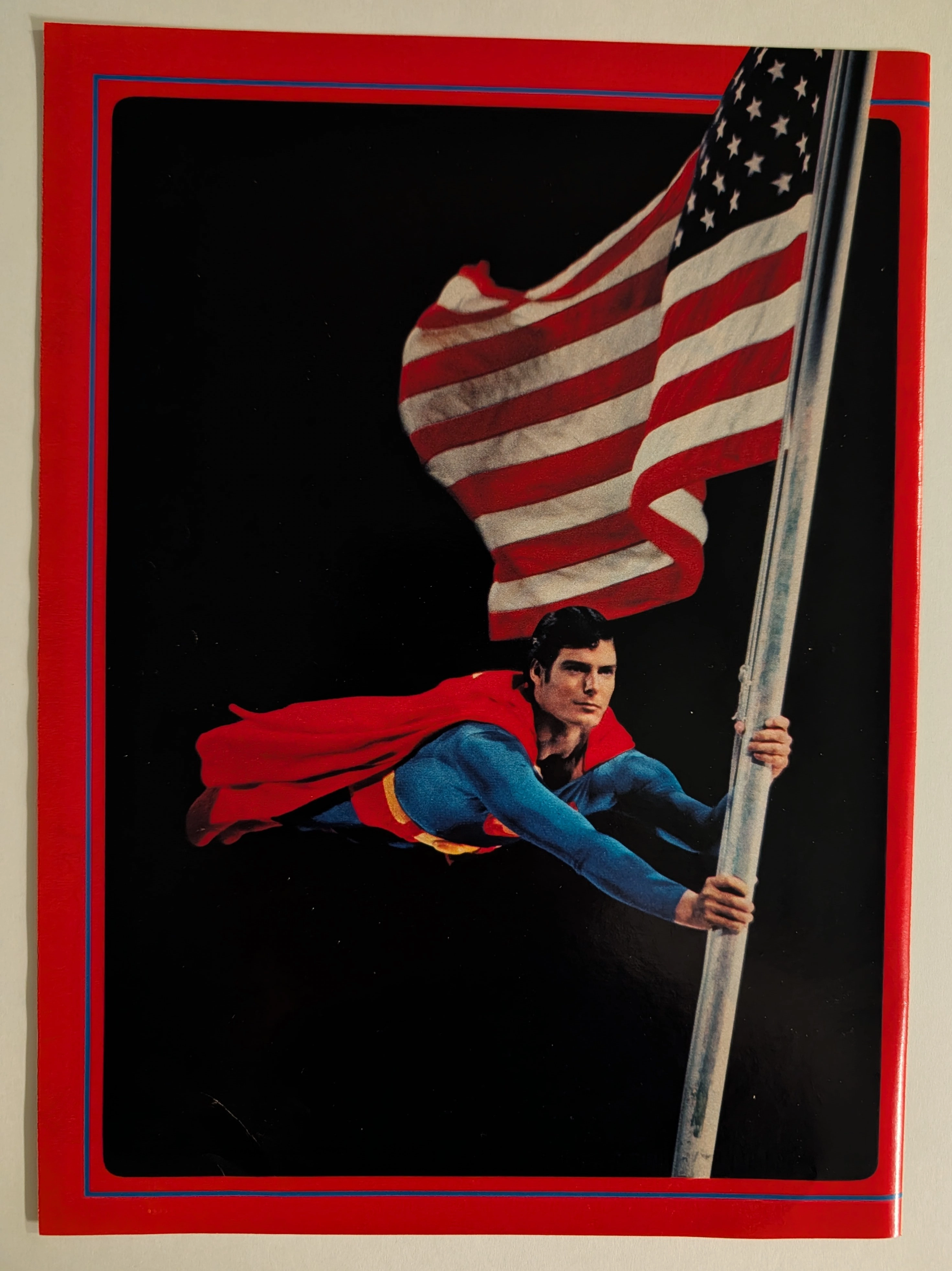
THE TIME TRAVELLER'DOISSIER : SUPERMAN — The Christopher Reeve Flagpole Postcard and the Birth of the Superhero Blockbuster
The item analyzed is an official Superman movie merchandise postcard or large-format photo card, featuring Christopher Reeve as Superman clinging dramatically to a metal flagpole while a large American flag billows behind him against a pure black background. The image is framed with a bold red outer border and a thin blue inner rule — a design consistent with the official Superman: The Movie (1978) merchandising aesthetic produced under license from Warner Bros. and DC Comics. Christopher Reeve (September 25, 1952 – October 10, 2004) portrayed Superman in four films (1978, 1980, 1983, 1987) and is universally regarded as the definitive cinematic Superman. This specific image — the flagpole scene lit dramatically against black — is one of the most iconic publicity photographs from the original film's promotional campaign. The physical item shows signs of age consistent with approximately 45–47 years, with slight surface wear and minor corner softening visible. The postcard format (estimated 4×6 or 5×7 inches) and the glossy coated stock are typical of high-quality movie merchandise of the late 1970s.
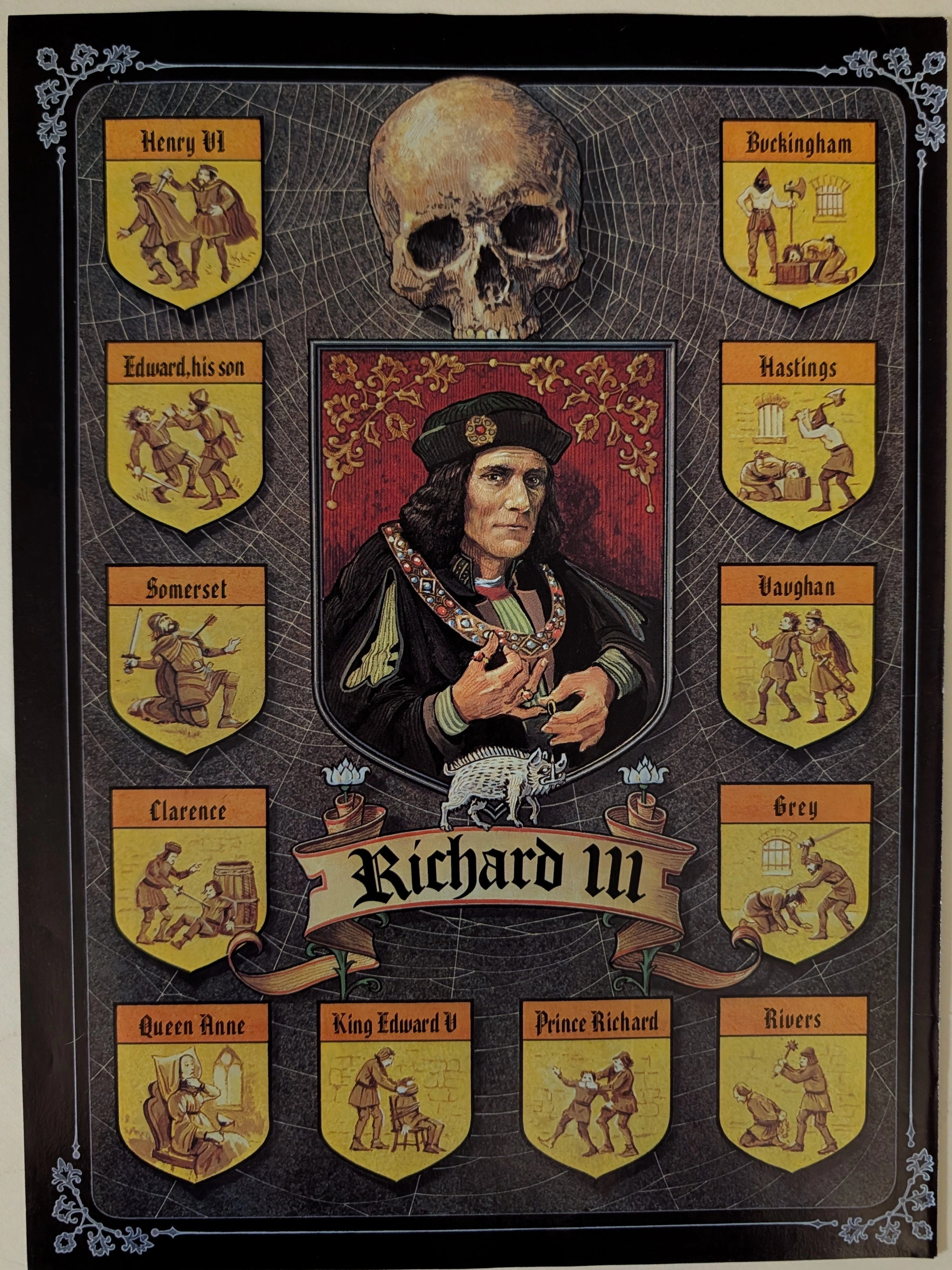
The Time Traveller’s Dossier: Circa 1970s Shakespearean Richard III Vintage Illustration — The Tudor Web of Blood
Delve into the archives to explore this definitive Circa 1970s Shakespearean Richard III vintage illustration, a profoundly dark and historically layered piece of theatrical and literary art. Likely produced as an educational broadside or promotional poster for a mid-to-late 20th-century theatrical run, this piece transcends basic historical depiction, serving instead as a macabre visual map of the corpse-paved path to the English throne as dramatized by William Shakespeare. For collectors of Gothic art, literary ephemera, and vintage ads, this artifact stands as a masterful intersection of historical reverence and narrative design. Unlike standard old advertisements or classic print ads that promote consumer goods, this illustration acts as a haunting visual codex of the "Tudor Myth." Its preservation of chilling literary iconography makes it a highly coveted piece of specialized print ephemera, capturing the visceral dread of Shakespeare's most infamous usurper.
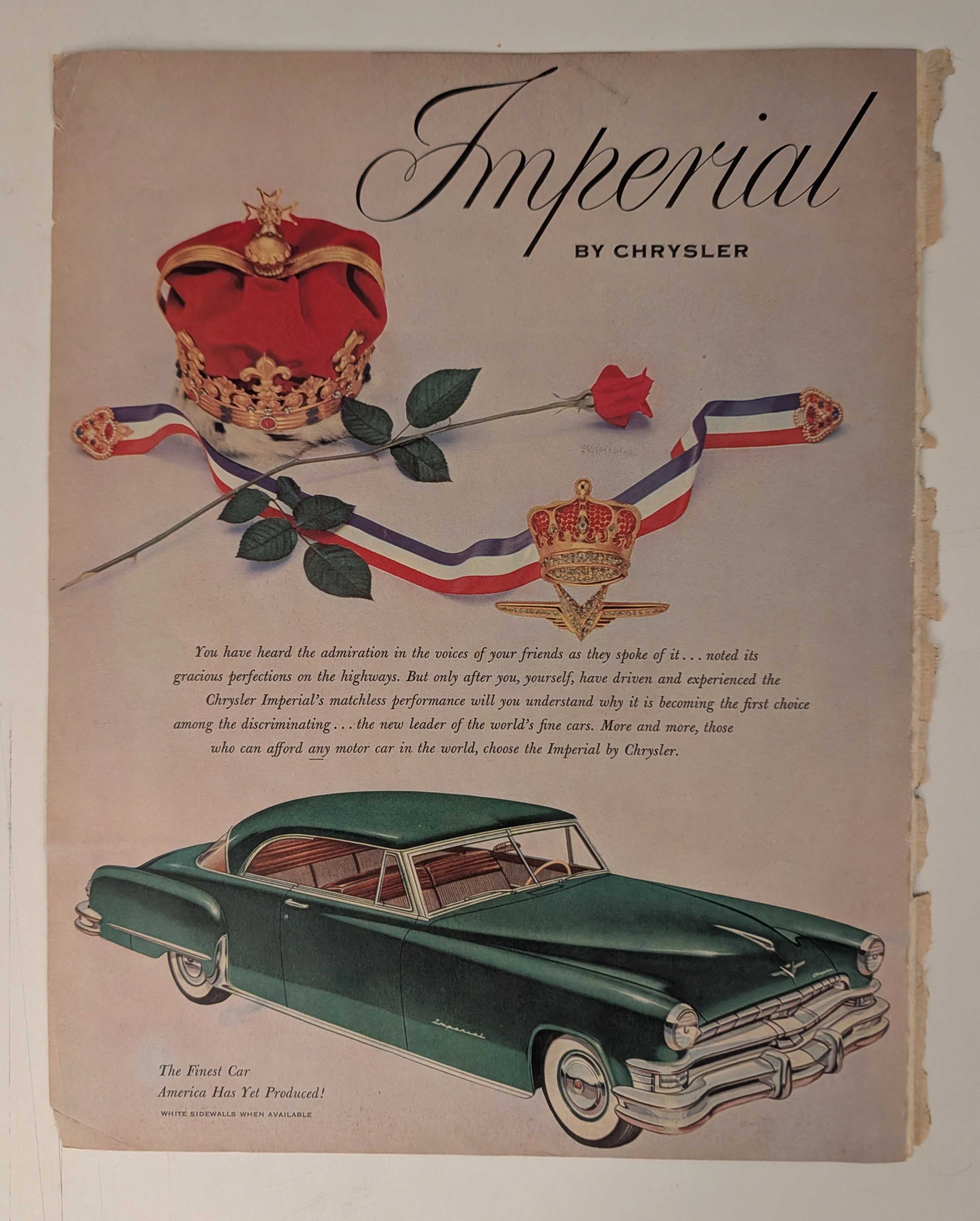
Chrysler · Automotive
THE TIME TRAVELER'S DOSSIER: THE KOREAN WAR ANCHOR AND THE SCARCITY OF LUXURY
The artifact under our uncompromising, unprecedented museum-grade analysis is a profoundly preserved Historical Relic excavated from the golden age of post-WWII American opulence. This Primary Art Document is a monumental magazine advertisement for the Imperial by Chrysler, dating to the pivotal 1951-1952 era. This document is a "Forensic Blueprint of American Aristocracy and Geopolitical Crisis." It masterfully weaponizes regal European iconography to elevate Chrysler's flagship model above mere transportation, explicitly targeting "those who can afford any motor car in the world". Yet, its most significant historical anchor is hidden in the microscopic fine print: "WHITE SIDEWALLS WHEN AVAILABLE". This single sentence instantly transforms the advertisement into a wartime relic, reflecting the severe rubber shortages imposed during the Korean War. Grounded by the iconic jeweled emblem and its breathtaking wabi-sabi chemical degradation—highlighted by its violently torn binding edge—this artifact commands an irreplaceable status, cementing its Rarity Class A designation.