THE TIME TRAVELER'S DOSSIER :THE APPARITION OF HERITAGE — THE STRIDING MAN
The History
Welcome to the heavily guarded, velvet-roped sanctuaries of mid-century American aristocracy. To merely glance at this document is a severe dereliction of curatorial duty; we must forensically interrogate its psychological intent. In the post-WWII era, America was experiencing an unprecedented economic explosion. A new class of wealthy executives, managers, and suburbanites had emerged. However, new money always craves the validation of old heritage.
This advertisement is the ultimate sociological mechanism designed to provide that validation. Examine the trio of men seated under the scalloped awning. They are not working; they are at absolute leisure. Their attire—the soft-shouldered tweed jackets, the club ties, the casual yet perfectly pressed slacks—screams of the "Ivy League" or "WASP" aesthetic. Behind them, men engage in golf, a sport requiring vast expanses of manicured land, signifying ultimate exclusivity. By placing a bottle of Johnnie Walker on their table, the advertising agency is executing a flawless piece of social engineering: If you consume this liquid, you are not just drinking alcohol; you are purchasing entry into this specific, exclusionary socio-economic echelon.
[ PART II: THE APPARITION OF HERITAGE — THE STRIDING MAN ]
The absolute focal point of this canvas is not the product, but the mascot. The "Striding Man" is one of the most successful, universally recognized corporate avatars in the history of global capitalism. Originally sketched on a menu by the great illustrator Tom Browne in 1908, the figure was designed to transform the founder, John Walker, from a humble grocer into an Edwardian dandy.
Notice how the artist has rendered him here. He is disproportionately large compared to the men in the background. He is a ghost, an idea, a physical manifestation of pedigree crossing over from the 19th century directly into the mid-20th century. His Hessian boots with tassels, the riding crop, the monocle, and the beaver-hair top hat are hyper-specific markers of British nobility. The tagline anchored directly beneath his boot—"Born 1820... still going strong"—is a brilliant psychological hook. It promises the anxious, newly wealthy American consumer that by purchasing this whisky, they are inheriting over a century of unshakeable European tradition and stability.
[ PART III: THE ALCHEMY OF COPYWRITING AND HIDDEN CORPORATE ANCHORS ]
The copywriting at the base of the page is a masterclass in subtle, persuasive arrogance. It commands: "MEET A GREAT SCOT!". It does not beg you to buy; it introduces you to a dignitary. It assumes you are already worldly enough to "appreciate the natural lightness" and "savour that world-famous mellowness".
However, the true forensic anchor of this document lies in the microscopic italicized text at the very bottom: "Canada Dry Ginger Ale, Inc., New York, N.Y., Sole Importer.". This is a massive historical clue. For decades, the Canada Dry corporation held the exclusive US distribution rights to Johnnie Walker, a partnership that dominated the mid-century liquor market. This specific corporate imprint roots the ethereal artwork firmly into the concrete reality of New York-based, post-war corporate logistics. Furthermore, the discreet text "HOLIDAY / JUNE" reveals its origin. Holiday magazine (published 1946-1977) was the most luxurious, sophisticated travel magazine in America. This ad was placed precisely where the absolute elite of the nation would see it.
[ PART IV: FORENSIC MACRO LITHOGRAPHY AND ICONOGRAPHY ]
At The Record, our curatorial gaze penetrates down to the molecular level of the ink. Direct your attention to the extreme macro crop of the highball glass and the bottle resting on the table.
Here, the illusion of the painting breaks down into the brutal, beautiful reality of mid-century offset lithography. You can explicitly see the "halftone rosettes"—the microscopic, overlapping dots of cyan, magenta, yellow, and black ink that trick the human eye into perceiving solid colors and shading. The reflection of the ice cubes in the glass and the amber glow of the whisky are revealed to be nothing more than a calculated mathematical arrangement of ink dots.
Examine the two bottles at the bottom left. The artist has painstakingly rendered the distinctive square bottles—a design innovation introduced by Alexander Walker in 1860 to reduce breakage and pack more bottles into shipping crates. Furthermore, the iconic labels, applied at a precise angle of 24 degrees, are rendered with hyper-realistic fidelity, showcasing the "Johnnie Walker Red Label" and "Black Label" designations alongside the intricate Royal Warrant crests. This is not just art; it is forensic product documentation.
The Paper
The physical medium of this artifact is just as historically profound as the artwork it carries. We must maintain absolute, uncompromising reverence for the inevitable, tragic beauty of analog destruction.
Examine the extreme left edge of the entire canvas. You will notice a deeply jagged, uneven, and violently torn perimeter running vertically from top to bottom. Amateurs and sterile perfectionists might view this as damage. At The Record, we view this as the "Scar of Liberation." It is the undeniable physical proof that this high-quality page was forcefully and purposefully ripped from the metal staples of a thick, original issue of Holiday magazine. It was rescued from the incinerator of history by someone who recognized its artistic value decades ago.
Furthermore, observe the surface of the paper itself. Over roughly 70 years, ambient oxygen and ultraviolet light have waged a relentless chemical war against the paper's inherent wood-pulp lignin. This irreversible oxidation process has birthed a magnificent, undeniable "patina." What was once a sterile, bright white background has gracefully degraded into a deep, warm, toasted Antique Ivory.
This is the profound Japanese aesthetic of wabi-sabi—the spiritual realization of finding absolute perfection in impermanence, flaw, and decay. This paper is quietly, literally burning itself alive at a molecular level. Its slow, majestic, and irreversible death is precisely what transfigures it from a disposable piece of mid-century corporate marketing into an immortal piece of Primary Art. No digital screen can ever replicate the tactile fragility or the distinct olfactory signature of this decaying 1950s pulp.
The Rarity
To understand the immense, almost incalculable valuation of this artifact, you must comprehend the brutal reality of ephemera survival. The post-war era was defined by rapid consumption; magazines were read on airplanes or in country club lounges and immediately discarded.
The statistical probability of a full-page, highly detailed Johnnie Walker advertisement from Holiday magazine surviving seven decades with its halftone colors so vividly saturated, its typography perfectly intact, and its historical importer data preserved is staggeringly low.
When you fuse this pristine physical preservation with the monumental sociological signaling of the American leisure class, the mythological iconography of the Striding Man, the forensic evidence of mid-century lithography, and the breathtaking wabi-sabi degradation of its torn paper stock, this artifact unequivocally commands the highly prestigious Rarity Class A designation. It has evolved far beyond a disposable piece of vintage commercial advertising. It is a highly coveted Historical Relic, a museum-grade testament to transatlantic commerce and the psychology of wealth, demanding to be framed and fiercely protected by an alpha curator who understands the heavy, beautiful weight of analog history.
Visual Impact
The Visual Impact of this vertical canvas is a masterclass in establishing an immediate, unassailable socio-economic hierarchy. The architectural layout employs a brilliant "foreground-background" psychological dichotomy.
In the background, bathed in the soft, diffused, and highly privileged light of a country club awning, sit three impeccably tailored men. Their posture is relaxed, their smiles are effortlessly confident; they represent the static, untouchable summit of the post-war American Dream. Behind them, the green expanse of a golf course—the ultimate spatial luxury—stretches to the horizon.
However, the foreground erupts with kinetic, almost supernatural energy. The iconic "Striding Man"—dressed in an aristocratic crimson riding coat, pristine white breeches, Hessian boots, and a top hat—is marching across the canvas from left to right. He is not a man; he is an apparition, an avatar of unbroken lineage and relentless progress. The visual weight of his bright red coat forces the viewer's eye to follow his stride, seamlessly leading down to the meticulously rendered bottles of Red and Black Label whisky waiting in the lower-left quadrant. The violently torn left edge of the page provides a brutal, physical frame to this scene of high-society serenity, anchoring the illusion firmly to the tragic reality of physical decay.
Exhibition Halls
The Archive Continues
Continue the Exploration
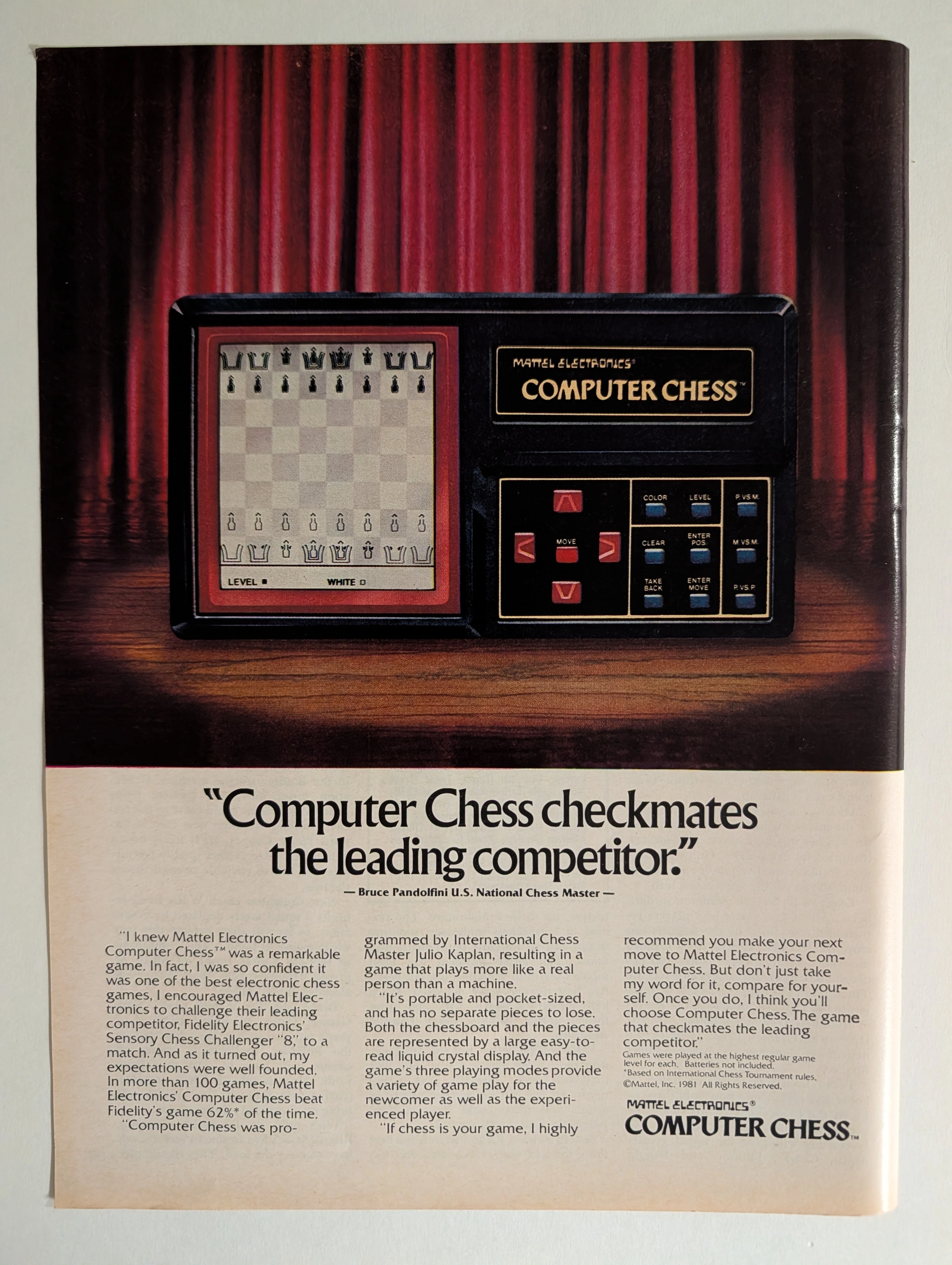
Mattel Electronics Computer Chess 1981 Full-Page Ad | Bruce Pandolfini | Julio Kaplan | Chess AI History | Deep Analysis Rarity Class A
The advertisement analyzed here is a full-page full-color magazine advertisement for the Mattel Electronics Computer Chess™ handheld/tabletop electronic game, copyright © Mattel, Inc. 1981. The ad ran in major American consumer magazines during 1981–1982 — the golden apex of the first electronic game boom. It features a dramatic theatrical photograph of the device spotlit against red velvet curtains on a wooden stage, with a bold competitive claim endorsed by U.S. National Chess Master Bruce Pandolfini: that Mattel's Computer Chess beat Fidelity Electronics' Sensory Chess Challenger '8' in more than 62% of over 100 head-to-head games. The ad also credits International Chess Master Julio Kaplan as programmer. This single page represents the intersection of early consumer AI history, 1980s toy advertising at its most theatrical, and a pivotal moment in the chess-computer arms race that prefigured Deep Blue.
De beers · Fashion
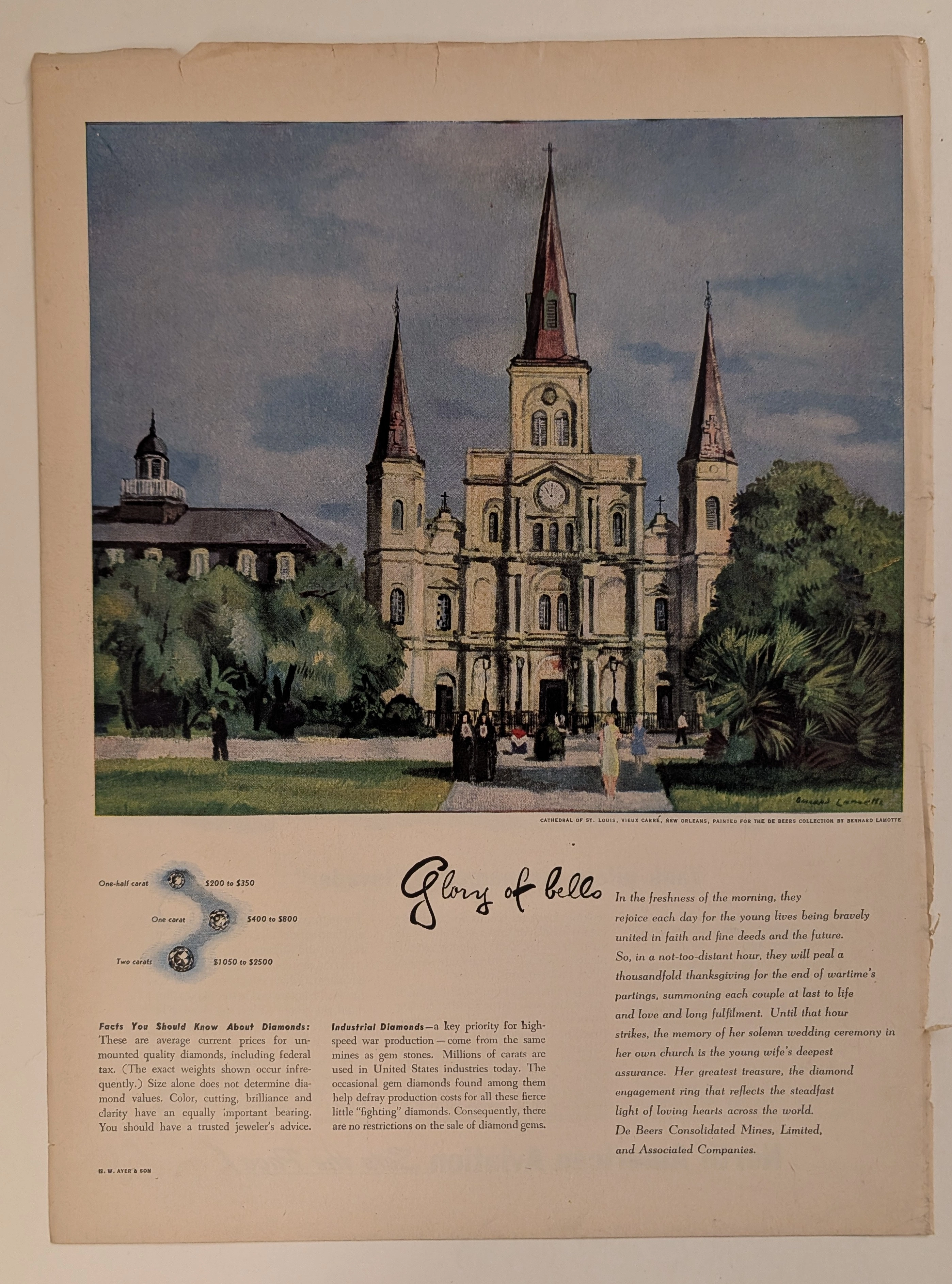
The Time Traveller's Dossier: The Architecture of Eternity – De Beers "Glory of Bells" Advertisement (Circa early 1940s)
History is not shaped by chance; it is engineered by those who control the narrative and own the resources. Long before the digital age fragmented human attention, the ultimate manifestations of social engineering and psychological manipulation were executed through the calculated precision of the four-color offset printing press and the masterful strokes of commercial fine art. The historical artifact presented before us is not merely a page from a vintage magazine. It is a perfectly weaponized blueprint of corporate capitalism, a masterpiece of emotional extortion, and a foundational document in the creation of one of the most successful, universally accepted illusions in the history of human commerce: the diamond engagement ring. This museum-grade, academic archival dossier presents an exhaustive, microscopic deconstruction of a World War II-era print advertisement for De Beers Consolidated Mines, Limited, executed by the legendary advertising agency N.W. Ayer & Son. Operating on a profound and ruthless binary structure, this document records a calculated paradigm shift within the global luxury and gemstone industry. It captures the precise historical fracture where a monopolized carbon allotrope was conceptually transmuted from a rare gemstone into an absolute, non-negotiable sacrament of love, faith, and matrimony. Through the highly specialized lens of late-analog commercial artistry and stringent visual forensics, this document serves as a masterclass in psychological marketing. It established the foundational archetype for linking extreme financial expenditure with spiritual and emotional devotion—an archetype that unconditionally dictates the visual and strategic totems of the modern diamond industry today.
THE TINY TEXT THAT AUTHENTICATES HISTORY Why Fine Print in Magazine Advertisements Matters More Than You Think
Tiny copyright notices in magazine ads originated from mandatory US copyright law (1909 Act) and sector-specific regulations (BATF for alcohol). They function as layered authentication evidence: typographic era-consistency, regulatory language accuracy, ink/paper forensics, and contextual integrity — paralleling vintage band tee authentication methods. Collaboration credits (Pierre Cardin × Tiffany & Co.) and creative credits (photography, calligraphy, fashion) document commercial relationships lost to no other record.