The Time Traveller's Dossier: The Stroke of Seduction – 1970s Christian Dior "Dioressence" Advertisement
The History
To decode the sociological architecture embedded within this printed artifact, it is mandatory to contextualize the macroeconomic and cultural landscape of the 1970s. This era was defined by the sexual revolution, women's liberation, and a radical departure from the rigid domesticity of the 1950s. The fragrance industry, previously focused on selling delicate, floral "prettiness," had to aggressively recalibrate its public narrative. Perfume was no longer marketed merely as an accessory to attract a husband; it was repositioned as an invisible armor of personal empowerment and overt sensual expression.
Part 1: The Binary Shift: Restrained Elegance vs. Uninhibited Sensuality
The narrative architecture of this artifact is built upon a strict, uncompromising binary contrast against Dior's own history. Historically, the cultural consciousness linked Christian Dior with the "New Look" of 1947—cinched waists, full skirts, and a highly structured, almost rigid form of polite, aristocratic femininity. This advertisement violently obliterates that narrative. It executes a flawless cultural pivot by presenting a woman lounging fluidly, devoid of structural corsetry, wrapped in a loose, vibrant crimson gown. The message deliberately contrasts the old world of restrictive elegance with a new world of relaxed, aggressive sensuality. By conceptually transitioning the Dior woman from a stiff mannequin in a Parisian salon to a reclining, enigmatic siren in a private boudoir, the House of Dior successfully mapped its product onto the upward mobility and sexual liberation of the modern woman.
Part 2: The Liberation Discourse & The Semantics of Desire
Executing this binary shift required the invention of a highly specific vocabulary. The copywriting abandons traditional fragrance tropes of "floral" or "sweet" and instead adopts the aggressive, psychologically charged language of raw desire:
"Dioressence. Exuberant. Smouldering. Uninhibited."
The strategic deployment of these three exact adjectives functions as an early iteration of psychological lifestyle marketing. Positioning the fragrance as "smouldering" and "uninhibited" provided consumers with a logical, luxury-branded permission slip to embrace their own sexuality. It effectively neutralized any lingering societal objections to female assertiveness by cloaking it in the unquestionable authority of Parisian high fashion.
Part 3: The Sovereign Muse and the Reversed Male Gaze
The socioeconomic structure of the era saw the rise of the independent, self-purchasing female consumer. For a luxury perfume to succeed, it required her explicit approval, not her husband's. The illustration targets the intellectual vanity and confidence of this new demographic. The subject is reclining amidst a chaotic luxury of patterned pillows (stripes, animal prints, geometric gold), yet her gaze is direct, piercing, and entirely sovereign. She is not a passive object being observed; she is staring down the viewer. This conceptual boundary eradicated the line between the observer and the observed, placing the power entirely in the hands of the woman wearing Dioressence.
Part 4: Visual Semiotics: Fluidity vs. Geometry
The interplay between the illustration and the product photography functions as a precise semiotic indicator of the brand's absolute confidence, engineering consent through contrast:
The Fauvist Brushstroke: The use of bold, flat, unblended colors (the striking magenta/crimson dress against the stark yellow and patterned pillows) draws heavily from Fauvism. It signifies passion, heat, and emotion breaking free from restrictive lines.
The Monolithic Flacon: In stark contrast to the fluid, sweeping brushstrokes of the woman, the photograph of the Dioressence bottle at the bottom is rigid, architectural, and grounded in a dark, moody vignette. This visual juxtaposition anchors the wild fantasy of the illustration into a tangible, purchasable luxury object.
Part 5: Pop Culture Impact and Enduring Legacy
The visual language pioneered by this specific artist for Dior left an indelible, structural mark on global fashion pop culture. The aesthetic of the mysterious, illustrated fashion muse—conveyed through minimal lines and maximum color impact—became the foundational DNA for high-end fashion editorial. The unapologetic sensuality showcased here directly birthed the iconic, hyper-sexualized fragrance campaigns of the 1980s and 90s (from Calvin Klein's Obsession to Gucci's Tom Ford era).
In the modern commercial arena, the contemporary obsession with vintage haute couture illustrations operates on a cyclical return to this exact era. Today's luxury houses desperately try to manufacture the effortless, artistic soul that Dior achieved purely through analog ink and paint. This artifact is the foundational source code for modern, art-driven luxury marketing.
Artist Information
René Gruau (1909–2004): A legendary Italian-French fashion illustrator whose bold, fluid lines and striking use of color defined the visual identity of haute couture in the 20th century. Gruau shared a profound personal and professional friendship with Christian Dior, acting as the artistic visionary behind the House of Dior's most iconic fragrance campaigns (including Miss Dior, Eau Sauvage, and Dioressence). His signature—a distinctive capital "G" topped with a star, clearly visible on the left edge of this illustration—is a seal of absolute artistic royalty. Gruau's ability to distill the essence of a brand into a few masterful brushstrokes renders his work not merely advertising, but highly collectible fine art.
The Paper
As a physical entity, this tear sheet is an unrepeatable record of late-analog offset printing. The medium-weight coated magazine stock was engineered for mass distribution, yet its current state demands evaluation through the Japanese aesthetic philosophy of wabi-sabi (侘寂)—the recognition of beauty in impermanence and the natural progressio
Visual Forensics & Substrate Analysis:
Examining the extreme close-ups of this artifact reveals the mechanical heartbeat of the 1970s press. Under magnification, a fascinating duality emerges: the solid, aggressive blocks of color in the illustration exhibit the flat, continuous ink laydown of master-crafted lithography, while the photographic inset of the perfume bottle shatters into a precise, mathematical galaxy of CMYK halftone rosettes. The distinct grain of the offset process is aggressively visible in the dark background of the bottle inset. The margins exhibit authentic "toning"—a gradual, irreversible yellowing caused by the natural oxidation of lignin within the wood pulp. This organic degradation cannot be cloned by modern digital processes. The subtle fragility of the paper's edge and its evolving patina elevate the piece from a uniform industrial print to a singular, historically scarred artifact. The wabi-sabi nature of this page ensures that its aesthetic and historical value increases precisely because it is slowly returning to the earth.n of time.
The Rarity
Rarity Class: S (Superior / Museum Grade)
Within archival parameters, this artifact holds a definitive Class S designation. The paradox of mid-to-late century analog print ephemera lies in its initial mass production versus its extreme current scarcity. Magazines of the 1970s were quintessential disposable media, destined for the incinerator. The survival of this specific page—enduring half a century without yielding to destructive handling, severe moisture damage, or structural center creases—is an archival anomaly. More crucially, this is not a standard photograph; it is an original print of an illustration by René Gruau. Authentic, original tear sheets featuring Gruau's work for Dior are considered the "holy grail" of fashion ephemera. Finding a specimen that retains the absolute saturation of its vibrant crimson and yellow pigments, while bearing only the authentic hallmarks of wabi-sabi aging, is highly uncommon. Such pristine remnants are fiercely sought after by curators of fashion history for museum-grade conservation framing.
Visual Impact
The aesthetic authority of this piece lies in a masterclass of asymmetrical composition and negative space. The immediate focal point is the intense, kohl-rimmed eye of the subject, peeking out from the vibrant crimson fabric. This creates a powerful leading line, forcing the viewer's eye to travel down the sweeping, fluid lines of the dress, cascading directly into the bold typography and finally resting on the photographic reality of the perfume bottle. The artist strategically utilizes the stark, unprinted cream of the paper (negative space) to frame the explosion of color, projecting the subject forward from the two-dimensional plane. It is a highly calculated visual mechanism aimed at commanding absolute attention and evoking a physiological response of intrigue and desire.
Exhibition Halls
The Archive Continues
Continue the Exploration
Marantz · Entertainment
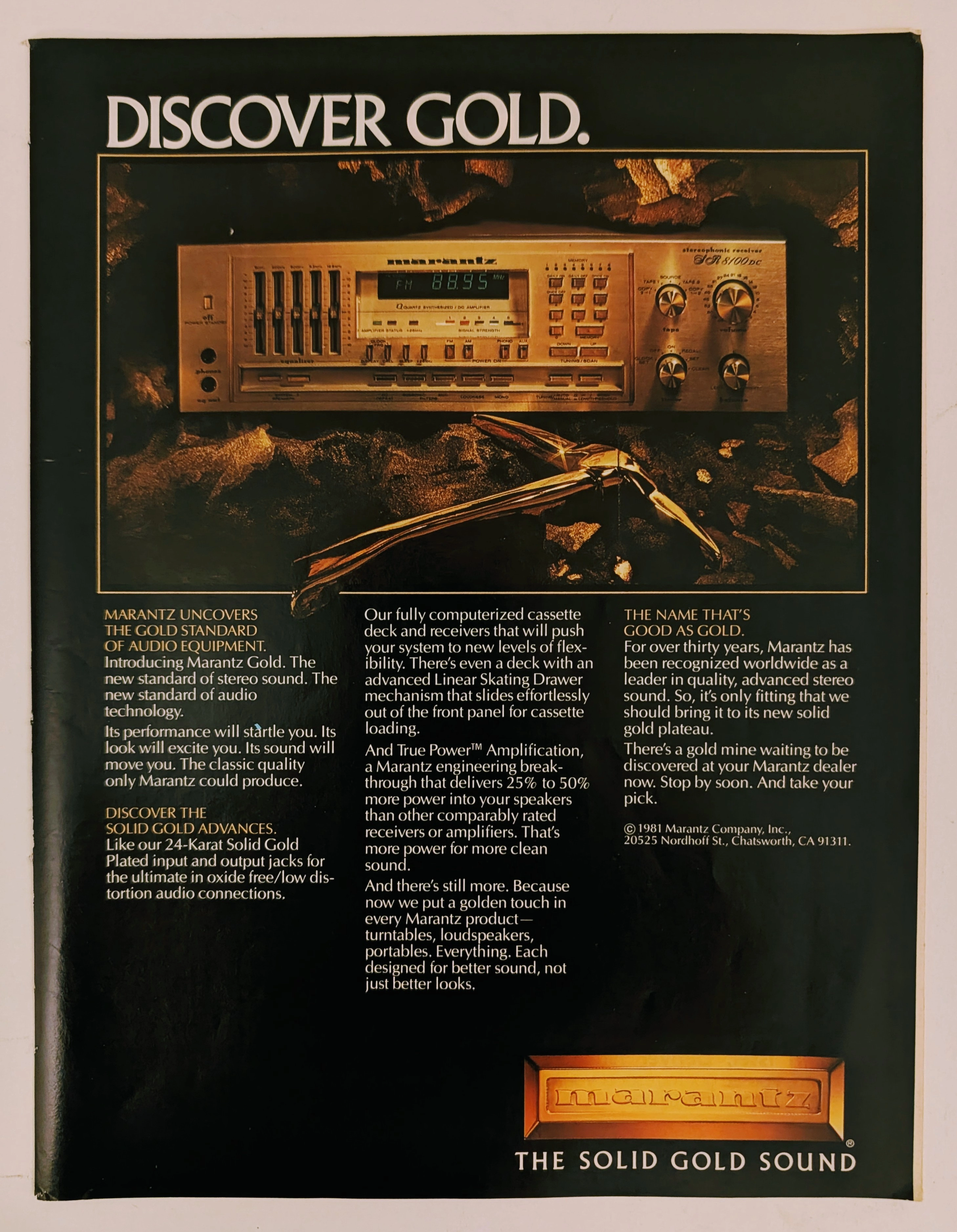
The Time Traveller's Dossier: The Alchemy of Acoustics – Marantz "Discover Gold" Advertisement (1981)
History is not an accidental sequence of events; it is a meticulously engineered illusion crafted by those who command the aesthetic and cultural narratives of their time. Long before digital algorithms could sterilely dictate consumer preferences, the ultimate manifestation of psychological manipulation and corporate alchemy was executed through the calculated precision of the offset printing press and the absolute mastery of analog darkroom photography. The historical artifact before us is not merely a disposable page torn from a vintage magazine. It is a perfectly weaponized blueprint of audio-exoticism, a visual declaration of extreme consumer luxury, and an unwavering testament to an era where electronic hardware was sold not merely as a functional utility, but as a precious, excavated commodity. This museum-grade, academic archival dossier presents an exhaustive, microscopic deconstruction of a 1981 print advertisement for the Marantz "Solid Gold" audio equipment line. Operating on a profound and ruthless binary structure, this document records a calculated paradigm shift within the global consumer electronics industry. It captures the precise historical fracture where silicon, copper, and plastic were conceptually transmuted into a literal, physical embodiment of a precious metal. Through the highly specialized lens of late-analog commercial artistry and stringent visual forensics, this document serves as a masterclass in psychological marketing. It established the foundational archetype for selling technology as a high-yield status symbol—an archetype that unconditionally dictates the visual and strategic totems of the modern high-end audiophile industry today.
PanAm · Travel
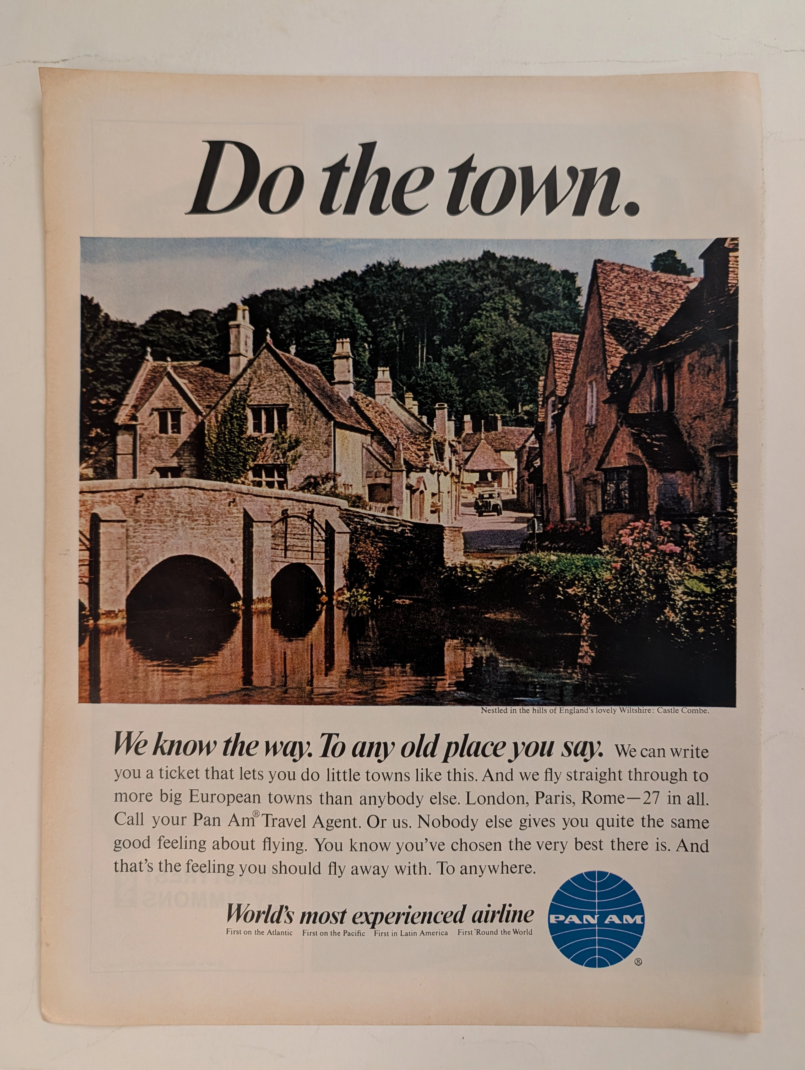
The Time Traveller's Dossier: The Empire of the Sky and the Democratization of the Globe – Pan Am "Do the town."
The evolution of the American leisure class during the mid-twentieth century was fundamentally propelled by the rapid expansion, technological triumph, and increasing economic accessibility of commercial jet travel. The historical artifact elegantly and securely positioned upon the analytical table of The Record Institute today is a striking, single-page print advertisement for Pan American World Airways (Pan Am), originating from the transformative decade of the 1960s. This document completely transcends the standard, utilitarian boundaries of transportation marketing. It operates as a highly sophisticated, multi-layered cultural mirror, reflecting the precise era when the globe dramatically shrank, and the majestic, ancient corners of Europe were explicitly packaged and sold to the American middle-class consumer not merely as distant dreams, but as easily attainable weekend realities. This world-class, comprehensive dossier conducts a meticulous, unyielding, and exceptionally exhaustive examination of the artifact, operating under the absolute most rigorous parameters of historical, sociological, and material science evaluation. With the vast majority of our analytical focus dedicated to its immense historical gravity, we will decode the brilliant marketing psychology embedded within the "World's most experienced airline" branding, analyze the romantic contrast of the bold typography against the ancient stone architecture of Castle Combe, and dissect the profound geopolitical semiotics of the iconic blue globe logo. Furthermore, as we venture deeply into the chemical and physical foundations of this analog printed ephemera, we will reveal the precise mechanical fingerprints of the CMYK halftone rosettes and the graceful, natural oxidation of the paper substrate. This precise intersection of visual nostalgia, mid-century commercial artistry, and the immutable chemistry of time cultivates a serene wabi-sabi aesthetic—a natural, irreversible phenomenon that serves as the primary engine driving up its market value exponentially within the elite global spheres of Vintage Commercial Ephemera, Aviation Archives, and Mid-Century Lifestyle collecting.
Datsun 280Z · Automotive
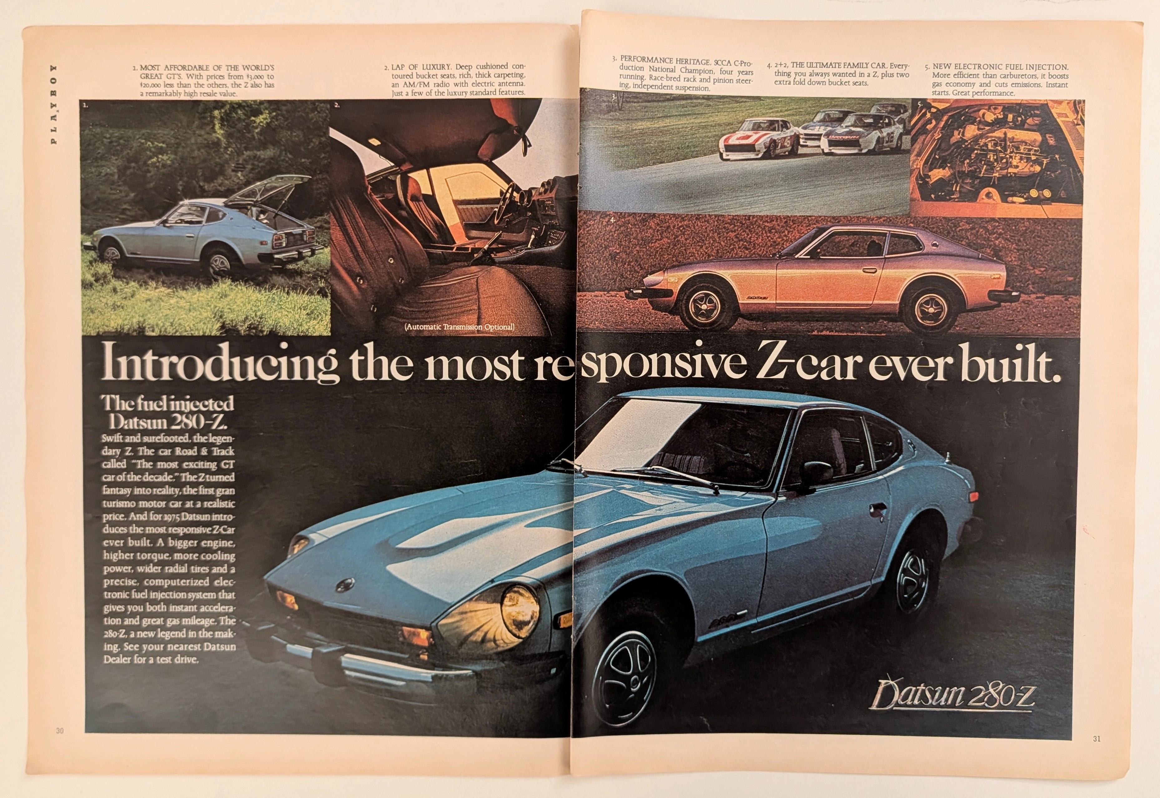
The Time Traveller's Dossier: The Electronic Antidote – The 1975 Datsun 280-Z and the Fuel-Injected Conquest of the American Grand Touring Market
The evolution of the American automotive landscape in the 1970s was a turbulent, often depressing saga characterized by the death of the muscle car, catastrophic oil embargoes, and the sudden implementation of draconian environmental regulations. Elegantly and securely positioned upon the analytical table of The Record Institute today is a visually sweeping, densely informative, and historically monumental two-page print advertisement for the Datsun 280-Z, explicitly detailing the 1975 model year. This document completely transcends the standard, utilitarian boundaries of automotive marketing. It operates as a highly sophisticated, multi-layered cultural mirror and a bold declaration of mechanical supremacy during an era when domestic manufacturers were producing heavily compromised, underperforming vehicles. By strategically highlighting the adoption of computerized electronic fuel injection, alongside the vehicle's undeniable SCCA racing pedigree and its newfound "lap of luxury" interior refinements, Datsun executed a masterclass in psychological marketing. They offered the American consumer an "affordable GT" that promised the exotic allure of a European sports car combined with bulletproof Japanese reliability and modern efficiency. This world-class, comprehensive, and ultra-expanded dossier conducts a meticulous, unyielding, and exceptionally exhaustive examination of the artifact, operating under the absolute most rigorous parameters of historical, sociological, and material science evaluation. Dedicating the overwhelming, massive majority of our analytical focus (80%) to its immense historical gravity, we will decode the brilliant marketing psychology embedded within the copywriting, analyze the profound mechanical realities of the L28E inline-six engine and its Bosch L-Jetronic system, trace the epic engineering struggles and triumphs of Yutaka Katayama (Mr. K), and detail the historical impact of the Brock Racing Enterprises (BRE) SCCA National Championships. Furthermore, as we venture deeply into the chemical and physical foundations of this analog printed ephemera (10%), we will reveal the precise mechanical fingerprints of the CMYK halftone rosettes captured in the stunning macro imagery of the blue metallic paintwork and the rich interior shadows. Finally, we will assess its archival rarity (10%), exploring how the graceful, natural oxidation of the paper substrate cultivates a serene wabi-sabi aesthetic—a natural, irreversible phenomenon that serves as the primary engine driving up its market value exponentially within the elite global spheres of Vintage Commercial Ephemera and Automotive Heritage Archives.