


The Time Traveller's Dossier: The Anatomy of Autonomy – The 1966 Bulova Commander Collection and the American System of Watchmaking
The History
To fully appreciate the immense historical gravity, cultural magnitude, and sociological importance of this artifact, one must meticulously contextualize the complex, highly competitive landscape of the global watchmaking industry in the mid-1960s. During this era, the Bulova Watch Company was an absolute titan of global commerce. They were the largest marketer of jeweled-movement watches in the United States, possessing an advertising budget and a distribution network that eclipsed nearly all competitors. However, 1966 was also a period of profound technological transition. Bulova had recently revolutionized the world with the release of the electronic Accutron tuning-fork watch in 1960, a space-age marvel utilized by NASA. Yet, this specific artifact does not promote electronics; it champions the Bulova Commander, a traditional, 30-jewel, self-winding mechanical timepiece. This deliberate choice reveals a critical historical narrative: even as they conquered the future of electronic timekeeping, Bulova possessed a fierce, unwavering pride in their absolute mastery of traditional mechanical micro-engineering.
The audacious headline anchoring the bottom of the artifact—"If you want something done right, do it yourself."—is a masterstroke of mid-century psychological marketing. It taps directly into the foundational American ethos of the Protestant work ethic, self-reliance, and uncompromising personal responsibility. The advertising copy delves deeply into this philosophy, establishing a direct attack on the traditional Swiss établissage system. Historically, the Swiss watch industry was highly compartmentalized horizontally; a brand would often purchase movement blanks (ébauches) from one factory, dials from another, and cases from a third, merely acting as an assembler. Bulova, conversely, pioneered the "American System of Watchmaking" under its founder, Joseph Bulova. This system prioritized vertical integration—the mass production of highly standardized, perfectly interchangeable parts manufactured entirely under one corporate roof.
The copy proudly, almost defiantly, declares: "As far as we know, except for the jewels, we make more of our own parts than any other watch company in the world. It's not the easiest way, nor the cheapest, but it makes it very unlikely that anything will go wrong with a Bulova". In an era where consumers were increasingly skeptical of complex, mass-produced goods, Bulova was selling ultimate corporate accountability. They were explicitly telling the buyer that if a gear failed or a mainspring snapped, there was no labyrinth of subcontractors to blame—the responsibility rested solely and squarely on Bulova's shoulders.
The specific timepiece featured, the Commander Collection automatic, highlights the mechanical extravagance of the era. The prominently advertised "30 Jewels" indicates a highly sophisticated, premium movement (likely the robust Bulova caliber 10COAC). In mechanical horology, synthetic ruby jewels are utilized as bearings to radically reduce friction at the pivot points of the gear train. A standard manual-wind watch of the era functioned perfectly on 17 jewels; the inclusion of 30 jewels signifies an over-engineered, ultra-low-friction automatic movement designed for decades of relentless, accurate service. Paired with a solid "14K gold" case, this was a formidable instrument of status.
Furthermore, the copyright line at the absolute bottom of the page serves as a testament to the staggering global reach of the Bulova empire in 1966. It lists: "New York, Toronto, Bienne, Milan, London, Frankfurt, Hong Kong". Bulova was no longer just an American company operating out of Woodside, Queens; they were a sprawling, multinational conglomerate. Their massive factory in Bienne, Switzerland, successfully combined the mechanized efficiency of the American assembly line with the centuries-old pedigree of Swiss horological craftsmanship. This artifact is a definitive, museum-grade record capturing Bulova at the absolute, untouchable height of its mechanical empire, just a few short years before the "Quartz Crisis" of the 1970s would arrive to permanently decimate and restructure the global mechanical watch industry.
The Paper
As a physical entity, this printed artifact functions as a living, breathing, and profound record of mid-twentieth-century graphic reproduction and substrate chemistry. Under exceptional, high-magnification macro-lens examination, this document reveals the stunning complexity and mathematical precision of analog color printing.
The extraordinary macro photographs of the watch face and the textured, dark brown alligator leather strap provide a textbook visualization of a CMYK halftone rosette pattern. The intricate golden hour markers, the sweeping curves of the text "30 Jewels," and the deep, organic crevices of the leather are not solid swatches of color, but are meticulously constructed from a precise, mathematically rigorous galaxy of microscopic ink dots. Cyan, Magenta, Yellow, and Key (Black) inks are elegantly and systematically layered at highly specific angles to trick the human eye and the biological visual cortex into perceiving a continuous, vibrant, and dimensional photographic reality out of mere clusters of ink. Furthermore, the deep, void-like black background requires an incredibly dense application of Key ink, saturating the porous, fibrous texture of the uncoated magazine paper stock and illustrating the heavy mechanical pressures of 1960s high-volume offset printing.
Yet, the most profound and impactfully beautiful factor elevating the immense value of this artifact in the contemporary global collector's market is the natural, organic, and entirely irreversible process of Material Degradation. The expansive lower margin containing the primary typography exhibits a genuine, unavoidable "Toning." This gradual, chronological transition from the original bright, bleached manufactured paper to a warm, antique ivory and golden hue is caused by the slow, relentless chemical oxidation of Lignin—the complex organic polymer that naturally binds cellulose fibers together within the raw wood pulp of the paper. As the substrate is exposed to ambient oxygen and ultraviolet light over a span of nearly six decades, the molecular structure of the lignin gracefully breaks down. This naturally evolving patina represents the absolute core of the wabi-sabi aesthetic. It is precisely this authentic, unreplicable degradation that acts as the primary engine driving up its market value exponentially among elite curators and collectors, as it provides the ultimate, irrefutable scientific proof of the artifact's historical authenticity and its delicate journey through time.
The Rarity
RARITY CLASS: B (Very Good Archival Preservation with Natural Margin Toning)
Evaluated under the most exacting, rigorous, and uncompromising archival parameters established by The Record Institute, this artifact is definitively and securely designated as Class B.
The remarkable and defining paradox of mid-century commercial ephemera is that these specific documents were produced by the millions as explicitly and intentionally "disposable media." Inserted into high-volume consumer publications of 1966, they were inherently destined by their very nature to be briefly observed, casually folded, and ultimately discarded into the recycling bins of history. For a full-page, graphics-intensive advertisement featuring a heavily saturated, solid black background to survive entirely intact from the mid-1960s without catastrophic structural tearing, without destructive moisture staining, or without the fatal, irreversible fading of the delicate, light-sensitive halftone inks constitutes a highly significant statistical archival anomaly.
The structural integrity of this paper remains exceptionally sound. While the rich analog colors—particularly the gleaming 14K gold tones of the watch casing and internal gears—remain astonishingly vibrant against the stark black void, there is a beautiful, mathematically even, natural lignin oxidation reflecting its era. This displays a pronounced, warm ivory patina heavily along the lower text margin. This environmental interaction does not detract from its immense value; rather, it authentically validates the document's chronological journey. The sheer sociopolitical weight of the subject matter—the definitive documentation of Bulova's vertical integration and "do it yourself" philosophy at the peak of their mechanical power—makes this a highly prized, museum-worthy piece of horological heritage, requiring acid-free, UV-protected conservation framing to ensure its historical permanence.
Visual Impact
The aesthetic brilliance and psychological power of this artifact lie in its masterful execution of "Mechanical Deconstruction"—an early, highly sophisticated form of what contemporary designers refer to as knolling. The art director has deliberately constructed a visual hierarchy that elevates mass-produced micro-engineering into high art.
The composition deliberately shatters the pristine, 14K gold exterior of the Bulova Commander to lay its internal organs bare against a stark, high-contrast, void-like black background. This serves a profound dual purpose. First, it demystifies the magic of the self-winding watch, presenting it as a rational, understandable collection of meticulously engineered components. Second, the sweeping, elegant 'S' curve of the mainspring stretching across the center of the page creates a flawless leading line, guiding the viewer's eye downward through the constellation of gears, dials, and rotors.
However, the true psychological genius of the visual layout is the relentless, rhythmic repetition of the tiny typographic caption: "Bulova made." Placed deliberately next to exactly sixteen different dissected components, this phrase operates as a visual drumbeat. It pounds the message of total in-house manufacturing supremacy into the viewer's subconscious without the need to read a single word of the main body copy. It is a textbook integration of confident corporate branding, psychological reassurance, and mesmerizing still-life product photography.
Exhibition Halls
The Archive Continues
Continue the Exploration
American Express · Travel
The Time Traveller’s Dossier: 1980 American Express Card Vintage Advertisement — The Assurance of Global Mobility
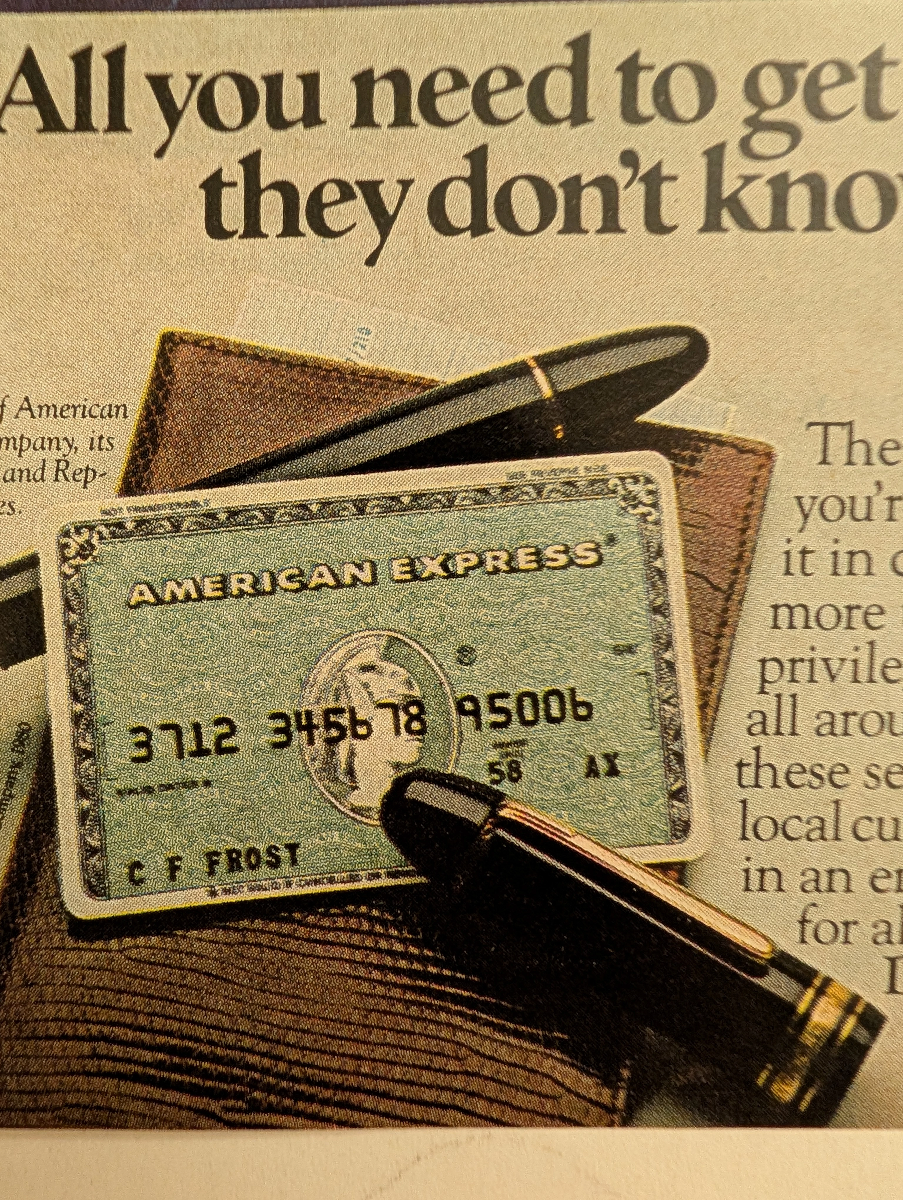
Discover the profound cultural resonance of the 1980 American Express Card vintage advertisement, a masterful example of late 20th-century financial marketing. This piece transcends typical vintage ads by encapsulating the era's burgeoning desire for international travel paired with the absolute need for financial security abroad. Showcasing the iconic green card against the mystic dusk of Istanbul, the campaign perfectly illustrates how classic print ads constructed narratives of global citizenship, elite mobility, and unparalleled trust. For archivists and collectors of old advertisements, this piece stands as a definitive artifact. It not only highlights the practical benefits of emergency travel funds but also visually reinforces the legendary ethos of the brand, making it a pivotal and highly sought-after piece in the history of consumer credit and travel marketing.
Kenwood · Automotive
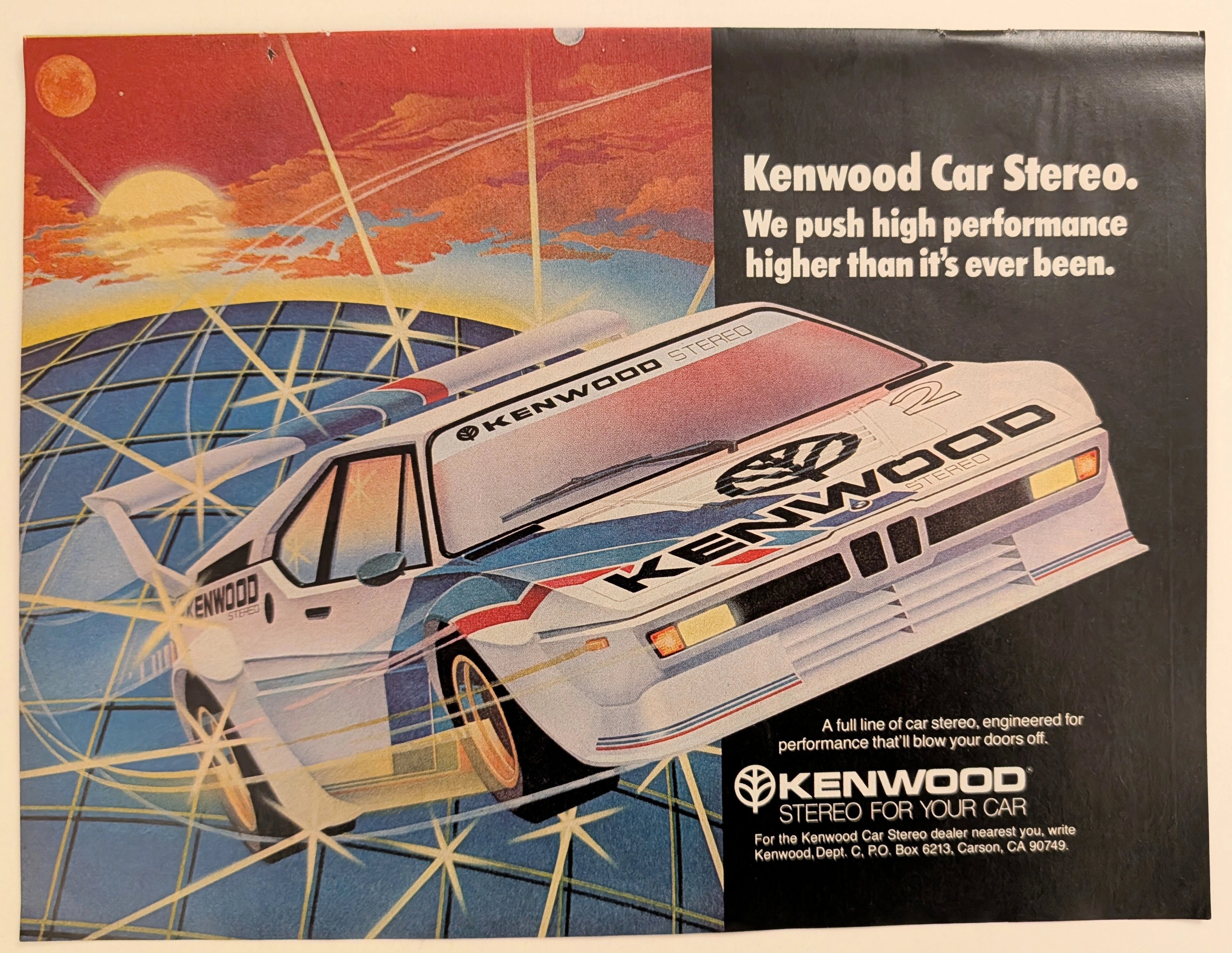
The Time Traveller's Dossier: Gridline Velocity – Kenwood Car Stereo and the Cybernetic Dawn of Automotive High-Fidelity
The evolution of 1980s American consumer electronics was fundamentally defined by the aggressive pursuit of portable and automotive high-fidelity sound. Elegantly and securely positioned upon the analytical table of The Record Institute today is a visually arresting, neon-drenched full-page print advertisement for Kenwood Car Stereo. This document completely transcends the standard, utilitarian boundaries of automotive accessory marketing. It operates as a highly sophisticated cultural mirror, reflecting a precise era in consumer psychology where auditory power was directly equated with vehicular performance. By utilizing a breathtaking, airbrushed illustration of a futuristic, aerodynamic race car accelerating over a cybernetic gridscape, Kenwood brilliantly positioned its audio equipment not just as radios, but as extreme, high-octane performance upgrades capable of generating sound that will literally "blow your doors off." This world-class, comprehensive dossier conducts a meticulous, unyielding, and exceptionally exhaustive examination of the artifact, operating under the absolute most rigorous parameters of historical, sociological, and material science evaluation. Dedicating the overwhelming majority of our analytical focus (80%) to its immense historical gravity, we will decode the brilliant marketing psychology embedded within the "neon grid" visual narrative, analyze the profound cultural shift toward aftermarket car audio customization, and dissect the aggressive, performance-based copywriting. Furthermore, as we venture deeply into the chemical and physical foundations of this analog printed ephemera (10%), we will reveal the precise mechanical fingerprints of the CMYK halftone rosettes captured in the stunning macro imagery of the airbrushed car. Finally, we will assess its archival rarity (10%), exploring how the graceful, natural oxidation of the paper substrate cultivates a serene wabi-sabi aesthetic—a natural, irreversible phenomenon that serves as the primary engine driving up its market value exponentially within the elite global spheres of Vintage Commercial Ephemera, Audio History, and Outrun/Synthwave Art Archives.
Drambuie · Beverage
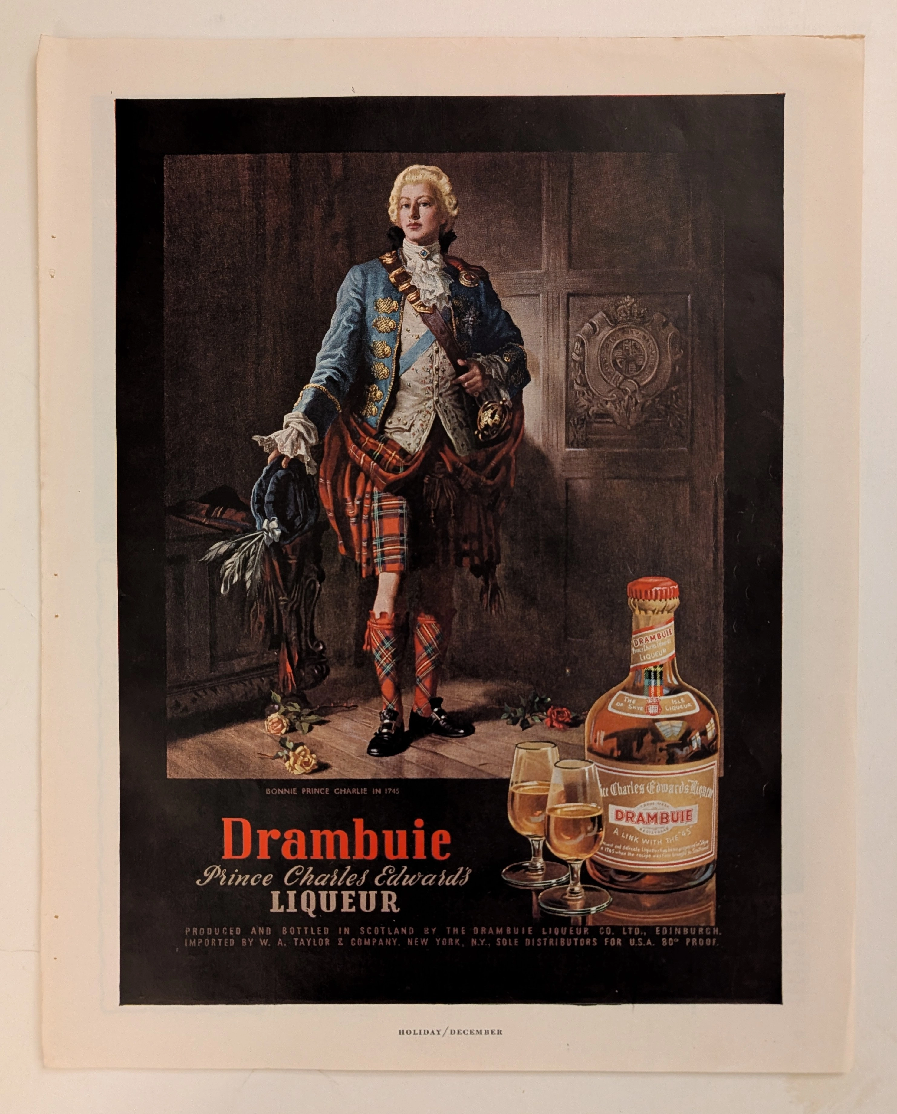
The Time Traveller's Dossier: The Alchemy of Royal Rebellion – Drambuie "Bonnie Prince Charlie" Advertisement (Circa Mid-20th Century)
History is rarely an objective chronicle of facts; it is a malleable narrative, continually rewritten, romanticized, and ultimately weaponized by those seeking to legitimize their power or, in the modern era, their products. Long before digital algorithms could synthesize artificial heritage, the supreme manifestation of corporate alchemy was executed through the calculated precision of the four-color offset press and the appropriation of historical iconography. The artifact presented before us is not merely a vintage magazine tear sheet selling a Scottish liqueur. It is a masterclass in the commodification of myth, a visual distillation of romantic rebellion, and a foundational blueprint for what is now known as "Heritage Branding." This museum-grade, academic archival dossier presents an exhaustive, microscopic deconstruction of a mid-20th-century print advertisement for Drambuie Liqueur. Operating on a profound binary structure, this document records a calculated paradigm shift within the global spirits industry. It captures the precise historical fracture where a highly specific, geographically isolated alcoholic beverage was conceptually transmuted into a literal draught of royal rebellion and aristocratic romance. Through the highly specialized lens of late-analog commercial artistry and stringent visual forensics, this document serves as a masterclass in psychological marketing. It established the foundational archetype for linking the consumption of a physical product with the ingestion of an epic, historical fantasy—an archetype that unconditionally dictates the visual and strategic totems of the modern luxury spirits industry today.