THE TIME TRAVELER'S DOSSIER: THE ILLUSION OF FRAGILITY AND THE ARCHITECTURE OF 60S BEAUTY
The History
( THE HISTORY: Charles Revson's Psychology, the Feminine Ideal, and the Haute Joaillerie Alliance )
As the Chief Curator of The Record, I invite you to submerge your senses into the psychological battlefield of mid-century consumerism. The impeccably preserved Double-Page Historical Relic before you is not a mere cosmetic wallpaper. It is a calculated "Psychological Blueprint" engineered to define and control the parameters of feminine beauty in the early 1960s. This is a masterwork by Revlon, orchestrated by Charles Revson, the titan of the cosmetics industry who famously declared: "In the factory we make cosmetics; in the store we sell hope."
To decode the immense historical gravity of this Primary Art Document, we must analyze the sociological context of Mid-Century America. The sweeping headline—"Revlon whips up the first sheer-matte makeup for today's fair and fragile face..."—is a flawless encapsulation of the era's gendered expectations. In the early 60s, women were not necessarily marketed to look strong or pragmatic; the ultimate status symbol was to appear aristocratic, flawless, and as delicate as porcelain. The "fragile" aesthetic implied a life of luxury, shielded from harsh labor or the elements.
In terms of technological evolution in the beauty industry, this advertisement marks a critical turning point. The 1950s were dominated by heavy "cake makeup" (like Max Factor's Pan-Cake), which required water to apply and left a thick, mask-like finish. Revlon was selling the future: "Creme Soufflé Makeup." It promised a whipped, aerated texture that delivered full coverage without the stifling weight, achieving the coveted "Sheer-Matte" finish—a face that felt "nearly naked." Paired with the heavy, graphic black eyeliner and subdued lips that defined the dawn of the 1960s (pioneered by icons like Audrey Hepburn), this page perfectly archives a monumental shift in cosmetic fashion.
The Historical Masterstroke:
The truly priceless nature of this artifact lies hidden in a microscopic, yet infinitely powerful detail. Direct your focus to the small text in the bottom right corner: "JEWELS BY VAN CLEEF & ARPELS," and observe the magnificent pearl and diamond cluster earring adorning the model. This is no coincidence; it is a masterclass in Psychological Luxury Marketing.
Revlon was a mass-market brand accessible in local drugstores and department stores. But Charles Revson craved the aura of the aristocracy. By strategically partnering with Van Cleef & Arpels—a Parisian house of Haute Joaillerie whose pieces cost tens of thousands of dollars—Revlon brilliantly hijacked their prestige. When the image of a $2 Revlon makeup jar is placed directly alongside elite European diamonds, the consumer's brain subconsciously fuses the two levels of luxury. The woman buying "Touch & Glow" wasn't just buying foundation; she was purchasing the manufactured feeling of being a high-society woman wearing Van Cleef. This advertisement is a definitive historical record of how mid-century capitalism successfully elevated a democratic commodity into an aspirational luxury object.
( THE PAPER: The Aesthetics of Decay — The Center Seam of Time )
At The Record, we do not worship pristine modern reproductions; we revere the "Signatures of Time." This historical artifact is a Double-Page Spread, surgically rescued from the spine of a decaying periodical. The fashion magazines of this era were printed on high-speed presses using acidic wood-pulp paper. It was an inherently fragile medium, harboring a chemical death sentence.
The most beautiful physical attribute of this piece is its "Center Seam"—the vertical line bearing the original staple holes that once bound the magazine together. This is the ultimate proof of its authenticity as a Primary Art Document. Over the past 60 years, the lignin within the paper fibers has engaged in a relentless chemical war with ambient oxygen. This oxidation has birthed a stunning, warm ivory "patina" that radiates from the edges inward. The vintage halftone lithography dots making up the model's flawless face have settled permanently into the degrading, brittle pulp. This is the profound aesthetic of wabi-sabi—the Japanese philosophy of finding perfection in impermanence and decay. This paper is quietly burning itself alive at a molecular level, and it is this exact, irreversible death that transfigures it into immortal art.
( THE RARITY: Class A — The Survival of the Double-Page Spread )
While preserving a single vintage magazine page is challenging, rescuing a complete, intact Double-Page Spread without the imagery tearing, splitting at the seam, or being consumed by moisture is an archival triumph. The vast majority of 1960s fashion magazines were cut up for mood boards, thrown into the trash, or lost to environmental rot.
When you synthesize the sociological history of 1960s beauty standards, the brilliant cross-branding alliance with Van Cleef & Arpels, and the breathtaking physical condition of this decaying analog double-spread, this artifact undeniably commands a Rarity Class A designation. It has evolved far beyond commercial ephemera. It is a massive, highly coveted Historical Relic, demanding to be framed and exhibited by a curator who truly understands the heavy, beautiful weight of mid-century architectural glamour.
Exhibition Halls
The Archive Continues
Continue the Exploration
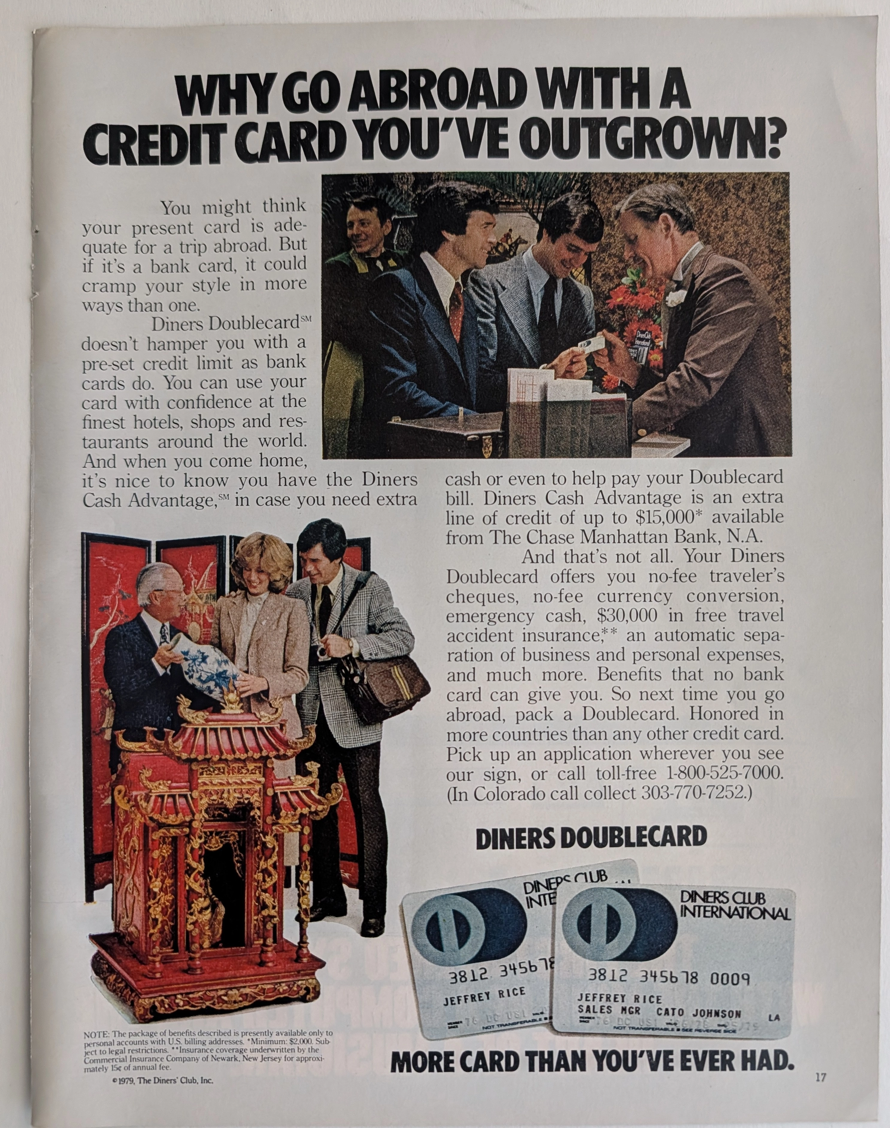
Diners Club · Travel
The Time Traveler's Dossier: Diners Club International Vintage Advertisement -Doublecard Credit Card 1979
The evolution of the global consumer credit market in the late twentieth century was a fierce, high-stakes battle for the wallets of the expanding middle and upper-executive classes. Elegantly secured upon the analytical table of The Record Institute today is a visually dense, highly informative full-page print advertisement for Diners Club International, conclusively dated to 1979 by its copyright macro. This document transcends a simple financial solicitation; it operates as a sophisticated sociological mirror reflecting the anxieties and aspirations of the late-1970s American traveler. By heavily emphasizing the "Doublecard" innovation—a system providing one card for personal use and a secondary card for corporate expenses—Diners Club executed a targeted psychological marketing campaign against traditional bank cards (Visa and MasterCard). They sold the American consumer on the premise that pre-set spending limits were an insulting hindrance to the true global globetrotter, positioning their charge card as the ultimate, borderless financial passport. This comprehensive, museum-grade dossier conducts a meticulous examination of the artifact, operating under the most rigorous parameters of historical, sociological, and material science evaluation. Dedicating the vast majority of our analytical focus (80%) to its historical gravity, we will decode the brilliant marketing psychology embedded within the copywriting, trace the origins of the Travel and Entertainment (T&E) card industry, and analyze the specific visual semiotics of the exotic travel vignettes. Furthermore, as we venture into the chemical and physical foundations of this analog printed ephemera (10%), we will reveal the precise mechanical fingerprints of the CMYK halftone rosettes captured in the stunning macro imagery of the Asian shrine and the embossed credit cards. Finally, we will assess its archival rarity (10%), exploring how the natural oxidation of the paper substrate cultivates a serene wabi-sabi aesthetic, a phenomenon that provides irrefutable proof of its journey through time and solidifies its value within the elite global spheres of Vintage Commercial Ephemera.
Gucci x Mercedes Benz · Fashion
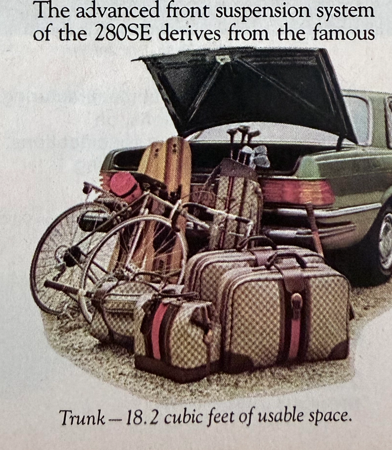
THE TIME TRAVELER'S DOSSIER:THE ENGINEERING OF ELEGANCE, THE GUCCI TRUNK, AND THE ARCHITECTURE OF REASON
The artifact under exhaustive, uncompromising, and unprecedented museum-grade analysis is a remarkably preserved Historical Relic originating from the absolute zenith of West German automotive engineering. This Primary Art Document is a densely informative, multi-column magazine advertisement for the Mercedes-Benz 280SE Sedan (W116 chassis). This document is a "Forensic Blueprint of Engineered Elegance and Status Commodification." It aggressively markets the 280SE as the "Heir to a Classic," positioning it as a vehicle that inherits the legendary proportions of the 450 Series but is powered by a highly advanced, fuel-injected 6-cylinder engine. The copywriting reads like an arrogant technical dossier, boasting of the "Continuous Injection System" (CIS) and a fully independent "Suspense-free suspension" derived from the legendary C-111 high-speed research vehicle. However, the absolute psychological masterstroke lies in the lower-left illustration. To visually prove the cavernous "18.2 cubic feet of usable space," the artist meticulously illustrated the trunk effortlessly swallowing a bicycle, golf clubs, and a set of Gucci luggage. The unmistakable beige geometric monogram and the iconic red-and-green Web stripe on the suitcases serve as a deliberate, powerful socio-economic signal. It explicitly communicates that the Mercedes-Benz trunk is designed exclusively for the "Jet-Set" elite who travel with Italian haute couture. Rescued from a mass-market periodical, this pre-2000s analog artifact exhibits a beautifully authentic warm ivory oxidation across its surface. This majestic chemical aging transforms a mass-produced piece of technical propaganda into an irreplaceable Primary Art Document of automotive and sociological history.
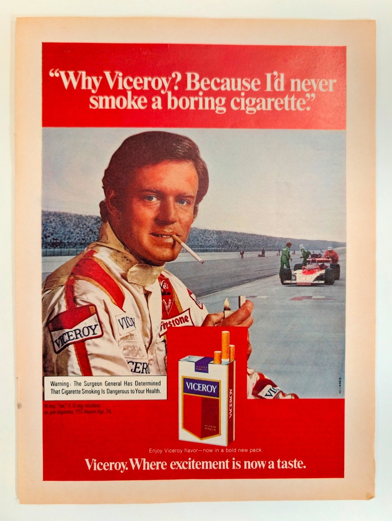
Viceroy: Al Unser and the "Taste of Excitement"
A legendary artifact linking Al Unser's racing dominance to the golden age of tobacco advertising, a style now permanently banned. The value of this original page will appreciate significantly as pre-2000 analog media naturally decays and vanishes forever.