


The Time Traveler's Dossier: The Midnight Superbike – The 1979 Honda CB750K 10th Anniversary Limited Edition and the Dawn of the Universal Japanese Motorcycle Era
The History
To fully appreciate the immense historical gravity, cultural magnitude, and sociological importance of this artifact, one must meticulously and exhaustively contextualize the highly specific landscape of the global motorcycle industry leading up to the end of the 1970s. The story embedded within the fibers of this two-page advertisement is not merely about selling a limited-run motorcycle; it is an epic saga of visionary engineering, the brutal realities of international market domination, and the absolute transformation of the two-wheeled riding experience.
The narrative of this artifact is inextricably linked to the seismic event that occurred exactly one decade prior: the unveiling of the original Honda CB750 in 1969. Before 1969, the "big bike" market was the exclusive domain of British and American manufacturers. Brands like Triumph, Norton, BSA, and Harley-Davidson ruled the streets with their large-displacement parallel twins and V-twins. While these machines had character, they were also notoriously temperamental. They vibrated violently at high speeds (often shedding parts in the process), their electrical systems were famously unreliable (courtesy of Lucas, the "Prince of Darkness"), and they leaked oil as a matter of course. High-performance motorcycling was a hobby strictly reserved for skilled mechanics willing to endure constant roadside repairs.
Soichiro Honda, a man possessing a singular, relentless vision of mechanical perfection, recognized this gaping vulnerability in the market. He tasked his engineers with creating a motorcycle that would not just compete with the British twins, but render them completely obsolete. The result was the 1969 CB750 "Four." It was an absolute revelation. It featured a transverse, overhead-camshaft inline-four engine—a configuration previously reserved exclusively for elite Grand Prix racing machines. It ran with a sewing-machine smoothness that defied belief. It featured a push-button electric starter, rendering the exhausting ritual of kick-starting obsolete. And, perhaps most revolutionarily, it was equipped with a hydraulic front disc brake, a first for a mainstream production motorcycle, providing stopping power that finally matched the engine's incredible 67-horsepower output. The CB750 didn't just move the goalposts; it built an entirely new stadium. It coined the very term "Superbike" and established the blueprint for the "Universal Japanese Motorcycle" (UJM)—a reliable, inline-four, transverse-engine layout that would dominate the industry for the next three decades. It fundamentally destroyed the British motorcycle industry and put the world on notice.
Fast forward exactly ten years to the artifact currently under the macro lens of The Record Institute. By 1979, the motorcycle landscape had violently shifted. The UJM paradigm that Honda invented had been adopted and fiercely weaponized by its rivals. Kawasaki had unleashed the fearsome Z1 900, Suzuki had developed the GS series, and Yamaha had entered the fray. The original SOHC (Single Overhead Cam) engine of the CB750 was beginning to show its age against this newer, faster competition. 1979 was a pivotal transition year for Honda; it marked the twilight of the original SOHC engine and the dawn of the new DOHC (Double Overhead Cam) era.
This specific advertisement celebrates this monumental transition with the 1979 Honda CB750K 10th Anniversary Limited Edition. As the copy elegantly states, it was created "to commemorate its own achievement." This machine was designed not just as a mode of transport, but as a rolling collector's item. The visual details captured in the artifact reveal the specific upgrades that separated the Limited Edition from the standard showroom models.
The motorcycle is adorned in a highly exclusive two-tone paint scheme, a deep, rich candy red and brown, separated by delicate gold pinstriping. This luxurious aesthetic is further anchored by the presence of a bespoke, gold-plated 10th Anniversary crest mounted on the side covers, proudly displaying the Honda wing and the dates 1969-1979. The extreme macro photography of this crest is a testament to the attention to detail Honda invested in this commemorative model. Furthermore, the artifact beautifully highlights the Comstar wheels. Introduced in the late 1970s, the Comstar was a revolutionary composite wheel design that combined the flexibility and lightweight characteristics of traditional wire-spoked wheels with the rigidity and tubeless-tire compatibility of heavy cast-alloy wheels. The Limited Edition featured these Comstars anodized in a striking gold finish, perfectly complementing the side cover crest and the dual-exhaust pipes.
The copywriting on the left side of the spread is an exercise in confident, legacy-driven marketing. By utilizing the giant numbers 7, 5, 0 as structural drop-caps for the paragraphs, the layout reinforces the iconic displacement number that changed the world. The headline "FUTURE CLASSIC." is remarkably prescient. Honda was explicitly telling the consumer that they were purchasing a piece of history. The copy reads: "Today, an incredible futuristic motorcycle... For tomorrow, a classic." In an era (1979) marked by a massive cultural boom in motorcycling, where bikes were often ridden hard and put away wet, Honda was pivoting to the idea of the motorcycle as an investment, a treasured artifact for the true aficionado.
The Paper
As a physical entity, this printed artifact functions as a living, breathing, and profoundly detailed record of late-twentieth-century commercial graphic reproduction, technical layout design, and substrate chemistry. Under exceptional, high-magnification macro-lens examination, this document reveals the stunning complexity and mathematical precision of analog color offset lithography, specifically adapted for a high-volume magazine centerfold spread.
The visual brilliance of this artifact is anchored by its capacity to render the moody, twilight atmosphere and the gleaming metallic surfaces of the motorcycle using only microscopic deposits of liquid pigment. The extreme macro photography of the 10th Anniversary gold crest on the side cover provides a textbook, museum-grade visualization of a CMYK halftone rosette pattern. The illusion of shining, metallic gold against a dark crimson background is not achieved through solid swatches of ink. Instead, these complex hues are meticulously and flawlessly constructed from a precise, mathematically rigorous galaxy of microscopic ink dots. The Cyan, Magenta, Yellow, and Key (Black) inks are elegantly and systematically layered at highly specific angles (traditionally 15, 75, 90, and 45 degrees respectively) to trick the human eye and the biological visual cortex into perceiving a continuous, dimensional reality out of mere clusters of overlapping pigment.
The physical construction of the two-page spread itself is an engineering marvel of the printing press. To create a seamless, atmospheric night sky that bridges across the central "gutter" (the fold where the two pages meet) required immaculate registration and binding precision. The dense, heavily saturated black and dark blue inks required for the twilight background mean that the paper was subjected to a massive ink load. This often results in "offsetting" (where ink transfers to the opposite page when the magazine is closed) or paper warping, yet this specific artifact exhibits a stunningly clean and flat surface, a testament to the high-quality, coated paper stock utilized by premium magazines of the era.
Yet, the most profound and beautifully impactive factor elevating the immense value of this artifact in the contemporary global collector's market is the natural, organic, and entirely irreversible process of Material Degradation. The expansive white margins running along the left side and the bottom edges exhibit a genuine, unavoidable "Toning." This gradual, chronological transition from the original bright, bleached manufactured paper to a warm, antique ivory hue is caused by the slow, relentless chemical oxidation of Lignin—the complex organic phenolic polymer that naturally binds cellulose fibers together within the raw wood pulp of the paper. As the substrate is exposed to ambient atmospheric oxygen and ultraviolet light over a span of nearly five decades, the molecular structure of the lignin gracefully breaks down, forming chromophores that darken the paper. This naturally evolving patina represents the absolute core of the wabi-sabi aesthetic. It is precisely this authentic, unreplicable degradation that acts as the primary engine driving up its market value exponentially among elite curators and collectors. It provides the ultimate, irrefutable scientific proof of the artifact's historical authenticity and its delicate, unbroken journey through time.
The Rarity
RARITY CLASS: A (Exceptional Archival Preservation of a Two-Page Spread)
Evaluated under the most exacting, rigorous, and uncompromising archival parameters established by The Record Institute (which spans a meticulous classification system from Pristine Class OMEGA down to Heavily Degraded Class D), this specific two-page artifact is definitively and securely designated as Class A.
The remarkable and defining paradox of late-century commercial ephemera is that these specific documents were produced by the millions as explicitly and intentionally "disposable media." Inserted into high-volume, mass-market enthusiast publications in 1979, they were inherently destined by their very nature to be briefly observed, casually folded, read with grease-stained hands in a suburban garage, or ultimately discarded into the recycling bins and incinerators of history.
For a full two-page centerfold spread to survive entirely intact is an exceptionally rare occurrence. Magazine centerfolds are structurally vulnerable; they are held together merely by thin metal staples. When extracted, they are highly susceptible to catastrophic tearing down the central gutter, heavy creasing, or separation. For this expansive, graphically complex, and heavily ink-saturated advertisement to survive without structural dismemberment, without destructive moisture staining (foxing), or without the fatal, irreversible fading of the delicate analog inks constitutes a highly significant statistical archival anomaly.
The structural integrity of this paper remains exceptionally sound. While the rich analog colors—particularly the deep blacks of the night sky and the gleaming golds of the Comstar wheels—remain astonishingly vivid, there is a beautiful, mathematically even, natural lignin oxidation reflecting its 1979 origin. This displays a pronounced, warm ivory patina heavily along the margins. The sheer sociopolitical and engineering weight of the subject matter—the definitive documentation of the 10th anniversary of the machine that created the modern superbike era—makes this a highly prized, museum-worthy piece of consumer culture heritage. It demands to be preserved via acid-free, UV-protected conservation framing, perfectly aligning with an aesthetic that appreciates the intersection of fine mechanics and curated history.
Visual Impact
The aesthetic brilliance and psychological power of this artifact lie in its masterful and highly unusual execution of "Atmospheric Contrast." The vast majority of motorcycle advertising in the 1970s relied on brightly lit, sun-drenched action shots of riders carving through mountain canyons, explicitly selling speed and adrenaline. The art director for this Honda campaign made a radical, sophisticated departure from this trope.
The scene is set at twilight, or perhaps the dead of night, illuminated only by unseen, artificial lighting. This dark, moody background instantly elevates the tone of the advertisement from a mere product showcase to a scene of high-fashion drama. It communicates exclusivity, mystery, and wealth. The motorcycle itself is brilliantly lit to highlight its metallic surfaces—the chrome exhaust, the engine fins, and the gold wheels pop aggressively against the darkness, turning the machine into a glowing jewel.
The most fascinating semiotic choice, however, is the inclusion of the human figure. Standing behind the motorcycle is a woman dressed in an elegant, high-collared black dress, her face painted with striking, avant-garde makeup. She is not draped over the motorcycle in a submissive or overtly sexualized manner, which was a common, tired cliché of 70s automotive advertising. Instead, she stands apart, looking away into the distance, almost like a ghostly apparition or a guardian of the machine. She projects an aura of icy sophistication and high fashion. By associating the CB750K Limited Edition with this level of sartorial elegance and nocturnal mystery, Honda was psychologically repositioning the motorcycle. It was no longer just a loud, greasy toy for hooligans; it was a refined, sophisticated instrument for the mature, affluent collector. It was, exactly as the bold typography stated, a "Future Classic."
The Archive Continues
Continue the Exploration
THE TIME TRAVELER'S DOSSIER: THE ILLUSION OF FRAGILITY AND THE ARCHITECTURE OF 60S BEAUTY
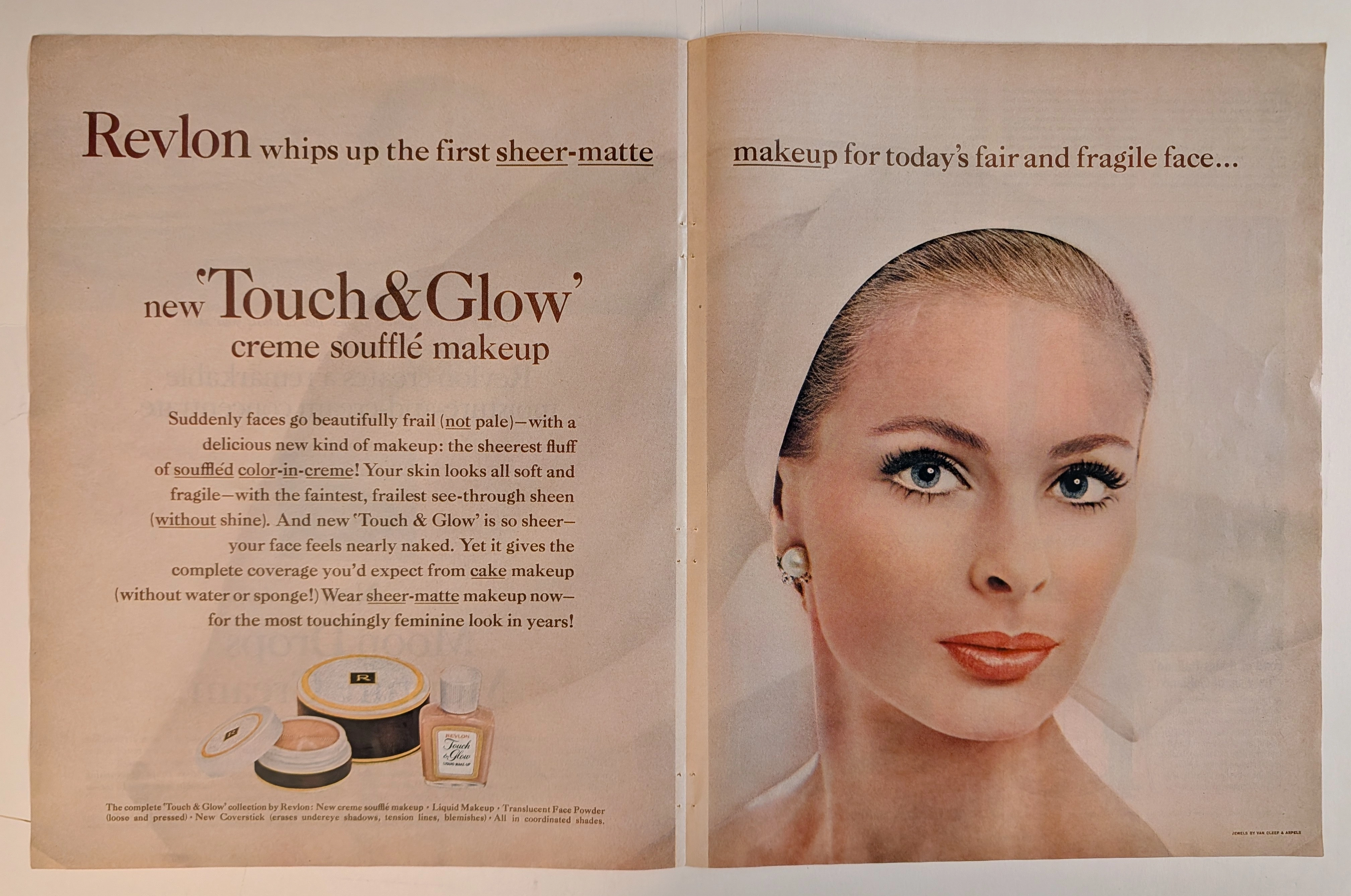
The artifact under rigorous, museum-grade analysis is a breathtaking, meticulously preserved Double-Page Historical Relic originating from the glamorous, highly engineered world of early 1960s American publishing. It features a sweeping, visually arresting advertisement for Revlon's "Touch & Glow" creme soufflé makeup. This Primary Art Document is not merely a cosmetic promotion; it is a profound sociological blueprint of mid-century feminine ideals. The ad's commanding copy, declaring makeup for "today's fair and fragile face," perfectly encapsulates the era's prescribed aesthetic: an aristocratic, porcelain delicacy juxtaposed with the striking, graphic eye makeup synonymous with the early 1960s. Crucially, this artifact documents the absolute genius of Charles Revson’s psychological marketing. By explicitly styling the model with "JEWELS BY VAN CLEEF & ARPELS" (as verified by the microscopic credit in the bottom right corner and the exquisite pearl/diamond earring), Revlon brilliantly anchored its accessible consumer cosmetics to the highest echelons of European haute joaillerie. Rescued from the binding of a forgotten periodical, this expansive double-page spread is printed on inherently acidic, mass-market wood-pulp paper. It is currently undergoing a slow, majestic chemical degradation. This natural oxidation—visible in the warm ivory patina and the delicate aging of the central seam—transforms a disposable commercial message into an irreplaceable, ready-to-frame Primary Art Document of mid-century beauty history.
Ford · Automotive
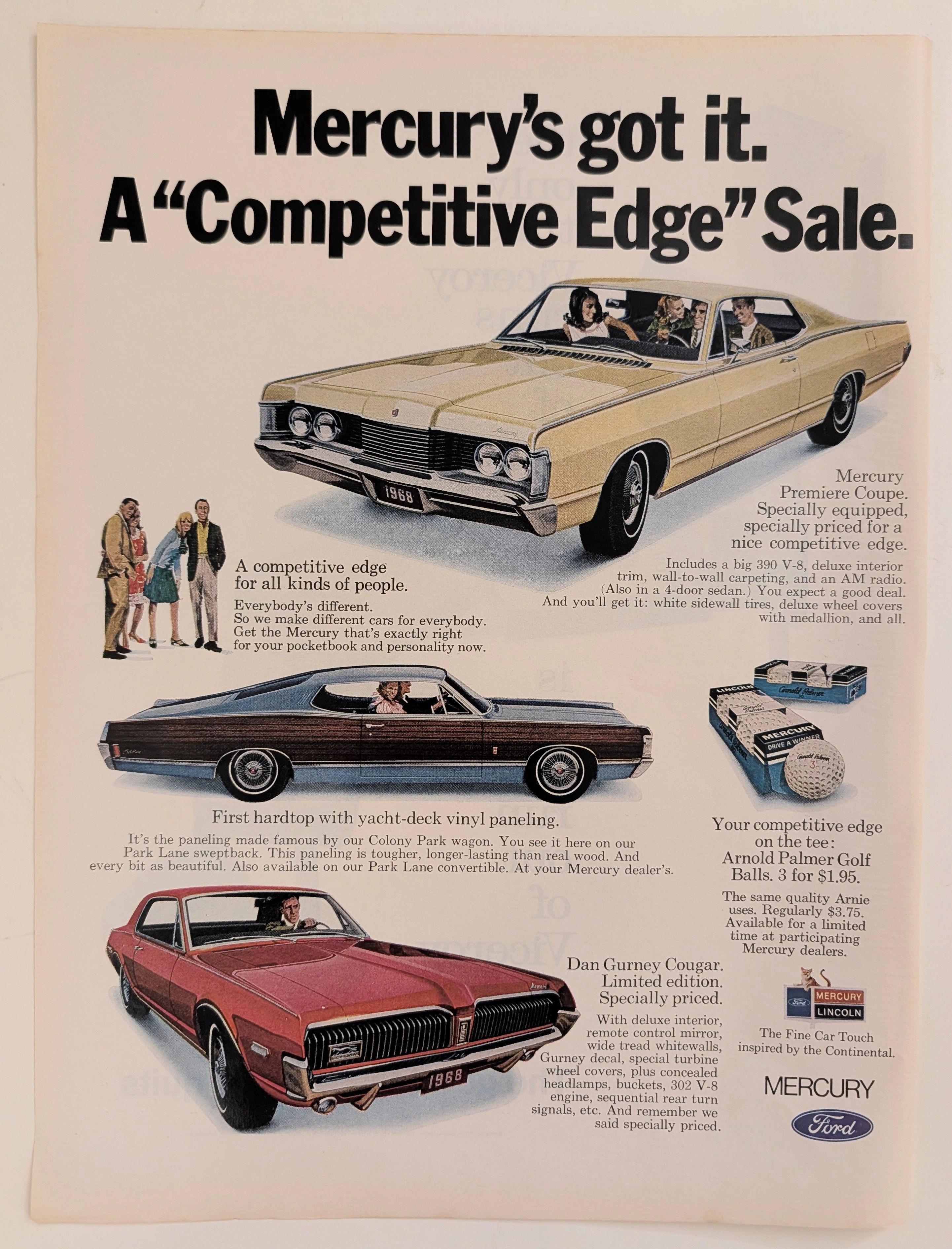
The Time Traveller's Dossier: The Competitive Edge – The 1968 Mercury Lineup and the Architecture of American Automotive Prestige
The evolution of the American automotive market in the late 1960s was characterized by a fierce, uncompromising battle for the expanding, affluent middle class. Automakers were no longer simply selling transportation; they were engineering complex lifestyle avatars. The historical artifact elegantly secured upon the analytical table of The Record Institute today is a striking, full-page print advertisement for the 1968 Mercury "Competitive Edge" Sale. This document completely transcends the standard boundaries of automotive marketing. It operates as a highly sophisticated, multi-layered cultural mirror, reflecting the precise era when the Lincoln-Mercury division sought to simultaneously capture the raw, adrenaline-fueled youth market and the established, affluent golfing demographic within a single, unified corporate narrative. This world-class, comprehensive dossier conducts a meticulous, unyielding, and exceptionally exhaustive examination of the artifact, operating under the absolute most rigorous parameters of historical, sociological, and material science evaluation. Dedicating the overwhelming majority of our analytical focus to its immense historical gravity, we will decode the brilliant marketing psychology embedded within the "Competitive Edge" campaign, analyze the profound cultural importance of legendary figures Dan Gurney and Arnold Palmer, and dissect the visual semiotics of the "Sign of the Cat" branding. Furthermore, as we venture deeply into the chemical and physical foundations of this analog printed ephemera, we will reveal the precise mechanical fingerprints of the CMYK halftone rosettes captured in the macro imagery of the vehicles and golf balls. Finally, we will assess its archival rarity, exploring how the graceful, natural oxidation of the paper substrate cultivates a serene wabi-sabi aesthetic—a natural, irreversible phenomenon that serves as the primary engine driving up its market value exponentially within the elite global spheres of Vintage Commercial Ephemera and Automotive Archives.
Gucci x Mercedes Benz · Fashion
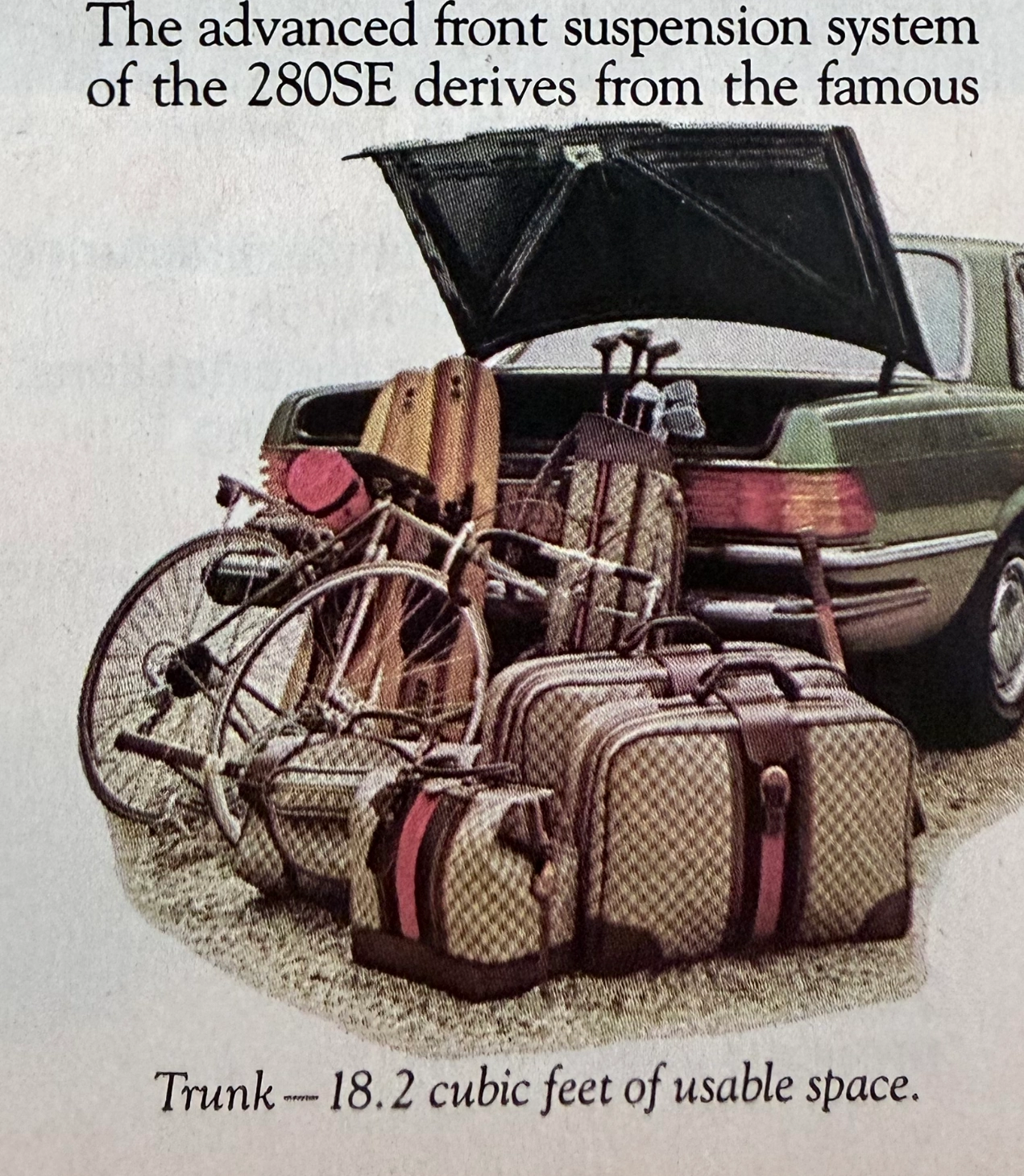
THE TIME TRAVELER'S DOSSIER:THE ENGINEERING OF ELEGANCE, THE GUCCI TRUNK, AND THE ARCHITECTURE OF REASON
The artifact under exhaustive, uncompromising, and unprecedented museum-grade analysis is a remarkably preserved Historical Relic originating from the absolute zenith of West German automotive engineering. This Primary Art Document is a densely informative, multi-column magazine advertisement for the Mercedes-Benz 280SE Sedan (W116 chassis). This document is a "Forensic Blueprint of Engineered Elegance and Status Commodification." It aggressively markets the 280SE as the "Heir to a Classic," positioning it as a vehicle that inherits the legendary proportions of the 450 Series but is powered by a highly advanced, fuel-injected 6-cylinder engine. The copywriting reads like an arrogant technical dossier, boasting of the "Continuous Injection System" (CIS) and a fully independent "Suspense-free suspension" derived from the legendary C-111 high-speed research vehicle. However, the absolute psychological masterstroke lies in the lower-left illustration. To visually prove the cavernous "18.2 cubic feet of usable space," the artist meticulously illustrated the trunk effortlessly swallowing a bicycle, golf clubs, and a set of Gucci luggage. The unmistakable beige geometric monogram and the iconic red-and-green Web stripe on the suitcases serve as a deliberate, powerful socio-economic signal. It explicitly communicates that the Mercedes-Benz trunk is designed exclusively for the "Jet-Set" elite who travel with Italian haute couture. Rescued from a mass-market periodical, this pre-2000s analog artifact exhibits a beautifully authentic warm ivory oxidation across its surface. This majestic chemical aging transforms a mass-produced piece of technical propaganda into an irreplaceable Primary Art Document of automotive and sociological history.