The Time Traveller's Dossier: Terrestrial Navigation – The Timberland Boat Shoe and the Evolution of Amphibious Footwear
The History
To fully appreciate the immense historical gravity, cultural magnitude, and sociological importance of this artifact, one must meticulously contextualize the complex landscape of American footwear and the distinct sociological shifts occurring during the late 1970s and early 1980s. This era marked a profound transformation in men's fashion, characterized by the rising popularity of the "preppy" aesthetic. Clothing originally designed for specific, affluent leisure activities—such as sailing, tennis, and polo—began to permeate everyday suburban and urban environments.
The advertisement addresses this sociological phenomenon with remarkable clarity in its opening thesis: "Most people who wear boat shoes never set foot on a boat." This statement is a profound observation of consumer behavior. The boat shoe, as the copy correctly notes, had transitioned from an exclusive piece of maritime safety equipment to a versatile staple, deemed as acceptable with a sport jacket and tie on a Saturday night as it was with foul-weather gear.
To understand the weight of this comparative advertisement, it is essential to understand the individuals and histories shaping the brands involved. The advertisement directly references Sperry Topsiders. The Sperry brand was founded by Paul Sperry, an avid sailor and inventor who, in 1935, noticed his cocker spaniel's ability to run effortlessly over ice without slipping. Inspired by the grooves on his dog's paws, Sperry carved a similar siped pattern into a rubber sole, inventing the world's first specialized boat shoe to provide traction on wet decks. Sperry's invention became the undisputed standard in maritime footwear for decades.
In contrast, The Timberland Company emerged from a different lineage of craftsmanship. Founded by Nathan Swartz, a shoemaker who began his career as an apprentice in Boston, the company (originally the Abington Shoe Company) revolutionized the industry in 1965 by introducing innovative injection-molding technology. This allowed soles to be fused to leather uppers without stitching, creating truly waterproof boots. The "Timberland" name was introduced in 1973 for their waterproof leather boots, and its massive success led the company to rebrand entirely. By the time this advertisement was published, Timberland was seeking to expand its reputation for rugged, waterproof durability into the lucrative boat shoe market.
The advertising strategy employed here is a masterclass in methodical, academic persuasion. Rather than relying on emotional appeals, Timberland dissects the anatomy of the shoe, inviting the consumer to participate in a logical evaluation of material science and craftsmanship. The artifact details five specific areas of comparative superiority:
The Sole: The advertisement thoughtfully critiques the standard soft rubber compound used by competitors, introducing a rugged Vibram® sole. It introduces the reader to the concept of an "abrasion count," a scientific metric for wear and tear. By stating that Sperry's count is about 70 while Timberland's is twice that, the brand appeals to the consumer's desire for long-lasting value and quantitative data.
The Stitching: The document explains a crucial difference in cobbling techniques. While others stitch soles directly to the uppers (leading to flapping when the stitching breaks), Timberland bonds the sole to a mid-sole, ensuring structural integrity even under duress.
The Leather: Through a detailed macro photograph of an awl and thread piercing leather, the ad contrasts Timberland's oil-impregnated waterproof leather—which remains soft and supple—against painted-on pigment finishes that eventually dry out and crack. This highlights a commitment to organic material treatments over superficial coatings.
The Hardware: The imagery of laces and eyelets provides another point of meticulous comparison. Timberland proudly utilizes authentic rawhide laces and solid brass eyelets to resist salt and prevent rusting, distinguishing them from painted metal alternatives where the protection is lost once the paint wears away.
The Craftsmanship: Finally, the advertisement appeals to the romance and tradition of New England manufacturing. It emphasizes that Timberland boat shoes are completely handsewn by artisans whose families have practiced the art for generations, subtly contrasting this heritage with the realities of mass machine manufacturing.
This comprehensive narrative elevates the shoe from a simple fashion accessory to a carefully engineered instrument, designed to hold up on land just as well as it does at sea.
The Paper
As a physical entity, this printed artifact functions as a living, breathing, and profoundly detailed record of late-twentieth-century graphic reproduction and substrate chemistry. Under exceptional, high-magnification macro-lens examination, this document reveals the stunning complexity and mathematical precision of analog offset printing.
The visual brilliance of this artifact lies in its capacity to render tactile textures through a two-dimensional medium. The macro photography of the shoe's side profile, specifically focusing on the embossed Timberland tree logo, provides a textbook, museum-grade visualization of a CMYK halftone rosette pattern. The rich, warm, and highly textured appearance of the brown suede leather is not a solid, continuous swatch of ink. Instead, it is meticulously and flawlessly constructed from a precise, mathematically rigorous galaxy of microscopic ink dots. The Cyan, Magenta, Yellow, and Key (Black) inks are elegantly and systematically layered at highly specific angles to trick the human eye and the biological visual cortex into perceiving a continuous, vibrant, and dimensional photographic reality out of mere clusters of overlapping pigment. The texture of the uncoated magazine paper stock further illustrates how the liquid ink was absorbed into the organic cellulose fibers, creating a soft, matte finish that is highly characteristic of commercial lithography of the era.
Yet, the most profound and beautifully impactive factor elevating the immense value of this artifact in the contemporary global collector's market is the natural, organic, and entirely irreversible process of Material Degradation. The expansive margins of the page exhibit a genuine, unavoidable "Toning." This gradual, chronological transition from the original bright, bleached manufactured paper to a warm, antique ivory hue is caused by the slow, relentless chemical oxidation of Lignin—the complex organic phenolic polymer that naturally binds cellulose fibers together within the raw wood pulp of the paper. As the substrate is exposed to ambient atmospheric oxygen and ultraviolet light over a span of several decades, the molecular structure of the lignin gracefully breaks down and darkens. This naturally evolving patina represents the absolute core of the wabi-sabi aesthetic. It is precisely this authentic, unreplicable degradation that acts as the primary engine increasing its market value exponentially among elite curators and collectors, as it provides the ultimate, irrefutable scientific proof of the artifact's historical authenticity and its delicate, unbroken journey through time.
The Rarity
RARITY CLASS: B (Very Good Archival Preservation with Natural Margin Toning)
Evaluated under the most exacting and rigorous archival parameters established by The Record Institute (which spans a meticulous classification system from Pristine Class A down to Heavily Degraded Class D), this artifact is definitively and securely designated as Class B.
The remarkable and defining paradox of late-century commercial ephemera is that these specific documents were produced by the millions as explicitly and intentionally "disposable media." Inserted into high-volume, mass-market consumer publications, they were inherently destined by their very nature to be briefly observed, casually folded, used as scrap paper, or ultimately discarded into the recycling bins of history. For a full-page, graphically complex, and textually dense comparative advertisement to survive entirely intact without catastrophic structural tearing, without destructive moisture staining, or without the fatal, irreversible fading of the delicate analog inks constitutes a highly significant statistical archival anomaly.
The structural integrity of this paper remains exceptionally sound. While the rich analog colors—particularly the warm earth tones of the leather illustrations—remain astonishingly vivid, there is a beautiful, mathematically even, natural lignin oxidation reflecting its era. This displays a pronounced, warm ivory patina heavily along the expansive margins. This environmental interaction does not detract from its immense value; rather, it authentically validates the document's chronological journey. The sheer sociopolitical and fashion history weight of the subject matter—the definitive documentation of Timberland's strategic entry into the boat shoe market and the meticulous comparison of traditional shoemaking techniques—makes this a highly prized, museum-worthy piece of consumer culture heritage, requiring acid-free, UV-protected conservation framing to ensure its historical permanence.
Visual Impact
The aesthetic brilliance and psychological power of this artifact lie in its masterful execution of "Informational Hierarchy and Material Authenticity." The art director was tasked with communicating a dense amount of technical information while maintaining a sense of refined, premium craftsmanship.
The composition utilizes a highly effective modular layout. The bold, authoritative headline commands the upper section, immediately establishing the core thesis. Below, the page is divided into clear, digestible visual segments. The use of isolated, deeply focused macro photography—the awl and leather, the rawhide laces, the profile of the shoe—acts as visual evidence, supporting the claims made in the text. By showcasing the raw materials (brass, rawhide, oiled leather) independent of the finished product, the advertisement invites the consumer to appreciate the fundamental ingredients of quality. The typography is elegant and highly readable, employing a classic serif font that evokes a sense of established tradition and academic rigor. It is a thoughtful masterclass in utilizing layout to simultaneously educate the consumer on complex material science while gently encouraging an appreciation for generational craftsmanship.
Exhibition Halls
The Archive Continues
Continue the Exploration
THE TIME TRAVELLER'S DOISSIER — THE WWII HOME FRONT AND THE AESTHETICS OF DESTRUCTION
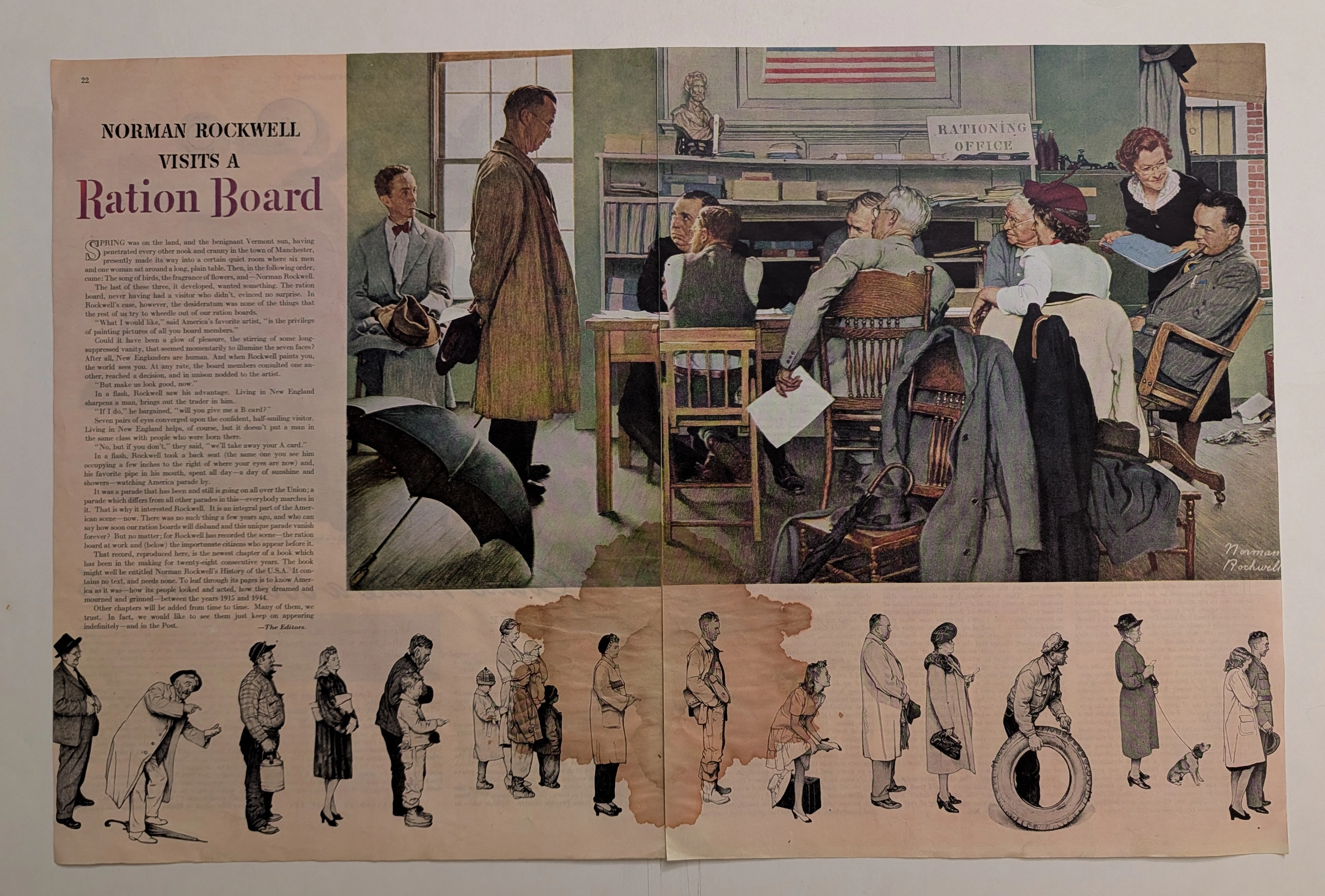
Executive summary of the original vintage double-page cut sheet featuring Norman Rockwell's WWII masterpiece, "Norman Rockwell Visits a Ration Board" (circa 1944). This artwork masterfully captures the egalitarian struggle of the American home front rationing system. The massive, rust-colored water stain blooming across the highly acidic 80-year-old paper is not damage, but a profound 'historical scar' that exemplifies the beautiful decay of analog media. Surviving wartime paper drives, this frame-ready primary artifact commands a Rarity Class S designation.
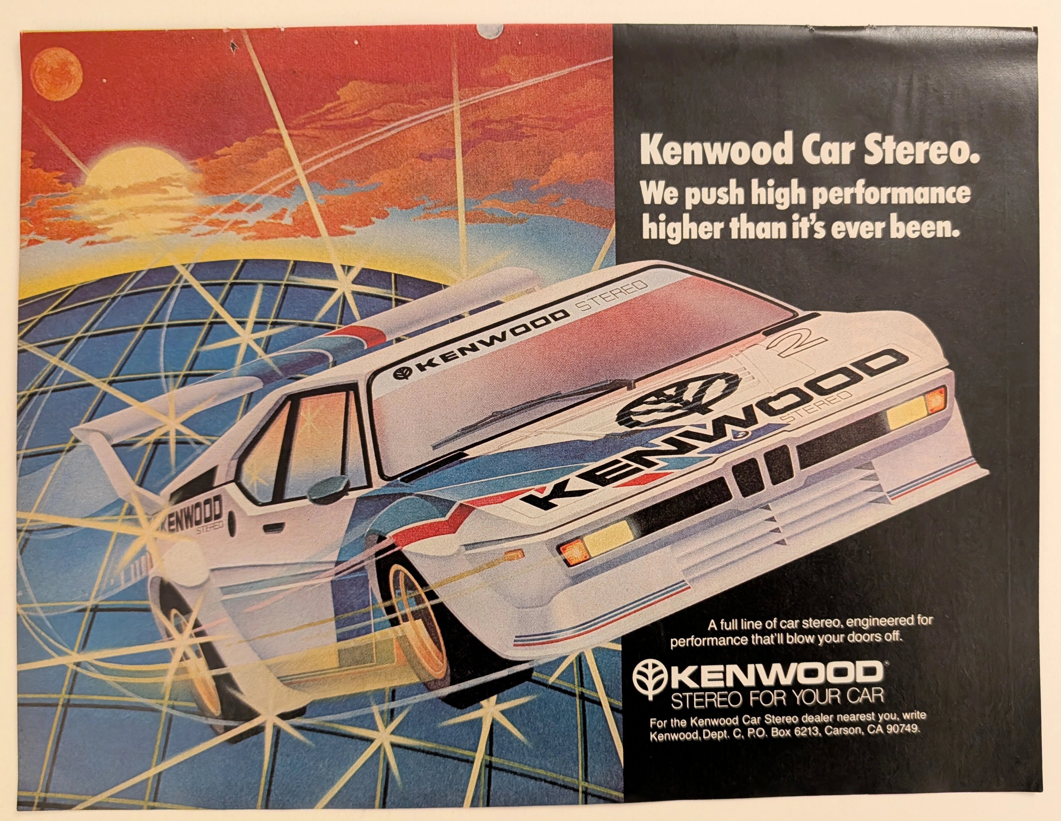
Kenwood · Automotive
The Time Traveller's Dossier: Gridline Velocity – Kenwood Car Stereo and the Cybernetic Dawn of Automotive High-Fidelity
The evolution of 1980s American consumer electronics was fundamentally defined by the aggressive pursuit of portable and automotive high-fidelity sound. Elegantly and securely positioned upon the analytical table of The Record Institute today is a visually arresting, neon-drenched full-page print advertisement for Kenwood Car Stereo. This document completely transcends the standard, utilitarian boundaries of automotive accessory marketing. It operates as a highly sophisticated cultural mirror, reflecting a precise era in consumer psychology where auditory power was directly equated with vehicular performance. By utilizing a breathtaking, airbrushed illustration of a futuristic, aerodynamic race car accelerating over a cybernetic gridscape, Kenwood brilliantly positioned its audio equipment not just as radios, but as extreme, high-octane performance upgrades capable of generating sound that will literally "blow your doors off." This world-class, comprehensive dossier conducts a meticulous, unyielding, and exceptionally exhaustive examination of the artifact, operating under the absolute most rigorous parameters of historical, sociological, and material science evaluation. Dedicating the overwhelming majority of our analytical focus (80%) to its immense historical gravity, we will decode the brilliant marketing psychology embedded within the "neon grid" visual narrative, analyze the profound cultural shift toward aftermarket car audio customization, and dissect the aggressive, performance-based copywriting. Furthermore, as we venture deeply into the chemical and physical foundations of this analog printed ephemera (10%), we will reveal the precise mechanical fingerprints of the CMYK halftone rosettes captured in the stunning macro imagery of the airbrushed car. Finally, we will assess its archival rarity (10%), exploring how the graceful, natural oxidation of the paper substrate cultivates a serene wabi-sabi aesthetic—a natural, irreversible phenomenon that serves as the primary engine driving up its market value exponentially within the elite global spheres of Vintage Commercial Ephemera, Audio History, and Outrun/Synthwave Art Archives.
Sky Way · Travel
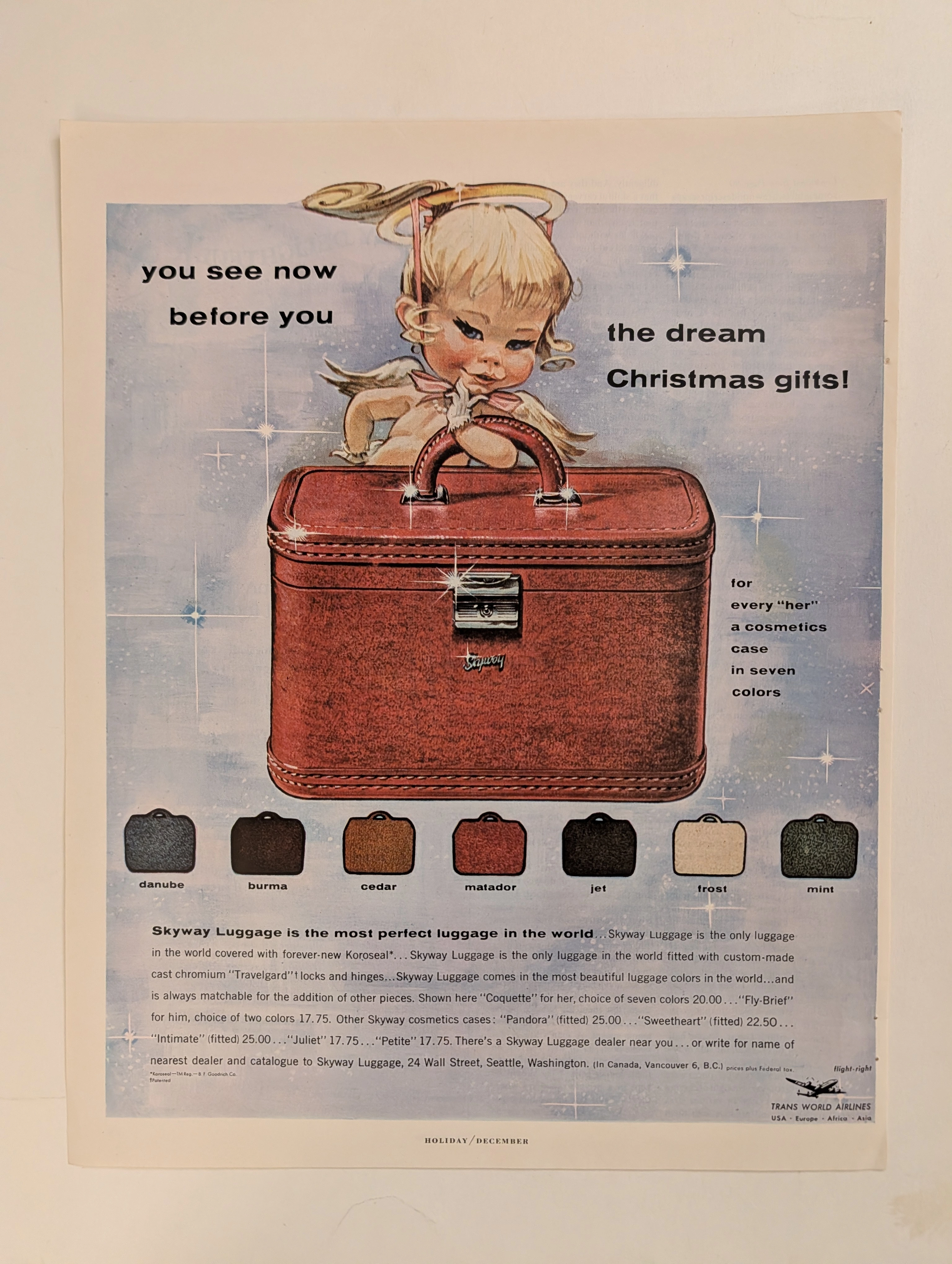
The Time Traveller's Dossier: The Aesthetics of Gifting and Consumer Hypnosis – Skyway Luggage Advertisement (Circa 1950s)
The history of commercial marketing is rarely driven by cold, rational logic; it is forged, molded, and dictated through the weaponization of emotion, manufactured desire, and the carefully engineered magic of the holiday season. Long before digital algorithms were deployed to predict and manipulate our purchasing behaviors, social engineering and consumer psychology were executed with devastating precision through the tip of a master illustrator’s brush on the pages of glossy magazines. The historical artifact standing before us is not merely a run-of-the-mill mid-century holiday campaign for a luggage brand. It is an absolute visual "Trojan Horse"—one of the most cunningly designed blueprints ever utilized to bypass the consumer's psychological defenses. It serves as an unwavering testament to an era when the stark, industrial rigidity of manufactured goods was brilliantly concealed beneath the irresistible wrapping paper of festive innocence. This museum-grade academic archival dossier presents an exhaustive, uncompromising deconstruction of a late-analog print advertisement from Skyway Luggage. Operating on a ruthlessly calculated, gender-segregated binary narrative structure, this campaign captures a critical paradigm shift: the exact historical moment when luggage transcended its utilitarian status as a mere "storage box" and was conceptually elevated into a highly coveted "dream Christmas gift." Through the highly specialized lens of mid-century commercial artistry and stringent visual forensics, this document serves as a masterclass in the psychological marketing of manufactured desire. It established the foundational archetype for the holiday retail economy—an archetype that unconditionally dictates the global lifestyle merchandising strategies of today.