The Time Traveller's Dossier: The Suburb's Sea – Avon for Men, the Windjammer Mythos, and the Commodification of Mid-Century Masculinity
The History
To fully appreciate the immense historical gravity, cultural magnitude, and sociological importance of this artifact, one must meticulously contextualize the complex, highly specific landscape of the American cosmetics and fragrance industry leading up to 1968. Avon Products, Inc., originally founded in 1886 as the California Perfume Company, had built a monumental corporate empire upon a singular, revolutionary distribution model: direct-to-consumer sales via independent female representatives, universally known as "Avon Ladies." By the mid-20th century, the iconic "Ding Dong, Avon Calling" campaign had established the brand as an unshakeable pillar of female domestic life. However, breaking into the male demographic presented a severe psychological and logistical hurdle. In the 1960s, the concept of elaborate male grooming or "cosmetics" was still heavily stigmatized, often viewed as an affront to traditional rugged masculinity. Men simply did not frequent cosmetic counters in department stores.
Avon’s strategic circumvention of this cultural barrier is a masterclass in behavioral economics and psychological marketing. They realized they did not need to sell the product directly to men; they needed to sell the idea of the ideal man to the wives who controlled the household purchasing power. The "Avon Lady" was already in the suburban living room. By introducing a dedicated "Avon for Men" line, the company empowered the housewife to purchase a fragrance for her husband that projected the rugged, elemental masculinity she desired, while providing the husband with a socially acceptable, risk-free entry into personal fragrance because it was gifted to him within the safety of his own home.
The specific 1968 campaign featured in this artifact, "Windjammer," perfectly encapsulates this psychological warfare. The late 1960s was a period of intense cultural upheaval, the Vietnam War, and the solidification of the "Organization Man"—the white-collar, middle-management worker trapped in the repetitive cycle of suburban commuting and corporate bureaucracy. There was a pervasive, underlying crisis of masculinity; men felt detached from physical labor, danger, and the conquest of nature. The marketing narrative of the "Windjammer" (historically, a type of large, majestic, iron-hulled sailing ship used for cargo in the 19th and early 20th centuries) offered an immediate, visceral antidote to this suburban sterility.
The visual staging of the advertisement is a textbook execution of the maritime masculine trope. The photograph captures a solitary, ruggedly handsome man in dark foul-weather gear, bracing himself against the mast of a sailboat. The angle is shot from below, a classic cinematic technique designed to elevate the subject to a heroic, monumental status against the turbulent, dramatic sky. He is engaged in a physical struggle with the elements—pulling ropes, navigating the "big wave." The accompanying copywriting aggressively reinforces this ethos: "Fight through... brave the big wave... soar. That's the feeling of Windjammer." It is not selling a scent; it is selling the adrenaline of survival and the romanticized freedom of the open ocean. It promises the desk-bound executive that, with a splash of cologne, his stifled, primal urge for adventure can be "re-lived."
Furthermore, the design of the product itself, showcased in the upper right quadrant, is a profound study in mid-century semiotics. The Windjammer Cologne is housed in a heavy, deeply colored blue glass bottle, projecting an aura of oceanic depth and masculine weight. The front of the bottle features stylized, abstract white sails, a stark, modernist graphic design choice that contrasted sharply with the ornate, floral packaging of Avon's female lines. The inclusion of a heavy brass ring around the neck of the bottle mimics nautical hardware, transforming a mere cosmetic container into a tangible piece of seafaring equipment. The presence of the "Aerosol Talc"—a highly popular mid-century grooming product intended to keep men dry and comfortable in heavy wool suits—further anchors the product line in practical, masculine utility rather than mere vanity. The subtle "Only an Avon Representative brings..." tagline at the bottom serves as the crucial call to action, reminding the female reader that this bottled adventure is available exclusively through her trusted, neighborhood network.
The Paper
As a physical entity, this printed artifact functions as a living, breathing, and profoundly detailed record of mid-twentieth-century graphic reproduction and substrate chemistry. Under exceptional, high-magnification macro-lens examination, this document reveals the stunning complexity and mathematical precision of analog color offset printing.
The extraordinary macro photographs of the Windjammer cologne bottle and aerosol talc provide a textbook, museum-grade visualization of a CMYK halftone rosette pattern. The deep, abyssal oceanic blues of the glass bottle and the crisp, stark whites of the abstract sail graphics are not solid, continuous swatches of ink. Instead, they are meticulously and flawlessly constructed from a precise, mathematically rigorous galaxy of microscopic ink dots. The Cyan, Magenta, Yellow, and Key (Black) inks are elegantly and systematically layered at highly specific angles to trick the human eye and the biological visual cortex into perceiving a continuous, vibrant, and dimensional photographic reality out of mere clusters of overlapping pigment. The texture of the uncoated magazine paper stock further illustrates how the liquid ink was absorbed into the organic cellulose fibers, creating a soft, matte finish that is highly characteristic of 1960s high-volume commercial lithography. Achieving the dark, brooding atmosphere of the storm clouds and the deep navy of the man's jacket required an exceptionally heavy, forceful application of Cyan and Key (Black) inks, serving as a testament to the immense mechanical pressure of the commercial presses of the era.
Yet, the most profound and impactfully beautiful factor elevating the immense value of this artifact in the contemporary global collector's market is the natural, organic, and entirely irreversible process of Material Degradation. The expansive margins of the page exhibit a genuine, unavoidable "Toning." This gradual, chronological transition from the original bright, bleached manufactured paper to a warm, antique ivory and golden hue is caused by the slow, relentless chemical oxidation of Lignin—the complex organic phenolic polymer that naturally binds cellulose fibers together within the raw wood pulp of the paper. As the substrate is exposed to ambient atmospheric oxygen and ultraviolet light over a span of nearly six decades, the molecular structure of the lignin gracefully breaks down and darkens. This naturally evolving patina represents the absolute core of the wabi-sabi aesthetic. It is precisely this authentic, unreplicable degradation that acts as the primary engine driving up its market value exponentially among elite curators and collectors, as it provides the ultimate, irrefutable scientific proof of the artifact's historical authenticity and its delicate, unbroken journey through time.
The Rarity
RARITY CLASS: B (Very Good Archival Preservation with Natural Margin Toning)
Evaluated under the most exacting, rigorous, and uncompromising archival parameters established by The Record Institute (which spans a meticulous classification system from Pristine Class A down to Heavily Degraded Class D), this artifact is definitively and securely designated as Class B.
The remarkable and defining paradox of mid-century commercial ephemera is that these specific documents were produced by the millions as explicitly and intentionally "disposable media." Inserted into high-volume, mass-market consumer publications of 1968, they were inherently destined by their very nature to be briefly observed, casually folded, used as scrap paper, or ultimately discarded into the recycling bins and incinerators of history. For a full-page, graphically significant, and highly saturated advertisement to survive entirely intact without catastrophic structural tearing, without destructive moisture staining, or without the fatal, irreversible fading of the delicate, light-sensitive halftone inks constitutes a highly significant statistical archival anomaly.
The structural integrity of this paper remains exceptionally sound. While the rich analog colors—particularly the deep, cavernous blues of the ocean and the stark white typography—remain astonishingly vivid, there is a beautiful, mathematically even, natural lignin oxidation reflecting its era. This displays a pronounced, warm ivory patina heavily along the expansive margins. This environmental interaction does not detract from its immense value; rather, it authentically validates the document's chronological journey. The sheer sociopolitical weight of the subject matter—the definitive documentation of Avon's strategic conquest of the male demographic and the commodification of the nautical masculine mythos—makes this a highly prized, museum-worthy piece of consumer culture heritage, requiring acid-free, UV-protected conservation framing to ensure its historical permanence.
Visual Impact
The aesthetic brilliance and psychological power of this artifact lie in its masterful execution of "Heroic Perspective and Environmental Dominance." The art director was tasked with communicating the intangible essence of adventure and rugged masculinity within a static, two-dimensional medium, necessitating a layout that felt both physically imposing and emotionally aspirational.
The composition utilizes a highly effective diagonal tension. The main visual element—the man leaning intensely against the mast of the sailboat—creates a strong diagonal line that sweeps from the bottom left to the upper right, drawing the viewer's eye directly up toward the massive, bold, cyan typography of the "WINDJAMMER" headline. This low-angle perspective physically forces the reader to look up at the subject, subconsciously instilling him with an aura of power, control, and heroism against the chaotic backdrop of the turbulent sea and sky. The upper right quadrant acts as a pristine, isolated gallery space for the product itself. By floating the deep blue glass bottle and the aerosol can against the white sail, the designer ensures the products are not lost in the dark ocean imagery, but rather presented as the ultimate, tangible rewards of this aspirational lifestyle. It is a masterclass in utilizing photographic framing and layout to simultaneously educate the consumer on the brand's identity while intensely stroking the deepest psychological desires for escape and masculine validation.
Exhibition Halls
The Archive Continues
Continue the Exploration
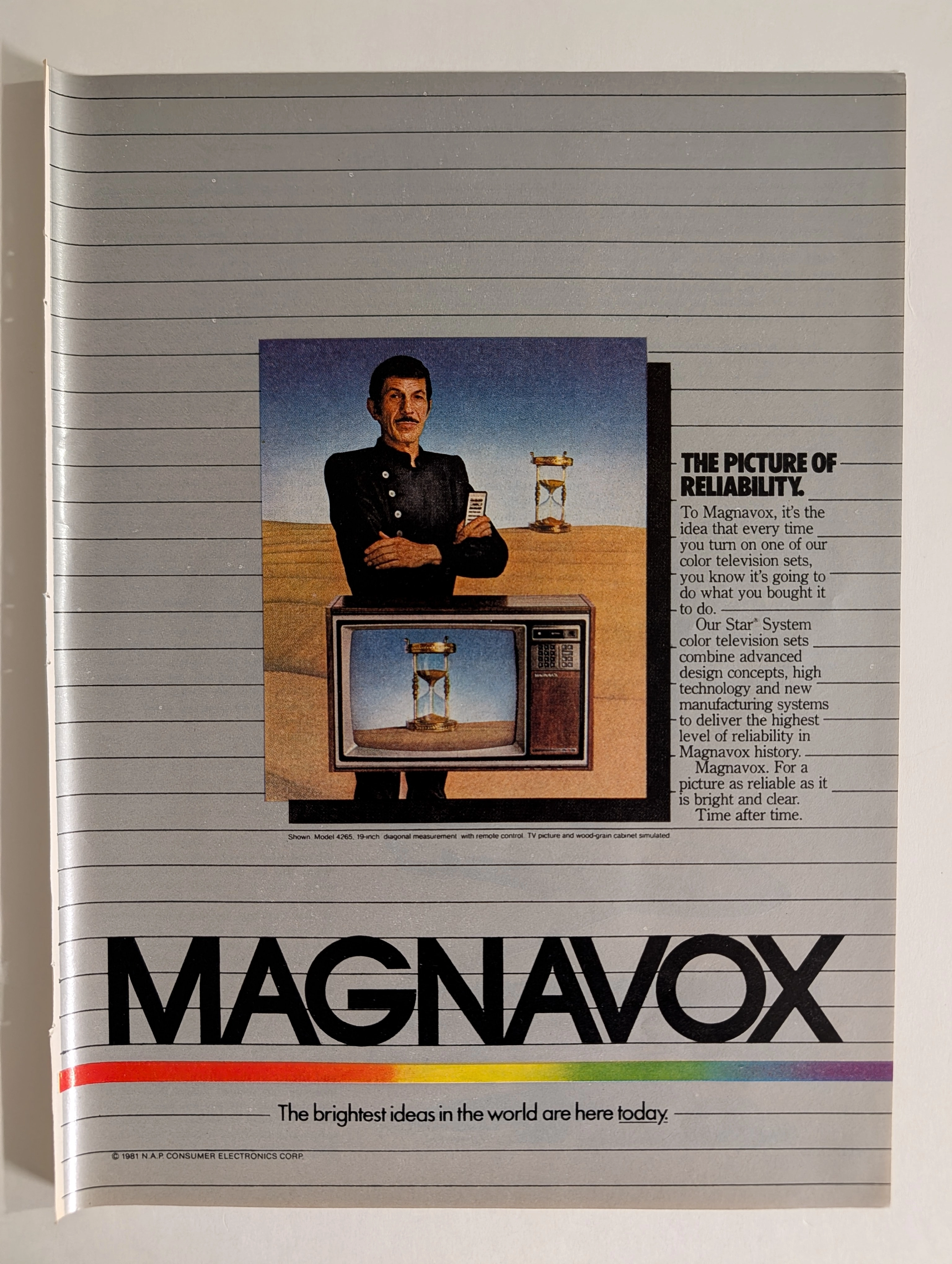
Magnavox Star System 1981 Leonard Nimoy TV Advertisement | 'The Picture of Reliability' | Deep Analysis Rarity Class A-SS
The advertisement analyzed here is a full-page full-color magazine promotion for Magnavox's Star® System color television sets, copyright © 1981 N.A.P. Consumer Electronics Corp. The ad features what is almost certainly Leonard Nimoy — iconic for his role as Mr. Spock in Star Trek — dressed in a black nehru-collar uniform against a surrealist desert landscape, standing above a Magnavox color TV set (Model 4265, 19-inch diagonal) that displays an hourglass on screen. A second hourglass appears behind him. The visual concept communicates timeless reliability. The headline 'The Picture of Reliability' and tagline 'The brightest ideas in the world are here today' frame Magnavox's Star System as the pinnacle of 1981 television technology. The rainbow spectrum stripe at the bottom is a distinctive brand element that ran across Magnavox advertising throughout the early 1980s. N.A.P. (North American Philips) Consumer Electronics Corp. was the American subsidiary of Philips that owned the Magnavox brand at this time, having acquired it in 1974.
Johnnie walker · Beverage
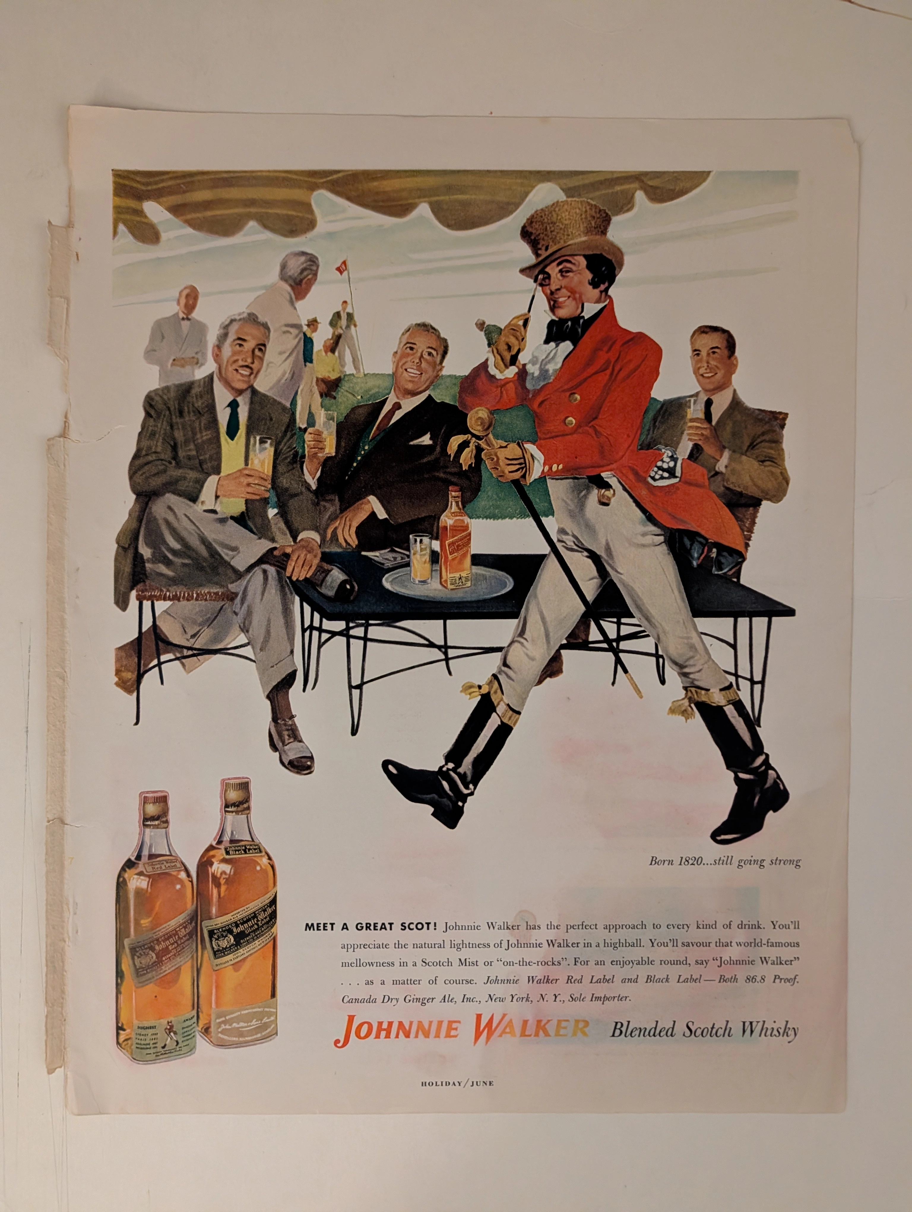
THE TIME TRAVELER'S DOSSIER :THE APPARITION OF HERITAGE — THE STRIDING MAN
The artifact currently subjected to our uncompromising, museum-grade analysis is a profoundly preserved Historical Relic excavated from the zenith of mid-century American prosperity. This Primary Art Document is a full-page magazine advertisement for Johnnie Walker Blended Scotch Whisky. Functioning as a "Forensic Blueprint of the Transatlantic Leisure Class," the document masterfully weaponizes British aristocratic heritage (embodied by the Striding Man) to validate the newly acquired wealth of post-war American consumers. Its historical context is irrefutably anchored by the microscopic fine print identifying the importer as "Canada Dry Ginger Ale, Inc., New York, N.Y.", a specific corporate era of distribution. Grounded by extreme macro details of analog halftone lithography and the breathtaking wabi-sabi chemical degradation highlighted by its violently torn binding edge, this artifact commands an irreplaceable status, cementing its Rarity Class A designation as a masterpiece of corporate sociological engineering.
ฺีฺBulova · Fashion
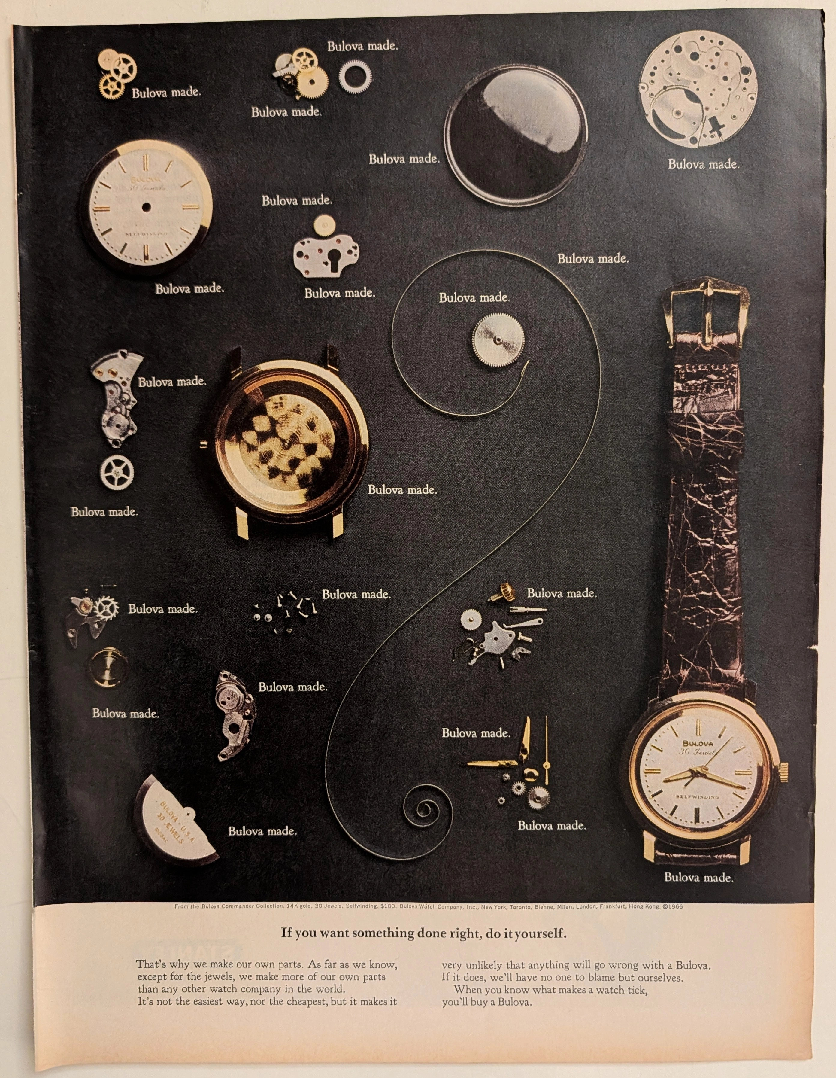
The Time Traveller's Dossier: The Anatomy of Autonomy – The 1966 Bulova Commander Collection and the American System of Watchmaking
The evolution of the mid-twentieth-century luxury consumer market was fundamentally propelled by an intense post-war desire for unwavering reliability and transparent corporate accountability. The historical artifact elegantly and securely positioned upon the analytical table of The Record Institute today is a striking, full-page print advertisement for the 1966 Bulova Commander Collection, originating from a highly transformative era in global horology. This document completely transcends the standard, utilitarian boundaries of jewelry marketing. It operates as a highly sophisticated, multi-layered cultural mirror, reflecting the precise era when American industrial might directly challenged the fragmented traditions of European watchmaking, explicitly packaging and selling the concept of total mechanical autonomy to the American middle-class consumer. This world-class, comprehensive dossier conducts a meticulous, unyielding, and exceptionally exhaustive examination of the artifact, operating under the absolute most rigorous parameters of historical, sociological, and material science evaluation. With the vast majority of our analytical focus dedicated to its immense historical gravity, we will decode the brilliant marketing psychology embedded within the "If you want something done right, do it yourself" campaign, analyze the sociopolitical impact of the "American System of Watchmaking," and dissect the profound visual semiotics of the exploded mechanical view. Furthermore, as we venture deeply into the chemical and physical foundations of this analog printed ephemera, we will reveal the precise mechanical fingerprints of the CMYK halftone rosettes captured in the macro imagery of the watch dial and alligator strap. Finally, we will assess its archival rarity, exploring how the graceful, natural oxidation of the paper substrate cultivates a serene wabi-sabi aesthetic—a natural, irreversible phenomenon that serves as the primary engine driving up its market value exponentially within the elite global spheres of Vintage Commercial Ephemera and Horological Archives.