The Time Traveller's Dossier : 3M Scotch Videocassettes - The Dawn of the Living Room Revolution
The History
The Network Oligopoly and "Borrowed Authority"
To understand the psychological strategy of this advertisement, one must first understand the media landscape of the era. Before the proliferation of cable television and the internet, the American cultural consciousness was entirely dominated by "The Big Three" broadcast networks: ABC, NBC, and CBS. They dictated the news, the entertainment, and the visual fidelity standards of the nation.
The primary marketing strategy employed here is "Borrowed Authority." The advertisement prominently displays the iconic, stylized test-pattern logos of these three monolithic networks on television screens. The copy explicitly states, "When the networks tape a TV show, they demand top performance from their video tape... That’s why they all use Scotch.".
This logic was incredibly potent for the 1980s consumer. The underlying message was clear: If the national broadcast engineers—the arbiters of visual perfection—trust this magnetic tape for network television, it is more than sufficient for your domestic VCR. The headline, "THE NETWORKS SHOW THEIR TRUE COLORS ON SCOTCH. YOU CAN TOO," acts as an invitation. It elevates the consumer from a mere viewer to an active participant, promising them studio-grade archival power in their own living room.
Artifacts of the Great Format War (VHS vs. Betamax)
If you look closely at the center of the composition, the advertisement serves as a historical casualty report of the great Format War. It clearly displays two distinct videocassette boxes side-by-side.
On the left is the VHS format (specifically labeled T-120, indicating 2 or 4 hours of recording time), championed by JVC. On the right is the Beta format (labeled L-750, indicating 3 hours of recording time), the proprietary innovation of Sony.
At the time this advertisement was printed, the war was still raging. Sony’s Betamax had entered the market earlier (1975) and offered arguably superior image resolution and a more compact cassette size. However, JVC’s VHS (introduced in 1976) countered with a brilliant, consumer-focused strategy: longer recording times. A standard VHS tape could record a two-hour movie, or an entire Sunday afternoon football game, on a single cassette without needing to be flipped or changed. Sony’s early Beta tapes could only record one hour.
3M, as a manufacturer of the raw magnetic medium, wisely chose to be an arms dealer to both sides rather than picking a winner. The copy diplomatically states that Scotch Videocassettes are available "In both Beta and VHS formats". This dual-offering immortalizes a specific window in time—a few years later, the Beta box would quietly disappear from consumer advertising entirely as VHS achieved total market dominance.
The Genesis of Magnetic Tape and 3M's Legacy
To reinforce their market dominance, 3M drops a massive historical flex in the final paragraph: "We invented video tape over 20 years ago, and we’ve been responsible for most of its technological advances ever since".
This is not marketing hyperbole; it is historical fact. The 3M Company (Minnesota Mining and Manufacturing) was a pioneer in magnetic audio tape. In 1956, working in conjunction with Ampex, 3M developed the first commercially viable magnetic video tape for the Ampex VRX-1000 broadcaster. This invention revolutionized television, allowing networks to broadcast the same program across different time zones without performing the show live twice or resorting to low-quality kinescope film recordings.
By reminding the consumer of this heritage, the advertisement effectively positions 3M not as a trendy electronics brand, but as the foundational architect of the video industry. They are telling the consumer: You are not buying a new gadget; you are buying the original industrial standard.
The Cultural Concept of "Time-Shifting"
Though not explicitly named in the copy, the entire product exists to facilitate "Time-Shifting"—the act of recording a broadcast to view at a more convenient time. Today, in the age of on-demand streaming, this concept is invisible because it is the default. But in the late 70s and early 80s, it was a radical, almost subversive behavior.
In fact, it was so disruptive that Universal Studios and Disney sued Sony in 1976, claiming that recording television broadcasts for home viewing constituted massive copyright infringement. This legal battle culminated in the landmark 1984 Supreme Court case Sony Corp. of America v. Universal City Studios, Inc., which ruled that home recording for non-commercial purposes was "fair use." This advertisement exists in the crucible of that cultural shift, selling the physical medium that made "Time-Shifting" possible.
The Paper
Demographic Placement and Material Context:
One of the most fascinating aspects of this specific archival pull is the context of the publication it was printed in. The vertical text reading "P L A Y B O Y" in the upper left corner firmly anchors this artifact in a highly specific demographic space.
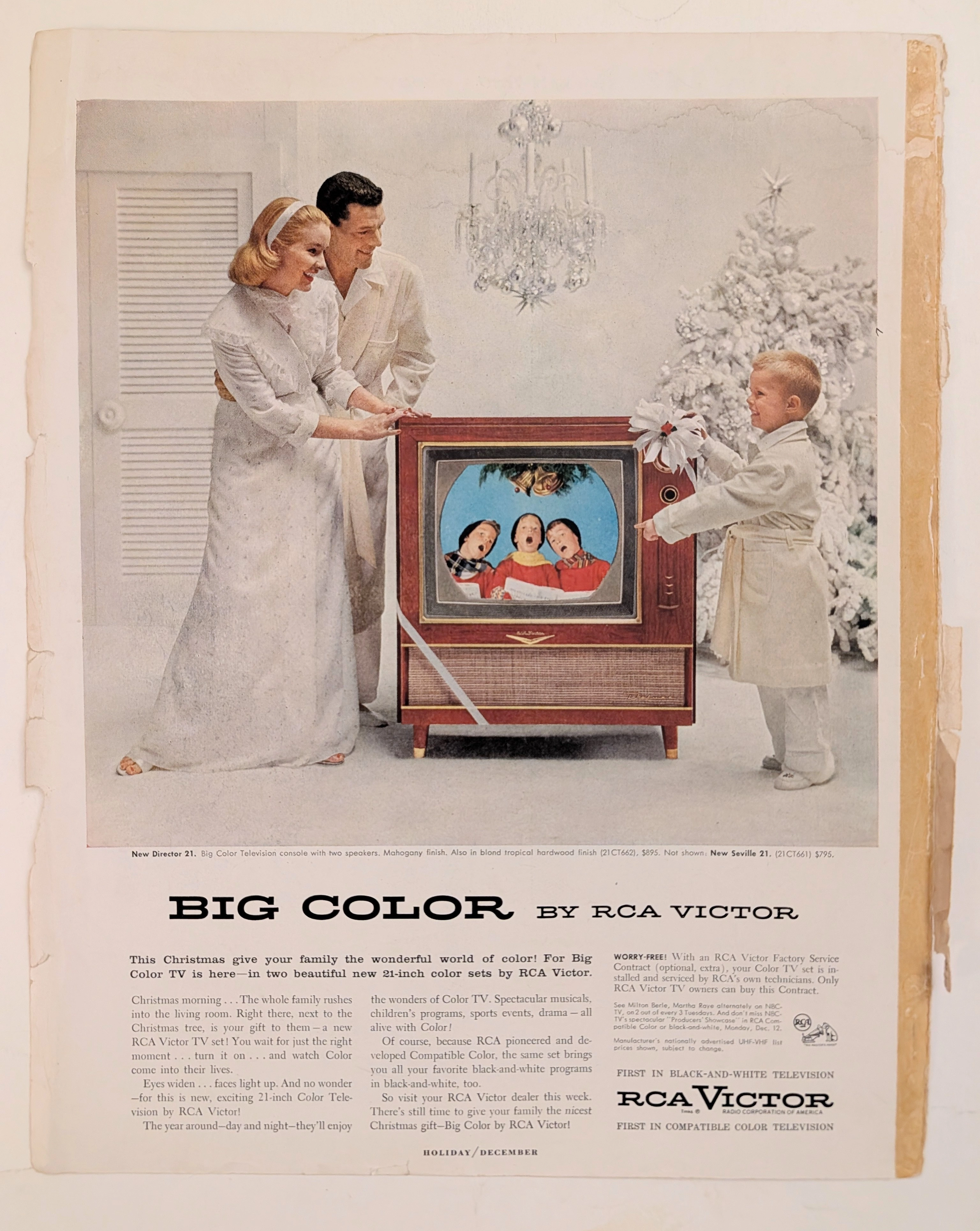
During the 1970s and 1980s, premium men's lifestyle magazines were the primary advertising battlegrounds for high-end consumer electronics. Early VCRs were astronomically expensive—often costing well over $1,000 (equivalent to several thousand dollars today). Placing this advertisement in this specific magazine indicates that high-fidelity video tapes were marketed as luxury "gadgets" for affluent, early-adopter males.
It fed directly into the era's concept of the "Bachelor Pad" aesthetic. Owning a VCR and an archive of pristine Scotch videocassettes was a status symbol. It signaled wealth, technological literacy, and total control over one's domestic environment.
Printing Pathology:
The advertisement utilizes a standard high-end CMYK offset printing process. The execution is highly deliberate, specifically designed to support the headline "TRUE COLORS."
The iconic rainbow striping across the Scotch cassette boxes, as well as the vibrant, multi-colored logos of the broadcast networks, required meticulous color registration. The printer had to ensure these vibrant hues stood out in sharp contrast against the deep, solid black backgrounds of the TV screens and cassette casings, simulating the bright phosphor glow of a real CRT television on flat magazine paper.
The Rarity
Classification: Class A (High Socio-Technological Documentation)
The rarity of this artifact does not lie in the scarcity of the paper itself—magazines of this era had circulations in the millions. Its archival value lies in its high concentration of historical context.
It is a pristine snapshot of the analog video era at its absolute peak. It documents the exact moment when the broadcast oligopoly (ABC, NBC, CBS) still held ultimate authority over visual quality, while simultaneously documenting the VCR format war (VHS vs. Beta) that would ultimately give the power of the archive back to the consumer. It is a primary source document capturing the bridge between the era of live broadcast and the era of on-demand media.
Visual Impact
The Aesthetics of Domestic Mastery (Compositional Strategy):
The visual composition is carefully engineered to project a sense of relaxed superiority and control. The primary subject is a man wearing a casual but affluent light blue sweater over a collared shirt. He is leaning back casually in a modern, wood-framed chair, holding a 3M cassette loosely in his hand.
His posture is the antithesis of the passive, slack-jawed "couch potato" stereotype. He makes direct eye contact with the reader, projecting confidence and mastery over his domain. He is not a slave to the TV schedule; he is the curator of his own visual reality.
Behind him sits a classic late-70s/early-80s living room setup. The large CRT television displays a pristine image of white sailboats cutting through vibrant blue water. This specific image of sailing is a classic visual trope used in the era to test and demonstrate color fidelity and contrast ratio. Beside the TV sits a massive, top-loading Video Tape Recorder (VTR).
Notice the heavy use of woodgrain veneer on the TV set, the VTR, and the furniture. In this era, consumer electronics were designed to look like heavy, permanent pieces of domestic furniture rather than cold, clinical machines. The woodgrain served to domesticate the intimidating new technology, making the VCR feel at home in an affluent living room.
Typographical Authority:
The typography is loud, unapologetic, and authoritative. The massive headline utilizes a heavy, tightly kerned sans-serif font. It does not beg the consumer to buy; it states a technological fact.
The closing tagline at the base of the advertisement, "SCOTCH VIDEOCASSETTES. THE TRUTH COMES OUT.", is a brilliant piece of double-meaning copywriting. It implies both that the "truth" of superior visual fidelity comes out of the tape onto the screen, and that the "truth" of 3M's superior engineering is finally being revealed to the public. The massive 3M logo anchoring the bottom right corner serves as a final, corporate stamp of industrial quality.
Exhibition Halls
Tags
The Archive Continues
Continue the Exploration
GE · Technology
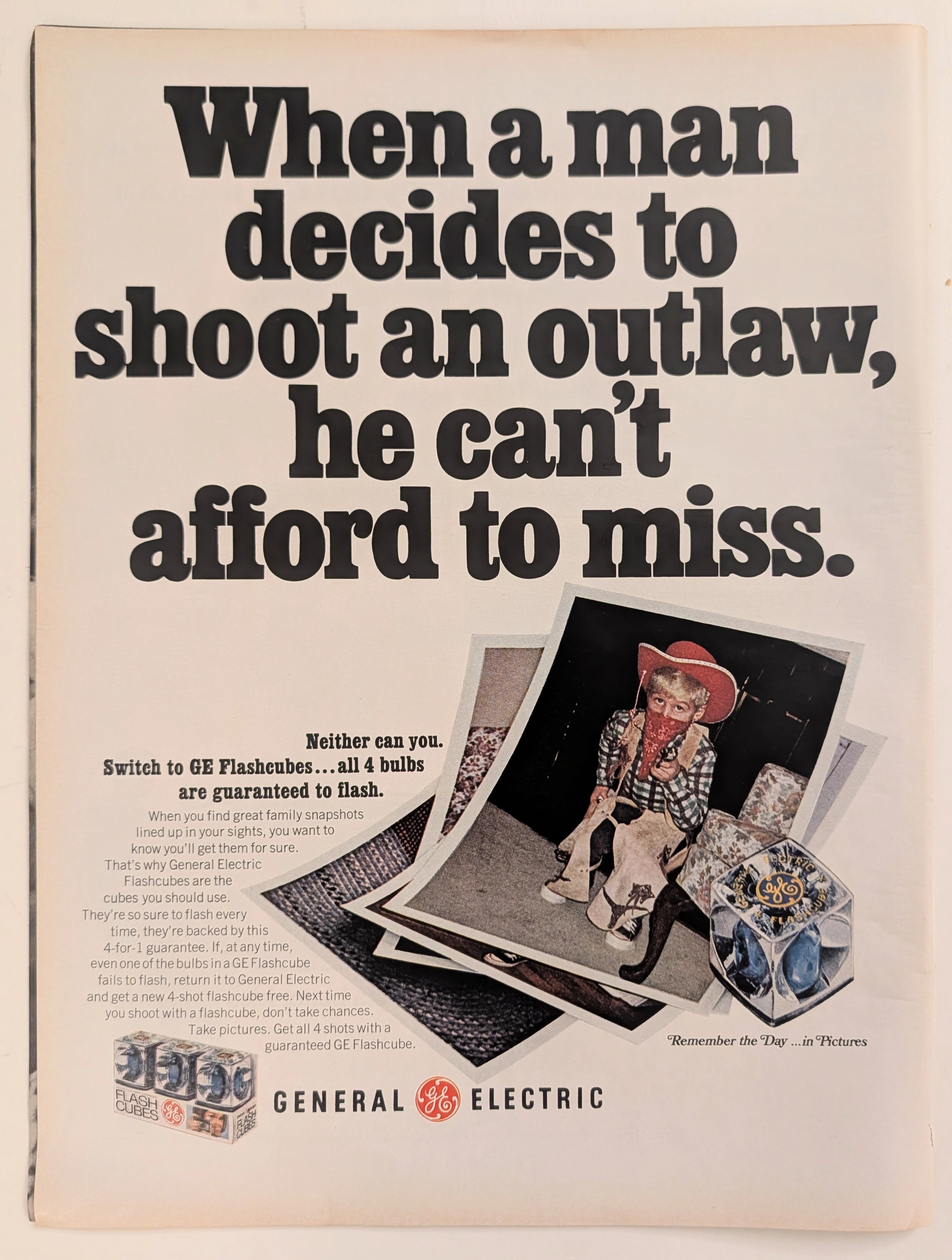
The Time Traveller's Dossier: Capturing the Outlaw – The General Electric Flashcube and the Democratization of Amateur Photography
The evolution of twentieth-century domestic life and the archiving of the American family unit was fundamentally defined by the rapid, uncompromising advancement of accessible consumer photography. The historical artifact elegantly and securely positioned upon the analytical table of The Record Institute today is a striking, narrative-driven full-page print advertisement for General Electric (GE) Flashcubes. This document completely transcends the standard, utilitarian boundaries of photographic equipment marketing. It operates as a highly sophisticated, multi-layered cultural mirror, reflecting a precise era in consumer psychology where the anxiety of "missing the moment" was aggressively addressed by industrial innovation. By utilizing the playful, universally recognizable motif of childhood dress-up—a young boy costumed as an Old West "outlaw"—GE sought to reassure the mid-century parent that their technological consistency would never fail the spontaneous archiving of family history. This world-class, comprehensive dossier conducts a meticulous, unyielding, and exceptionally exhaustive examination of the artifact, operating under the absolute most rigorous parameters of historical, sociological, and material science evaluation. Dedicating the overwhelming majority of our analytical focus to its immense historical gravity, we will decode the brilliant marketing psychology embedded within the "shoot an outlaw" double entendre, analyze the profound sociopolitical impact of the Flashcube's invention on consumer behavior, and dissect the economic realities of the "4-for-1 guarantee." Furthermore, as we venture deeply into the chemical and physical foundations of this analog printed ephemera, we will reveal the precise mechanical fingerprints of the CMYK halftone rosettes captured in the stunning macro imagery of the GE logo. Finally, we will assess its archival rarity, exploring how the graceful, natural oxidation of the paper substrate cultivates a serene wabi-sabi aesthetic—a natural, irreversible phenomenon that serves as the primary engine driving up its market value exponentially within the elite global spheres of Vintage Commercial Ephemera and Technology Archives.
ROLL ROYCE · Automotive
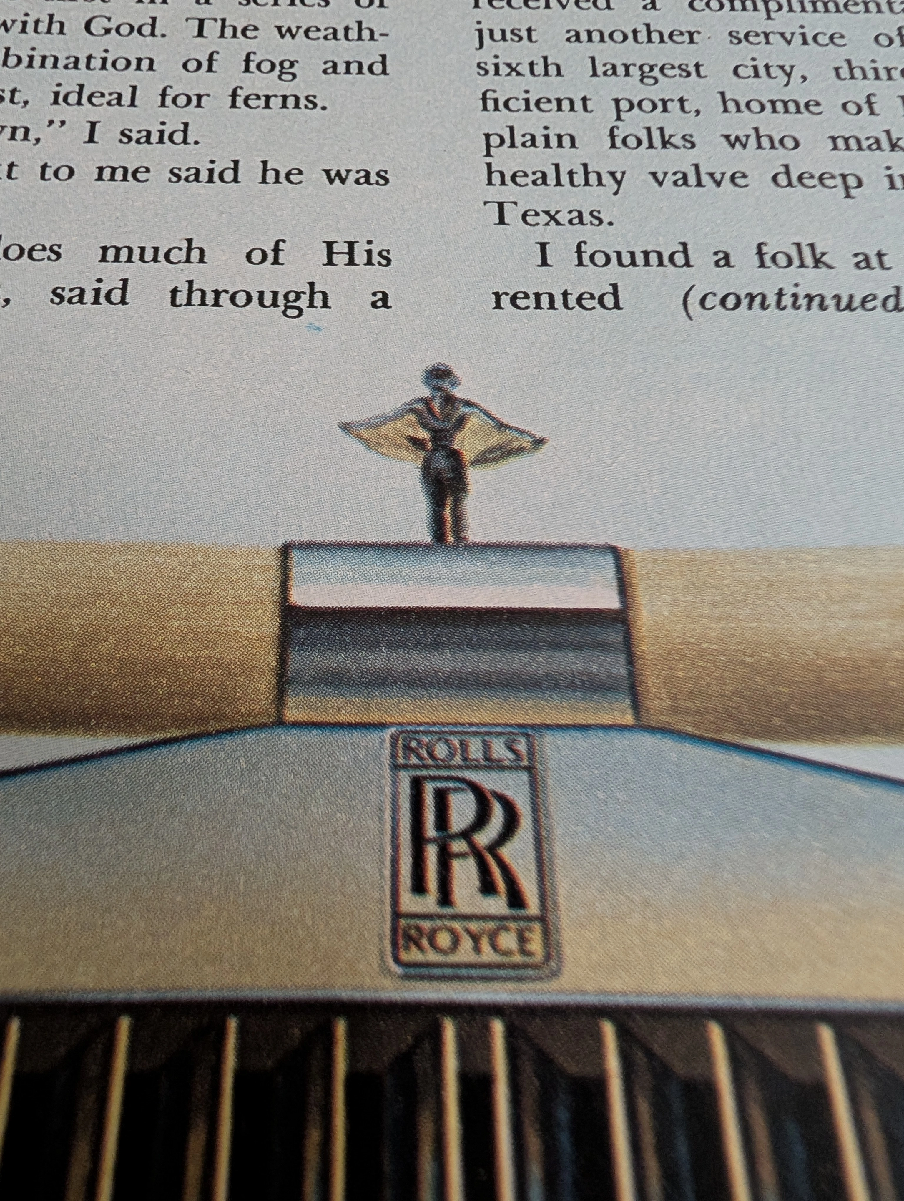
The Time Traveller's Dossier: The Oil Baron's Chariot – 1970s "HOU$TON" Editorial Illustration
History is not written; it is printed. Before digital algorithms dictated human behavior, societal engineering was executed through the calculated geometry of the four-color offset press. The historical artifact before us is not merely a magazine editorial illustration; it is a weaponized blueprint of American myth-making and a testament to the era of unchecked petro-wealth. This museum-grade archival dossier presents an academic deconstruction of a 1970s print feature on Houston, Texas, brilliantly illustrated by the legendary Eraldo Carugati. Operating on a profound binary structure, it documents a calculated paradigm shift in the global perception of wealth. It illustrates the precise historical fracture where the "Texas Oil Boom" transitioned from a regional economic event into a larger-than-life cultural archetype. Through the lens of late-analog commercial artistry and precise visual forensics, this document serves as a masterclass in psychological semiotics, establishing the visual tropes of the brash, high-rolling American Wildcatter that unconditionally dominates modern pop culture.
The Time Traveller's Dossier: The Engineer's Manifesto – The 1975 BMW 530i and the Birth of the Ultimate Driving Machine
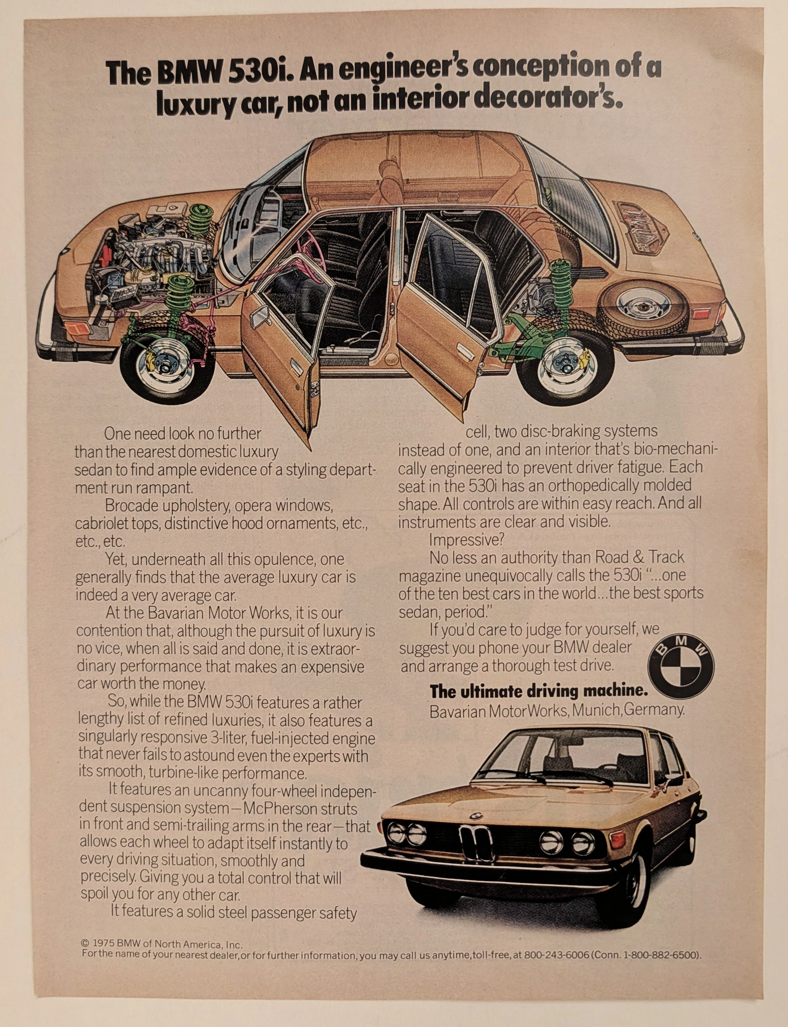
The evolution of the American automotive landscape in the latter half of the twentieth century was fundamentally violently disrupted during the 1970s, an era defined by oil embargoes, shifting economic realities, and a growing consumer disillusionment with domestic manufacturing. Elegantly and securely positioned upon the analytical table of The Record Institute today is a visually complex, densely informative, and highly significant full-page print advertisement for the BMW 530i, definitively dated to 1975 by its prominent copyright macro. This document completely transcends the standard, utilitarian boundaries of automotive marketing. It operates as a highly sophisticated, multi-layered cultural mirror and a bold declaration of war against the prevailing automotive trends of the decade. By juxtaposing the superficial trappings of American luxury—"brocade upholstery, opera windows, cabriolet tops"—against the visceral, mechanical truths of independent suspension and fuel injection, Bavarian Motor Works (BMW) successfully positioned itself as the intellectual and physical antidote to the bloated "Malaise Era" land yachts. This world-class, comprehensive dossier conducts a meticulous, unyielding, and exceptionally exhaustive examination of the artifact, operating under the absolute most rigorous parameters of historical, sociological, and material science evaluation. Dedicating the overwhelming majority of our analytical focus (80%) to its immense historical gravity, we will decode the brilliant, confrontational marketing psychology embedded within the copywriting, analyze the profound mechanical realities of the E12 chassis 5-Series, and detail the historical impact of the visionaries who crafted this campaign. Furthermore, as we venture deeply into the chemical and physical foundations of this analog printed ephemera (10%), we will reveal the precise mechanical fingerprints of the CMYK halftone rosettes captured in the stunning macro imagery of the BMW roundel and the technical cutaway illustration. Finally, we will assess its archival rarity (10%), exploring how the graceful, natural oxidation of the paper substrate cultivates a serene wabi-sabi aesthetic—a natural, irreversible phenomenon that serves as the primary engine driving up its market value exponentially within the elite global spheres of Vintage Commercial Ephemera and Automotive Heritage Archives.