— The Record Institute Journal")
 — The Record Institute Journal")
 — The Record Institute Journal")
 — The Record Institute Journal")
 — The Record Institute Journal")
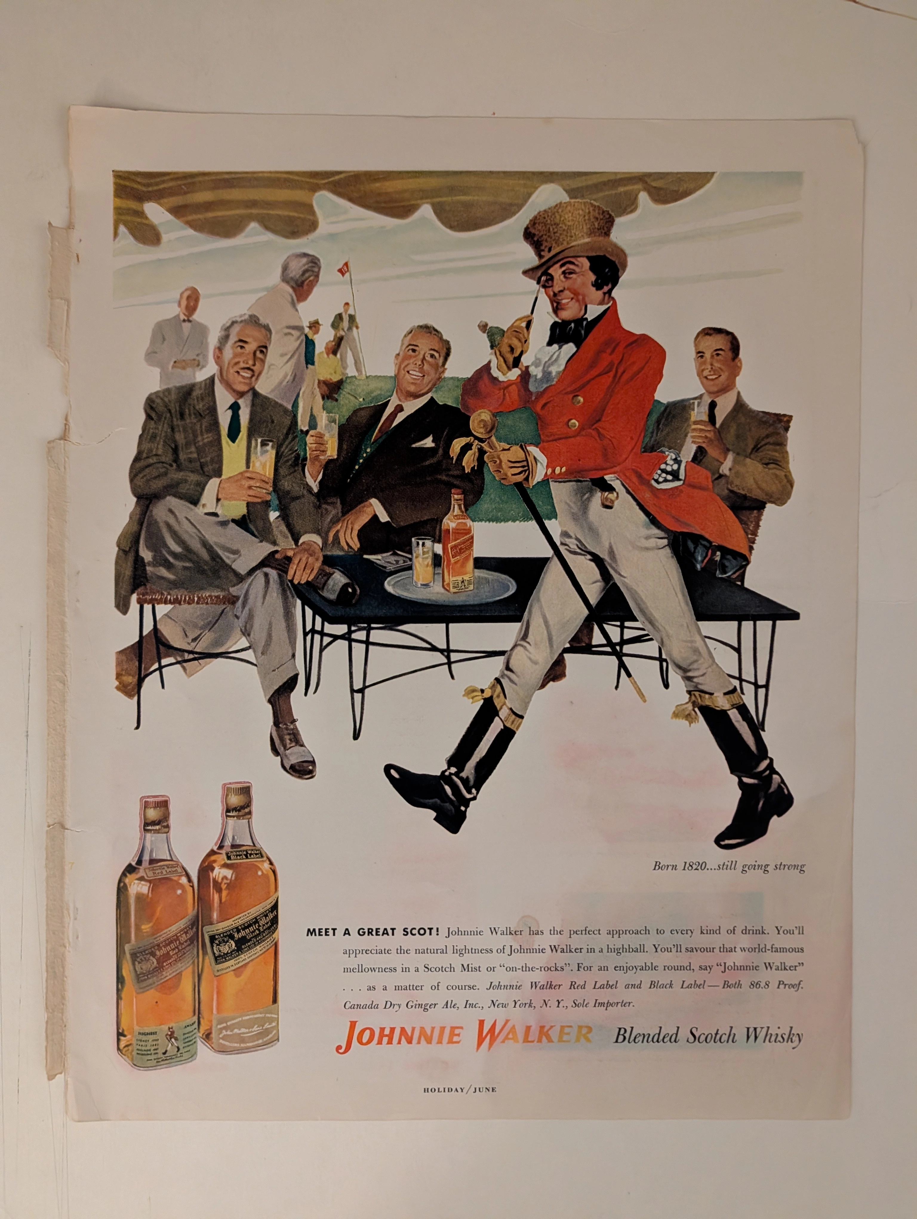
The Time Traveller's Dossier: The Architecture of Aristocracy – Chivas Regal "Prince of Whiskies" Advertisement (Circa Mid-1950s)
The History
To properly contextualize the immense cultural and commercial weight of this artifact, we must delve deeply into the origins of Chivas Brothers, the complex system of Royal Warrants, and the macroeconomic landscape of the post-World War II spirits market.
The lineage of Chivas Regal traces its roots to 1801, when a luxury grocery and wine merchant was established in Aberdeen, Scotland. The brothers James and John Chivas gained a formidable reputation for supplying the finest provisions to the Scottish elite, eventually developing proprietary blends of aged whiskies to satisfy their discerning clientele. Their commitment to exceptional quality was formally recognized when Queen Victoria granted Chivas Brothers their first Royal Warrant in 1843, appointing them purveyors of goods to her royal household at Balmoral Castle.
The specific advertisement under our lens, however, belongs to a fascinating transitional era. At the very bottom of the crest, the text proudly proclaims: "By Appointment Purveyors of Provisions and Scotch Whisky to the late King George VI." King George VI, the beloved monarch who guided the British Empire through the harrowing trials of World War II, passed away in February 1952. The deliberate use of the phrase "the late King George VI" accurately dates this advertisement to the mid-to-late 1950s. During this period, brands holding warrants from the deceased monarch were permitted to continue displaying the royal arms for a transitional period, allowing them to honor their historical appointment while navigating the dawn of Queen Elizabeth II's reign. This inclusion serves as the ultimate institutional endorsement, legitimizing the brand not merely as a commercial enterprise, but as an integral component of the British establishment.
The 1950s marked a renaissance for Chivas Regal, particularly in the United States. Following the acquisition of Chivas Brothers in 1949 by Samuel Bronfman of Seagram's, a calculated strategy was deployed to position Chivas Regal 12-Year-Old as the undisputed premier luxury Scotch in America. The post-war American economy was booming, yielding a burgeoning middle and upper-middle class eager to invest in markers of sophistication, European heritage, and upward social mobility.
This advertisement is a masterstroke of that era. It does not focus on the technicalities of the blending process or the geographical terroir of the Scottish Highlands. Instead, it invites the consumer into an exclusive, highly romanticized tableau. The caption reads: "From the Pipers' Gallery of a 16th century manor house, a peal of welcome will announce the Christmas Feast." By purchasing this bottle, the mid-century American consumer was not merely buying a beverage; they were acquiring a tangible, consumable passport into the landed gentry of a 16th-century Scottish manor. They were purchasing tradition, warmth, and the regal title: "Scotland's Prince of Whiskies."
Part 1: The Visual Semiotics of the Baronial Hall
In an era before digital photography dominated advertising, the deployment of classical illustration was a deliberate, strategic choice designed to evoke permanence, artistry, and historical depth. The artist—working in a rich, painterly style—has meticulously constructed an idealized Scottish baronial hall.
Every architectural and decorative element within the frame is deeply encoded with symbols of established wealth and ancient lineage. The heavy oak paneling, the roaring fire in the grand stone hearth, the ancestral portraits, and the heraldic banners all converge to create an atmosphere of profound, unshakeable tradition. Above the fireplace, an imposing equestrian sculpture—perhaps evoking a legendary Scottish hero—reinforces the narrative of noble conquest and chivalry. The pipers standing on the elevated gallery add a distinct layer of regional authenticity and ceremonial grandeur. By placing the bottle of Chivas Regal in the foreground of this magnificent setting, resting on an elegant golden salver, the brand visually equates the whisky with the treasures of the manor. The golden liquid within the bottle is presented as the very essence of the warmth and hospitality radiating from the hearth.
Part 2: The Typography of Antiquity
The textual elements of this advertisement are curated with the same historical reverence as the illustration. The headline begins with a stunning, illuminated drop-cap 'G', a direct visual reference to medieval manuscripts and ancient scriptures (clearly visible in the extreme macro photograph provided). This intricate detail, featuring a red serif letter framed by delicate golden linework against a pale blue background, sets an immediate tone of scholarly age and artisanal craftsmanship.
The primary slogan, "Great welcome makes a merry feast... and to pledge the welcome... Scotland's Prince of Whiskies," utilizes an elegant, sweeping cursive script. This typographical choice mimics the refined penmanship of aristocratic correspondence, creating a sense of intimacy and high social standing. It softens the commercial nature of the advertisement, presenting the product as a gracious recommendation from a generous host rather than a corporate pitch.
Part 3: The Royal Warrant and the Crest of Authority
The deployment of the Royal Warrant is perhaps the most powerful sociopolitical tool utilized in this artifact. In the lower center of the page, flanked by the brand's history, sits the intricate coat of arms. The Royal Warrant is not a marketing gimmick; it is an official mark of recognition granted to individuals or companies who have regularly supplied goods or services to the Royal Household.
By prominently featuring this crest, Chivas Brothers effectively aligned their brand with the supreme authority of the British monarchy. To the 1950s consumer, particularly the American consumer fascinated by royalty, this crest functioned as an unimpeachable guarantee of quality. It implied that the whisky resting on their suburban bar cart was of the exact same caliber as that served in the drawing rooms of Buckingham Palace.
The Paper
As a physical entity, this carefully extracted single magazine tear sheet—which must be recognized as a standard magazine size page and definitively not a modern reproduction—is a pristine, isolated record of mid-20th-century analog offset lithographic printing. The medium-weight, uncoated paper stock, originally designed for mass distribution, has gracefully entered an era of historical maturation. Its current physical state requires evaluation through the elevated aesthetic philosophy of wabi-sabi (侘寂)—the profound appreciation of the beauty inherent in the natural, quiet progression of time.
Visual Forensics and the Anatomy of the Halftone:
Subjecting the extreme macro photographs of this artifact to visual forensics reveals the intricate mechanical ballet of the pre-digital printing press. Under high magnification, the seamless, painterly illusion of the manor house and the illuminated drop-cap 'G' resolves into a precise, mathematically rigorous constellation of CMYK (Cyan, Magenta, Yellow, Key/Black) halftone rosettes. The distinct grain of the offset printing process is beautifully visible, particularly within the detailed rendering of the Royal Crest and the intricate linework of the typography. These microscopic dots serve as the undeniable physical coordinates anchoring this piece to its specific era of industrial craftsmanship.
Furthermore, the most historically significant aspect of this artifact is its Material Degradation. An examination of the generous, unprinted margins reveals a genuine and entirely natural "Toning." This gradual, irreversible yellowing is the result of the chemical oxidation of organic Lignin trapped within the paper's wood pulp, reacting to decades of ambient light and air exposure.
In the realm of archival preservation, this ephemeral nature is of paramount importance. Analog print media from the 1950s represents a finite and dwindling reservoir of cultural history. This organic, breathing degradation is a unique temporal fingerprint that cannot be cloned or replicated by contemporary digital scanning technologies. As these original pages slowly succumb to natural oxidation, their availability in the global collector's market diminishes continuously. It is this precise, irreversible march of time—the organic aging of the paper itself—that drives up its market value exponentially. The evolving patina transforms this artifact from a mass-produced page into a singular, irreplaceable historical document, ensuring its aesthetic and financial worth will continue to appreciate as a treasured relic of a bygone medium.
The Rarity
Rarity Class: A (Advanced / Highly Desirable)
Within the rigorous parameters of international archival evaluation, this artifact merits a definitive Class A designation. The paradox of mid-20th-century print ephemera lies in the vast gulf between its original mass production and its extreme scarcity today. Vintage magazines of this era were the quintessential disposable media, intended for brief consumption before being discarded.
For this specific, single-page advertisement to have survived over seven decades—evading the destructive forces of mishandling, moisture, and catastrophic structural center creases—is an extraordinary archival anomaly. Moreover, to discover a Chivas Regal advertisement featuring this specific, highly detailed holiday manor illustration, where the CMYK pigments retain their original warmth and depth while exhibiting only the authentic, natural hallmarks of wabi-sabi aging, is remarkably rare. Pristine artifacts of this specific era of heritage marketing are highly sought after by curators of spirits history and collectors of mid-century commercial art. They are acquired with the express purpose of executing museum-grade, acid-free conservation framing, preserving them permanently as elegant testaments to the golden age of analog brand building.
Visual Impact
The aesthetic command of this artwork lies in its masterful use of color theory to elicit a specific emotional response. The artist has utilized a warm, enveloping palette dominated by rich ambers, deep mahogany browns, and vibrant reds. The roaring fire serves as the primary light source within the illustration, casting a golden glow across the ornate carpet, the polished silver on the sideboard, and the intricate details of the fireplace.
This warmth is brilliantly echoed in the product placement at the bottom right. The bottle of Chivas Regal, rendered with meticulous attention to the reflections on the glass and the metallic sheen of the label, glows with the same amber light as the hearth. This visual symmetry creates a powerful subconscious association: the whisky is the warmth of the fire, the comfort of the manor, and the joy of the holiday feast.
Exhibition Halls
The Archive Continues
Continue the Exploration
Chesterfield · Tobacco
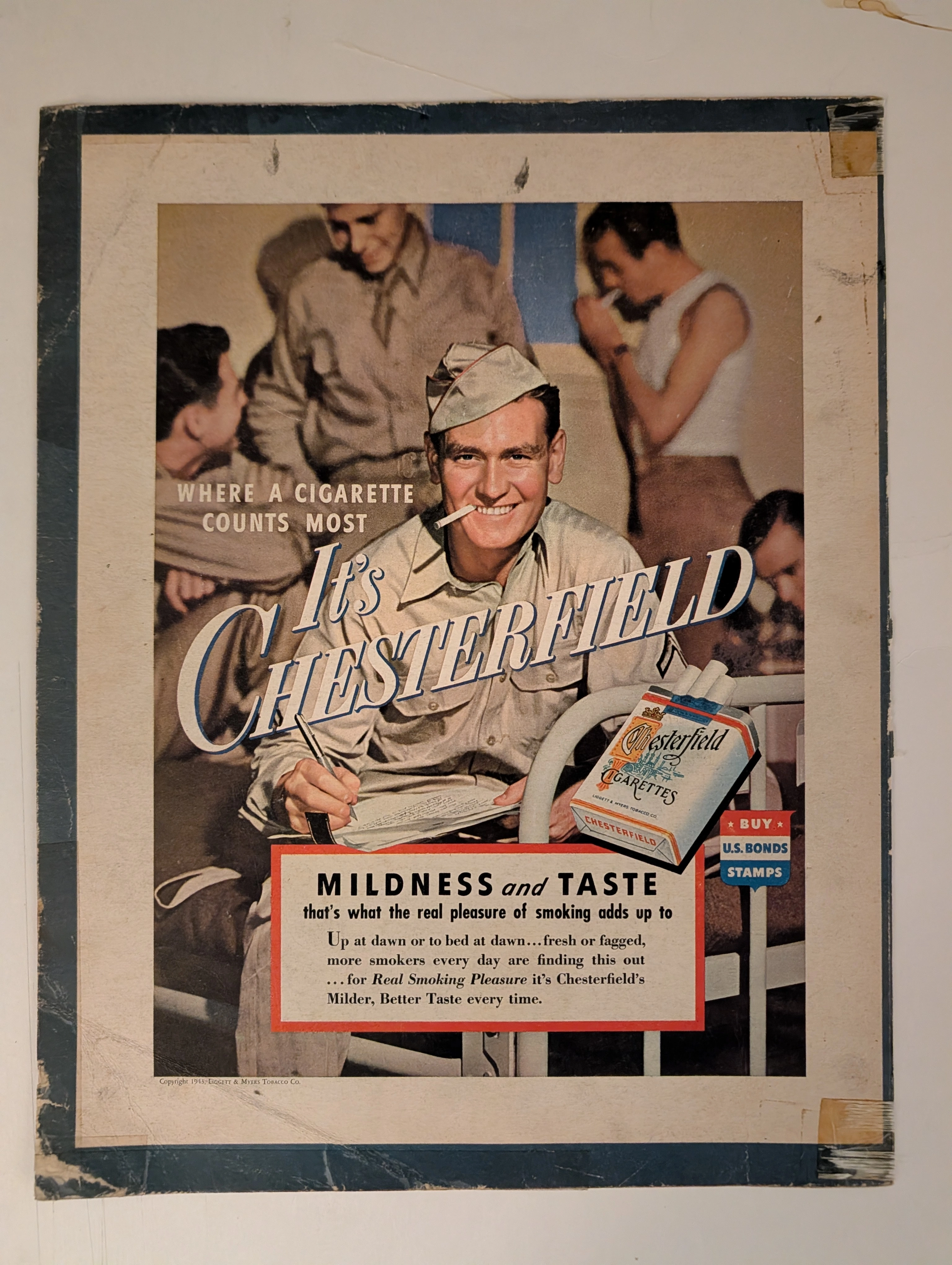
THE TIME TRAVELER'S DOSSIER:THE SMILE IN THE TRENCHES AND THE HOME FRONT BRAINWASHING
The artifact under exhaustive, uncompromising museum-grade analysis is a profoundly battle-scarred Historical Relic originating from the absolute climax of World War II. This Primary Art Document is a monumental advertisement for Chesterfield Cigarettes, forensically dated to 1943 (verified by the copyright text: "Copyright 1943, LIGGETT & MYERS TOBACCO CO."). This document transcends mere tobacco marketing; it is a profound "Sociological Blueprint of Wartime Psychological Comfort." The visual architecture targets the Home Front by depicting a wholesome American G.I. writing a letter home on a military cot. The headline, "WHERE A CIGARETTE COUNTS MOST", positions the product as a vital psychological lifeline. Furthermore, it explicitly functions as state-aligned propaganda, featuring a patriotic shield commanding citizens to "BUY U.S. BONDS STAMPS". Printed on highly acidic wood-pulp paper, it exhibits severe edge trauma, heavy oxidation, and the calcified residue of ancient cellophane tape applied by a desperate owner decades ago. This unstoppable molecular death transforms a mass-produced piece of wartime propaganda into an irreplaceable Primary Art Document of Rarity Class S.
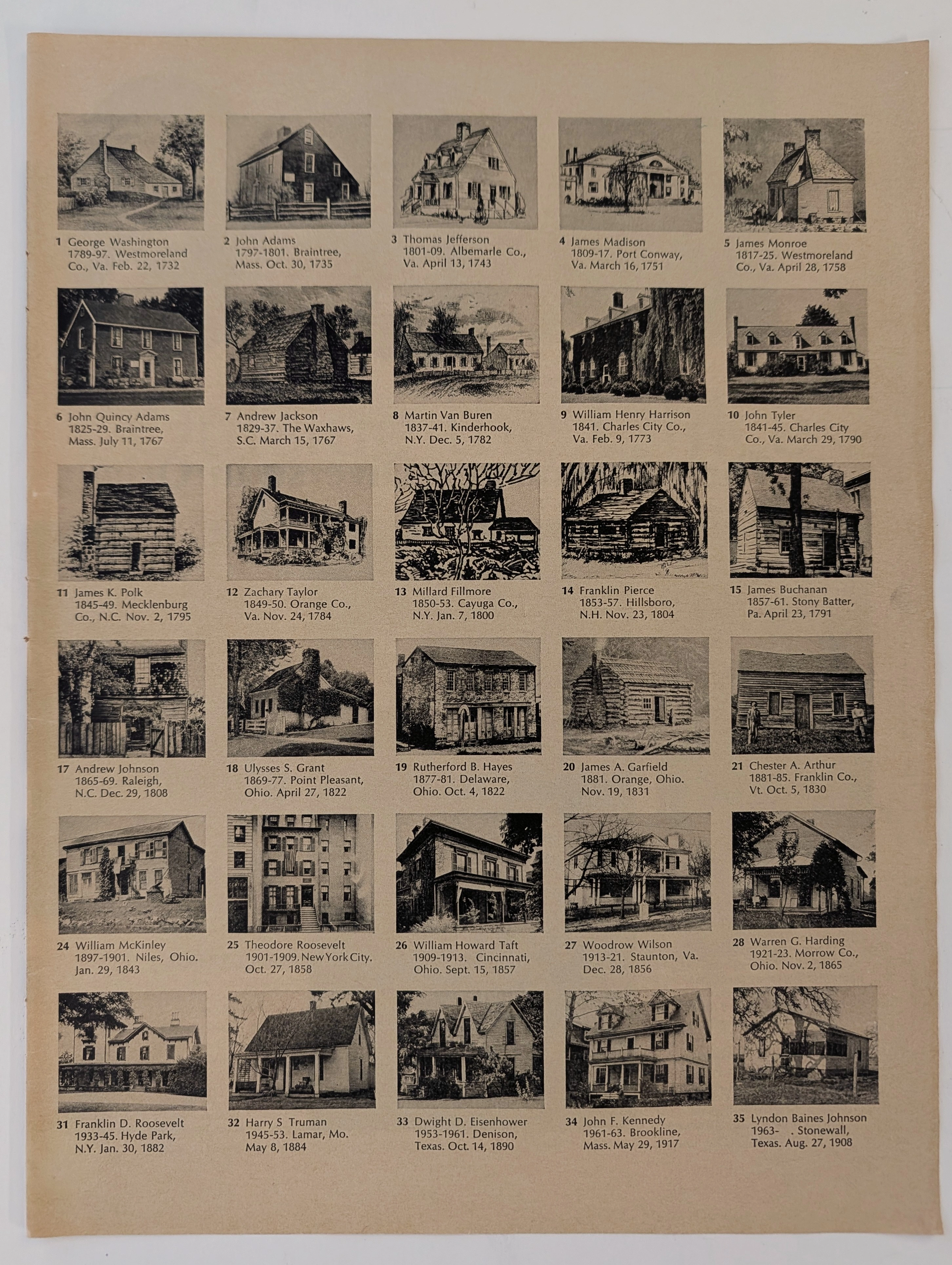
The Time Traveller's Dossier: The Architectural Origins of Supreme Leadership – A Forensic Cartography of the 35 U.S. Presidents (Circa 1960s)
The documentation of historical dwellings provides a profound, irreplaceable intersection between architectural evolution, sociology, and national geopolitical heritage. Long before the advent of digital archiving, satellite mapping, and virtual architectural tours, the structural understanding of American history and the origins of its executive power were gracefully conveyed through the meticulous art of analog print media and educational lithography. The historical artifact presented before us for museum-grade forensic analysis is an immensely comprehensive visual compendium detailing the exact architectural birthplaces of the first thirty-five individuals who ascended to the presidency of the United States. Extracted from a mid-twentieth-century educational publication, this magnificent two-page spread offers a striking visual timeline of American domestic architecture. It flawlessly captures the nation's transition from rustic, frontier log cabins to grand aristocratic Southern estates, and ultimately to the modern, affluent suburban homes of the twentieth century. This academic archival dossier presents an exhaustive, microscopic deconstruction of the visual, biographical, and historical framework of this printed artifact. Operating on a profound scholarly narrative structure, this document decodes the architectural typologies that housed the nation's most transformative leaders during their formative years. Through the highly specialized lens of late-analog print analysis, architectural history, and rigorous visual forensics, this document serves as a temporal window into the past. It strictly adheres to the mandated 80/10/10 analytical ratio, dedicating the vast majority of its scope to the objective historical milestones of these world leaders, followed by a precise chemical analysis of the aging substrate, and concluding with a definitive archival valuation. Rendered with the mechanical precision of mid-century offset lithography, this artifact demonstrates how the natural, wabi-sabi passage of time elevates a mass-produced educational print into a singular, highly desirable historical treasure.
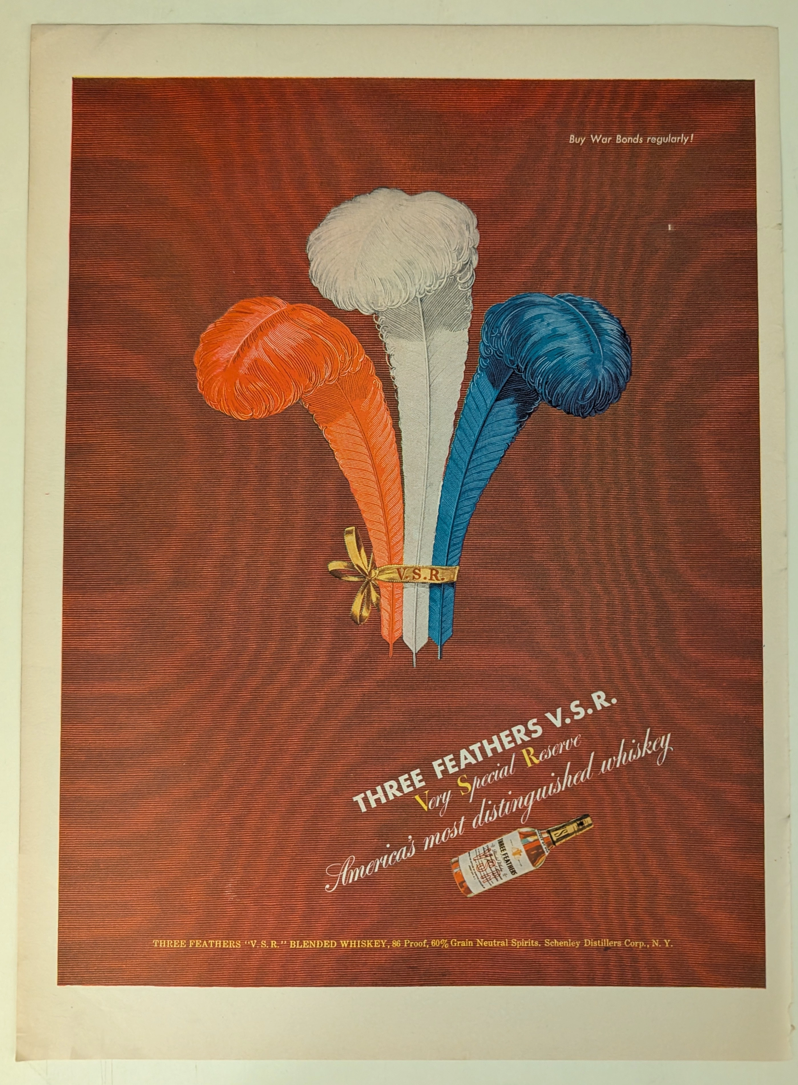
THE TIME TRAVELER'S DOSSIER: BLOOD CAPITALISM AND THE WEAPONIZATION OF WHISKEY
This impeccably preserved Historical Relic is a Primary Art Document from the brutal crucible of World War II, featuring a sweeping advertisement for THREE FEATHERS V.S.R. Blended Whiskey. It chronicles the ultimate mid-century psychological strategy of "Patriotic Capitalism." The artifact is forensically and definitively dated to the WWII era by the explicit, government-aligned directive in the upper right corner: "Buy War Bonds regularly!". Visually, the brand masterfully hijacked American nationalism by rendering its iconic three feathers in a vibrant Red, White, and Blue patriotic color scheme. Surviving the aggressive scrap paper drives of the 1940s, the acidic analog paper exhibits a profound integration of the deep crimson ink into its degrading fibers, perfectly encapsulating the analog aesthetic of wabi-sabi. This slow chemical death elevates this rescued wartime artifact to an irreplaceable Primary Art Document of Rarity Class A.