The Time Traveller's Dossier: The Sanctuary of the Highway – The 1968 Ford LTD and the Democratization of Silence
The History
To fully appreciate the immense historical gravity, cultural magnitude, and sociological importance of this artifact, one must meticulously contextualize the psychological, economic, and infrastructural landscape of the American driver in 1968. This was a year characterized by intense domestic and international turmoil; the sociopolitical fabric of the United States was vibrating with the anxieties of the Vietnam War, civil rights struggles, and generational shifts. Concurrently, the physical landscape of America was being radically permanently altered by the Federal-Aid Highway Act, which was rapidly pouring millions of tons of concrete to create the Interstate Highway System.
Within this noisy, turbulent, and concrete-heavy environment, the American consumer developed a profound psychological desire for a sanctuary. They craved a controlled, isolated environment. The Ford Motor Company, possessing an exceptionally astute reading of this sociological undercurrent, responded not merely with a car, but with a mobile isolation chamber. The 1968 Ford LTD represented the pinnacle of this philosophy.
The bold, authoritative typography anchoring the top left of the artifact reads: "QUIET. STRONG. BEAUTIFUL. A GREAT ROAD CAR.". The deliberate placement of "QUIET" as the very first adjective is a monumental departure from traditional automotive marketing, which typically prioritized speed, horsepower, or aggressive styling. Ford was selling the absence of noise. The advertising copy delves deeply into this legendary engineering narrative, referencing a marketing campaign that began three years prior: "In 1965 Ford built a good car—an LTD so good it rode quieter than a Rolls-Royce".
This specific claim—that a mass-produced, middle-class American sedan was acoustically superior to the bespoke, hand-built pinnacle of British automotive aristocracy—was one of the most audacious and successful marketing strategies of the 20th century. Ford actually hired acoustic engineers to measure the decibel levels of an LTD against a Rolls-Royce Silver Cloud, utilizing the scientific data to democratize the concept of luxury. The copy in this 1968 artifact reminds the consumer of this continuous legacy, noting that in 1966 it was quieter than European cars, and in 1967 it was strong enough to survive "eight punishing steeplechase jumps... and stay quiet". Ford was not just selling a vehicle; they were selling an impenetrable fortress of domestic tranquility.
The visual composition of the advertisement brilliantly reinforces this narrative of the "Great Road Car." The 1968 Ford LTD 2-door hardtop is photographed parked beneath the massive, sweeping, brutalist curves of a modern concrete highway overpass. The lighting is moody and cinematic, casting the harsh infrastructure in deep shadows while the warm, metallic bronze paint of the car gleams with sophisticated elegance. This deliberate juxtaposition highlights the car as a refined, beautiful haven amidst the cold, unforgiving reality of modern American infrastructure. The car features "disappearing headlamps," a hallmark of high-end 1960s automotive design that allowed the front grille to appear as a single, unbroken, and menacingly wide horizontal graphic element, further emphasizing its sleek, aerodynamic isolation.
Furthermore, the artifact documents a critical shift in corporate branding via the secondary focal point at the bottom right of the page: the "See the light!" inset. This macro section highlights the legendary "Ford ...has a better idea" campaign. The visual substitution of the letter 'O' in FORD with a glowing, incandescent lightbulb was a stroke of genius. During an era when competitors like Chevrolet and Pontiac were heavily focused on muscle and brute force, Ford positioned itself as the intellectual automaker. They were selling innovation, smart engineering, and "better ideas"—such as the optional "push-button AM/FM Stereo Radio," the "SelectAire Conditioner," and "Power front disc brakes" detailed in the fine print. The lightbulb symbolized that buying a Ford was not an act of passion, but an act of supreme, calculated intelligence.
The Paper
As a physical entity, this printed artifact functions as a living, breathing, and profound record of mid-twentieth-century graphic reproduction and substrate chemistry. Under exceptional, high-magnification macro-lens examination, this document reveals the stunning complexity and mathematical precision of analog color printing.
The extraordinary macro photograph of the LTD's wheel hubcap and lower fender provides a textbook visualization of a CMYK halftone rosette pattern. The intricate, radial spokes of the hubcap, the deep shadows of the wheel well, and the metallic glint of the central red emblem are not solid colors, but are meticulously constructed from a precise, mathematically rigorous galaxy of microscopic ink dots. Cyan, Magenta, Yellow, and Key (Black) inks are elegantly and systematically layered at highly specific angles to trick the human eye and the biological visual cortex into perceiving a continuous, vibrant, and dimensional photographic reality out of mere clusters of ink. This overlapping dot pattern constitutes the unforgeable mechanical fingerprint of the pre-digital analog offset printing press.
Yet, the most profound and impactfully beautiful factor elevating the immense value of this artifact in the contemporary global collector's market is the natural, organic, and entirely irreversible process of Material Degradation. The expansive margins and the overall paper substrate exhibit a genuine, unavoidable "Toning." This gradual, chronological transition from the original bright, bleached manufactured paper to a warm, antique ivory and golden hue is caused by the slow, relentless chemical oxidation of Lignin—the complex organic polymer that naturally binds cellulose fibers together within the raw wood pulp of the paper. As the substrate is exposed to ambient oxygen and ultraviolet light over a span of nearly six decades, the molecular structure of the lignin gracefully breaks down. This naturally evolving patina represents the absolute core of the wabi-sabi aesthetic. It is precisely this authentic, unreplicable degradation that acts as the primary engine driving up its market value exponentially among elite curators and collectors, as it provides the ultimate, irrefutable scientific proof of the artifact's historical authenticity and its delicate journey through time.
The Rarity
RARITY CLASS: B (Very Good Archival Preservation with Natural Margin Toning)
Evaluated under the most exacting, rigorous, and uncompromising archival parameters established by The Record Institute, this artifact is definitively and securely designated as Class B.
The remarkable and defining paradox of mid-century commercial ephemera is that these specific documents were produced by the millions as explicitly and intentionally "disposable media." Inserted into high-volume consumer publications of 1968, they were inherently destined by their very nature to be briefly observed, casually folded, and ultimately discarded into the recycling bins of history. For a full-page, graphically intensive automotive advertisement to survive entirely intact from the late 1960s without catastrophic structural tearing, without destructive moisture staining, or without the fatal, irreversible fading of the delicate, light-sensitive halftone inks constitutes a highly significant statistical archival anomaly.
The structural integrity of this paper remains exceptionally sound. While the rich analog colors—particularly the warm bronze of the car's paint and the deep, moody blacks of the concrete shadows—remain astonishingly vibrant, there is a beautiful, mathematically even, natural lignin oxidation reflecting its era. This displays a pronounced, warm ivory patina heavily along the top and side margins. This environmental interaction does not detract from its immense value; rather, it authentically validates the document's chronological journey. The sheer sociopolitical weight of the subject matter—the definitive documentation of Ford’s "Quiet" luxury campaign during a tumultuous era of American history—makes this a highly prized, museum-worthy piece of automotive heritage, requiring acid-free, UV-protected conservation framing to ensure its historical permanence.
Visual Impact
The aesthetic brilliance and psychological power of this artifact lie in its masterful execution of "Brutalist Juxtaposition." The art director has deliberately constructed a visual hierarchy that contrasts the cold, unforgiving reality of modern infrastructure with the warm, isolated sanctuary of the automobile.
The composition is heavily dominated by the massive, sweeping curves of the concrete highway overpass that looms over the vehicle. This heavy, shadowy, and almost oppressive architectural element serves a profound psychological purpose: it represents the noisy, chaotic outside world from which the 1968 consumer desperately wished to escape. In brilliant, stark contrast, the Ford LTD sits below it, bathed in warm, cinematic light. The rich bronze paint and the unbroken, sleek horizontal lines of the disappearing headlamp grille project an aura of impenetrable, sophisticated tranquility.
The typography anchors this visual narrative with absolute authority. The top-left quadrant commands immediate attention with the heavy, clean sans-serif declaration: "QUIET. STRONG. BEAUTIFUL. A GREAT ROAD CAR.". This immense typographic weight is perfectly counterbalanced in the bottom-right quadrant by the glowing, almost magical inset of the "See the light!" lightbulb logo. This creates a flawless, diagonal focal path across the entire page—guiding the eye from the authoritative promise of silence, across the sleek sanctuary of the vehicle, and down to the glowing symbol of intellectual engineering. It is a textbook integration of moody environmental photography and psychological corporate branding.
Exhibition Halls
The Archive Continues
Continue the Exploration
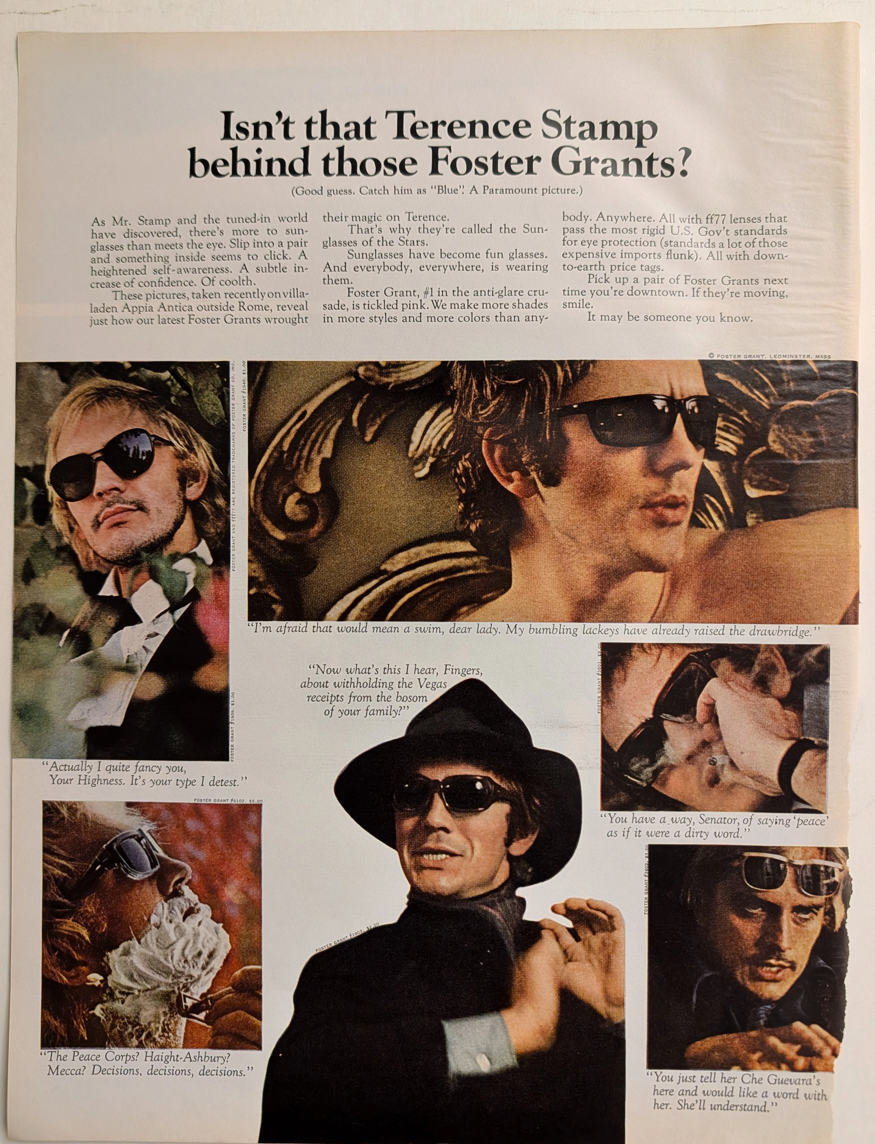
The Time Traveller's Dossier: The Sartorial Armor of Terence Stamp – A Foster Grant Exhibition
The metamorphosis of sunglasses from a purely utilitarian device designed to protect the human cornea into a profound instrument of psychological transformation and sartorial armor is one of the most fascinating narratives in the history of modern fashion. The historical artifact elegantly and securely positioned upon the analytical table of The Record Institute today is a majestic, large-format print advertisement for Foster Grant Sunglasses, featuring the internationally renowned British actor Terence Stamp, originating from approximately 1968. This document completely transcends the traditional boundaries of optical equipment marketing. It operates as a highly sophisticated, multi-layered cultural mirror, reflecting the exact moment when celebrity mystique, mass-market manufacturing, and the volatile sociopolitical crosscurrents of the late 1960s converged on a single printed page. This world-class, comprehensive dossier conducts a meticulous, unyielding, and exceptionally deep examination of the artifact, operating under the absolute most rigorous parameters of historical, sociological, and material science evaluation. We will decode the brilliant advertising strategy that successfully elevated injection-molded plastics to the realm of high fashion, analyze the complex biographical and cultural significance of Terence Stamp as the chosen emissary of this campaign, and dissect the rich, era-defining semiotics embedded within the six distinct personas he portrays. Furthermore, as we venture deeply into the chemical and physical foundations of this analog printed ephemera, we will reveal the precise mechanical fingerprints of the CMYK halftone rosettes and the graceful, natural oxidation of the paper substrate. This precise intersection of visual nostalgia, mid-century commercial artistry, and the immutable chemistry of time cultivates a serene wabi-sabi aesthetic—a natural, irreversible phenomenon that serves as the primary engine driving up its market value exponentially within the elite global spheres of Vintage Fashion Ephemera and Cinematic Memorabilia collecting.
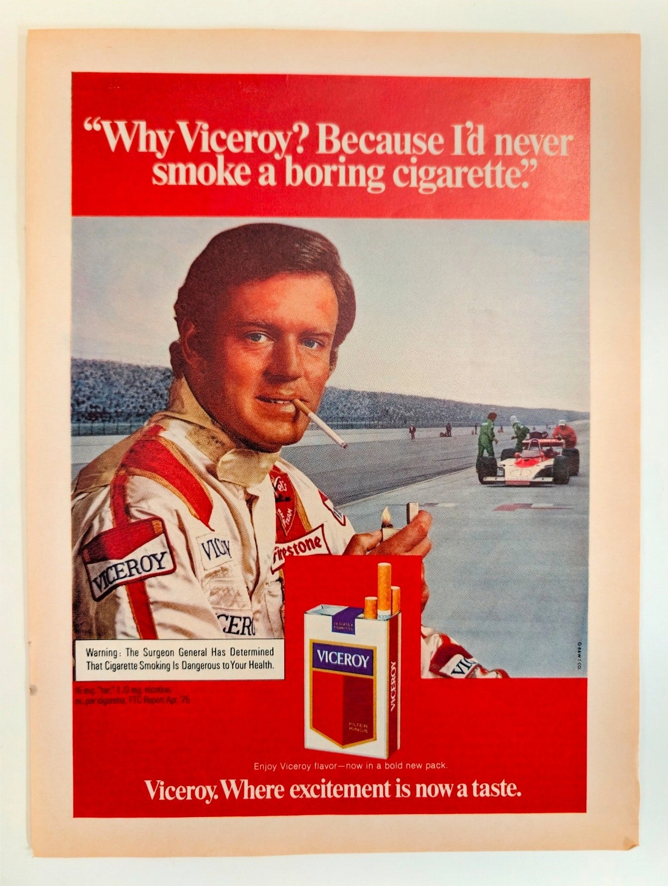
Viceroy: Al Unser and the "Taste of Excitement"
A legendary artifact linking Al Unser's racing dominance to the golden age of tobacco advertising, a style now permanently banned. The value of this original page will appreciate significantly as pre-2000 analog media naturally decays and vanishes forever.
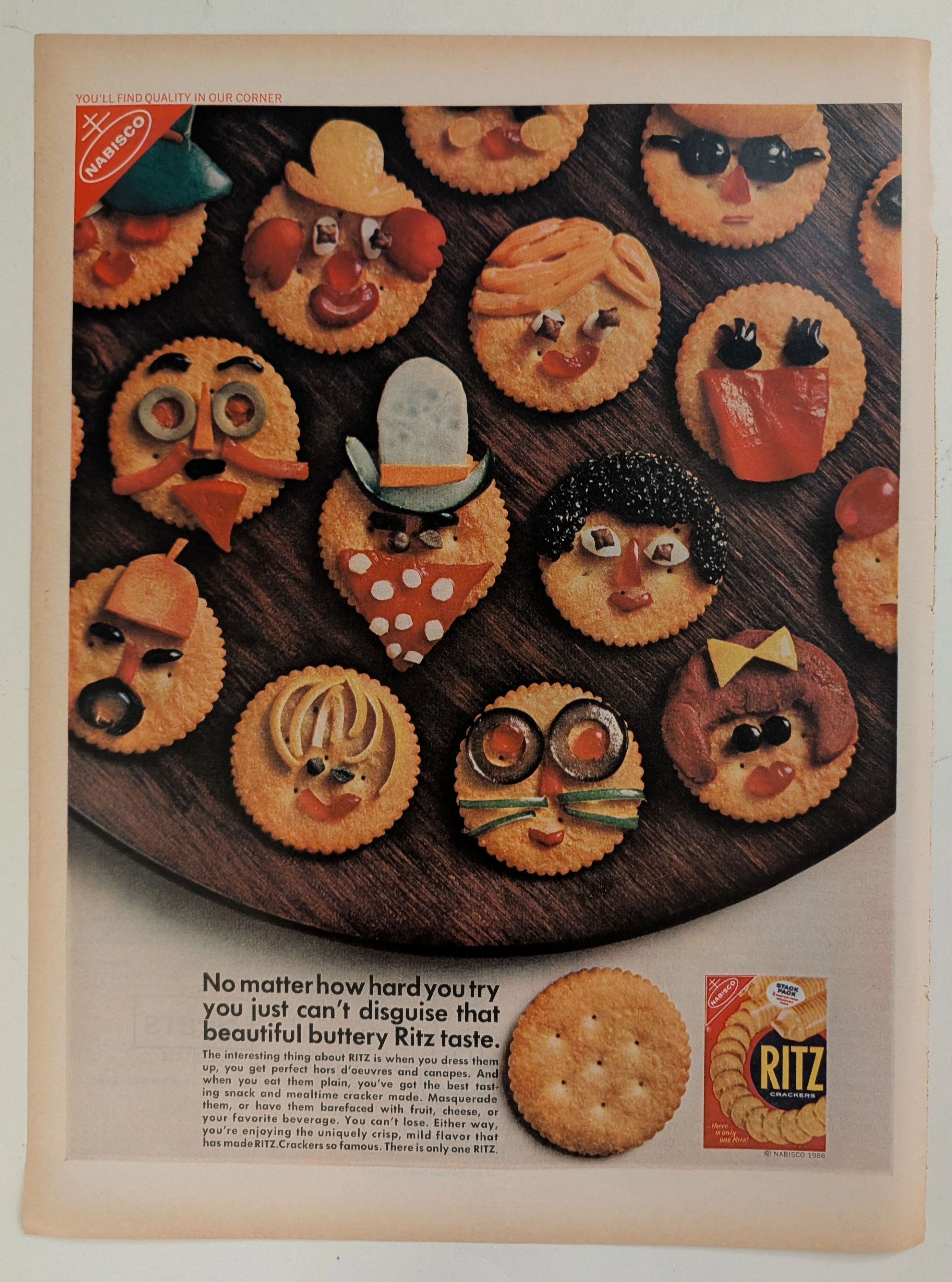
Ritz · Food
The Time Traveller's Dossier: The Masquerade of Quality – Nabisco's 1968 Ritz "Can't Disguise" Campaign and the Golden Age of Snack Branding
The evolution of the twentieth-century American pantry was fundamentally defined by the rise of standardized, nationally recognized "anchor" brands. The historical artifact elegantly positioned upon the analytical table of The Record Institute today is a striking full-page advertisement for Ritz Crackers, originating from 1968. This document represents a pivotal era in consumer psychology where snack foods were repositioned from simple staples to creative culinary canvases. By utilizing playful, anthropomorphic food art—crackers "disguised" as whimsical faces—Nabisco sought to reassure a burgeoning suburban middle class of the cracker's unmistakable "buttery" identity regardless of how it was "dressed up" for social gatherings. This comprehensive dossier conducts a meticulous examination of the artifact, operating under the absolute most rigorous parameters of historical and material science evaluation. We will decode the brilliant marketing psychology of the "Quality in Our Corner" slogan, analyze the profound sociopolitical impact of standardized grocery branding in the late 1960s, and dissect the mechanical fingerprints of the CMYK halftone rosettes captured in macro imagery. Finally, we will assess its archival rarity, exploring how the graceful, natural oxidation of the paper substrate serves as the primary engine driving up its market value exponentially within elite collection circles.