The Time Traveller's Dossier: The Wide-Track Illusion – The 1968 Pontiac Grand Prix Exhibition
The History
To fully appreciate the immense historical gravity, cultural magnitude, and sociological importance of this artifact, one must meticulously contextualize the miraculous corporate turnaround of the Pontiac Motor Division during the 1960s. In the mid-1950s, Pontiac suffered from a staid, conservative image; it was colloquially known as an "old man's car." Under the visionary leadership of General Manager Semon "Bunkie" Knudsen, Chief Engineer John DeLorean, and advertising executive Jim Wangers, Pontiac underwent a radical transformation. They introduced the legendary "Wide-Track" stance—pushing the wheels further outward toward the fenders—which not only improved handling but gave the cars an aggressive, muscular, and planted visual presence. By the 1960s, Pontiac had surged to become the third best-selling brand in America, synonymous with youth, performance, and aggressive styling.
The 1968 Pontiac Grand Prix, featured in this advertisement, represents a fascinating inflection point in American automotive history: the pursuit of the "Personal Luxury" coupe. The advertising copy masterfully bridges the gap between raw, Detroit muscle and refined, aristocratic luxury. The text boasts of a "standard, 400-cubic-inch, 350-hp, 4-barrel V-8" and an "all-synchro 3-speed Hurst shifter". These are the aggressive specifications of a purebred muscle car. Yet, in the very same breath, the copy tantalizes the consumer with "Carpathian burled elm vinyl on the doors" and an aura of "opulence." The Grand Prix was designed for the successful American male who demanded the visceral thrill of a drag racer but required the sophisticated aesthetics of an executive's touring car.
The copywriting is a masterstroke of confident, almost arrogant branding: "A Wide-Track luxury car with dual exhausts, buckets and console-mounted shifter can't be called ordinary. We call it Grand Prix." It challenges the consumer to reject the mundane and step into a highly curated, exclusive automotive lifestyle.
The Paper
As a physical entity, this printed artifact functions as a living, breathing, and profound record of mid-twentieth-century graphic reproduction and substrate chemistry. Under exceptional macro-lens examination, this document reveals the stunning complexity and mathematical precision of analog color printing. The intricate, dark rendering of the Grand Prix's iconic split grille, the warm, glowing light illuminating the interior of the car, and the crisp typography of the "Pontiac Motor Division" signature are all meticulously constructed from a precise, mathematically rigorous galaxy of halftone rosettes. This intricate pattern constitutes the mechanical fingerprint of the pre-digital analog offset printing press. Microscopic, varying sizes of Cyan, Magenta, Yellow, and Key (Black) ink dots are elegantly and systematically layered at specific angles to trick the human eye and the biological visual cortex into perceiving continuous, vibrant, and dimensional photographic reality.
Yet, the most profound and impactful factor elevating the immense value of this artifact in the contemporary collector's market is the natural, organic, and entirely irreversible process of Material Degradation. The expansive margins and the overall paper substrate exhibit a genuine, unavoidable, and entirely unforgeable "Toning." This gradual, graceful transition from the original bright, bleached manufactured paper to a warm, antique ivory and golden hue is caused by the slow chemical oxidation of Lignin—the complex organic polymer that binds cellulose fibers together within the raw wood pulp of the paper. As the substrate is exposed to ambient oxygen and ultraviolet light over a span of nearly six decades, the molecular structure of the lignin gracefully and systematically breaks down. This accumulation of time, this naturally evolving patina, represents the absolute core of the wabi-sabi aesthetic. The profound appreciation for the beauty found in natural aging, impermanence, and the physical manifestation of history upon a fragile medium is an irreversible chemical reaction. It is precisely this authentic, unreplicable degradation that acts as the primary engine driving up its market value exponentially among elite collectors, as it provides the ultimate, irrefutable proof of the artifact's historical authenticity and its miraculous journey through time.
The Rarity
Evaluated under the most exacting, rigorous, and uncompromising archival parameters, this artifact is definitively and securely designated as Class A.
The remarkable and defining paradox of mid-century print advertising is that these specific documents were produced by the millions as explicitly and intentionally "disposable media." They were inherently destined by their very nature to be briefly observed, casually folded, read over a morning coffee, and ultimately discarded into the recycling bins and incinerators of history. For a large-format advertisement to survive entirely intact since 1968 without catastrophic structural tearing, without destructive moisture staining, or without the fatal fading of the delicate, light-sensitive halftone inks constitutes a highly significant statistical archival anomaly. The impeccable structural integrity of this paper, combined with the immense cultural nostalgia associated with the Pontiac brand and the legendary status of its illustrators, elevates the desirability of this document far beyond standard automotive collectors. It makes it a highly prized, museum-worthy piece of Americana and commercial art history. It is ardently sought after by global curators to ensure its historical permanence through acid-free, UV-protected conservation framing.
Visual Impact
The aesthetic brilliance and psychological power of this artifact lie in its masterful execution of "Aspirational Environmental Staging," created by the greatest duo in the history of automotive illustration.
The image immediately draws the eye to the impossibly wide, low, and sleek profile of the Grand Prix, bathed in the cool, twilight blues of evening. The dark, reflective surfaces of the car contrast dramatically with the warm, inviting yellows of the European-style architecture and the car's opulent interior. The setting is deliberately ambiguous but unmistakably cosmopolitan—perhaps a casino in Monaco or a grand hotel on the French Riviera. The inclusion of a formally dressed gentleman opening the door for an elegant blonde companion creates an atmosphere of exclusive romance and high-society intrigue. The visual message to the American consumer was clear: purchasing a Pontiac Grand Prix provided immediate access to an international lifestyle of wealth, romance, and unbridled power.
artist name
Art Fitzpatrick and Van Kaufman (AF / VK)
The small, highly distinct signature "VK AF" visible in the lower-left quadrant of the illustration is the absolute cornerstone of this artifact's immense artistic and collectible value. From 1959 to 1971, Arthur "Art" Fitzpatrick and Van Kaufman created the most successful and visually stunning automotive advertising campaign in American history for the Pontiac Motor Division.
They worked as a seamless, symbiotic unit. Art Fitzpatrick (AF) was responsible for illustrating the automobiles. He was famous for his "magic perspective," intentionally drawing the cars up to 10% wider and lower than they actually were, exaggerating their proportions to perfectly capture the psychological feeling of Pontiac's "Wide-Track" marketing. Van Kaufman (VK), a former Disney animator, painted the lavish, exotic backgrounds and the sophisticated human figures, placing Fitzpatrick's muscular cars into environments of ultimate jet-set luxury. Their combined genius elevated automotive advertising from mere product photography into the realm of fine, romanticized commercial art, making this artifact a masterpiece of 20th-century illustration.
The Archive Continues
Continue the Exploration
Gucci x Mercedes Benz · Fashion
THE TIME TRAVELER'S DOSSIER:THE ENGINEERING OF ELEGANCE, THE GUCCI TRUNK, AND THE ARCHITECTURE OF REASON
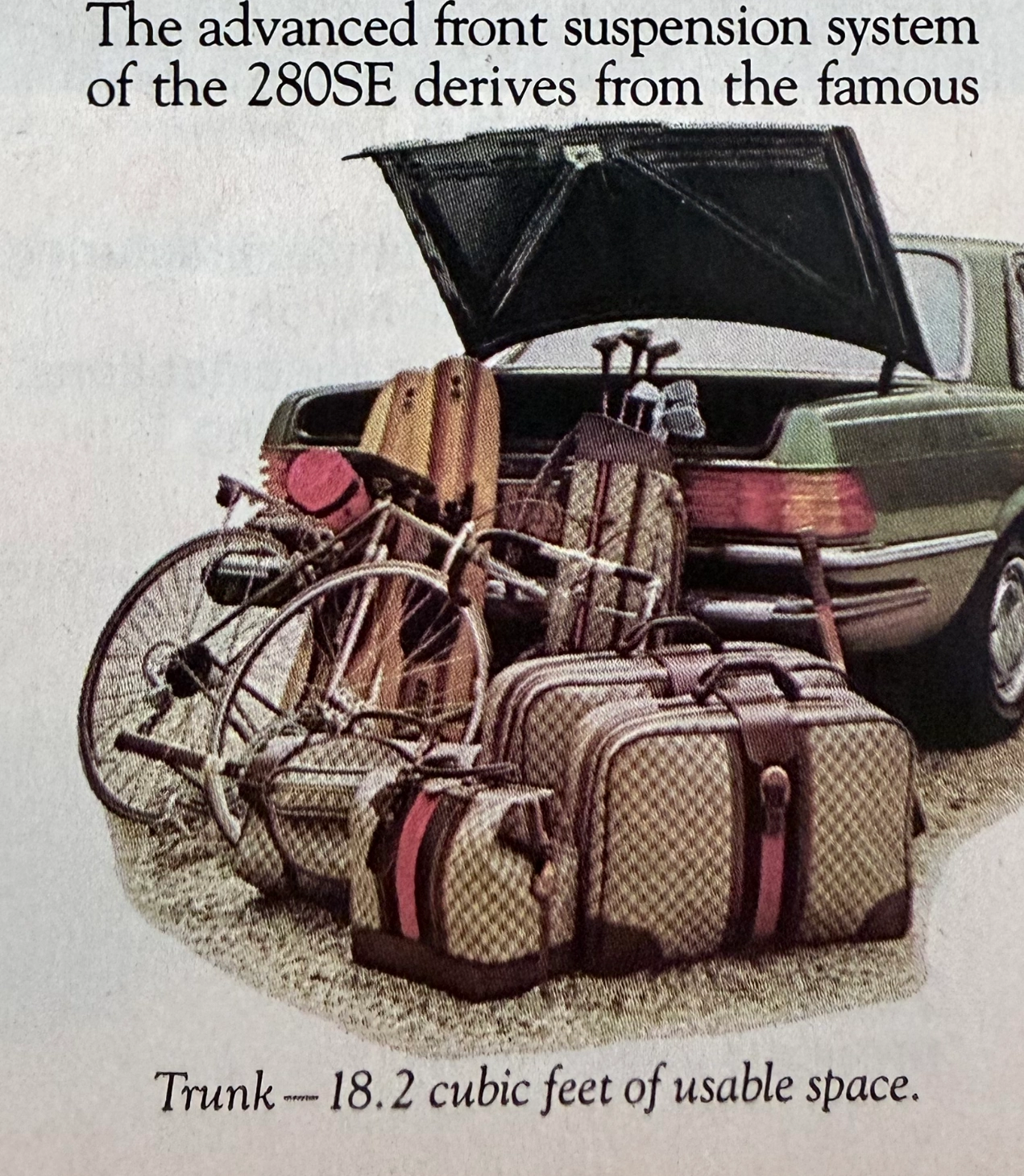
The artifact under exhaustive, uncompromising, and unprecedented museum-grade analysis is a remarkably preserved Historical Relic originating from the absolute zenith of West German automotive engineering. This Primary Art Document is a densely informative, multi-column magazine advertisement for the Mercedes-Benz 280SE Sedan (W116 chassis). This document is a "Forensic Blueprint of Engineered Elegance and Status Commodification." It aggressively markets the 280SE as the "Heir to a Classic," positioning it as a vehicle that inherits the legendary proportions of the 450 Series but is powered by a highly advanced, fuel-injected 6-cylinder engine. The copywriting reads like an arrogant technical dossier, boasting of the "Continuous Injection System" (CIS) and a fully independent "Suspense-free suspension" derived from the legendary C-111 high-speed research vehicle. However, the absolute psychological masterstroke lies in the lower-left illustration. To visually prove the cavernous "18.2 cubic feet of usable space," the artist meticulously illustrated the trunk effortlessly swallowing a bicycle, golf clubs, and a set of Gucci luggage. The unmistakable beige geometric monogram and the iconic red-and-green Web stripe on the suitcases serve as a deliberate, powerful socio-economic signal. It explicitly communicates that the Mercedes-Benz trunk is designed exclusively for the "Jet-Set" elite who travel with Italian haute couture. Rescued from a mass-market periodical, this pre-2000s analog artifact exhibits a beautifully authentic warm ivory oxidation across its surface. This majestic chemical aging transforms a mass-produced piece of technical propaganda into an irreplaceable Primary Art Document of automotive and sociological history.
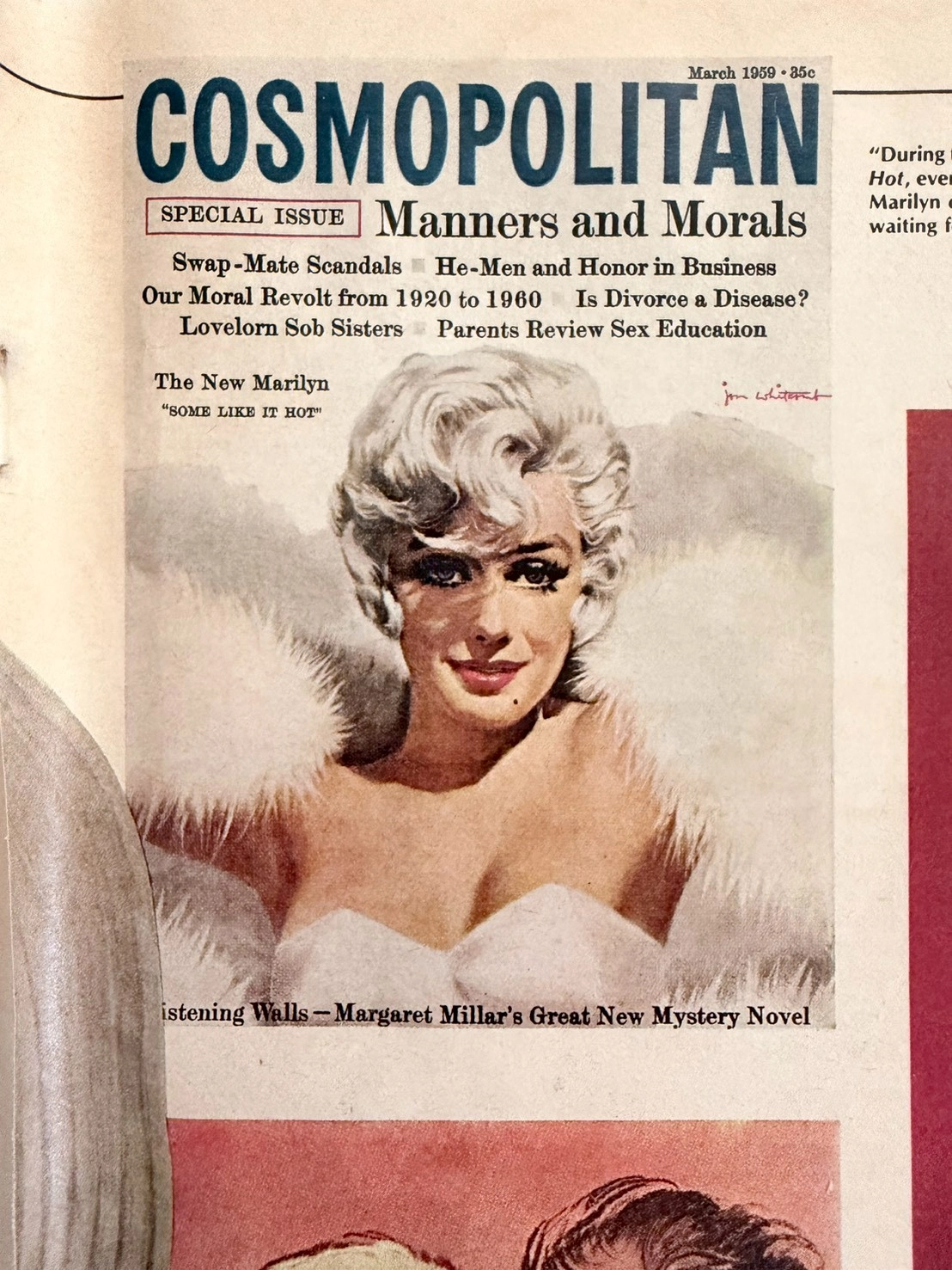
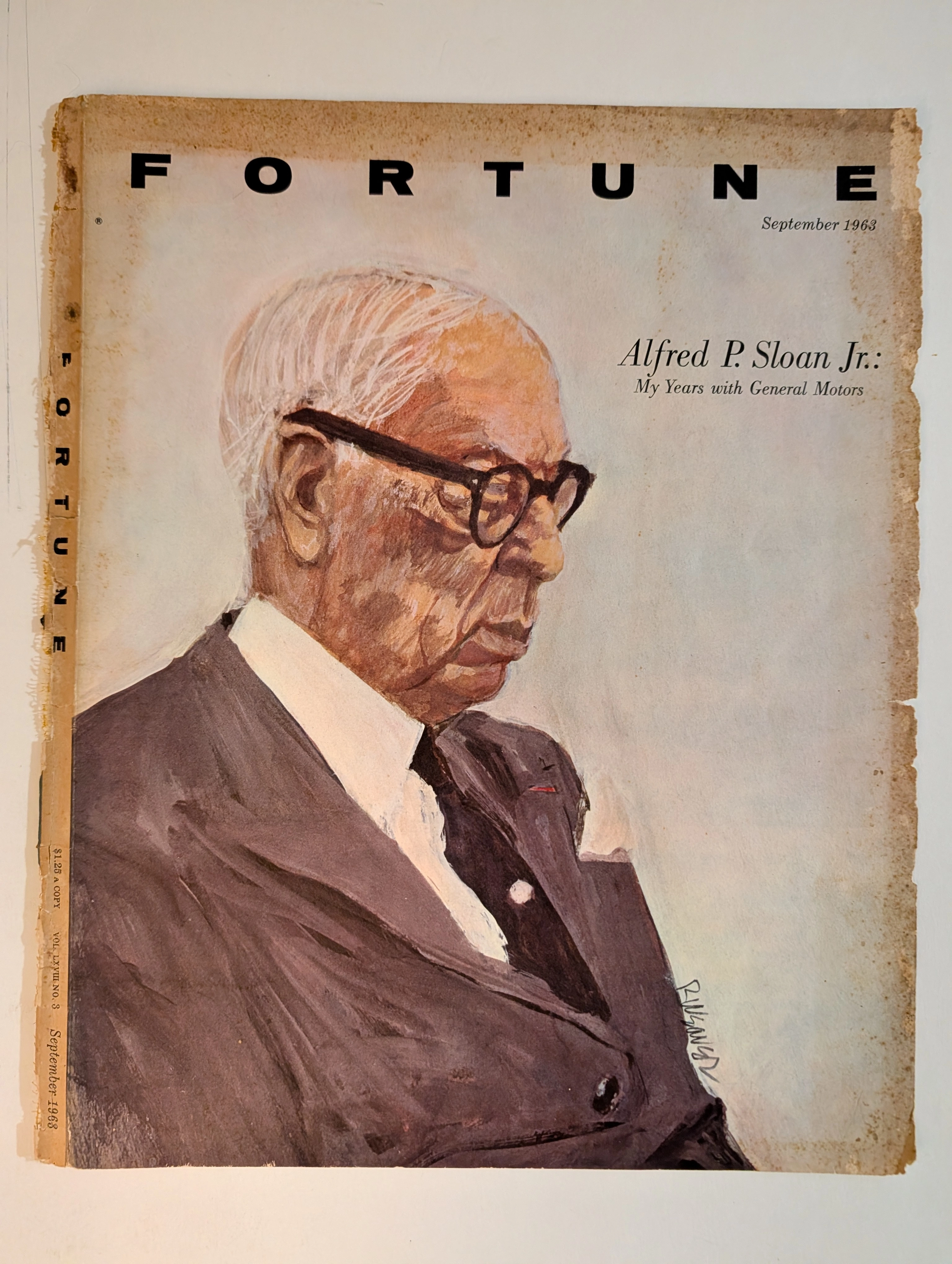
The Marilyn Monroe Enigma: Uncovering 1950s Hollywood Secrets Through Ultra-Rare Vintage Magazine Art (Class SS)
This museum-grade editorial explores an ultra-rare SS-Class archival piece from The Record Institute. It chronicles the 1980 Playboy magazine discovery of lost Marilyn Monroe negatives, eventually solved by legendary illustrator Jon Whitcomb. The artifact not only captures the vulnerability of the 1950s ultimate sex symbol alongside Arthur Miller but also serves as a poignant historical record of the transition from the Golden Age of Illustration to modern photography, celebrating the visceral charm of analog paper preservation.
Simmon · Other
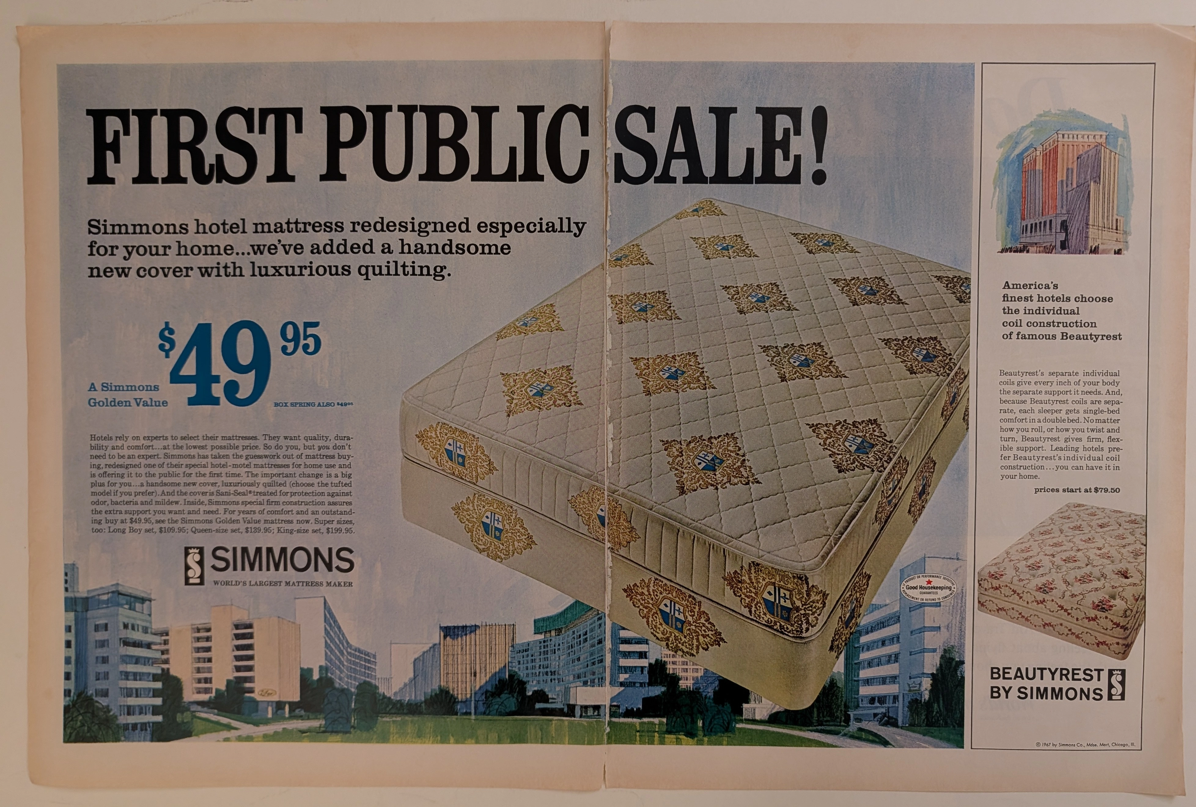
The Time Traveller's Dossier: The Architecture of Slumber – The 1967 Simmons Golden Value
The evolution of the American domestic interior during the mid-twentieth century was heavily influenced by the golden age of travel and the rapid expansion of the luxury hospitality industry. The historical artifact elegantly secured upon the analytical table of The Record Institute today is a large-format, two-page centerfold print advertisement for the Simmons Mattress Company, copyrighted in 1967. This document transcends standard consumer goods marketing; it operates as a sophisticated sociological mirror, reflecting a highly specific moment when industrial sleep engineering and the aspirational luxury of the modern hotel were explicitly packaged and sold to the suburban American household. This world-class, comprehensive dossier conducts a meticulous, profound, and historically objective examination of the artifact, operating under the absolute most rigorous parameters of sociological and material science evaluation. We will decode the brilliant marketing psychology embedded within the "First Public Sale" messaging, analyze the iconic "Good Housekeeping" endorsement, and dissect the rich semiotics of the heraldic quilt patterns alongside the modernist architectural illustrations. Furthermore, as we venture deeply into the chemical and physical foundations of this analog printed ephemera, we will reveal the precise mechanical fingerprints of the CMYK halftone rosettes and the graceful, natural oxidation of the paper substrate. This precise intersection of visual nostalgia, mid-century commercial artistry, and the immutable chemistry of time cultivates a serene wabi-sabi aesthetic—a natural, irreversible phenomenon that serves as the primary engine driving up its market value exponentially within the elite global spheres of Vintage Commercial Ephemera and Mid-Century Lifestyle Archives collecting.