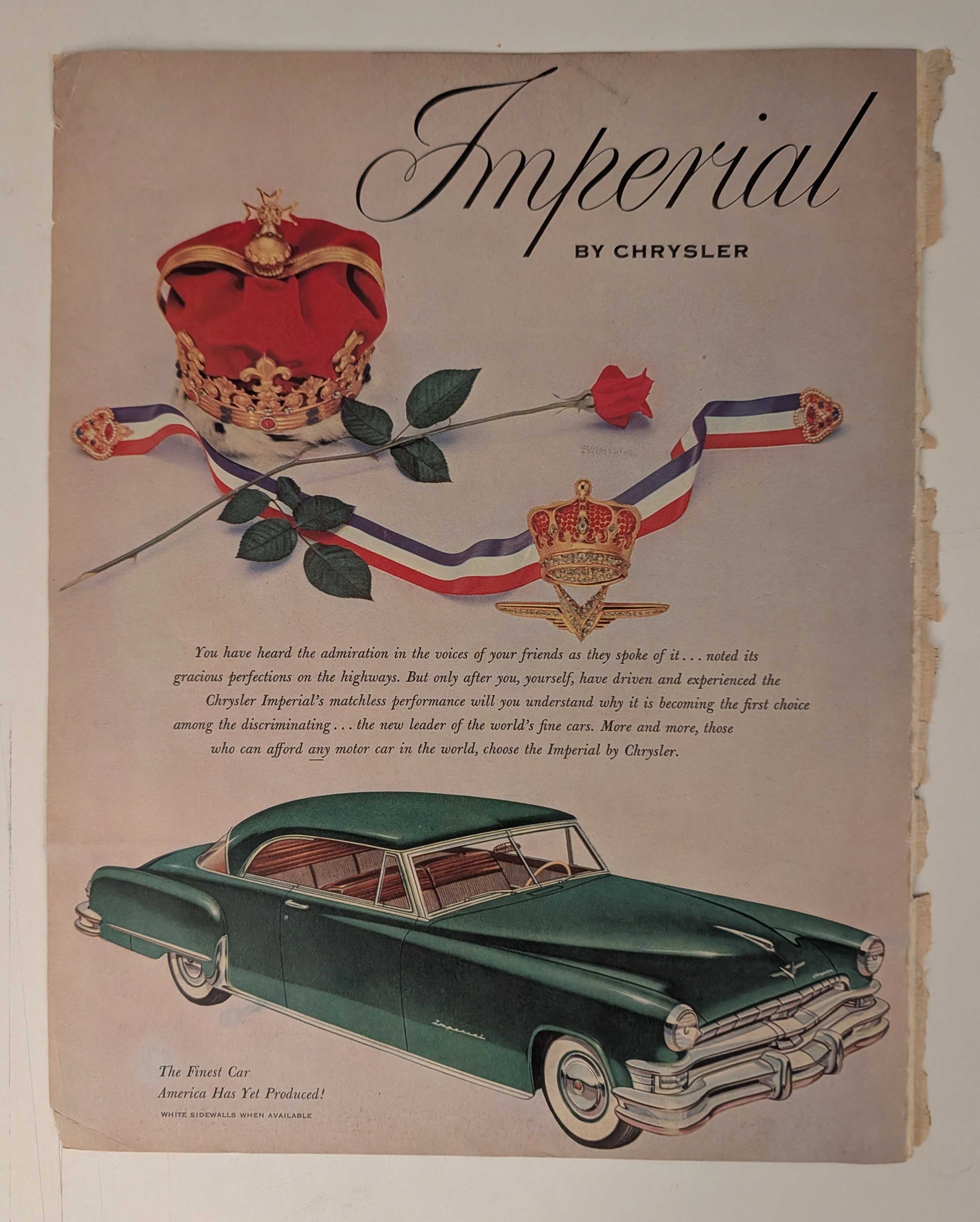
Vintage 70s Crown Royal Ad: Vanishing Analog Art | The Record
The History
THE SHATTERED CROWN
When a Grown Man's Tears Become a Fading Legend on Paper
As the Chief Curator of The Record, traversing through the timeline of analog history, I invite you to dive deep into one of the most viscerally powerful advertising campaigns of the 1970s. This is not merely an ink-stained page; it is a "Museum Grade Artifact." It speaks of pride, unrepeatable analog craftsmanship, and the ruthless economics of decay.The image before you is the iconic "Have you ever seen a grown man cry?" campaign by Seagram's Crown Royal. One short sentence that sent a shockwave through the souls of drinkers worldwide. The sight of a shattered crown-shaped crystal bottle, its premium amber liquid bleeding across the floor, plays on a dark humor that triggers a profound sense of masculine loss—weeping for a whiskey too precious to spill. To comprehend the immense value of this single page, we must dissect its history, art, and the chemistry of time.
🏛️ CHAPTER I: THE GENESIS OF THE CROWN
The prestige of this advertisement is meaningless without understanding how "Crown Royal" was born, and the titan behind it.
Samuel Bronfman (1889–1971): A Canadian billionaire and the visionary architect of the Seagram Company, the largest distiller in the world during the 20th century. Bronfman didn't just sell liquor; he sold class.
The Royal Connection: In 1939, for the historic visit of King George VI and Queen Elizabeth to Canada, Bronfman sought to create a whiskey fit for a monarch. He masterfully blended 50 distinct whiskies, housing them in a cut-glass crown bottle wrapped in a royal purple velvet bag. Crown Royal was strictly a tribute to the King before it was released to the masses. Therefore, when this 70s ad depicts the shattering of that exact bottle, it is a deliberate psychological masterstroke—the destruction of a symbol of upper-class perfection.
📷 CHAPTER II: THE GOLDEN AGE OF ANALOG CRAFTSMANSHIP
If a modern agency wanted a broken bottle, they would render it perfectly via 3D CGI in hours. But this page is from the 1970s—the era of authentic, unforgiving analog art.
The Lighting Setup: Capturing shattered glass and liquid required immense skill. Photographers used large-format cameras and reversal film. They orchestrated complex lighting with strobes, tungsten lights, reflectors, and gobos to catch the facets of the broken crystal without flattening the image with lens flare.
The Timing: The spilled amber liquid had to look dynamic and visceral. The art directors physically smashed dozens of real, expensive crystal bottles to find the perfect shards and meticulously styled every droplet. You are looking at days of sweat, madness, and Madison Avenue perfectionism that simply does not exist in the digital age.
⏳ CHAPTER III: THE FRAGILITY OF HISTORY & PAPER DEGRADATION
As a collector and investor, the fundamental rule is: "Vintage print is a constantly degrading asset."
Lignin & Acidic Autocatalysis: Pre-2000 magazines were printed on wood pulp paper containing Lignin. When exposed to UV light and oxygen, lignin oxidizes, turning the paper yellow, brittle, and frail. Alum used in the paper reacts with moisture to create sulfuric acid, literally eating the page from the inside out.
The Ink of the Past: Look closely, and you'll see the vintage CMYK halftone printing—a beautiful, imperfect pattern of ink dots that no modern laser printer can replicate. This specific page survived fire, moisture, and the trash bin for half a century. Its patina is a signature of survival.
📈 CHAPTER IV: THE ECONOMICS OF SCARCITY
The investment strategy at The Record is absolute: Value peaks when irreversible destruction of supply meets the rising demand of nostalgia.
Zero Production: 1970s printing presses cannot be fired up to recreate this exact paper and ink smell.
Exponential Attrition: Every day, original magazines are destroyed by acid, pests, or humidity. The source material is violently shrinking.
The Rise of "Home Art Gallery": In an era of screen fatigue, the elite crave tangible art. Framing an original, magazine-sized piece of advertising history elevates any bar or study. This page is no longer just paper; it is an "Alternative Asset" whose rarity will only compound as time erodes the rest.
Exhibition Halls
The Archive Continues
Continue the Exploration
THE TIME TRAVELER'S DOSSIER: ARROGANCE AND INNOVATION IN THE ABYSS OF THE DEPRESSION
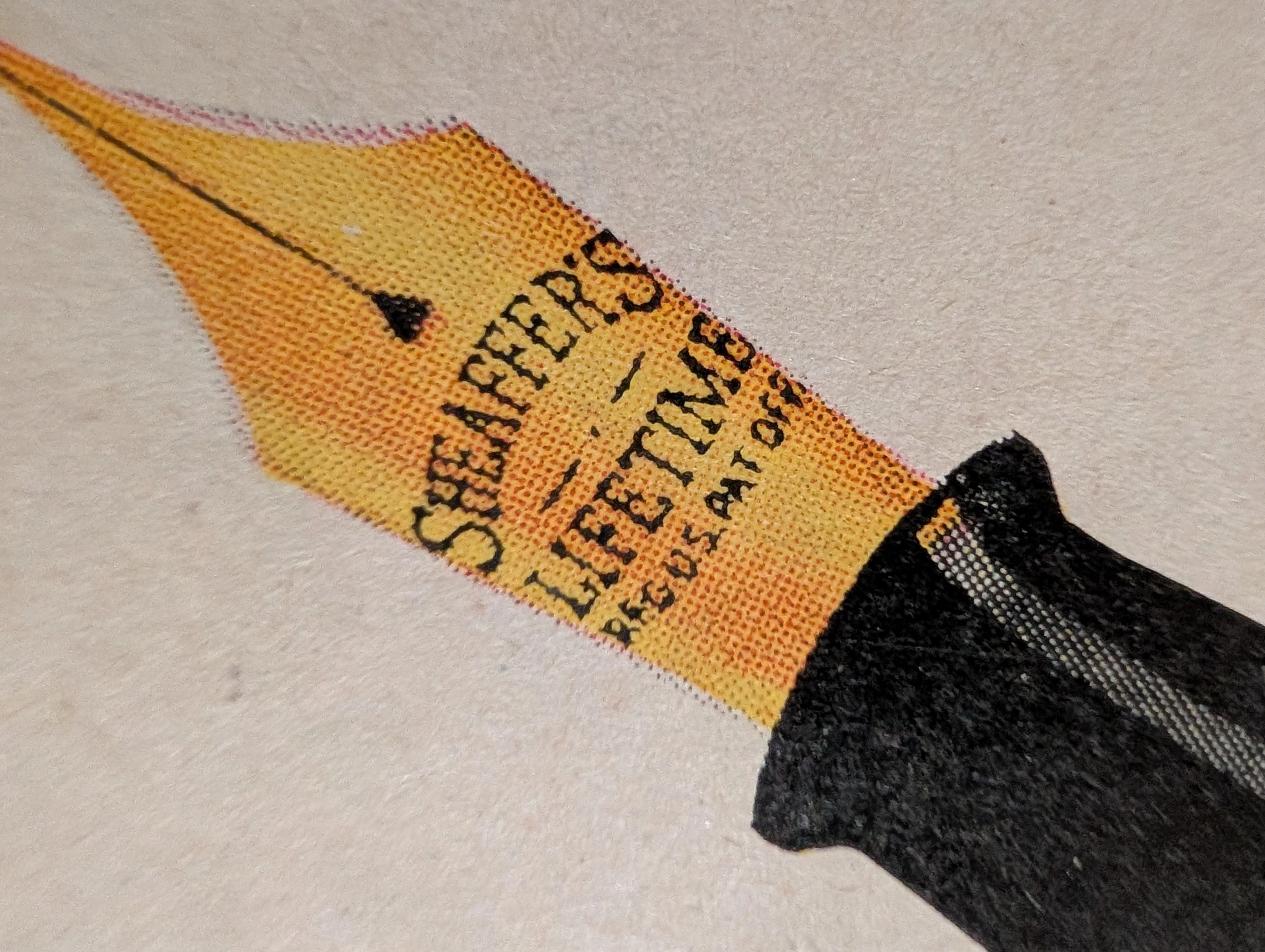
The artifact under rigorous, museum-grade analysis is an exceptionally preserved Historical Relic originating from the darkest economic abyss of the 20th century: the American Great Depression. Sourced from a 1931 issue of The Saturday Evening Post, this Primary Art Document features a sweeping, full-page advertisement for the Sheaffer's "Balance" Lifetime Pen. This piece is a profound sociological and industrial marker. In 1931, as the global economy collapsed, W.A. Sheaffer defiantly marketed a revolutionary, streamlined luxury writing instrument priced at an astronomical $15. The ad explicitly highlights the "White Dot" lifetime guarantee and the 14-karat solid gold "Autograph" band engraved with the owner's signature ("John Adams"). It is a masterclass in aspirational marketing during an era of mass destitution. Physically, this nearly century-old wood-pulp document is a breathtaking testament to the Japanese aesthetic of wabi-sabi. It exhibits severe, dramatic edge trauma, profound edge loss, deep amber oxidation, and prominent moisture staining along the left margin. This extreme analog decay transforms the mass-produced commercial print into an irreplaceable, highly coveted Primary Art Document that physically embodies the scars of its 90-year journey through history.
PanAm · Travel
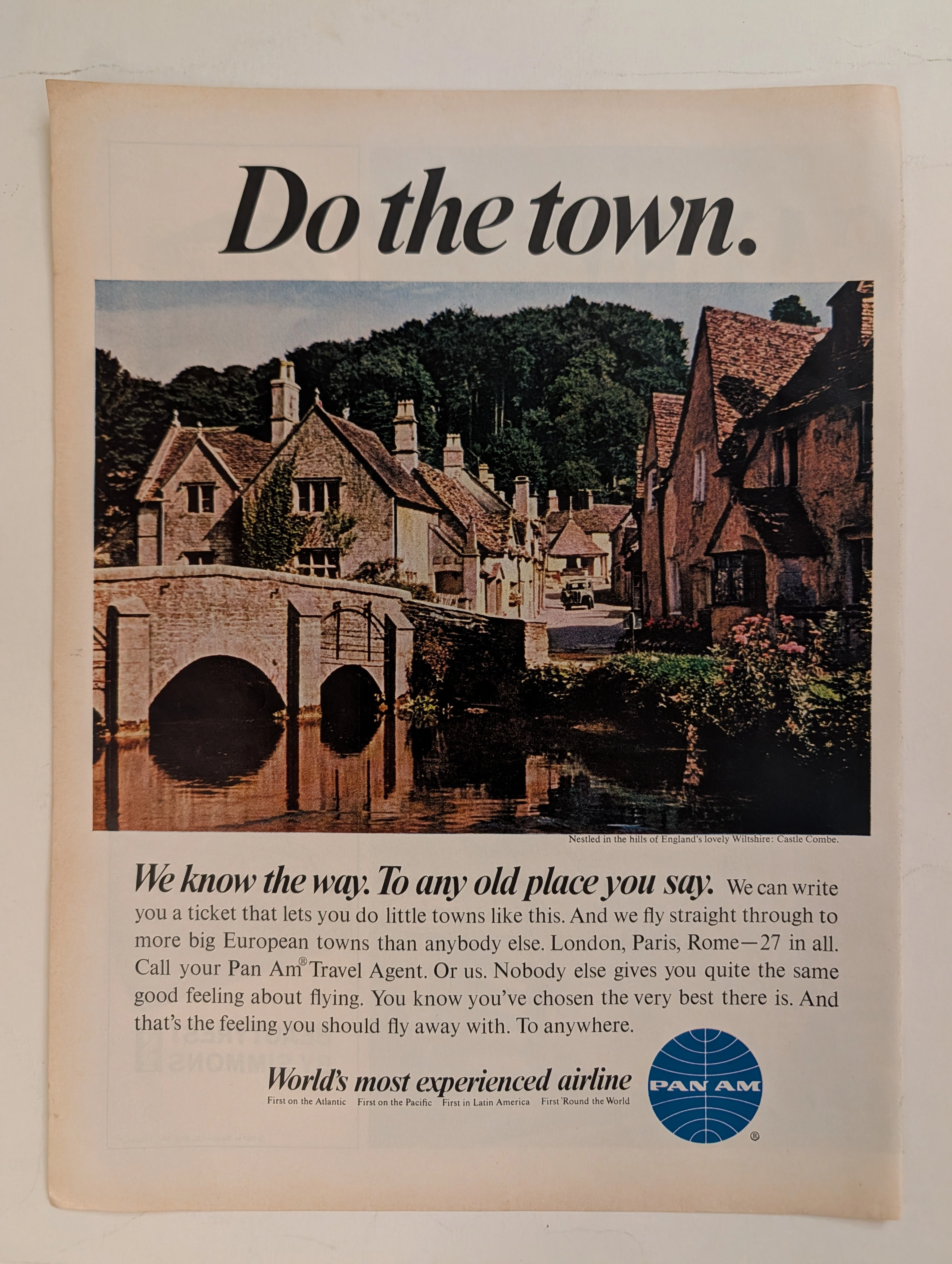
The Time Traveller's Dossier: The Empire of the Sky and the Democratization of the Globe – Pan Am "Do the town."
The evolution of the American leisure class during the mid-twentieth century was fundamentally propelled by the rapid expansion, technological triumph, and increasing economic accessibility of commercial jet travel. The historical artifact elegantly and securely positioned upon the analytical table of The Record Institute today is a striking, single-page print advertisement for Pan American World Airways (Pan Am), originating from the transformative decade of the 1960s. This document completely transcends the standard, utilitarian boundaries of transportation marketing. It operates as a highly sophisticated, multi-layered cultural mirror, reflecting the precise era when the globe dramatically shrank, and the majestic, ancient corners of Europe were explicitly packaged and sold to the American middle-class consumer not merely as distant dreams, but as easily attainable weekend realities. This world-class, comprehensive dossier conducts a meticulous, unyielding, and exceptionally exhaustive examination of the artifact, operating under the absolute most rigorous parameters of historical, sociological, and material science evaluation. With the vast majority of our analytical focus dedicated to its immense historical gravity, we will decode the brilliant marketing psychology embedded within the "World's most experienced airline" branding, analyze the romantic contrast of the bold typography against the ancient stone architecture of Castle Combe, and dissect the profound geopolitical semiotics of the iconic blue globe logo. Furthermore, as we venture deeply into the chemical and physical foundations of this analog printed ephemera, we will reveal the precise mechanical fingerprints of the CMYK halftone rosettes and the graceful, natural oxidation of the paper substrate. This precise intersection of visual nostalgia, mid-century commercial artistry, and the immutable chemistry of time cultivates a serene wabi-sabi aesthetic—a natural, irreversible phenomenon that serves as the primary engine driving up its market value exponentially within the elite global spheres of Vintage Commercial Ephemera, Aviation Archives, and Mid-Century Lifestyle collecting.
Longines · Fashion
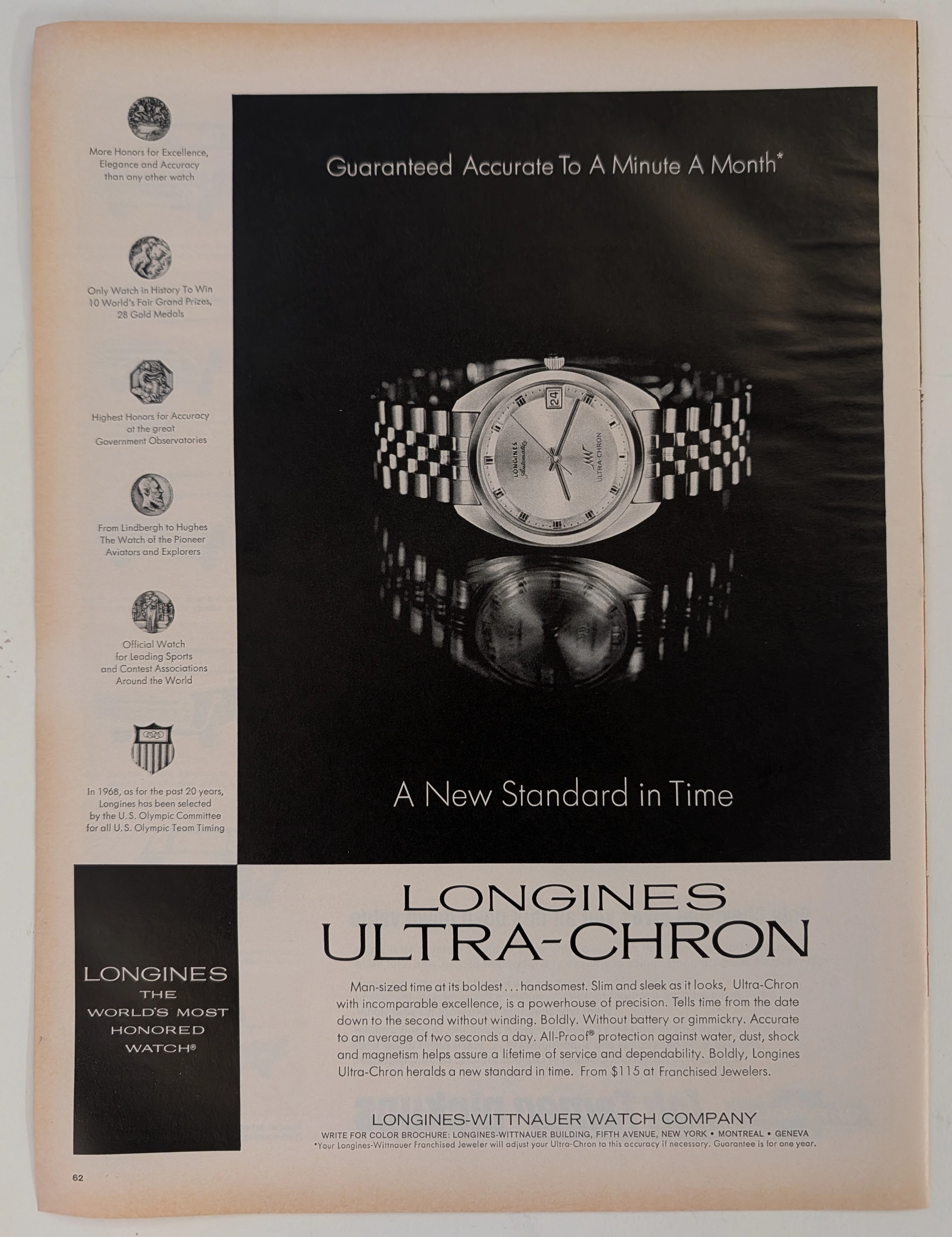
The Time Traveller's Dossier: The Ultimate Horological Supremacy – A Museum-Grade Forensic Deconstruction of the 1968 Longines Ultra-Chron
The evolution of human timekeeping is not merely a passive record of hands rotating in concentric circles; it is a brutal, centuries-long engineering war waged against the absolute, unforgiving laws of physics—specifically gravity, temperature fluctuation, and physical friction. The historical artifact placed upon The Record Institute’s forensic examination table today is a monumental full-page print advertisement for the 1968 Longines Ultra-Chron, extracted from a mid-twentieth-century publication. Released precisely on the precipice of the "Quartz Crisis"—a technological tsunami that would soon decimate the traditional Swiss watch industry—this document represents the absolute pinnacle, the zenith, and the glorious final, defiant stand of analog mechanical engineering. This exhaustive, world-class academic archival dossier will ruthlessly dissect the artifact with microscopic precision, operating under the most rigorous parameters of historical and physical evaluation. We will decode the arrogant yet mathematically backed copywriting that boldly claims "A Minute A Month" accuracy, the profound mechanical significance of the 36,000 vibrations per hour (vph) high-beat movement, and the five specific medallions of honor that permanently anchor the brand’s bloodline to legendary aviation pioneers such as Charles Lindbergh and Howard Hughes. Furthermore, we will subject the heavy, dark-field offset lithography to a rigorous material science analysis, exposing the mechanical fingerprints of the analog halftone rosettes and the inevitable, profoundly beautiful wabi-sabi oxidation of the paper substrate. It is this exact intersection of horological mastery and chemical degradation that acts as the primary engine driving the artifact's market value exponentially upward among serious global collectors.