The Time Traveller's Dossier: The Firestone Margin of Safety
The History
To fully appreciate the immense historical gravity, cultural magnitude, and sociological importance of this artifact, one must meticulously contextualize the terrifying "traction deficit" that plagued the American automotive industry during the mid-to-late 1960s. During this era, domestic manufacturers in Detroit were engaged in a ruthless, escalating horsepower war. Pontiac, Ford, Chevrolet, and Dodge were dropping massive, high-displacement V8 engines into intermediate and compact chassis, creating the legendary "muscle cars." However, a critical engineering crisis emerged: the tire technology of the era had not kept pace with the engine technology. Cars were leaving the assembly line with 300 to 400 horsepower, yet they were riding on tall, narrow, bias-ply tires designed for the sedate sedans of the 1950s. This mismatch created vehicles that were exceptionally fast in a straight line but perilously unstable in corners and dangerously deficient under heavy braking.
Firestone's answer to this crisis, loudly heralded in this specific artifact, was a literal reshaping of the wheel: The Super Sports Wide Oval tire. The copywriting explicitly details this technological leap: "This is the new Wide Oval. Nearly two inches wider. It's built lower, wider. Nearly two inches wider than regular tires. To corner better, run cooler, stop 25% quicker." By decreasing the aspect ratio (the ratio of the tire's sidewall height to its section width), Firestone created a tire with a significantly larger contact patch. This wider footprint revolutionized automotive handling, allowing the massive torque of late-sixties muscle cars to be safely transmitted to the pavement. The Wide Oval became an instant cultural icon, a mandatory aesthetic and performance upgrade for any serious automotive enthusiast, and a standard factory option on the highest-tier performance vehicles of the era.
The central premise of this advertisement—"What we learn here gives you an extra margin of safety here"—relies entirely on the concept of technology transfer from the racetrack to the driveway. To validate this claim, the advertisement utilizes distinct visual vignettes. On the left page, we observe open-wheel formula/Indy cars navigating a sweeping curve, directly juxtaposed below with a low-angle, aggressive shot of a dark green pony car, instantly recognizable as a first-generation Ford Mustang. The Mustang, introduced in late 1964, was the progenitor of the youth-driven performance market. By showing the Mustang equipped with Wide Ovals, Firestone directly aligned its brand with the vibrant, youth-oriented car culture of the decade.
On the right page, we witness a rigorous testing scenario featuring a dark-colored Dodge Coronet (circa 1968 styling) surrounded by a dedicated pit crew in matching red Firestone jackets at the Fort Stockton, Texas, test track. This imagery assures the consumer that the tires undergo punishing, high-speed, and high-temperature evaluations in unforgiving desert conditions before they are deemed safe for the public.
However, the absolute historical crown jewel of this artifact lies in the right-hand column under the bold headline "Whooooooosh." Here, the advertisement meticulously documents one of the most famous and controversial machines in the history of global motorsport: Parnelli Jones' turbine car at the 1967 Indianapolis 500.
To understand the profound importance of this inclusion, we must deeply analyze the figure of Parnelli Jones. Rufus Parnell "Parnelli" Jones (born 1933) is a titan of American auto racing, a driver of unparalleled versatility, bravery, and mechanical intuition. He achieved immense success in sports cars, sprint cars, midget cars, off-road vehicles, and stock cars, but he is most eternally revered for his mastery of the Indianapolis Motor Speedway. Jones won the prestigious Indianapolis 500 in 1963 and was the first driver to officially qualify at over 150 miles per hour. In the pantheon of American motorsport heroes, Parnelli Jones occupies the highest echelon, representing an era where drivers routinely risked their lives in highly volatile, experimental machinery.
The vehicle he piloted in the 1967 Indianapolis 500, depicted in vibrant color within this advertisement, was the STP-Paxton Turbocar, affectionately dubbed the "Whooshmobile" due to the unique, jet-like sound of its engine. Commissioned by the flamboyant and legendary racing promoter Andy Granatelli, the Turbocar was a radical departure from traditional internal combustion racing engines. It was powered by a Pratt & Whitney ST6B-62 gas turbine engine—essentially a helicopter engine—mounted side-by-side with the driver. Furthermore, it featured a highly advanced four-wheel-drive system to manage the immense, instantaneous torque delivery of the turbine.
The 1967 Indianapolis 500 is etched into history because Parnelli Jones and the Turbocar utterly humiliated the competition. The car was demonstrably superior, running flawlessly and quietly while the traditional piston-engine cars roared and struggled in its wake. As the ad copy proudly states, "The turbine car set 18 new track records." Jones led 171 of the 200 laps and was cruising to a guaranteed, historic victory with a lead of nearly a full lap. Then, with a mere three laps remaining, a devastatingly simple mechanical failure occurred: a six-dollar transmission bearing shattered, disconnecting the turbine engine from the wheels. Jones coasted to a heartbreaking halt, and A.J. Foyt inherited the win.
Despite the agonizing loss, the performance of the STP-Paxton Turbocar terrified the racing establishment. The United States Auto Club (USAC), the sanctioning body of the Indy 500, quickly moved to impose severe restrictions on turbine air intake sizes, effectively banning turbine cars from remaining competitive in future races. Therefore, the 1967 race represents a singular, miraculous flashpoint of unrestrained innovation.
Firestone's strategic utilization of Parnelli Jones and the Turbocar in this advertisement is an act of marketing genius. The copy asks, "The tires for this amazing 4-wheel-drive car? Firestones. They performed flawlessly... another reason why Firestone is the greatest tire name in racing." By outfitting the most technologically advanced, record-shattering, and torquey vehicle the racing world had ever seen, Firestone unequivocally proved the durability and safety margin of their rubber compounds. If Firestone tires could withstand the brutal, continuous four-wheel-drive thrust of a helicopter-turbine-powered racing car piloted by Parnelli Jones at the Indianapolis Motor Speedway, they could certainly keep a suburban family safe in a Ford Mustang or a Dodge Coronet on the interstate. This artifact captures the absolute zenith of this technological romance.
The Paper
As a physical entity, this printed artifact functions as a living, breathing, and profound record of mid-twentieth-century graphic reproduction and substrate chemistry. Under exceptional macro-lens examination, this document reveals the stunning complexity and mathematical precision of analog color printing. The intricate textures of the track asphalt, the vibrant red of the STP-Paxton Turbocar, the glossy dark green paint of the Mustang's fender, and the razor-sharp typography of the registered "Wide Oval" trademark are all meticulously constructed from a precise, mathematically rigorous galaxy of halftone rosettes. This intricate pattern constitutes the mechanical fingerprint of the pre-digital analog offset printing press. Microscopic, varying sizes of Cyan, Magenta, Yellow, and Key (Black) ink dots are elegantly and systematically layered at specific angles to trick the human eye and the biological visual cortex into perceiving continuous, vibrant, and dimensional photographic reality.
Yet, the most profound and impactful factor elevating the immense value of this artifact in the contemporary collector's market is the natural, organic, and entirely irreversible process of Material Degradation. The expansive margins and the overall paper substrate exhibit a genuine, unavoidable, and entirely unforgeable "Toning." This gradual, graceful transition from the original bright, bleached manufactured paper to a warm, antique ivory and golden hue is caused by the slow chemical oxidation of Lignin—the complex organic polymer that binds cellulose fibers together within the raw wood pulp of the paper. As the substrate is exposed to ambient oxygen and ultraviolet light over a span of nearly six decades, the molecular structure of the lignin gracefully and systematically breaks down. This accumulation of time, this naturally evolving patina, represents the absolute core of the wabi-sabi aesthetic. The profound appreciation for the beauty found in natural aging, impermanence, and the physical manifestation of history upon a fragile medium is an irreversible chemical reaction. It is precisely this authentic, unreplicable degradation that acts as the primary engine driving up its market value exponentially among elite collectors, as it provides the ultimate, irrefutable proof of the artifact's historical authenticity and its miraculous journey through time.
The Rarity
RARITY CLASS: B (Very Good Archival Preservation with Minor Environmental Wear)
Evaluated under the most exacting, rigorous, and uncompromising archival parameters, this artifact is definitively and securely designated as Class B.
The remarkable and defining paradox of mid-century print advertising is that these specific documents were produced by the millions as explicitly and intentionally "disposable media." They were inherently destined by their very nature to be briefly observed, casually folded, read over a morning coffee, and ultimately discarded into the recycling bins and incinerators of history. For a large-format advertisement to survive since the late 1960s constitutes a highly significant statistical archival anomaly.
This specific artifact is a highly vulnerable two-page centerfold spread. While the rich, deep blacks of the left-hand page and the vibrant reds of the racing photography remain stunningly unfaded, close inspection reveals a visible, organic moisture stain at the top edge of the central fold, extending slightly into the upper margins. In the rigorous world of paper archiving, such environmental interaction precludes a Class A grading. However, this minor degradation does not detract from its immense value; rather, it authenticates the document's journey through the harsh realities of time. The sheer historical weight of the subject matter—the documentation of Parnelli Jones' banned turbine car alongside the birth of the muscle-car era Wide Oval tire—renders this minor staining aesthetically acceptable. The structural integrity of the paper remains sound, making it a highly prized, museum-worthy piece of automotive history. It is ardently sought after by global curators to ensure its historical permanence through acid-free, UV-protected conservation framing, where the warm, lignin-oxidized patina and its slight imperfections tell a story of authentic survival.
Visual Impact
The aesthetic brilliance and psychological power of this artifact lie in its masterful execution of "Technological Juxtaposition." The art director has deliberately split the two-page spread into distinct, high-contrast psychological zones. The left page is dominated by a massive, commanding block of stark black ink, utilizing reverse-out white serif typography to deliver the central thesis: "What we learn here gives you an extra margin of safety here." The immense weight of the black background forces the viewer's eye directly to the bright, kinetic inset photos of the track and the road car.
The right page transitions into a clean, journalistic, magazine-style layout with a warm, off-white background. Here, the visual hierarchy is driven by documentary evidence: the side-by-side technical comparison of the tires, the action-oriented photography of the pit crew, and the thrilling blur of Parnelli Jones' red turbine car. The layout is highly engaging, rewarding the reader who lingers to absorb the technical data and racing lore, creating a flawless integration of high-stakes sports journalism and consumer product marketing.
Exhibition Halls
The Archive Continues
Continue the Exploration
The White House · Other
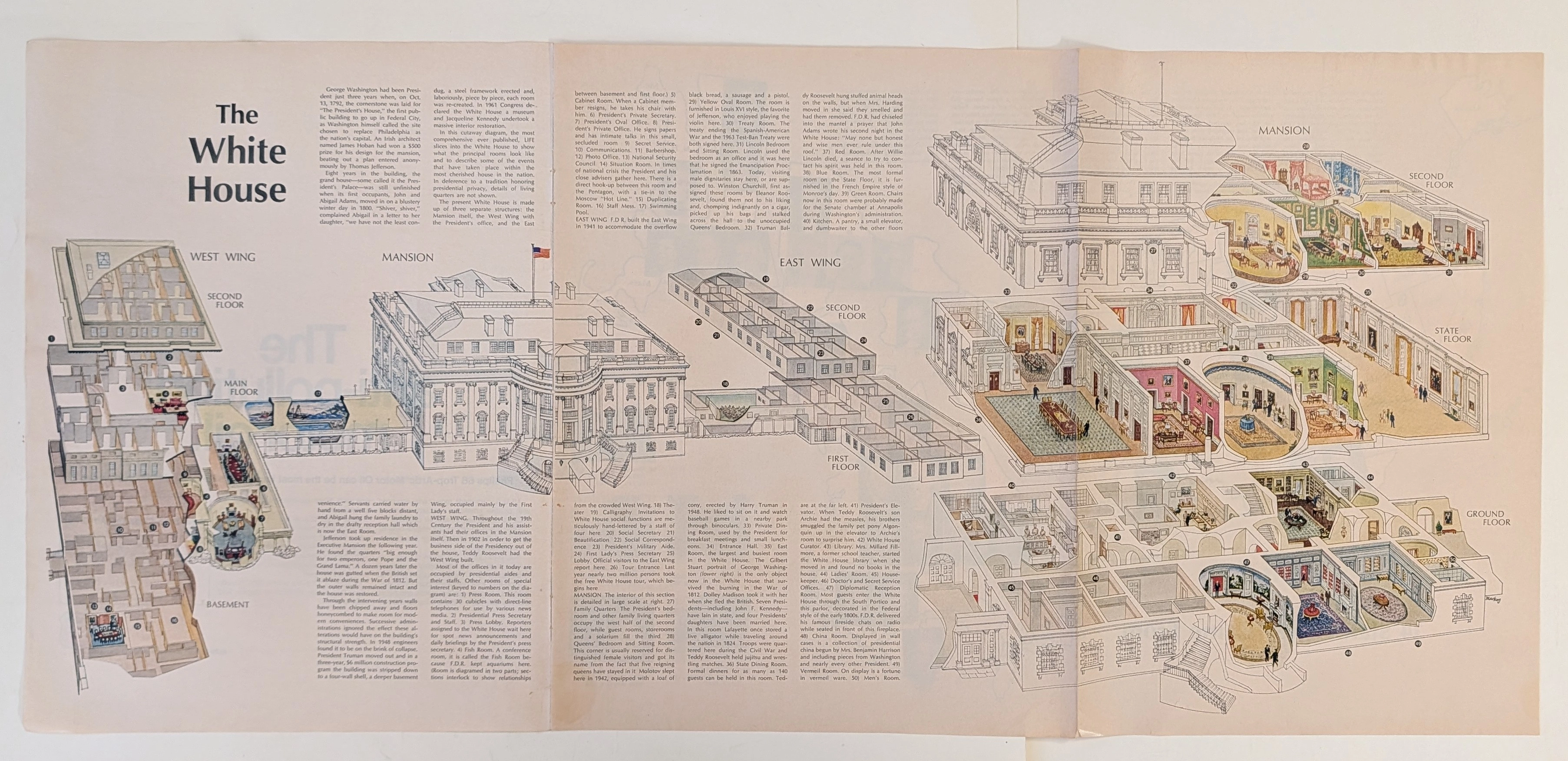
The Time Traveller's Dossier: The Masterpiece of Architectural Anatomy – The White House Isometric Cutaway Artifact (Circa 1960s)
The documentation of monumental architecture represents one of the most profound intersections of art, engineering, and historical preservation. Long before the advent of digital rendering software, computer-aided design (CAD), or virtual three-dimensional modeling, the supreme manifestation of structural visualization was executed through the calculated, mathematically rigorous discipline of the isometric cross-section. The historical artifact presented before us for analysis is not merely an educational fold-out extracted from a mid-20th-century mass-market publication. It is an absolute triumph of commercial illustration and draftsmanship, offering a meticulous visual dissection of one of the most famous residential structures on the globe. This museum-grade, academic archival dossier presents an exhaustive, microscopic deconstruction of this mid-century isometric cutaway diagram. Operating on a profound structural and spatial logic, this document completely strips away the iconic neoclassical exterior facade to reveal a masterful, dollhouse-like cross-section of interior design, historical room layouts, and underlying spatial engineering. It captures a precise historical era in publishing when complex architectural topographies were translated into highly accessible, visually thrilling infographics designed for public education. Through the highly specialized lens of late-analog commercial artistry, architectural history, and stringent visual forensics, this document serves as a masterclass in spatial communication. It establishes the foundational archetype for educational diagrams—an archetype that dictates the visual standards of modern architectural encyclopedias today, executed with a level of handcrafted precision that modern digital tools strive to emulate.
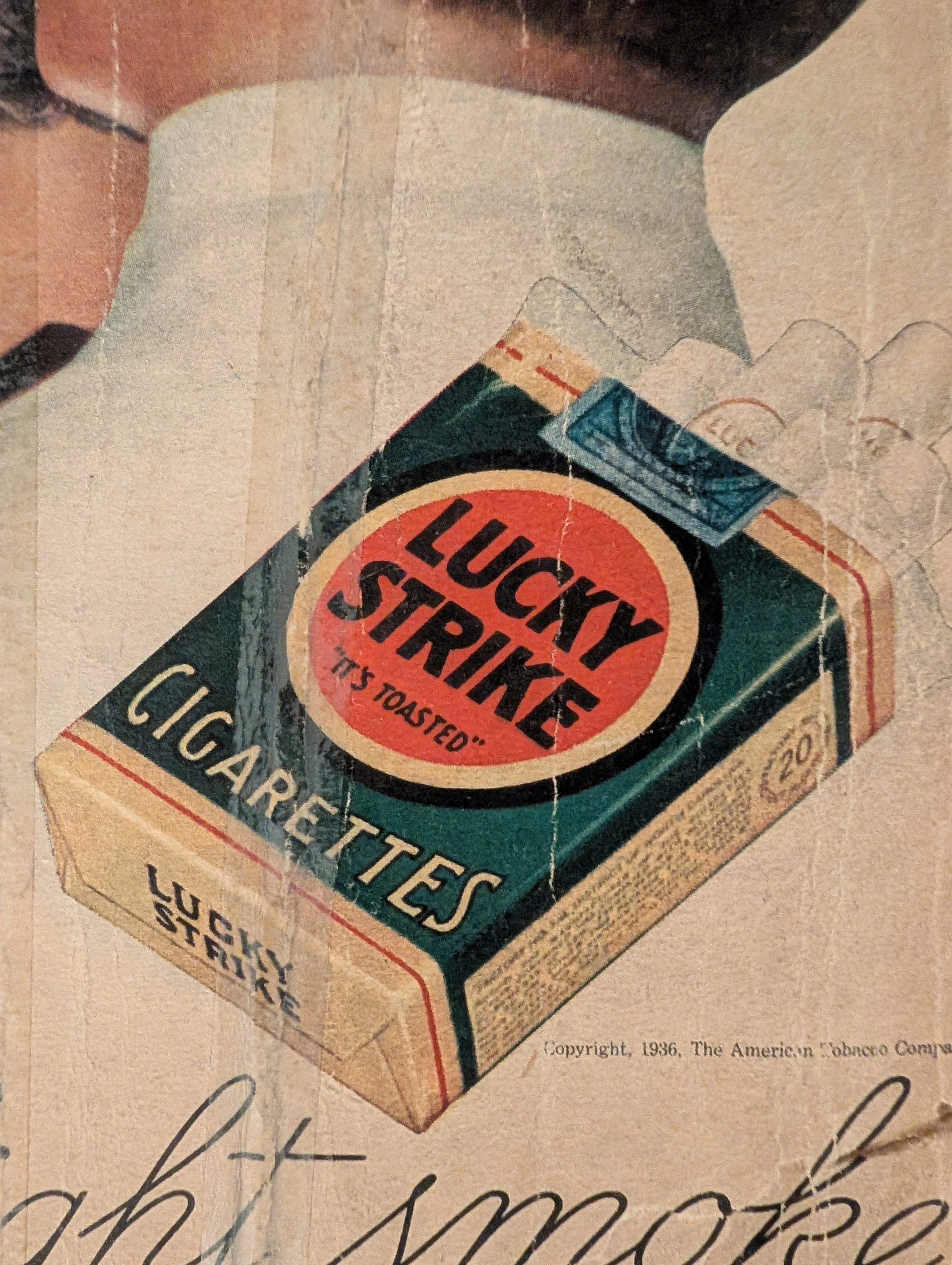
THE TIME TRAVELER'S DOSSIER: THE GOLDEN LIE AND THE PROPAGANDA OF 1936
The artifact under exhaustive, uncompromising, and unprecedented museum-grade analysis is an exceptionally rare, battle-scarred Historical Relic originating from the absolute zenith of the American tobacco empire. This Primary Art Document is a monumental, full-page advertisement for Lucky Strike Cigarettes, forensically and definitively dated to 1936 by the explicit copyright text: "Copyright, 1936, The American Tobacco Company". This is not merely a vintage tobacco ad; it is a profound "Sociological Blueprint of Corporate Propaganda" from the interwar period. Emerging in the heart of the Great Depression, this artifact captures the audacious peak of 1930s psychological marketing. The commanding headline, "Smoke to Your Throat's Content", represents the era's surreal, medically ironic strategy where tobacco conglomerates aggressively marketed deadly carcinogens as "smooth" and "non-irritating" to the throat. Furthermore, the legendary slogan "It's Toasted" serves as a masterclass in advertising spin, transforming a standard manufacturing process into an exclusive health benefit. Visually, the ad brilliantly normalizes and glamorizes female smoking—a direct continuation of the industry's sociological engineering to double their consumer base. Rescued from the inevitable oblivion of disposable mass media, this pre-2000s analog artifact is a breathtaking embodiment of the Japanese aesthetic of wabi-sabi. Printed on highly acidic wood-pulp paper, it exhibits severe, violent edge trauma, deep structural creasing, ancient tape residue, and a profound, burning amber oxidation across its entire surface. This unstoppable molecular death transforms a piece of mass-produced corporate propaganda into an irreplaceable, ready-to-frame Primary Art Document of American marketing history.
Whirlpool · Technology
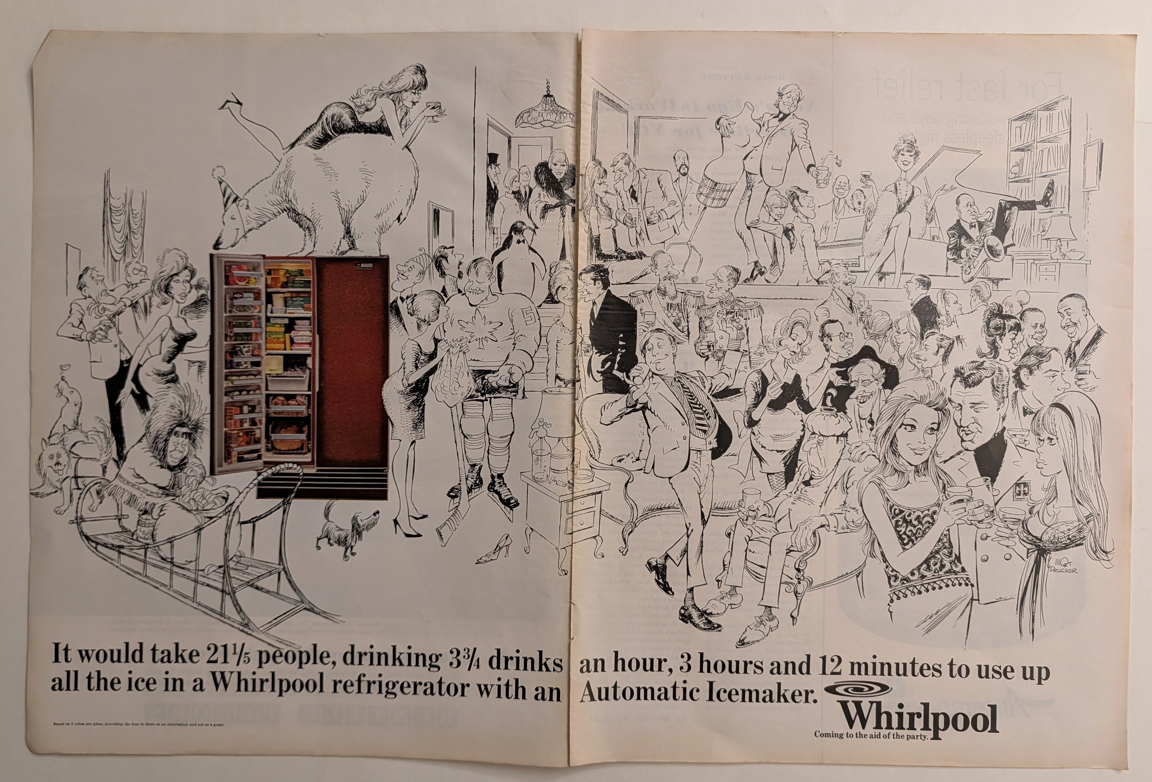
The Time Traveller's Dossier: The Sub-Zero Socialite – The Whirlpool Automatic Icemaker Exhibition by Mort Drucker
The evolution of the domestic appliance from a purely utilitarian instrument of labor into a central pillar of social entertainment and psychological comfort is one of the most fascinating sociological phenomena of mid-twentieth-century America. The historical artifact elegantly and securely positioned upon the analytical table of The Record Institute today is a majestic, large-format, two-page print advertisement for the Whirlpool Refrigerator with an Automatic Icemaker, originating from the cultural zenith of the 1960s. This document completely transcends the traditional boundaries of household goods marketing. It operates as a profound, sophisticated declaration of how technological innovation liberated the American middle class, transforming the private kitchen into a nexus of boundless hospitality, leisure, and social status. This world-class, comprehensive dossier will conduct a meticulous, unyielding, and deep examination of the artifact, operating under the absolute most rigorous parameters of historical, sociological, and material science evaluation. We will decode the brilliant, chaotic, and highly kinetic party scene birthed from the pen of legendary illustrator Mort Drucker, and analyze the dramatic visual juxtaposition of this monochromatic chaos against the highly structured, full-color reality of the Whirlpool refrigerator. Furthermore, as we venture into the chemical and physical foundations of this analog printed ephemera, we will reveal the mechanical fingerprints of the CMYK halftone rosettes and the graceful, natural oxidation of the paper substrate. This precise intersection of visual nostalgia, pop-art mastery, and the chemistry of time cultivates a serene wabi-sabi aesthetic—a natural, irreversible phenomenon that serves as the primary engine driving up its market value exponentially within the elite global spheres of Vintage Appliance Ephemera and Commercial Art collecting.